Thursday, May 28, 2015

Daily Wrap

I'm going to keep tonight's post a bit short because 1) the market has acted exactly as we expected since last Friday's "week Ahead" forecast and 2) I've given you just about everything as it has happened. The signals now are paramount and how the $USD reacts is going to be very telling, although you probably know what my opinion is already on that subject, The $USD and USO / Oil.

I was expecting the market to either pin roughly in place or to see some slight gains as posted in last night's, Daily Wrap...

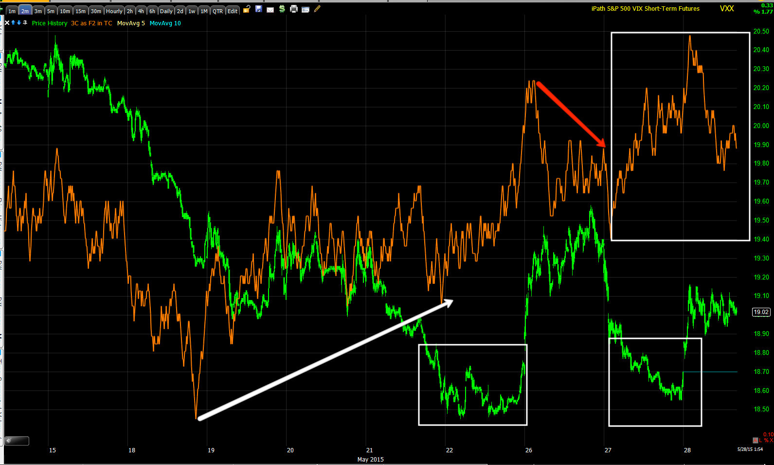
"Note the second squeeze took place just after we closed the VXX puts, but had waited before entering any assets that would count on market downside as the charts simply were not confirming in enough timeframes to justify such a trade "

and perhaps more telling were yesterday's internals...

"The Dominant Price/Volume Relationship saw 17 Dow stocks, 55 NASDAQ 100, 899 Russell 2000 and 271 SPX 500, a strong Dominant reading and all in Close Up / Volume Down, THE MOST BEARISH OF THE 4 POSSIBLE READINGS.

Also in a polar opposite to yesterday's internals, 8 of 9 S&P sectors closed green with Tech leading at +1.89% and Energy lagging at -0.18.

Even more so, of the 238 Morningstar groups I track, a full 222 of 238 closed green. 

As much as yesterday's internals were at a 1-day oversold condition that as I said last night, "This CLEARLY suggests a next day close in the green on a very strong 1-day oversold condition.", today's internals are the strongest form of the EXACT opposite, typically seeing a next day close in the red." 


Traders simply don't give enough (if any) credibility to all that volume can tell you.

The averages today stayed fairly well correlated except for weakness in Transports again...
 The major averages on the day today with transports in salmon lagging...

The major averages the last 2-days , staying within yesterday's range and all closing  red as internals suggested.

And the averages on the week, not much progress with transports slipping more.

Although it seemed like the internals and the gut feeling I had about the market's price action today was based in some objective evidence such as Internals or scattered short term 3C signals, certain other indications seem to show that today's close in the red for all of the averages was not due to the lack of trying...

 The same EUR/JPY carry that lifted the market yesterday was in force again today (EUR/JPY CANDLESTICKS VS. ES PURPLE).

HYG, High Yield Corporate Credit was also in lock-sync with the SPX today like yesterday, although both closed red. See last night's Daily Wrap fir the bigger picture with HY Credit leading the market significantly lower.

However on the other hand, there's serious signs of deterioration that are not every day occurrences and in most cases are worse than the 200 or 2007 tops.

For one, the Dow Theory confirmation signal between Industrials and Transports has fallen off a cliff.
 Rather than just compare the two averages, I created a custom Histogram on a daily basis showing you the deterioration between the two averages that should confirm each other which is the centerpiece of Dow Theory. Obviously the red histogram crossing below neutral (zero) is the difference between Industrials and Transports... I use to think it wasn't as relevant anymore since the US has transitioned from an Industrial to a services economy, but apparently I was wrong and a lot of those services still require shipping, take something as simple as DHL document deliveries.

In any case, the charts do the talking and as you may recall in recent years, Transports were a high beta momentum group so the fall-off there alone is noteworthy. By the way, our longer term Transports core short is nicely in the green.

As for Breadth Indications which have been steadily sliding for over a year now, in many cases much worse than the 2000 and 2007 tops...
 YESTERDAY FOR THE FIRST TIME, THE NYSE ADVANCE/DECLINE LINE WITH A TREND-LINE DRAWN FROM THE 03/09/2009 LOWS TO THE SECOND POINT AT 11/15/2012 DIP AND THE THIRD POINT MAKING THE TREND-LINE MUCH MORE RELIABLE AT THE 10/13/2014 LOWS HAS FOR THE FIRST TIME SINCE 2009 BROKEN BELOW THE TREND-LINE!

This is the first time this has happened since this 6 year trend-line has been in effect.

AS ALWAYS, "CHANGES IN CHARACTER LEAD TO CHANGES IN TRENDS"

I like to update breadth charts every now and then because they aren't open to interpretation, they are math, they are as honest as you get in the market. There's no interpretation, there's no special circumstances, just pure, hard and sometimes cold facts...

*I display the breadth indicator in green vs the comparison symbol (usually the S&P-500) in red unless otherwise noted. The basics of breadth are the same as volume, a rising market should see rising breath indications to match, when there's a divergence between the hard number count of breadth and the market, there's something not right.

The Percentage of ALL NYSE Stocks Trading ABOVE Their 40-Day Moving Average (in green ) vs the SPX (in red). As you can see earlier in the market's trend when internals were still strong, this breadth indicator averaged highs around 80+%. In to 2013 that fell slightly to 80% and in 2014 it fell to a still respectable, but obviously weakening market of 70%. Since 2015 there has been a notable decline in which breadth never recovered from the October lows and the current reading is 42% meaning LESS THAN HALF OF NYSE STOCKS ARE TRADING ABOVE THEIR 40-DAY SIMPLE MOVING AVERAGE. This is about half of what the percentage was when the market had healthy breadth.

This just shows us again if we are looking at the obscure weighting schedules of the market averages, we aren't too far off the highs, but when looking at the stock market as a market of stocks, you might say we are already in a bear trend as more traders are experiencing losses in individual stocks as they fall below their 40-day moving average.

This is the Percentage of ALL NYSE Stocks Trading ABOVE Their 200-Day Moving Average.

You may recall my nearly 4 years teaching Technical Analysis for the Palm Beach County School System's Adult Education program where I inadvertently had been slamming Motorola only to find out after class that one of my students was a former CEO of Motorola in the 1980's, thankfully he agreed with me. The point actually being, Dow Theory was a complicated concept to teach to neophyte traders and I had found that the 200-day moving average was "close enough" to represent the Primary trend (bull or bear market) , the 50-day was close enough to the Intermediate trend and the 22 day was close enough to the Dow Theory Short term trend classification so I used these moving averages, whether the asset was above or below the average and whether the average was pointing up or down as a proxy for Dow Trend classification.

Here the Percentage of ALL NYSE Stocks Trading ABOVE Their 200-Day Moving Average fell from a normal average in a bull market of 80+% to the current 50%. Again, half of the NYSE stocks are in a bear market trend despite the market and its obscure weighting (unique to each average and proprietary to NASDAQ 100 which will cost you a $10,000 a year membership to find out the weighting schedule). Take away the weighting schemes and just look at the percentage of stocks above or below and half of the stocks are in a Dow bear market.

 The Percentage of ALL NYSE Stocks Trading 1 Standard Deviation ABOVE Their 40-Day Moving Average  declines from 70% to 60% in 2013 to 50% in 2014 and currently  at a mere 25.5%, about 1/3rd of a normal, healthy bull market.

The Percentage of ALL NYSE Stocks Trading One Standard Deviation ABOVE Their 200-Day Moving Average, generally stronger momentum stocks. The average percentage in a healthy market was about 60%, although that has fallen to about  half that number to a current 31.26%. There's a clear trend of deterioration through 2015 in which it never recovered from the 2014 lows.

 The The Percentage of ALL NYSE Stocks Trading Two Standard Deviations ABOVE Their 200-Day Moving Average , stronger momentum stocks... usually running around 40% of NYSE stocks, currently at less than 12% with clear deterioration through 2015.

 This is the NASDAQ Composite and its Advance/ Decline Line. I'm sure you can see the issue here.

However if we look specifically at 2015 alone...
 There has been recent and significant deterioration in the number of advancing NASDAQ listed stocks vs declining.

As for Leading Indicators... For several months the Carry trade unwind made our use of yields as a leading indicator useless, however, even if only for a brief time, it seems they are working again as yields would act like a magnet pulling equity prices toward them whether that be up or down.

I can't argue with the recent evidence as yields plummeted last week in to the end of the week and Tuesday caught down to the magnetic pull of yields when acting as a leading indicator, which is a shame with the carry trade unwind as Treasuries tend to fall, making this once extremely reliable indicator useless, but recently it seems to be working if only for a brief time.

Like yesterday when Yields dislocated with the SPX, they have remained as such today, suggesting that perhaps our analysis of a major market shock next week may be reflected here.

Also among Leading Indicators, our Pro Sentiment indicator which looks much worse overall, see last night's  Daily Wrap to see how much worse. However the point of this shorter chart is to show how much faster Pro sentiment has fallen off recently, making a new low today.

And commodities which have acted as a reliable leading indicator, once again effected by the carry trade unwind as they tend to appreciate during the process, seem to be acting as a Leading Indicator once again, even if briefly as they led to the upside with the SPX, pulling the SPX back from excesses, but leading negative now which fits with indications of a possible major shock to the market next week.

As for internals tonight, they aren't surprising given that the Options Expiration max-pain pin is usually around Thursday's close at least until around 2 p.m.

Unlike the extremes of Tuesday and its 1-day oversold condition leading to Wednesday's sharp reversal to the upside and last night's 1-day overbought condition, almost as extreme leading to a red close today...Internals are not nearly as Dominant as the last 2 days which makes sense. However both the NDX (48 stocks) and the SPX (196 stocks) both fell in to the Dominant P/V relationship of Close Down / Volume Down which is the least influential relationship of the 4. In fact I've given it a nick-name, "Carry On" as in "Keep doing what you were doing" which would mean little movement in to tomorrow's op-ex pin which tends to be what we have noticed anyway with the pin typically close to Thursday's close. The S&P sectors saw 3 of 9 close green and the Morningstar groups saw 97 of 238 close green, mediocre at best. For future reference I will mention that the most common Price/Volume relationship during a bear market is Price Down / Volume Down, it is the thematic relationship, not that it means anything today in that respect.

The 3C signals will be very important the next few days and any additional price strength should be a gift for any short positions we may find looking appealing as we can enter at better prices with less risk, if only we had a 3rd decent shot at transports!

The $USD trend and whether the counter trend bounce is over or failing as I suspect will have dramatic ramifications for the market. As mentioned earlier, the assets bought with carry proceeds tend to be sold off, those are typically bonds and in the reach for yield in this market, a lot of stocks, but bonds have already reversed trend to the downside whereas stocks are yet to make that move...yet.

Finally as to futures tonight... It may be more appropriate to look at them in multiple timeframes with the $USD once again acting as the hub of the wheel.

Starting with the $USDX, From the looks of the Euro charts (which tend to move opposite the $USD), there are short term negative divergence in the Euro like...
 Euro 3 min negative which tends to suggest the $USD will see some near term strength. However whether a head fake or the recent trend of the $USD seeing overnight strength and cash market weakness, I can't be sure, but I suspect the $USD will make a last asp move higher.

The Euro 5futures 5 min chart starts to show developing positives suggesting any near term $USD strength, even a head fake move will not hold for long.

 The $USD 15 min chart tends to confirm that view as it should worsen in to any near term strength.

By the 60 min Euro charts we have significant positive divergence suggesting $USD weakness and...

60 min $USD charts also confirming the same.

I suspect the $USD will make a last gasp push higher before failing and ending its counter trend bounce and resuming its downtrend, making a new cycle lower low.

This will have an effect on oil as the two tend to trade opposite each other. We already saw today that USO weakness is being accumulated, but I expect more near term weakness which is why the USO equity short is still open.

The longer term 15 and 30 min Oil Futures are positive. Remember as posted earlier today, we are already seeing signs of oil being accumulated in to lower prices which is what I have expected and will be a prerequisite to any longer term core long position in oil, but it needs to pullback to be accumulated at lower prices. The 15 and 30 min Oil futures seems to tell us that is what is happening.

 Oil 15 min futures positive divergence in to lower prices and...

The stronger 30 min chart positive in to lower prices, I expect near term $USD strength will send oil lower and it will continue to accumulate, by the time the $USD turns down, oil should be in a position in which a long term trend long can be entered.

As for gold... It too tends to move opposite the $USD so near term strength in the $USD on a last gasp push, should hold gold back for a short period. However the 5, 7, 10, 15 and 30 min Gold futures are all positive, this may reflect a flight to safety because of Greece as well as inflation expectations related to what I believe will be a much earlier than expected F_E_D rate hike. Whether the projections of higher inflation by the F_E_D are genuine or not, they'll have to make the case to hike rates and as such, gold should appreciate on inflation expectations, real or imagined.

Treasuries (TLT), I have expected a move lower in treasuries and that would be the case on a falling $USD and carry trade unwind. Very near term Treasury charts are negative and I suspect we see the move lower I have anticipated (June TLT puts), here are a few key timeframes...

 30 year Treasury futures 3 min near term negative...

3 year t futures 7 min negative

And 15 mi  negative.

We'll have to reassess Treasuries/TLT for a counter trend rally upon seeing lower prices. If like Crude we see accumulation in to a decline, then it is likely we get a counter trend rally in Treasuries as I have also expected on a longer term basis, although not a reversal basis. If we don't see accumulation in to lower prices, we just stay away from the trade.

Lastly Index Futures... I can't imagine the $USD making a new lower low, the carry trade turning negative at losses magnified by 100:1 to 300:1 leverage and equities which were financed with carry profits not falling.

Very near term there's not much in the way of guidance which makes me think this is more related to an op-ex max-pain pin than anything else. There are some slight positive intraday divergences in the averages, but nothing I''d consider trading when considering the risk:reward ratio.

Remember the VXX charts today and then the 30/60 min $USDX. This is where the real ugly charts appear in Index futures, shorter term charts are all over the place...

 ES 30 min

 NQ 30 min

ES 60 min

NQ 60 min

And as a reminder of what I believe is the hub of the wheel...
$USDX 60 min negative.

Once the counter trend bounce fails and $USD starts trending lower, the carry trade losses will be magnified, I suspect this will coincide around the time of the Greek June 5th IMF payment which it seems all but assured they'll miss and be in default as well as other event risk such as the mid month F_O_M_C meeting. I know it's not mainstream thought, but I truly suspect that they'll hike at the June meeting.

Have a great night... Sweet dreams of a lot of great opportunities out there...


The $USD and USO / Oil

Rather than post all of the same charts again, please see last Friday's $USO / $USD Update.

The gist is, the $USD and oil, as a $US Dollar denominated asset, have an inverse correlation...

For years I have said that bear market , counter trend rallies (for a rally to be counter trend it must by definition be in a prevailing downtrend) are some of the strongest rallies you'll see in ANY market.

As for this move, the prevailing trend in the $USD has gone from a strong uptrend under the expansion of the $USD-based carry trade to a strong 3C negative divergence followed by lower highs and lower lows which is the definition of a downtrend or most certainly a trend reversal.

 Daily $USDX 3C chart with stage 1 base/accumulation, stage 2 mark-up/rally, stage 3 top/distribution and now stage 4 decline.

Note the 3C positive divergence at stage 1, the confirmation at stage 2, the negative divergence at stage 3 and the leading negative daily divergence (strongest) at the current decline.

The yellow hash marks show the $USDX making lower highs and lower lows as the trend has now changed.

For a closer look since the daily $USDX's top to the left, we have seen a trend lower and a counter trend rally in the $USD at the yellow arrow with the first 7-days (the two small yellow arrows) putting in the strongest 7-day move in the $USD since 2008! Stronger than any 7-day move during the entire uptrend or bull market. IT is this counter trend bounce in the $USD that I believe is ending as I posted on in some detail in last night's Daily Wrap.

While any trend is allowed to and even expected to consolidate, this is not the normal, healthy trend, it's more akin to a short squeeze. With only a day's evidence, it's really too early to be calling an end to such a bounce, but I have a feeling that we'll have enough evidence in the next several days that a warning post is worthwhile.

As I pointed out last night, the daily candlestick pattern in the $USD turned negative after it made a new high early in the morning and failed to make a higher high since.
As of yesterday, I pointed out the Doji star closing candle in the $USD daily chart above with its new intraday high at the white arrow and no new higher high since. Not only is the Doji star a possible downside reversal candle, but it falls within the body of the previous day's candle making it a stronger Harami reversal candle and today's red candle is looking like a bearish engulfing confirmation candle.

This should, if I'm correct, send the $USD down to a new lower low within its downtrend.

The 60 min $USDX chart which doesn't show all of the history since our April 2nd $USD forecast that called for a bounce to be followed by a much larger decline  We saw the bounce (which is now cut-off the left side of the chart) and the much larger decline has taken place at the red arrow since. The counter trend bounce is at the yellow arrow and note the tell-tale rounding reversal top. Perhaps we get a chimney head fake move here as well, perhaps not. I am however expecting the last low at the horizontal red trend line to be taken out with a new lower low eventually that has implications for oil, but more importantly for the Carry trade and ll assets purchased with carry proceeds including bonds and stocks, although bonds have already wrung out plenty of the excesses...

Treasuries which outperformed even equities in 2014 have already made lower highs and lower lows wringing out some of the carry trade excesses, CAN WE SAY THE SAME OF STOCKS YET?

It's hard to say whether there's a head fake/Chimney move in the $USD...

So far we have these charts showing deterioration of the rally...
 The 3 min $USD chart shows the negative divergence at yesterday morning counter trend rally highs.

The 15 min chart shows the accumulation at a "W" base, confirmation on the up-trend and a negative divergence across the highs. Again, this isn't a lot of evidence, the 60 min and daily charts have been negative since the start so they don't add new information, but I suspect we are either at the top or within days of it, again having some correlation as far as time with other charts in the market averages and VIX futures.

As to oil, I'll give a brief summary. I believe oil is creating a large base from which it will reverse its trend...
Daily CL / Brent Crude Futures with a 3C negative divergence at stage 3 top/H&S top, confirmation at stage 4 decline and a positive divergence now at stage 1 base.

More specifically, I believe USO has created a base, but is not done with it yet and needs to pullback 1 more time to create a strong enough base for a true primary trend reversal.

 USO daily chart base. I believe USO needs to pullback within the base and we should see accumulation in to that pullback. Then USO should be ready for a large trend trade long, the best trade opportunity in oil since the decline from last summer's highs.

The 2 hour $USO 3C chart shows the accumulation of a head fake/stop-run below base support which can be seen above on the daily chart as a "V" in the middle leading to a +30% run just above base resistance, but it failed to breakout convincingly as we had forecasted about a week before the breakout attempt came to pass.

This divergence tells us USO needs to pullback, gather a head of steam and pull off a proper breakout.

The 15 min chart shows the details of both head fakes below and above the base. This is the entire reason for our USO short which is at a +6% gain with no leverage...

 USO short position for the pullback.


As the pullback has already started, this 10 min chart is already showing us the accumulation we expected to see and a prerequisite to any long trade. We want to make sure the pullback is being accumulated for a strong breakout before entering long, initial signs are that it is being accumulated in to lower prices.

The 3 min chart shows this with more detail, but not as strong of a divergence.

As does the 2 min chart.

An the 1 min chart suggests USO will pullback some more.

I suspect that by the time $USD has started trending down, USO/Oil will start trending up and as a new low is made in the $USD, oil will make its breakout.

Unlike the last head fake/stop run leading to the +30% move, the next base should be wider than the "V" base last seen. either an inverted Igloo/Chimney or a "W" base so I expect some reversal process, not just a sudden move higher, which should give us plenty of time to enter the trade.

Again, the turn down in the $USD which will come eventually has more serious market implications than simply oil, but this is one that seems to be confirming what we are seeing in the $USD.


Brief Bigger Picture Market Update

There are too many issues to touch on in an intraday update and there are too many different assets and different signals to touch on, it would take hours to get to it all.

However for the sake of brevity (as much as I can provide) lets just remember The Week Ahead forecast from last Friday which was looking for an "Igloo & Chimney" top formation. Don't bother looking it up, you won't find it, it is one of the price patterns we have documented over and over again. It looks like a typical rounding top that is actually a real top, but it's also very obvious to mist technical traders so after it completes and seems to be heading down, there's a head fake move to shakeout any traders following this rounding top and going short, this is the "Chimney" which looks like an Igloo snow block house with a chimney protruding above the rounding top. The chimney portion is a shakeout,  causing traders to stop out and reverse positions back to long and just after, price tends to fall sharply. This is why I often say that this is the best price-based pattern we have for timing of a decline (once we see the chimney) and it is often one of the best places we can enter short positions or exit longs at the best prices with the least risk and great timing. 3C should always confirm this pattern.

In the week ahead, this was the first thing I talked about for this week and every night in the Daily Wrap I have updated the price pattern as it develops exactly as we had expected on Friday. The rounding part of the Igloo was distorted and fell much faster which made me think there's a hurry to get this pattern through.

Yesterday I said that despite some of the divergences in the averages, I wasn't ready to enter any new short term positions as it seemed to me there was a good probability that price would either linger in the area of yesterday's highs or even move to higher highs (the chimney), so far today we haven't been far off considering the additional information of the internals last night that strongly suggested a 1-day overbought condition yesterday that usually ends with a red close the following day (today).

Looking at the averages, they all have nor differences and I suspect that's because they each have different options expiration max-pain pin levels, but there's a theme among them which I'll try to demonstrate, however these aren't very different than the earlier market update, actually the exact same theme.

 SPY 1 min intraday saw a negative divergence in to the close yesterday, today prices pulled right down to that area from yesterday's negative divergence and have a short term 1 min positive divergence either holding them in place or it perhaps will make a minor move higher. One thing I've said is that because of the op-ex tomorrow, I didn't think any major move would take place until next week.

 The 2 min SPY has the same, short term, minor positive divergence as well.

 However when looking at the best example of the Igloo/Chimney top in the QQQ with the rounding Igloo at the yellow area on the time axis which sees a rapid and sharp drop off rather than the normal rounding down (which is why I said it seems that there's some hurry to get this price pattern through before some event which may be Greece, perhaps the June F_O_M_C, etc...). Then, exactly as I drew it a day before it even occurred, the Chimney portion which is a strong, straight up move formed. Note the negative 3C QQQ 5 min negative divergences in to both the rounding area and a worse leading negative divergence in to the Chimney area.

This is the kind of confirmation we look for to verify this price pattern.

Looking at VXX, I'm not ready to take a position yet and we have been trading rather minor swings in VXX, but it looks like a large move is taking shape and nearly finished with its base. Remember, VIX/VXX moves opposite the market so a move up in VXX= a move down in the market averages.
 The 1 min chart shows nothing of interest today, more like a stall which fits with the scenario expected of the market from yesterday.

However looking at a 2 min chart we see a recent positive divergence, we traded this one with calls.

It gets more interesting looking at the 2 min trend...
 We seem to have a "W" shaped bottom price pattern with stronger leading positive divergences as it builds. There's a small distribution area which sent VXX down which we also traded, but note how much smaller it is than the positives. Typically there's a range smart money will buy at and it's at the lower end, when prices move too far from that range, they let out some supply to send prices back down, but not so much that they are deteriorating the shares they are accruing.

 A 10 min VXX chart shows an even larger, stronger positive divergence.

And the very strong 60 min chart that shows a negative sending VXX lower with confirmation of the trend at the green arrow and a current large, leading positive divergence in the area.

It looks like something big is getting ready to happen which is what we have expected since calling for a head fake move above the various market triangles (around mid to late April). At the time the analysis was that the market would not make any serious move to the downside until the clear resistance of those triangles was broken on a head fake move or failed breakout which is what it has turned out to be with no ability to hold the move and certainly no follow through.

Those events all seem to be lining up with our shorter term events above.

While I can't cover it in any depth right now, the counter trend rally in the $USD also looks to be ending with signs over the last 2 days suggesting it is getting ready to end and return to the previous downtrend and make a lower low, something that will cost carry traders. I have a very strong feeling just as I did when we forecasted the strong counter trend bounce which ended up being the strongest 7-day $USD move since 2008, that this is all carry trade related and as such, very much market related as the assets funded with carry proceeds are typically sold as the carry trade is closed.

I'll try to cover the $USD as well.

I don't think we'll see anything significant today or tomorrow, although price strength right now would be welcome to set up longer term trend shorts that are on my watch lists. I've spent the day going through them and they are also giving signals that they are moving closer to trade entries, ironically right in time for the convergence of these multiple events not to even mention the Leading Indicator divergences posted last night.

Again, we'll take the opportunities where we can find them, but this is looking like patience very near term for much larger opportunities than several day option trades.