I've noticed that the large caps had been leading the recent move, I wrote about it and showed you the weighting in which it would make sense to use large caps to move the averages higher even while more stocks then ever (in the run) are declining. This isn't opinion, this is fact, below are some breadth indicators you have recently seen.
Percentage of stocks trading one standard deviation above their 40 day moving average
Back in January this level was 78.5% of all NYSE stocks trading above the 40 day m.a., it recently declined to a mere 15% and is now less than half of January's reading at 36.84%.
Percentage of stocks trading 2 standard deviations above their 40 day m.a.
These are the strongest stocks, the percentage went from 50% all the way down to less then 3% and is now at 13.06%, less then a third of what it was in late January.
Percentage of stocks trading above their 40 day moving average
This would be most stocks, as you can see the percentage was at 88% and is now at 58%.
This is the SP-500 in green, the white line is the 40 day moving average, the upper blue channel is 1 standard deviation above the 40 day and the upper red channel is 2 standard deviations above the 40 day m.a.
For the percentage of stocks that were formerly above these measures to decline so much, it means they are trading lower then they were in most cases, thus we have fewer stocks keeping up with the averages, so the market can be manipulated by using weighted stocks within the averages. It's not uncommon to have more stocks in an average decline then advance and the average to still be up, although as more and more stocks fall apart, this situation can't last long.
So large caps recently were in rotation, I believe for this very purpose. As you have seen recently, the Industrials (generally very large cap stocks) have declined significantly the last week or so.
CAT is one example worth looking at as it may be of interest to some of you as a trade. Cat is the second most heavily weighted stock in the Dow-30 at 6.5% (the range for weighting for the Dow is from 11.76% to 0.54%)
This is the second half of what I believe is a long term double top in CAT, the white box simply shows the concept of a reversal on a bullish candle and high volume as I have mentioned), the red box is CAT gapping down on increasing volume and RSI is negatively divergent at both tops.
Cat on the 1 min chart never stood a chance today of filling the gap.
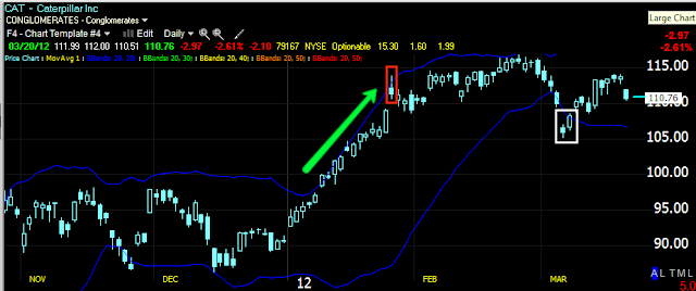
Here is CAT when it had strong momentum and was walking the upper Bollinger Band, after breaking out of the band, CAT lost all momentum. The recent break below the bands taken with the bullish reversal candle and a high volume day suggested CAT would see a bounce as it did.
On a weekly chart we can see the CAT double top with Money Stream showing much less money flow in Cat now as opposed to 2011. Note this isn't a perfect technical definition of a double top because it is more "V" shaped in the middle then "U" shaped, but real life patterns are rarely like the textbook patterns.
Note the volume going in to the first top is advancing and bullish and the volume going in to the second top is declining and bearish. Also, although not very dramatic, we often see a slightly higher move at the second top, this is the head fake move. We see the same with bases, the second low is lower then the first.
After showing great strength, CAT took out 5 weeks of longs in one week on that downside move. As is almost always the case, Fear is stronger then greed and markets fall faster and harder then they rise.
Using my Trend Channel, the down trend was held well, at the yellow arrow there is no trend (or it is lateral) and the Channel held the uptrend until the break below the white trend line. In my experience, once the Trend Channel is broken, you may have some volatility and slightly higher highs, but usually the volatility risk and the opportunity cost are not worth hanging around once the trend is stopped out.
Compare the weekly 3C and the two tops, the readings are similar to what Money Stream showed us and this is exactly what I would expect to see in a double top.

The 60 min chart at the second top went leading negative before CAT fell, it did the same on the bear flag bounce.
Here's the bear flag in CAT on a 15 min chart, there was no accumulation on the 60 min and only a brief period on the 15 min, just enough to get CAT moving, but not enough that there was a serious attempt to keep CAT alive, more likely then not, this move was used to sell or short in to.
This is what many of the large caps look like and you can see it in the Dow's recent underperformance.
If you have questions about a possible short trade in CAT, feel free to email me.


