Monday, June 16, 2014

Daily Wrap

I want to start From Friday's The Market Into Next Week to see if there's continuity in what we are observing...(Today's notations are in red)

"Going through the charts, there's a lot today that looks similar to yesterday, which is to say quite a few newly formed divergences have been either run-over like yesterday or deteriorated pretty badly.

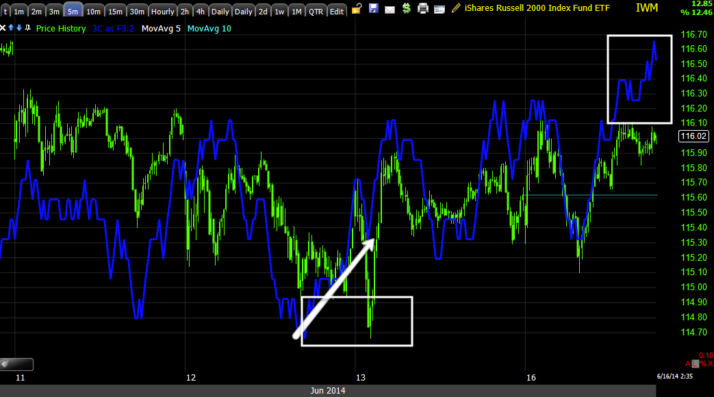
Today there was more deterioration, although not to the same degree as late last week. The only average I didn't notice deterioration of meaningful significance (or I should may have had some deterioration here or there, but made up for it on stronger charts) was the IWM which is the reason I chose it as a bounce candidate for early this week, Trade Idea: Short Term IWM Calls. The IWM's +0.48% gain today trounced the other averages leaving that trade idea at a nearly +14% gain today.


Right now, the 1 min charts for the averages and Index futures are negative. There are scattered positives, mostly in the 2 min area, a few out to 3 min and the IWM has been able to maintain a 5 min positive looking signal, but not quite a clean, clear divergence. The IWM 5 min positive looks better today as a leading positive, even though it moved in line with price. Just the added extra day makes the divergence look more defined. I mention this to contrast it with the 5 min SPY which is just seeing more damage today.The SPY 5 min chart remains in leading negative position, but didn't improve or deteriorate today, if it is zoomed to intraday view, it would appear to be in line all day, even though it is in leading negative position from last week's damage. It has been a while since I've seen this kind of activity, but I'd say there's a real sense of fear and the hedge fund herd that usually moves together, seems to be breaking up in to an every man for themselves or "Whoever sells first, sells best" mentality. I believe that's why it has been so difficult to hold together positives that have formed.

I was a bit surprised this morning to see how much opening damage there was on the TICK chart, 

Late morning trade saw an extreme of -1350 (The TICK is NYSE advancing issues per bar minus declining issues per bar) which is quite a bit of selling and where the only real positive divegrence of the day was found as if it was there to halt selling. The +1050 reading saw negative divergences in to the early afternoon bounce.

HYG is still supportive of a bounce, although the asset itself has seen deterioration which I showed in last night's Daily Wrap; whatever deterioration was on the charts in last night's post, you can pretty much triple that today, yes, massive deterioration in HYG so I am amazed it's still able to hold in position. The exact same was seen today posted this afternoon FIRST Utilities outperforming, now VIX

In fact, any bounce from HYG may have been held back by some minor strength in VXX and TLT as they counter HYG is the SPY arbitrage which was eerily near perfect today.
The HYG/TLT/VXX weighted Arbitrage model was nearly perfectly aligned with SPY today which I've never seen to this extent.

It's my opinion based on F_E_D communication and the way the 3C has acted since SPX 1900 was crossed (along with these right shoulders everywhere) that the F_E_D / F_O_M_C next Wednesday is going to do or say something to pop the exuberance they see in the market or perhaps better said, the lack of volatility (fear), I suspect it will be subtle so they aren't charged with manipulating the market as we all know they do, but they are clearly unhappy suddenly with the lack of respect for market risk.

The bounce I had envisioned considering I used a partial IWM call position with expiration next Friday, would be along the lines of pre-F_O_M_C and looking at the market as a whole, right now I can't say that I would expect much. In fact I am starting to wonder if it is even possible given it seems any kind of underlying strength that builds is so quickly torn down. Which was the case to a lesser degree again today, but the end result is the same, SPX +0.09%, Dow-30 +0.03% and NDX +0.12%, just about in line with Friday's expectations except for the IWM which the call trade was opened in at a +0.48% gain.


Last Friday I said I expected the head fake move that began on 5/23-5/27 to start to be resolved to the downside this week, thus far, that's exactly what has happened.

From what I see right now, I'd expect a pre-F_O_M_C relief bounce and the move to really start generating downside momentum, however as to any bounce, I don't think (at this point) you can count on positive divergences much past 3 mins, meaning I think you'll need to be nimble to capture gains and likely need a fair deal of leverage to make it worth the risk this was absolutely true today, while also pre-defining that risk to a tolerable level which you can do with options as the premium paid is the maximum risk.

Beyond that, there has been an exceptional amount of damage done this week and I'm talking about damage being done while the market has lost ground as we usually see distribution in to higher prices, this week we have seen it in to lower prices as well, which is what gives off an aura of panic."


END OF QUOTE...

Along the lines of panic, while nothing was as obvious today, there were negatives in the averages on what would otherwise be expected to be an in line day with so little movement... The outperformance of XLU +0.66% (the safe-haven trade of Utilities) was notable, even though our earlier fade trade was working, again you needed to be nimble and use significant leverage.

OF THE S&P SECTORS, Only Utilities and Energy finished with any sort of gains at +.68 and +.60 respectively, the Energy gains likely related to the ongoing insurgency in Iraq (borderline sectarian genocide). The biggest loser of the S&P sectors was Financials, down -0.49% which I mentioned earlier in the day for a possible bounce along the lines of the IWM options trade from Friday, however only XLF has any positive divergences and only clearly out to a 3 min chart, missing the 5 min mark which is the minimum timeframe for a trade. Furthermore there was no confirmation whatsoever in FAS, FAZ, SKF and UYG (although I'll keep it on the radar). This happens to be one of the sectors I believe will suffer the most with the end of real QE that is able to generate the trading incomes these banks have seen the last several years and with the loss of the traditional banking model as mortgages have plunged as well as Corp. loans (to Lehman era levels).
 Longer Term Financials 3C chart as the F_E_D's Q/E or the Bernanke Put held up banks via trading profits, since the talk of taper, there's been a much different character,

On a closer term 60 min chart, there's been major recent damage to Financials.

Also noted was the outperformance of VIX, largely attributed to the F_O_M_C (but I'd have to see the same tomorrow to believe that)...
VIX showing significant outperformance of its normal SPX correlation (SPX prices in green are inverted to show the correlation).

With everyone short volatility as the VIX has seen 75 consecutive weeks below its long term average, a rate not seen since 2006/2007,  "if" the F_E_D follows through with action on what they've been talking about, a massive squeeze in volatility would send the market much lower, especially considering the "Short volatility trade" and the fact that the Dow is only up 1.24% since Dec. 31st, 2013 to today's close; the SPX +4.84%; the NASDAQ Composite +3.45% and the "Market Leading " Russell 2000 only up +0.28% during the same timeframe, while the VIX has spent 75 consecutive weeks below its long term average, a record not seen since 2006/2007. The resulting squeeze in volatility could be sharper than most expect and there are hints that smart money knows this, not only the extremely sharp negative divergences since the market crossed above the 3-month SPX range which we expected as a head fake move and so far has been verified as one, but action in VIX Futures I've been tracking are now leading positive out to a 60 min chart.

VIX Futures leading positive on a 60 min chart, while the market looks like this during the same period...
This is a 15 min chart of the SPY which is not close to the worst negative divergences, but necessary to show the same time period's action. The white area is the same period that VIX futures have a leading positive divegrence while the SPY has a leading negative divegrence. Ironically, the leading negative not only started as the market moved above the 3-month range and SPX 1900, but the two charts both depict divergences from May 15th when we saw a bear flag with accumulation and speculated it would see a Crazy Ivan to jump start a short squeeze leading to an anticipated head fake move ABOVE the range before any meaningful downturn in the market.

Also ironic is the timing of this move (in its entirety and also recently) as it just started turning last week, a week in front of the F_O_M_C meeting.

May of 2013 during a F_E_D meeting, the Advisory council stated they had, "strong concerns over its low interest rate policies and bond purchasing program", we know one end of those concerns have been handled with the taper of QE. The council went on to say, "this could lead to unmanageable inflation and an unsustainable bubble". Here we are a year later and F_E_D members are speaking openly about the council's second concern.

The F_E_D has been transparent in the past in stating their objective to create the "wealth effect" via the markets, while perhaps a well-intentioned idea (or perhaps not, you probably know by now I believe QE was nothing more than a stealth bank bailout), it didn't work, even today's beat in the Empire F_E_D coming in at 19.28 vs. consensus of 15, had it's dark clouds, specifically the employment index which fell from 20.88 to 10.75. The other apparent failure is capital expenditures, while many companies "say" they feel better about them, what they have said hasn't translated in to investment in new equipment, rather many seem to be turning toward the short term investor sugar rush of buybacks instead.

Some recent comments from F_E_D members on the state of the markets:

"One of the things that concern me is there is almost no volatility in markets... low volatility is unhealthy"
"This indicates to me a little bit too much complacency that [interest] rates are going to stay at abnormally low levels forever"

-Richard Fisher president of the Dallas Federal Reserve Bank 

"Volatility in the markets is unusually low,... "I am a little bit nervous that people are taking too much comfort in this low-volatility period. As a consequence, they'll take more risk than really what's appropriate."

-William Dudley, president of the Federal Reserve Bank of New York (also a known member of Janet Yellen's inner circle).

Hinting that the expected F_E_D Funds rate "may not" be at zero until mid 2015 as the market now expects, Janet Yellen (after the F_E_D moved policy guidance from quantitative to qualitative, essentially allowing them to make it up as they go) recently said,

"It is important to note that tying the response of policy to the economy necessarily makes the future course of the federal funds rate uncertain,"

Yellen was essentially telling the market, in turning to qualitative guidance, the market shouldn't make assumptions that the funds rate will be at zero until mid-2015, which is what fuels low volatility and complacency in the markets.

And Kansas City Fed president, Esther George, a skeptic of keeping rates low for an extended period recently said,

"My concern is that keeping rates very low into late 2016 will continue to incentivize financial markets and investors to reach for yield in an economy operating at full capacity, posing risks to achieving sustainable growth over the longer run,"


Even the WSJ and F_E_D's unofficial mouthpiece, Jon Hilsenrrath wrote a piece about the market's complacency and the F_E_D's concerns about it.


In any case, it's  a fool's game to try to predict what the F_E_D may do Wednesday, but in my view considering how vocal they have been, I think they've been warning the market. The underlying 3C trends in the market, especially recently as well as VIX futures, seems to indicate to me that someone heard them loud and clear, obviously someone/s with deep pockets as these are large and extreme divergences.


FIRST Utilities outperforming, now VIX

By the way, if anyone took the XLU "fade trade" from earlier today, Fade Trade: XLU Utilities I'd be interested to know how you are doing as XLU is fading intraday as anticipated.

XLU (Utilities) have long been a safe haven trade for long-only funds.

Financials are also underperforming, I looked at XLF and considered a similar Call trade like the quick, speculative IWM entered Friday, however, although I'm getting small positives that suggest a pop that could be played with call options, I'm not getting any confirmation in FAZ or FAS, both are still favoring Financials heading lower even though XLF is showing some "SMALL" positive divergences on today's weakness in the sector.

As for the VIX, take a look and consider VIX is a flight to protection trade so it seems there's a flight to buy protection from a downside move. I do think there's a VIX trade available, I don't think it's here yet, I'd say about the same time I exit IWM calls from Friday, I'll be looking closely at VIX possibilities.

Short term Leading Indicators still suggest a bounce, take HYG vs SPX,
HYG is in red, as I showed late last week, internally it's falling apart, but for the short term, it's holding enough to allow a bounce like the one I had in mind late last week for early this week, pre-F_O_M_C and if SPX (green) were to revert to HYG (red), that would be a reasonable expectation for a bounce.

A quick look at HYG deterioration, I posted more charts last week.

In any case, this is about VIX...
 This is VIX (blue) vs SPX over the last week or so, you may not see the outperformance, but if I invert SPX prices to show the natural inverse correlation between the two...

You see VIX outperforming SPX today by a comfortable margin.

I suspect if we get our bounce VIX will follow its natural correlation, but I also think that will be the area where a VIX / VXX trade may be a reality.

Lots of little chinks in the armor today.

GDX / NUGT Update and Long Term (LONG) Trade Set-Up

Several days last week (Thursday/Friday) I felt pretty certain GDX/NUGT which is a current long (NUGT) up +12.5% which is pretty good considering how far we are off the recent bottom, was going to pullback, I feel nearly certain it is going to pullback.

However, you saw the sectors earlier in this post Major Industry Sectors and the one Investment that Seems to be Getting a LOT of Attention and specifically the miners (gold), that's a very hard trend to ignore.

In any case, NUGT is in the trading portfolio as a trading position so normally I'd be exiting NUGT right about now or Friday and entering DUSt for a quick pullback trade (NUGT's pullback), however, I can't bring myself to do it considering what these charts are showing in this group, not over a pullback.

I think there's a good opportunity for a long trade set up (longer term) and or an add/to position here.

 As I've shown before, this base could be a large inverse H&S, the volume is right so far or it could be a Cup & Handle bottom (at the white box around dates).

We were looking for a head fake move below this bearish descending triangle as there was longer term accumulation in the area and major reversals (or really almost any reversal) rarely takes place without a shakeout/head fake move, thus the move below the triangle was not only anticipated, it's where we wanted to enter some GDX/NUGT long. There was accumulation as soon as price broke the support of the triangle.

Here we have a daily chart of GDX (NUGT is the 3x leveraged long ETF of GDX), there's good volume on the break out back above not only resistance (former support), but also above the triangle's downtrend line, however the last two days have put in a hanging man (it could use a gap on the first candle, but the psychology is the same) and what looks like a bearish confirmation of the reversal set up today, however volume is not large or increasing on either day which typically makes for a much stronger and more reliable reversal pattern. 

 This 15 min GDX 3C chart shows the accumulation below the triangle and the recent negative divegrence I've been watching since late last week, I feel pretty confident this will pullback, I don't feel confident in exiting the position on a pullback only.

 My Xover (Daily) screen is also just about a day or so away from a confirmed long signal, only the middle indicator needs the yellow custom indicator to cross over its 22-day moving average which is very close.

Typically AFTER there's a long signal, the first pullback will be to the yellow 10-day price moving average and subsequent pullbacks to the 22-day blue average, in this case it;'s difficult to say as there's a lot of resistance/support congestion right in that area, stops and other limit orders are going to be all over that area and likely run.

This is the 4 hour chart, there are much stronger charts, but this is more than strong enough for me.

So I'll stay put in NUGT and ride this out if it comes to that, BUT FOR THOSE LOOKING TO ENTER OR ADD-TO,  I'D SET SOME ALERTS TO AND BELOW THE $23.20 AREA, I will too and as soon as we see accumulation in to the pullback (which looks pretty high probability), I'll put out a Trade Idea on NUGT/GDX.

I really think this is one of the better long trade set ups out there, just look at the charts of gold/miners posted earlier linked above.

IWM Call Trade Follow Up

Friday I put out a VERY short term IWM bounce trade idea, Trade Idea: Short Term IWM Calls .

This was a 1/2 size spec Call position ($115, expiration this Friday 20th). Right now the position is in the green, but in the single digits, about 7%. For now I intend to continue holding it, the idea from my point of view is that the trade should be wrapped up no later than the F_O_M_C Wednesday at 2 p.m.

Here's what we have in the IWM, there's 1 chart causing some concern, but I'm not sure it's enough to warrant exiting the position.

First the strongest chart for an IWM bounce would be the 15 min Russell Futures positive divegrence, it's a 15 min chart, but a small divergence...
 TF 15 min, I showed this chart this morning in the A.M. Update.

Intraday, the action has been pretty stale, we saw that initial negative this morning on the a.m. high and everything since has been in line , however, this next chart is causing me some concern because of the concept of migration, but  I think it's such a short term timeframe and would take a bit more to become something more bothersome, I'd expect the trade to be over with by then.

 In to this afternoon, the 2 min chart has broken down, leading negative. The same has happened in the QQQ 2 min , SPY 1 min and DIA 1 min. As I said earlier, this bear flag is not showing the same positive character that the one from mid-May did which is what caused us suspicion that it would cause upside momentum which it did, right through the top of the multi-month range.

 So far the 3 min chart which saw some accumulation on a head fake below support, has remained in line, if migration of the 2 min negative reaches this chart, I'll be looking to take more action and not just in that IWM call position.

The IWM 5 min shows the same accumulation of a stop run below support tested 3 times in an afternoon, there's a very slight leading divergence now, but this could just be a bit of noise in the chart, it's not anything jumping off the chart.

As for the IWM 10 min, this is why it was a short term call position expiring this Friday rather than a longer one.

The trend here is leading negative, if I were to zoom the chart to intraday view, the area in yellow (today) would be perfectly in line with price, so it seems beyond the accumulation on the head fake stop run, there hasn't been much else and that 2 min chart in most of the averages is bothersome.

I'll of course let you know if I make any moves before I make them.

This still looks like the resolution of a head fake move above the multi-month range/SPX 1900.

Fade Trade: XLU Utilities

The DJUSUT and XLU have been way outperforming the broad market today, that's a very defensive trade.

In any case, while I wouldn't want to take a swing position, I think there's an opportunity to fade the move as it looks like they'll be coming down intraday, maybe better, the problem is I think you need leverage, the ETFs are very low volume and it's not the best volume either as you can imagine in options (puts), you have to have a pretty tight expiration, but it's worth a look.

DJUSUT
 5 min negative

3 min negative

XLU...
 5 min negative

3 min negative

2 min negative.

This looks like it's coming down intraday, but I wouldn't consider this more than a fade trade and a tricky one.

Major Industry Sectors and the one Investment that Seems to be Getting a LOT of Attention

While broad market averages aren't looking good, many other related indicators such as the carry trade, aren't looking good, High Yield Credit, Corp. Credit (especially in light of BAC's disclosure last week that Corp. loan origination has fallen off at the fastest pace and at lows not seen since Lehman Brothers when the entire financial market froze up) aren't looking good, there are one or two sectors from what I see that money is PILING in to at an incredible pace, this is the same general sector that we have been watching as it bottoms and the same sector I have said numerous times in the past that I expect to see a long term primary bull trend in.

First lets just take a look at a number of sectors that I've been able to get very clean, clear and confirmed signals in so we can compare.

*With the Dow Industry groups, I used Multiple Timeframe Analysis of the prevailing trend and confirmed when possible via multiple asset confirmation. The charts I chose to represent each trend where the median of my analysis for each group (the chart that gives the best feel of all of the different charts looked at). In some cases there have been recent changes in Industry groups so there may be two charts, one showing the longer term trend and the second showing the more recent trend changes.


This is the DJ-US Telecom Index, this is a 2-part chart as the longer trend above shows weakness at the 2007 top and even more weakness at the current area, the next chart is also the same Index, but a closer view or more detailed view.

 DJ US Telecom Index, has shown some very recent weakness as the longer term trend has well defined weakness. I'm using the longer and shorter charts to show trends and probabilities the same way I'd use a 60 min chart for strategic probabilities and something like a 5 or 15 min chart for more tactical probabilities/timing. This chart looks to weaken more form here.

 I find this very interesting because I believe most of QE was a stealth bank bailout, these are US retail banks, what is interesting is the sharp deterioration from 2013-2014, the same time the F_E_D was making it VERY clear they were about to and then started to, back out of accommodative policy (QE-Taper). Before that had been made clear for those who were paying attention, this index was moving largely in line.


 This is another example of the above, The Dj US Financial Index, which saw distribution in 2007 , accumulation at the 2009 lows when it became apparent the F_E_D would expand their balance sheet in what I firmly believe was a stealth bank bailout as the public's reaction to the AIG (and other bailouts like GM) was very extreme and angry, how may average Americans do you think understand QE and the method by which money is transferred from the F_E_D to the banks at US taxpayers' cost?

Again, around the time it was clear the F_E_D was backing out of accommodative policy, a very strong chart turned very ugly.

 The DJ US Basic Materials Index, this chart is not surprising at all as QE had the consequence of driving up commodity prices (especially in QE1 and 2 as you can see on the chart in to the second red arrow) causing producer input prices to rise exponentially, while their output prices fell. This looks to be a very interesting area to do more digging around, essentially commodities, Steel, Aluminum, etc.

 DJ US Biotech Index which was seeing confirmation, then additional accumulation at the white trend line and a nearly parabolic run in to very recent, strong distribution, thus this is worth a closer look at more recent action.

 Daily chart of the US Biotech Index, late 2013-2014 hasn't been looking good and the failure to make a new high with the rest of the market in generally very high beta stocks is also weak-looking.

 This is the DJ Corporate Bond Index, Credit... Remember BAC's shocker last week that Corporate loan origination had fallen at the fastest pace since Lehaman in 2008, it's little wonder the chart and candlesticks look the way they do.

One of my questions is without QE, without US first time home buyers taking out loans, without corps. taking out loans, what happens to the traditional banking model which they haven't had to rely on since 2008 when QE is fully tapered out? and rates begin to rise?

I think this could be one of the most dangerous sectors in the economy (Financials).

 The DJ US Healthcare Index. This is another interesting one as Obama had certainly made Healthcare reform a staple of his run for presidency, thus the extreme accumulation around 2008-2009 makes sense,however, something was clearly lost in the execution of Obama_care and the 3C chart seems to be reflecting that sharply.

This is a closer Daily chart view of the US HealthCare Index.


 This is the DJ US Retail Index, if you understand what QE did to savers/consumers (they paid the heaviest toll), the Retail Index probably makes some sense as well, none of this is out of line with the broad market averages either.

 This is a close daily chart view of an apparent top in the Retail Index.

Here's where we see an enormous change in character, the DJ Precious Metals Index. 
 There was VERY clear distribution around the 2011 top, that's when we called a top in Gold and expected at least an Intermediate Down trend if not primary, we got a solid intermediate downtrend, but something has changed recently. Often interest in gold picks up on the EXPECTATION of inflation. 

Pay attention to where the chart goes strongly positive divergent, in to 2014. This area also looks like a bottom being carved out as I have said for some time and coincides with the exit of the F_E_D from highly accommodative policy. I wonder how well the F_E_D's inflation expectations are truly anchored? This could have a very interesting twist on the F_E_D's time-table for rate hikes, this is something I'll be listening to very carefully this Wednesday as I've already said I expect some kind of hawkish tone.

 DJ Gold Mining Index

Note the similarity between the DJ Gold Index above this chart and the AMEX Gold Mining Index, especially as it relates to 3C action around 2014.

Now note the similarity between the two above charts and this one of GDX, the Gold Miners ETF.

 And GLD, recall we called the 2011 top nearly on the nose, but look at action in to 2014.

Here are some individual gold mining companies, note the similarity in their charts as well...

 NEM

RBY

GFI

GG- these are large bases, some along the lines of the 1999-2000/2001 Home Builder accumulation that lead to gains of +2500% in some instances.

 ABX

I'm not quite as excited about Silver, but it is worth noting...
 SLV

And some individual mining companies with very similar trends to the gold miners...
 SLW

HL

PAAS

EXK

GPL

IT should be fairly obvious that there's a large movement and flow of funds in to the miners, traditionally (except during QE) they tend to lead gold prices, without QE they may again, but in any case, someone is very interested in precious metals in a big way. I prefer to trade in and out of leveraged ETFs like NUGT and DUST, but there may be some mining companies above that have decent dividends, I didn't look at those yet, but I will, that may make a longer term position even more interesting.