Wednesday, September 12, 2012

Well if that isn't interesting

I mentioned something I had hypothesized might be a trigger in moving AAPL and thus the market, a change in character in the worst looking of the averages. This isn't something I've used much in the past, but market makers and specialists know the order flow, they know when something is about to happen as they fill the orders for the people who make it happen. AAPL (and other assets) all had multiple fishing expeditions for stops, but they were tiny moves, just enough to take advantage of traders' habit of placing stops EXACTLY at support and resistance levels, you saw the first on in AAPL, nearly a million shares in 5 minutes on a $.12 cent break of support. Still AAPL wouldn't break down, the 5 min positive divergence wouldn't deteriorate.

Early today I thought 1 of 2 things would happen, either AAPL would just take off as the IP-5 was introduced or there would be a signal from market makers/specialists as they stock up just before the move. The reason I thought "just before the move" is because this wasn't a huge divergence in AAPL, it was only out to 5 minutes, market makers/specialists wouldn't need days of stocking up like they normally would on a bigger 15 or 30 min positive divergence. The other side of the coin was the very negative charts in AAPL beyond 5 mins (as you know, I expect AAPL to be sold in to), so as a market maker, you also don't want to have so much inventory that you are stuck with it when the worm turns. This was just a passing thought, but something I thought I'd watch for and within minutes of those signals showing up, AAPL surges over 2% to the highs of the day on volume with indications it will move to tomorrow.

Go back and look at the signals I posted, they were right at the same time AAPL began its move.

Now we look for the other side of this move.

It worked

Amazing, AAPL just hit new highs on the day, this isn't the completion of the move the 5 min chart would suggest, but we have a start and something to work from now.

Chart Examples

From the last post, here are some chart examples, like I said, they aren't screaming signals, they don't change the big picture, but they may just be the little timing clue.

 DIA 1 min example on a relative positive divergence, considering the DIA hasn't done anything on this timeframe all day but tread water, this is the first significant signal all day, albeit not that large.

 DIA 2 min-the same is true of the character of the DIA on this chart all day, this is the first significant change.

 The IWM has been mostly in line with price until this divergence.

 The NASDAQ futures

 The QQQ 2 min

 The SPY
And Tech...

Finally,

The concept of a bullish or bearish candle at the right spot, which this would be, with heavy volume, has historically been an excellent reversal signal.  There is no measurement of the reversal though, it could be a half a day, 1 day, or the start of a primary trend (we have other tools to judge that).

Market/AAPL Update

One of the things I have been thinking about and watching for is a move up on short term 1 or 2 min charts in the averages that aren't looking as good as the Q's underlying trade, like the SPY/DIA as a potential timing signal for a move up.

There are signals like that forming in the SPY, DIA, IWM Tech (XLK) and even ES and NQ futures. Essentially in my view if we saw something like these, they would represent market makers/specialists taking stock right before a move, they've had plenty of time to pick up shares on the cheap from just barely tagging stops.

While there's not much time left in the day and these aren't large signals, they are what I had been thinking about. So lets see if there's something to them.


AAPL stops hit again

What can really be said about this except learning from it, the last stop run that broke support by $.12 becomes the new support level intraday, that was hit by $.38 cents.

AAPL Update

Still nothing much has changed in AAPL yet,

 5 min

30 min

There's some deterioration in the 1-3 min timeframes, but not exciting enough to warrant a capture.

GLD Looking Lonely

I'd prefer not enter an asset that is super sensitive to F_O_M_C policy (even if just on a knee jerk basis) the day before an F_O_M_C_ meeting, however if I didn't already have some exposure to GLD, I would be looking at adding some now, how aggressive is up to the individual, I already have open Put positions in GLD and will be sitting tight. If I didn't have them, I might consider either a smaller Put position, maybe something like an equity position in a 3x leveraged bear gold ETF like GLL or more conservatively, a position just short GLD.

For new positions I think I'd have to seriously consider a phased in entry with some exposure in this area, but allowing room (with a wide stop) to add on a transient knee-jerk move). If I had a partial position short GLD, I'd leave that in place and look for an opportunity to add to it tomorrow, if the opportunity doesn't arise, at least you still have some exposure.

As for the options model portfolio, I talk a lot about one of my favorite traders, Jesse Livermore and how he talked about a lot of people were right on the market yet didn't make money and it wasn't his being right on the market that made him money, but in his words, his "sitting" (patience, conviction of his belief in his position despite market volatility).

Today I'm seeing that payoff in the model options portfolio that has a lot of positions that are moving the right way.

That's #2 out of 1020 portfolios, earlier in the week the equity model portfolio was in the top 10 or 11.

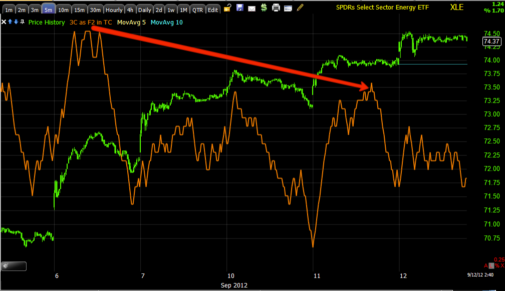
While all the volatility swirls around, sticking with the longer term 3C signals is paying off.

As for Gold...
 GLD is looking VERY extended up here sitting on a large gap and in a flat range for 4 days.

 Like so many other 5 min charts, this one looks horrible as well, but this isn't the reason for a position in GLD.

 This 30 min chart is, the 5 min chart just helps with confidence for timing.

This 4 hour chart's movement right at the gap up and range is also a compelling case.


ERY (Energy 3x Leveraged Bear ETF) Trade

I mentioned last night ERY popped up on my radar, I felt it needed a little more time, but not much. I'd consider options, but just don't have the time to pay that close attention to an options entry. Second best, a little less leverage/risk with a long ERY position, for me, it's close enough.

 XLE/Energy 4 hour chart looking like it' topping here.

 On a 5 min chart it's losing ground like some other risk assets in the same timeframe, also its rather flat in this area which is where underlying institutional activity is common place.

 Recent acceleration on the negative side has been strong-3 min

As for ERY, the inverse Bear ETF for Energy, the charts today are coming in to the area I was hoping to see.

This isn't a perfectly timed set up in my opinion, but it's fine for me for a 3x long ETF.

I'll be opening a long ERY position now.

Multiple Asset Confirmation Building in

Treasuries, which can probably be excused for not knowing how to behave (especially Monday) in front of the F_O_M_C tomorrow. Being they didn't seem to know what to do on Monday, I wouldn't expect they would make any significant moves until after tomorrow, but there's some confirmation building in TLT finally that is very much along the line of the market averages.

One thing I'm concerned about and is keeping me very busy, is what is happening everywhere else as AAPL provides a convenient distraction? That question is answered or beginning to find an answer in at least one asset class and the answer is very much in line with a flight to safety, how convenient, on AAPL's release of the I-Phone 5, an assumed risk on day, there's flow toward safe haven Treasuries, BUT ONLY after they filled the 8/22 gap today.


 The DIA's 2 day triangle is going to catch some attention, other averages are showing a similar price formation. We know that this will almost certainly (and probably soon) lead to a very directional move. I'd like to be able to pinpoint that move, but the more important question is what that move ultimately brings. For this timeframe, a 5 min chart is nearly a perfect fit.

 DIA 5 min has added to the leading negative move. This does not rule out the typical pre-reversal head fake breakout as that is what the triangle signifies for technical traders, a bullish continuation pattern.

 The QQQ 5 min

 And SPY 10 min-all very similar.

Finally TLT seems to have made a change in character that fits with the charts above.

Now to see what else is going on while AAPL captivates...

AAPL-Think like Wall Street

The easiest, fastest way to accumulate a position in size without having to pay up for it is to hit stops. Most of you have access to some level of a window in to where stops are congregated, if not then it's always pretty easy to guess where they will be as technical traders place them at support levels to the penny, with a $660 dollar stock, placing a stop to the penny? That's what they've been taught, "support should hold" and that's what gets used against them. If you think like Wall Street, instead of bidding for 878,500 shares and driving up price, you just move price down a fraction of a percent and as they say in that mis-translated Japanese video game, "ALL OF YOUR SHARES ARE BELONG TO US".

It appears that is what happened.

AAPL 5 min.

There's no significant change in timeframes above 5 min.

The QQQ remains leading positive to 3 min and improved on the AAPL stop hunting expedition, Tech as a group is also leading positive out to 5 mins.

I don't have any reason to believe out original theory has any holes in it based on what has transpired in the last 30 minutes.

I do want to check the other averages, Financials, Energy , etc.

AAPL UNVEILS I-PHONE 5-MARKET HITS STOPS BY $0.12

Let the volatility begin, I'll be watching AAPL close so I may be a little slow on the emails.

Here's what canned Technical Analysis gets you...

Stopped out and in size on a $.12 cent move below support, this is why you should never put stops where everyone can see them, like with your broker and at the most obvious place possible.


FB Sept Calls

This is a difficult decision with a gap right under FB today, but September Calls need to be rolled out to October.

I'm going to close half the September calls in FB and hopefully add October Calls on a gap fill.

 This is a decent profit, but not like the 110% gain another member just emailed me with as he closed out September 20's for $1.00 which were bid at $1.10 on the open.

 The 1 min chart looks like some light profit taking, there's a triangle-like formation there so that could break soon in either direction, but even an upside break could quickly pullback in to the gap.

 2 min is close to in line, if this were an equity long I wouldn't touch it at all.

15 min still looking good, adding to the positive posture, this is the only reason I'm keeping half of the September calls.

I'll be looking to add October ASAP.

Market Update Charts

Not much has changed since the market update two posts ago, but here are the charts promised, you probably don't need much of an explanation. 

 DIA 1 min with yesterday's late day positive divergence , not much added to the 1 min.

 DIA 2 min -For those of you using 3C, this is a classic example of a chart that is giving you no edge whatsoever,  don't try to twist a signal out of a chart like this, if it doesn't jump off the chart, it's not a high probability signal. What this tells us is the DIA is just treading water.

DIA 3 min

 And as I said, 5 min there's a lot of damage here. This is a clear 3C signal, put the charts together, you get something like, "Maybe the DIA drafts the NASDAQ via correlation alone, relative performance will probably be weak and this will likely be one of the first to fail at the end of the move".

 DIA 60 min speaks for itself.

 QQQ 2 min with yesterday's late day positive divergence and adding to it today.

 QQQ 3 min with a relative positive to a leading positive divergence, still it doesn't look like much more than a counter-trend bounce even on this timeframe.


 at 5 min on the QQQ, not much different than the DIA.

 SPY 1 min's last signal was late yesterday with a positive, it's treading water so far today.

 The same with the 2 min although today it looks a bit worse than the 1 min.

 Same story at 3 min

 And weakness at 5 min

After that at 10 min even more weakness and so on.

AAPL Charts

If I were younger and still lacked that sense of self-preervation you start to acquire in your 30's, I'd probably be setting up an AAPL day trade (long) right about now. After capturing the charts for this post and having a closer look at AAPL, nothing said since yesterday or in the previous post has changed as to my opinion. It looks very much like an AAPL move up is being set up and it looks like the probabilities are very high that it will be sold in to in a big way. The only question that remains is timing, this could very well be a very sharp turn around as this entire cycle (yet to start) looks 100% engineered. For those who are very nimble, I think some very nice trades could be made in both directions and it is not highly likely, but it is possible that both could be executed within a day.

 1 min with a new leading positive high that started at the 11 a.m. dip.


 OVerall relative positive 3 min divergence, you can also see to the right that the 3 min chart has gained ground since yesterday.

 5 min relative positive divergence

 5 min intraday since yesterday at a new leading positive high

 At 10 min we do have an intraday positive, but within the context of a much larger leading negative divergence. I would not consider the 10 min timeframe to be a strong signal at all.

 The same situation on the 15 min chart.

At 30 mins all AAPL positive activity stops. We have sen hourly charts give positive signals in less than a day like GLD on 5/31 for 1 6% move the next day, so it's not a function of the indicator lagging, the underlying activity is just not there.