Monday, July 11, 2011

The Miners Trading System

So far the miner trading system has been working out better then I expected. Last Thursday System  1 signaled a long in DUST, closing down the NUGT trade. The stop-loss for a system 1 entry is $40.62.

System 2 signalled a long DUST trade Friday after the close, so that was to be executed this morning. The stop-loss for system 2 is $40.87.

Tonight there are no changes, both systems remain long DUST.

Trade Idea- LEE (long)

This is speculative for a lot of reasons, but t may produce some follow through buying.

 Here's the apparent resistance zone in red, if LEE can close near or at the top of t's range today, t would be bullish for the possibility of follow through buying.

 Here's the daily 3C chart

And the hourly chart. It seems there has been a lot of accumulation and LEE hasn't burnt through that much volume the last 2 days, the assumption being, there may still be accumulated shares that need to be distributed into rising prices. Look for a strong close. Remember-VERY SPECULATIVE

JVA Speculative Counter trend trade (Short)

This is speculative because it is counter trend and because this stock can really move. However, the move has become very parabolic.
 JVA daly hart from lateral base to parabolic rally

 The daly chart shows good accumulation throughout the low volume, lateral trading range.

 The 30 mn chart has a negative divergence

 As does the 15 min chart

 The 10 min chart is leading negative with a negative divergence in RSI and Stochastics.

 1 min negative divergence at a tower top.

Here's the tower top reversal formation, we talked about this formation last week as a reversal formation. Note the failure of volume on the test of the highs.

The position s obviously speculative, but you might try a reduced risk position with a stop above today's highs.

Market Update

The 5 min charts continue to be constructive even with the market falling. There are now some 1 min positive divergences suggesting we may about to see the start of a move up.
 DIA 5 min positive

 IWM 5 min positive

 IWM 1 min just going positive.

 QQQ 5 min positive.

 QQQ 1 min leading positive divergence.

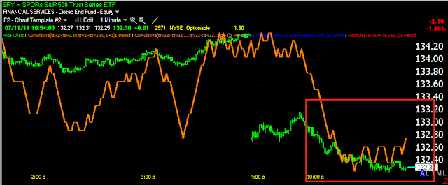
SPY 1 min positive divergence

The SPY Options Chain-PUTS

As I was just reminded, this is options expiration week. Being retail investors/traders usually buy options and Wall Street usually writes them, we often see high open interest options pinned. So here's a look at where the action is on the bearish puts.

In red from $136-$142 open interest is negligible, in purple between $134-$135 open interest picks up a bit. In green from $123-$133, that's where we are seeing some very heavy open interest. As of now, anything under $132 would expire worthless so there seems to be some incentive to keep the SPY from dropping too much more before OP-EX Friday.

Just something to consider as we move along. I'll be checking these daily to see where volume and open interest are flowing.

Market Update

Well the 1 min charts aren't showing much, but the 5 min charts that worked earlier in showing the fall was going to level off are showing us something.

 DIA 5 min showing some good positive divergences and a slight leading positive

 The IWM is looking especially good on the 5 min.
 As are the Q's.

It's starting to look like this basing activity may be a multi-day event, perhaps we see some upside this afternoon, and some tomorrow as well.

 The SPY is finding support at the 50-day moving average, which is simply a trader induced self fulfilling prophecy.

There are some gaps on the upside that could use filling, the gap from Friday (the highest one) would be best left unfilled, creating a bearish breakaway gap or a mini island top.

Remember the first post of the day and what reversals tend to look like, they aren't always, actually they are rarely clean u-turns.

Gold vs. Silver

I think it would be fair to say I feel a bit stronger about my gold scenario then I do silver. This has been bothering me so I've been A/B comparing the charts and found 1 standout, the SLV daily 3C chart looks stronger then GLDs.

 Here is GLD daily, it's been negative through the consolidation, there was a brief positive that sent GLD higher in white.

 Now the daily for SLV, it looks a lot stronger, even though the price pattern looks quite negative.


The 15 min chart shows a clear negative divergence for Silver and it seems as if it WILL pullback more. Perhaps the answer to the longer term question lies within the underlying action of the pullback. For example, if SLV were to show signs of accumulation on a pullback, that would be a bullish hint, if not, then bearish, but the daily charts are clearly different.

FSIN Coming In To Range Again

The last trade on FSIN yielded nearly a 40% return and this without even breaking the major top in place. Now FSIN is nearing our last entry point around $7.20, I would keep this one on the radar.

 FSIN's multi year top pattern. Remember that tops often break and then retrace to enter the top region once again-it's precisely these set-ups that I look for as we've already broken the top and have under went the retrace, which sets up the next leg for a serious move down. However, because FSIN can really put in a high % performance (that cuts both ways), risk management s essential. The top pattern suggests FSIN could see a target in the $1-$2 range eventually, but risk is always the first priority. I'd like to see FSIN around $7.20 again for an entry.

 Here's the upside reversal on a 3C positive divergence and high volume (capitulation-often seen at reversals).

The 5 min 3C chart has been going negative ever since FSIN crossed above the long term top's neckline.

I'd like to see some additional timeframes show this depth of divergence, but this position is worthy of consideration even here, so long as you leave room to add on a wide stop. Or you can just wait for a more sold signal. FSIn continues to be a favorite short position on my list.

Transports

Remember, transports are still an important indication for the market. Under Dow Theory, transports were key in confirming the Industrials. However, since Dow Theory was put forward, many things have changed, we aren't the Industrial giant we once were, we have significantly transformed to tech and services, but still the transports are a valuable tool in assessing the market. After all, if UPS and FedEx aren't doing healthy business, it tells us something about the state of the economy.

Short term, here are the transports in intraday trade (they took a real beating today).

 On a 1 min chart, you can see the 3C negative pressure on the transports (you can use the ETF IYG as well).

 The 5 min hart though, much like the market charts I showed you earlier, suggests some accumulation going on. A decent bounce would probably need to include the transports.

As for the bigger picture, this hourly chart of the Dow-20 (transports) shows the index making a new recovery high last week while a 60 min negative divergence formed (this is also visible and pronounced on a daily chart). It seems here too, on a new high, the transports have had the back of the major uptrend broken.

Market Update

As the 5 min 3 charts hinted at, the downside has subsided and we are getting some of that lateral basing action intraday. I'm not seeing a bunch of positive movement yet, but the negative downside movement seems to have stabilized. I still think the chances are good for an intraday bounce. Try to remember the different versions of tops/reversals I showed you this morning to help put things in perspective.

I view counter-trend bounces, whether intraday or multi-day to be a good thing. They are good in keeping the market from reaching extreme oversold conditions in which you get an unpredictable large bounce and they offer opportunities to trade intraday on counter trend moves as well as set up positions with better trade characteristics. In the end, it doesn't really matter if I like them or not, they are simply the reality of the market and you can either understand them and use them to your advantage or let them cause you undue stress and worry.

Some lateral price action forming into lower volume, suggests some intraday accumulation or at least an area that is ripe for it. Please understand I'm talking about intraday dynamics and not the daily trend.

Following Up on the ES Vs. Risk Basket

Remember on Friday after the close I put out this post which shows divergences between the S&P E-minis and a risk basket of other assets and how when they diverge, often the market is being manipulated higher by an also. I even noted the suspicious trading action late in the trading afternoon. I followed up with this post.

At the end, I said draw your on conclusions, with the historical data showing a divergence between the two often leads back to a convergence, meaning the market heads lower. I think it's an interesting post and the implcations of the divergence in the post came home to roost today with the market's sell-off. Now f we can all just chip in a few thousand dollars and get our own Bloomberg Terminal!

SLV / GLD

On Friday I posted a very short update on SLV

I said, " I've seen this pattern a lot and usually it's a good indication of a downside reversal."


A so far this morning, the warning was spot on with SLV down nearly -2.25%


 The price/3C pattern in the red box is what I was referring to, SLV has slipped on heavy volume since.

 The hourly chart still shows some strength, but is starting to turn ambiguous.

 The weakness in the 15 min chart (the first chart above) and this 10-min hart may spread to the longer term charts and reveal more trouble ahead for silver. Friday of this week, the Dodd/Frank legislation goes in to effect, many OTC trades in gold and silver will have to be closed this week so I expect some unusual volatility. We don't really have a recent historical model to guide us with regard to how the closing of the majority of the OTC gold and silver markets will effect the metals. This legislation seems as if it will effect hedge funds as well and there could be some huge positions that are shut down there, I imagine they may be reopened in the regulated markets, which would target GLD and SLV specifically. However, the key word is "regulated" where the trades in gold and silver will fall under COMEX margin rules. It will be interesting to say the least.

 The long term daily chart of SLV is not bullish and if the price action n the red box turns out to be a head fake/false breakout, we could see some rather swift downside.


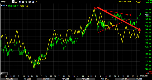
GLD- My thoughts on gold are pretty well known by members, I view this daily chart below as a bearish formation which in turn, may give rise to a pullback to the long term mean, which can be found at the 150-day moving average for GLD. In the case of a pullback to the 150 m.a. which only happens 1-2x a year (from recent historical data), this may indeed turn out to be an excellent long term buy signal. This may in fact be what the OTC gold traders will look for as they are forced out of the heavily leveraged OT markets, with less leverage, they may be looking to buy gold at a discount to make up for the loss of leverage. Also (even though out miners trading signal is currently bearish being long DUST), there seems to be a longer term base forming in the gold mining stocks which are also a great bargain relative to the price of gold.


 At least 1 false breakout in the GLD triangle can be seen at the first white box, sending GLD lower. This second breakout also appears to be a false breakout.

Here's the daily 3C chart for GLD, it is a bearish topping pattern and suggests that GLD will pullback.


Market Update

There are some sharp leading 1 min divergences, they should move the market a bit, but I suspect the market may base a little intraday forming several positive 1 min divergences before making a bigger move to fill the gap.

Market Update

 The entre premise of the last month's action (rally included and the breaking of the back of the rally) all centered on two key concepts, 1) the market is going to always seek to make as many people as possible wrong at any one time which we saw with the short squeeze rally and 2) the strength of the 30-60 min 3C charts in a market that showed little strength otherwise. That's why I'm happy to see things have worked out as planned and the DIA 60 min chart has fallen in to a leading negative divergence so quickly, establishing the proof of the second part of the trade, "What should happen after the rally?" As you know, I felt there was a high probability a long trap would be set and as the DIA moved higher, you can see 3C showing distribution into that move.

 Right now the 1 min chart of the DIA, just like the SPT, QQQ and IWM - is in line with trade, but....

 The 5 min chart is still in a relative positive divergence suggesting we will see an intraday bounce today, which provides you an opportunity to short any stocks/ETFs you may like, in to strength, which reduces your overall trade risk and gives you better positioning.

 The IWM 60 min chart breaking down as well, after it showed good confirmation of the early uptrend/rally

 The 1 min chart in line on the IWM, but...

 a 5 min relative positive divergence is found here as well, like all of the others.

 The QQQ hourly 3C chart going from strength/confirmation, to weakness/divergence, this is exactly what I wanted to see.

 The QQQ 30 min chart doing the same-remember, it was strength in the 30-60 min charts that made me believe we would see the market bounce we saw.

 1 min QQQ chart in confirmation of price

 And the 5 min chart suggesting again we will see some strength build in to the market some time, likely today.

 Here's a longer view of the underlying strength in the SPY 60 min chart, while the market was weak, suggesting the bounce. Then 3C confirmed the bounce making higher highs with price, now it's gone negative.

 The same can be seen on the 30 min chart.

 Like all of the others, 1 min confirmation, but...

a 5 min positive relative divergence.