Monday, September 17, 2012

Manipulation

There's no better time to manipulate a market than on a holiday when volume is typically much lighter and bid/ask spreads get wider.

Today I think we have pretty good evidence for manipulation in Brent Crude Futures as well as WTI / USO. When there's the kind of geo-political risks there are in the world presently and an asset such as crude which should be the most sensitive to them, common sense would have you expecting an upside move, but the market is no longer about common sense or value.

Furthermore, when an issue such as the Light Sweet Crude futures, go from trading 152 contracts one minute to 10,000 contracts the next minute, something is not normal. In addition, when the price of Brent Crude has 7 straight sessions of gains and suddenly goes from trading at $115.20 and is at $111.60 3 minutes later, something is up. US crude went from $98.65 to $95 during the same 3 minutes.

First lets look at Light Sweet Crude Futures...

 On this 30 min 3C chart of the issue, there's good upside confirmation to the left, 3C is making higher highs with price, however after the high is put in, 3C is already starting a subtle leading negative divergence late Friday. In overnight trade 3C continues to lead lower while crude is relatively flat in the overnight session, someone knew something or was up to something. The negative leading divergence continued through the day session until crude broke. There's no doubt algos/HFT was used in the snap lower, but in the leading negative divergence which is selling, whether outright or short selling, it reads the same and shows they took their time (considering the plunge only took 3 minutes) and established their position without arousing suspicions by buying in bigger block sizes, just consistent block sizes and consistently distributing, as far as the market is concerned, it looks like a transaction between a buyer and seller the only difference is the seller is not a bunch of individuals but a few and they know something the buyers don't, then crude snapped it lower and buyers found out.

 The 5 min chart shows the divergences in two forms, a relative negative (red arrow) and a leading negative (red box). Although this is only a 5 min chart, there is also a relative positive divergence at the lows, this will have an effect on crude.

 The 1 min chart of CL shows a large relative negative divergence in an overall leading negative position, just before 2 p.m. prices snap lower.

At the lows that 5 min relative positive divergence 2 charts above, seems to have put a floor in, likely shares were picked up on the cheap and even what appears to be a modest gain in the bounce back in crude is fairly significant at the leverage of Futures contracts. The 1 min chart now shows a relative negative divergence, I'll probably keep an eye on this, but I'm thinking maybe they bring price a bit lower, accumulate a bit more and take crude back to Friday's closing levels.

USO also showed similar activity...
 This 3 min chart shows the leading negative divergence in 3C/USO. Measuring from the same relative price level (white trend line), had there not been distribution in USO, 3C should have been no lower than the area of the yellow box, instead it is at the red trendline before oil snaps.


 The more detailed 2 min chart shows a couple of intraday positive divergences in white, one causing USO to gap up on the 13th, the other lifting USO off the intraday lows of the 13th and in to the gap up of the 14th in which there was distribution right on the open and a second area of distribution at the intraday high today, although the entire area should be considered under distribution, it's just the areas mentioned are where it is sharpest and both are at the highs of their respective days. 3C continues leading negative right until 1 bar before USO breaks lower.

 The 1 min chart shows a leading negative divergence off the gap up highs of the 13th and continues negative as the intraday highs today are hit and continues leading negative from there until price snaps lower. There are no significant signs of positive divergences in to the move lower on USO's chart, that could change, but if we consider the longer term charts which have always been the most meaningful, then today's price action makes sense and even though it is counter-intuitive, may just be the start; this is why I'm trying to gather data post F_O_M_C to determine whether there's a re-set since the QE3 announcement or whether this was priced in and the longer term charts, however unlikely they may seem, are still valid.

The 4 hour USO chart shows distribution during Q1, 2012 with price falling until a positive divergence of some importance around the end of June/start of July which lead price higher and now we have a similar negative divergence in place, actually sharper and more compact than the Q1 divergence which was more akin to a topping process whereas this one would be more like a reversal of a counter-trend rally.

Just food for thought and a look at how the markets are moved and manipulated, notice they waited for the Jewish Holiday when volume would be low and they could move the bid/ask spread wider (which naturally occurs as a function of lower volume) to their advantage. I'd love to see the NANEX analysis of the trading activity during those 3 minutes.

Late Day Price Action

When positive divergences started developing Friday afternoon, I talked about perceptions, long weekends and short memories. What happened in the market Friday all day (which was a lack of follow through from Thursday) would have been completely wiped clean from sentiment if there had been even a 15 min rally at the end of the day that lifted the averages enough that the day would appear to be a follow through day on a daily candle or closing basis. After the positive divergences were in place, Egan-Jones downgraded the US and unlike the S&P warning the US 24 hours in advance or unlike Moody's making it clear months in advance what they intend to do with the US credit rating if Congress doesn't end the gridlock, Egan Jones took the credit action as a specific result of QE 3, it was a quick action and I doubt they gave the government the knowledge of what they were going to do upfront - as in the case of the debt ceiling the government was given about 24 hours by the S&P in which it is plausible they could have struck a deal that would have avoided the credit downgrade. With Egan Jones reasoning, unless the F_E_D was going to take back the policy announcement, there would be no point in warning in advance. I think this (especially after watching trade today and how those divergences from Friday were run over until new ones today were created) credit event did derail the plans to give the market a nice finish for the weekend.

Those divergences were left over in to today, since there was a commitment already made as of Friday (the positive divergences), I figured at some point today that we'd see the move that Friday didn't bring.

Here's what the accumulation looked like in a few different areas of the market and what the longer view, but still post F_O_M_C in most cases, looks like.


 I first pointed out an earlier divergence as the market had a downside hiccup around 2 p.m., here it was a relative positive divergence (not drawn), but later we had a second break that saw a positive divergence that was stronger, it should be noted that neither small drop did anything to stops, no obvious stop fishing was evident as volume remained steady and failed to surge on a cross below the typical stop levels on 3 of the 4 major averages.

DIA 5 min chart remains leading negative, but very close to having a relative positive divergence at roughly 3:15.

 The IWM was one that moved quickly and strongly, yet on a 1 min chart.

 Move to a 2 min chart of the IWM and it's still leading negative and the divergence shows up, but isn't all that impressive, yet it is the first positive divergence on this chart/timeframe  since at least 1 pm last Thursday so it is something I'll need to pay attention to.

The IWM 5 min is almost exactly like the DIA 5 min with a leading negative divergence and a relative positive at the late afternoon positive.

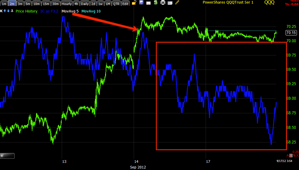
 QQQ 1 min positive divergence from Friday, the real action came at the last dip of the afternoon. The QQQ is the only among the 4 majors that showed a volume surge at a break of intraday support (stops getting hit).

 The QQQ 2 min, unlike the IWM, isn't showing any positive information migrating through the timeframes
.
The QQQ 5 min looks like the DIA and IWM 5 min in that it is leading negative and quite deep, but also has a relative positive divergence in place at today's late afternoon dip to new lows on the day.

 SPY 1 min, the SPY had to build a new positive divergence as Friday's was run over.

I didn't post these charts for each of the above averages in the interest of time, but many have charts that look like this on 10, 15 and even 30 min.

Light Sweet Crude Oil Futures
 The 1 min chart shows deterioration in the Futures, at least on a short term basis, you may recall USO was giving negative signals as well, starting at the open and continuing through the day until the plunge.

 This is a very different chart of Crude Futures, 30 min. There's a negative divergence noted at the far left sending price lower, a positive divergence at the low in CL sending price higher and in confirmation (meaning the trend is expected to hold until a new divergence takes place) then (and this is the reason I included it) you can see a very clear negative divergence in to the overnight session as well as today's day session until crude broke lower, 3C is now in the area it was at when crude's price was at the lows of the chart.

 Gold mini Futures were roughly in line, but the contract is a bit spotty in 1 min trade which doesn't provide for the best signals.

 The Gold 15 min chart takes care of that problem, you can see clear deterioration in 3C starting Friday, overnight last night and during the day session before gold made a short break to the downside. I see no positive divergence here at all.

The gold 30 min. futures chart also shows deterioration from Friday and continuing until today's drop . 3C is leading lower, in fact below its position at the price lows on the chart.

I'd like to look closer today at market breadth and I will, unfortunately those scans are pretty time intensive, but looking at the TICK Index reveals some breadth information.
While the downside moves were a little sharper than the upside moves, for the most part the dominant theme was the TICK chart spending the most time at the zero level or right in the middle, this is why I want to take a closer look at market breadth today.

I'll post the results of those scans shortly.

Going to get our Closing move now

The move they tried to organize late Friday that the US Credit downgrade appears to have killed, is now primed and ready to go.

Expect it now. Charts coming

Manufacturing Seems to be Killing Transports

If anyone is familiar with Dow Theory and how the transports confirmation of the Industrials plays a major role, you may find this interesting even though the Dow-Jones Industrials aren't quite as Industrialized as they were back then. In any case, goods need to be shipped, al of the information over the last several weeks have pointed to a world wide manufacturing recession or "Contraction" and in many cases these manufacturers already have adequate stock on the shelves, thus Capacity Utilization is falling, as we saw today the employment sub-index is falling, there are no new orders, exports are falling, etc.

Historically the transports (which I remember, but was a little surprised at the time) have responded well to QE, even better than the Dow-30 during specific QE environments. However now there's a clear divergence between the two which triggers part of Dow Theory, the "Von-Confirmation" part as liquidity, printing and dollar debasement generally, clash with the reality that companies aren't shipping as much.

The Dow-30 vs the Transports...
 Here the Dow (green) vs Transports (white) have tracked each other very well, whether it was during the 2008 decline or the 2009 bottom and the QE1 program, at the Jackson Hole announcement of QE 2, transports actually outperformed the Dow-30, the strong or even positive correlation lasted right until the first 2012 top area in March when we identified weakness and started building core short positions. Recently and since QE-3, transports have again diverged away from the Industrial counter-part. So are transports calling another reversal as they did in March-May 1 this year?

 A closer look and the March 2012-May 1 is clearly negatively divergent as transports fail to make a new high and since, they have not only failed to make a new high, but in fact have come unglued even worse.

 Here's an hourly chart of the two, note after today's pre-market Empire State Manufacturing, Transports performed badly.

This is an interesting area because demand for transports and the resulting earnings apparently look like they can't hide behind open ended printing. As to whether they have a greater impact as traditionally thy do, we'll have to wait and see, but the initial break away from the Dow is as strong if not stronger than anything we have seen since well before QE1 was launched.

Volatile Market Moves

We've seen some volatile move in assets such as oil in particular. The VERY short term intraday charts seemed in many cases to pick up their positive divergences at the dip, unless they are run over like this dip did on some other earlier 1 min positive divergences, I'd expect some upside movement before the close as we have had hints of that all day, still the broader, more important trend/signal remains a very weak negative divergence on the 5+ min charts which suggests other than some distraction type volatility, the more immediate/larger move beyond intraday volatility is going to be down.


 DIA 1 min leading positive at the dip

 The 2 min chart has a relative positive, it's a weaker divergence.

 QQQ 1 min with a leading positive divergence at the dip

 Even as early as the 2 min QQQ chart, there's no positive signal at all.

 SPY 1 mi with he original divergence (Diagonal) and a relative positive in to the dip.

 as early as 2 mins, no o positive strength on the chart.

 USO 2 min was deteriorating all day today as you can see.

 USO 3 min with a relative negative divergence at local highs.

 GLD 1 min positive divergence on the dip.

 There is positive strength on the 2 min GLD chart here.


However like everything else, at 5 mins it's negative.

Again, I'd suspect some brief, bur perhaps impressive move to the upside followed by a larger move to the downside, however it seems world events are taking the spotlight away from the F_E_D's  direct I.V. of green backs in to the market, the market doesn't like uncertainty and certainly not on this scale.

AAPL Update

All 3 Major Industry groups are now trading in the red, seemingly the negative divergence from Friday, VERY solid on 5 min charts, but present as newly formed since last Thursday all the way pout to 30 min. suggested motivation and pretty strong underlying action to move out of positions, even the average trade size in ES on Friday has many ES traders saying there was net and heavy selling.

This in no way answers any questions about QE3, but it does give some evidence (Really no follow through move since Thursday-global markets aren't very impressed with Asia down overnight and Europe languishing) and starts us on a path to gather the additional needed information.


AAPL is useful as a market indicator and for trades. The strength we saw pre-Iphone 5 release is dissipating rapidly.

 With a break above obvious resistance and a small bodied candle (Star) on Friday, today AAPL "could" put in a bearish engulfing candle which would make the probabilities of a downside reversal much higher.

 AAPL 1 min chart

 1 min chart's trend since last Thursday.

 This is part of the strength we saw in AAPL before the I-phone release last week, since it has faded badly.

 The 5 min chart showed the strength in AAPL at recent lows, VERY clearly with a leading positive divergence, that has now transitioned in to a growing leading negative divergence.

 Since the positive divergence is visible on the 15 min chart, I took a look and as is usually the case, AAPL's negative divergence started with a weaker relative negative divergence followed by a stronger leading negative divergence (the upside positive divergence developed the same way).

This may be too far out, at least to count on the longer relative divergence, but the leading divergence is newer information.

FB Update

So far all is well and as expected with FB as of last week, the pullback is taking shape which may offer an opportunity for those interested that aren't already in FB (long), of course as always with a pullback, we want to verify accumulation as price reaches their target area. I suppose if you were very nimble and had the time, you could even play the FB pullback with some leverage, however I'd prefer to trade on the side of probabilities and that's not where they are with FB.

 Here's our X-Over Screen, used to weed out false crossover signals. The top window has a simple 10 and 22 bar moving average (yellow and blue respectively), the middle window has a custom indicator which is a series of conditions that must be met and a blue 22 bar moving average of the custom conditional indicator and at the bottom is Wilder's RSI (period 14). For a short signal which we probably had although FB doesn't offer quite enough information to put the moving averages together that far back, the 10 bar crossed below the 22 (for most traders this is where their moving average systems stop and as such see a number of false signals or whipsaws), the yellow custom indicator was likely below the blue moving average and RSI is below the 50 level, those 3 signals together give a short signal. As is the case either short or long, the first pullback is often to the yellow 10-bar moving average as you can see price on the short do at the red arrow. Subsequent pullbacks as the trend develops pullback deeper, by the 2nd or 3rd pullback it is often to the blue 22 bar moving average.

We are VERY close to a long signal now, the custom indicator just needs to cross its moving average which should happen soon, look for a pullback to the yellow 10-bar m.a.

 The Trend Channel has just enough information to create a 1-day channel which is probably a little narrow for a longer trend, but for a swing move, it should be fine. The short is stopped out when price crosses above the lowest level of the upper channel on a closing basis (at the white arrow) and coincidentally the long stop is at the exact same place right now, which is the highest point of the lower channel on a closing basis. I prefer to use the Trend Channel on an established trend, in those situation, it's ability to call the end of a trend is incredible, with newly developing trends, you often need a little more room for the volatility of tops or bottoms.

 We see a head fake move on the open today, there's a gap that may be filled at the white box, if it isn't filled, it becomes a very bullish break-away gap which would hint at a very strong momentum move.

 FB 4 hour chart has a very strong leading positive divergence as well as a positive divergence right where we suspected a base would form and seems to have formed.

 The hourly chart that gave such amazingly strong signals back in June, now makes those signals look almost imperceptible as the much larger and stronger positive divergence forms now.

 Here's the 1 min chart and the immediate distribution of the opening gap higher, as with most reversals the head fake move is usually the first thing to occur.

 The negative divergence for a pullback on the 5 min chart and in fact goes out to about 15 min, not as sharp or large though.

The 30 min chart shows the trend of confirmation with  a couple of small divergences on pullback moves.

I'd be interested in additional or new positions in FB around the $20-$20.50 area.

You might want to set some price alerts.