Wednesday, April 20, 2011

AAPL BEATS, LOWERS 3Q Guidance

AAPL has a track record for not disappointing when earnings come along, some say it's because they underestimate guidance and then look like heros beating weak guidance. In any case, earnings and the market in general have less to do with what you did then with what you will do next? What's done is done, this is why stocks with great earnings sell off, poor guidance.

We'll see if AAPL's lowered guidance has any effect on investor perceptions of AAPL moving forward.

The volatility indicators

The VXX just hit another all time new low, the VIX just hit a new low that would correlate approximately with the 2007 market top, so about a 4 year intraday low today.

Remember that these trade inversely to the market and give signals or warnings at extreme levels. Right now we are at extreme levels of complacency, coupled with near record margin debt, traders simply aren't taking this market's downside potential serious.

Last Market Update

 DIA 5 min

 DIA 10 min

 DIA 30 min.

 QQQ 5 min

 QQQ 10 min.

 QQQ 15 min (very negative)

 SPY 5 min (very negative)

SPY 15 min (very negative).

Oddly the IWM doesn't look too bad at all, but the rest of what we have here does. In my opinion, this looks much like Friday in which the market moved up and then lateral into short selling for Monday's drop.

AAPL UPDATE

There's some interesting activity in Apple right now, it may be traders just getting out of the position before earnings, but we saw similar behavior last week in GOOG in the last hour.
 1 min 3C

 5 min 3C

 10 min 3C

15 min 3C

All leading negative divergences.

CAT Follow Up

Here's the original CAT trade idea posted yesterday

 Here's the daily for CAT, remember in the original idea, it was, "let the trade come to you". Now CAT has regained the lost ground which was the expectation, however it was starting an up cycle that had been interrupted on Friday by the S&P rating debacle.

 On the 30 min chart we can see the accumulation of shares for the up move that would be distributed at higher prices, we can also see the negative divergence on the S&P leak last Friday, thus far CAT is moving up under confirmation here.

 On the 15 min chart, we have the short term positive divergence that re-established the move to the upside, it's currently leading.

There are some negatives forming on the 10 min and the 5 min is a bit negative in not confirming as well as it should so the process of distribution could be underway. In the original idea, I laid out several scenarios of how this could play out. Personally, I'd lik to give CAT a chance and see if we can get a higher price point to short into. If you look at the first chart, CAT is at resistance, I'd like to see that resistance broken to the upside and look for strong signs of distribution and get short in that area.

GS, Oil and the Typical Wall Street Game

You should be pretty unimpressed with this article by now, this s the kind of stuff we have come to expect from Wall Street, but it's a quick little reminder of how the game is played.

Remember the recent USO analysis, especially the part about accumulating in the lower end of a range.

Full Story on GS Oil downgrade 

AAPL Earnings

This is turning into a strange situation with AAPL. First, yesterday there was a legal document filed in a suit AAPL has against Samsung which made it's rounds and apparently seems to have given details of how many I-pads, I-Phones they've sold. There's some question as to whether it covered the full quarter, but if so, then they came in above consensus on I-phone sales and below consensus on I-pad sales. I pads, from what I understand have the highest profit margin around 60%. For this to be released yesterday is a little beyond coincidence in my opinion. This morning another unusual leak made its rounds, that AAPL would be releasing an upgraded I-phone later this year.

I just don't believe in coincidences like this right before earnings. I don't know what to make of them, perhaps letting information out slowly would reduce the shock from any bad earnings? I really don't know. However, here are the AAPL chart as of 2:30 today (keep in mind that GOOG's earnings offered no clarity until the last hour of the day so things can move quickly.

 AAPL is in a confirmed downtrend, it just hit the lower channel Monday and is now at the upper channel today. On 3/7 there was a false break above the channel.

 The hourly chart shows most of the negative divergences at the reversal point and really is in very good confirmation with AAPL's price trend.

 On this 30 min chart, I have to call Monday's low a positive divergence (relative), but the positioning right now is a bit shy of confirmation.


I guess this chart says the most to me, a 15 min 3C chart shows no apparent large accumulation, in fact it doesn't show any and today's move once again is not confirmed.

I also don't see a really negative recent reading, but the trend is established and 3C has been in confirmation of the trend. My best guess at this point is that AAPL remains within the trend with the possibility of a slight move above the channel before heading back down. I'd think if the report would come in strong, we'd see accumulation on a decent scale, I don't see that. Perhaps a miss isn't going to be a huge event with the leaks out early to let traders get used to the idea by preemptively lowering expectations.

PCLN Follow Up

Yesterday I posted "PCLN Possible Trade"

The one thing I wasn't crazy about was this chart...


 PCLN has many of the features I look for in a reversal from an upward trending cycle that is ending. First the lateral movement that has created a clear resistance zone is very typical, we also have a break out on the close above that zone, which failed (at the white arrow).  I'd prefer that the breakout had been bigger to attract more attention, but it's there, possibly we may get one more.


And we did get one more, one that wasn't questionable, but clear.


 Here's today's chart showing a clean break through the resistance level.

 On the 15 min chart we have a negative divergence as 3C did not follow PCLN to the new high.

 It's evident all the way to a 30 min. chart.

Again, this is what many reversals look like, so if you are inclined to try the trade, there are a couple of approaches. One would be to short here with a stop a few percent above today's intraday highs, the second would be to wait for confirmation of the false breakout with price moving below the $520 area.

SLV Chart Request

SLV is looking overbought, maybe time for a correction here.

 SLV daily, note the doji thus far today which indicates a loss of momentum.

 The 1 min  doesn't seem to suggest much, which can often be a sign that there's some distribution going on if confirmed in longer charts.

 Like this 5 min chart which is leading negative

 This 15 min chart which is relative negative

However, there doesn't seem to be any real risk showing up to the viability of more upside after a correction.

Market Update

 DIA 1 min

 DIA 5 min in a leading negative divergence

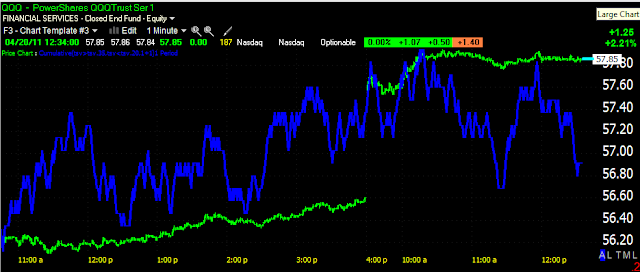
 QQQ 1 min

 QQQ 5 min in a leading negative divergence

 SPY 1 min

SPY 5 min in a leading negative divergence.

It's still very early and lunch hour on Wall Street, but between the 5 min charts, the lateral price movement in the averages and deteriorating breadth, this is eerily reminiscent of Friday's action in which we saw almost the exact same thing. I noted on Friday it was my belief (because of the deterioration and persistent lateral trend) that they were going short on Friday, Monday we found out why.

USO Update

 USO 1  min looks like an intraday pullback, recently we've been seeing these and they appear to be used to bring USO back into the accumulation zone I defined in the last several USO updates, I'm not so sure this one is the same, this appears more to be a simple intraday correction.

 The 5 min chart is one of the reasons I feel this way as it is largely in confirmation of the uptrend

As is the 10 min chart after our last bout of accumulation at the lower end of the range.

Breadth on the 4 Majors

Here's te breadth charts for the S&P, NASDAQ 100, DOW-30 and the Russell 2000. I usually use the NASDAQ, but I wanted to see the entire market. This is the first time I've run the Russell 2000 as it is so time and bandwidth intensive, but it's here. Each Average shows 3 different measures of breadth. Right now, they looks reminiscent of Friday's action.

Breadth is the number of stocks participating in an advance or decline, which can be very different then what price reflects in the averages due to how each average is weighted. In essence, breadth readings give you a feel for what the broad market is doing and in a healthy advance, you should see advancing breadth indicating a majority of stocks are participating. When you have a day up like today and breadth is deteriorating, it's a warning sign.

DOW -30 Breadth
 % of stocks above or below their 50 bar moving average (1 min). This is a very surprising reading, to see that the % of stocks below their 50-bar m.a. is rising, and the ones above are falling.

 The DOW A/D Line and Ratio, advancing issues have fallen off badly and the moving average for the A/D line has gone lateral with several crosses below.

 Dow % count of new highs/new lows over a 250 bar period. The red indicator isn't surprising, there shouldn't be too many new 250 bar lows on a day up like today, but the new highs falling off is a bit surprising.

NASDAQ 100 Breadth
 This is the same as the last indicator, % count new lows/highs over a 250 bar period, again new highs are falling off

 Advance / Decline line and Ratio, also shows fewer advancers and the moving average of the A/D line is lateral with a cross below

 % of stocks above/below their 50 bar moving average, again this is a very surprising reading, this indicator went from near 100% to 30%, and below from near zero to 70%.

S&P-500 Breadth
 % count of 250 bar new highs/new lows, we see some deterioration here, but not too unexpected.

 The A/D ration and line are also losing steam.

And another very surprising reading with stocks above/below their 50 bar moving average.

Russell 2000 Beadth
 There's deterioration here, but not hugely surprising

 The A/D ratio going negative is a bit surprising.

And again the biggest surprise in all of the averages is the % of stocks able to maintain above their 50 bar moving average, from over 90% down to 36%.