HYG (High Yield Corporate Credit) was basically the poster child for what I see as early week (Monday- likely first half of the day) action.
I hope you'll go back and read the post and take a look at the charts.
Referencing HYG, One and 2 min charts (very near term intraday typically) are positive, at 3 mins. there is no more positive and at 5 mins.. the chart goes negative, I'll at least show that.

The gist of the HYG section of the post was this...
"The point being, HYG is helping, but its commitment is skin deep unlike action in previous weeks, they could close and be out of HYG in minutes if need be."
It was also pointed out that the more skittish High Yield Credit (because of lower liquidity) had a very different take on the "after-pin" Friday action in the market in which there was a closing ramp (again, the charts are there in Friday's post linked above)...
"And almost as if right on cue from last night's post, High Yield Credit dislocates with the SPX today as soon as the SPX shows any upside ambition, like I said, this will fall first "
Sentiment (not typical Stock-twits retail, but Leading Indicator sentiment) had soured Friday. I don't think I posted charts of these, but what is interesting about these is they follow a whole range of other leading indicators and signals in to the afternoon (post op-ex pin) action, like High Yield Credit, they were of a different opinion of any strength, even if it was minor.


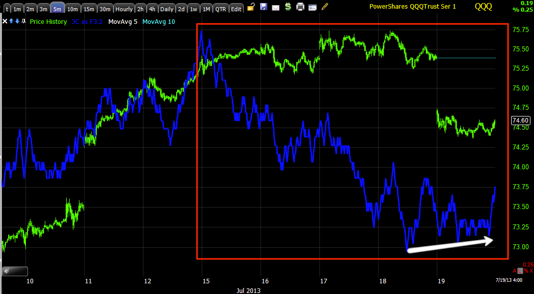
Referencing the market, specifically QQQ (SQQQ as a proxy)...
"I think we'll see the gap filled before we move on to the waterfall, which gives us some amazing opportunities, if you can just get past the emotional difficulty of shorting an apparently string asset, Price is above all, DECEIVING."
Referencing JPM....
"However, like almost every other asset today, the intraday charts are positive suggesting early Monday at least we see some ranges that are yet to be broken, broken, take XLF/Financials for instance.
The 2 min chart is the largest positive in JPM, 3 min has nothing, 5 min is negative, so again, like HYG, it's bare minimum support to move JPM. Obviously the only thing keeping JPM from a short position is Financials as JPM's sector and the head fake move needed there. For the 1 and 2 min chart to go negative, that can happen in an hour."
On XLF...
" And on the 1 min XLF intraday chart, look what 3C is showing, XLF is obviously getting ready for something. With that small, but consistent positive divergence on a short timeframe, what do you think the probabilities are?.... XLF 5 min. When we see flat ranges like this, these are some of the best indications that smart money is at work in the asset...3C tells us very clearly what that something is above, distribution, but if 80% of all reversals on any timeframe see a head fake move above or below a VERY obvious support/resistance area, then where do you think out highest probability, lowest risk entry is in XLF?
If you said a "Head fake /false breakout ABOVE the range", you are 100% correct."
In fact, if I had to summarize expectations for tomorrow morning or the first part of the day, (although every chart and asset in that post leads to the same expectation), HYG of XLF would both be very simple, very representative example. Because HYG is more an asset used as an arbitrage (manipulation) asset intraday, it's a means to an end, XLF I think better represents the end (but I'd still like you to review Friday's post).
XLF EXAMPLE...


"The point being, HYG is helping, but its commitment is skin deep "


At 5 mins XLF goes from confirmation to a leading negative divergence and the 8th of July area comes up again, right now this is deeply leading negative.
This is why I said the following several time, but in relation to Financials...
"The 2 min chart is the largest positive in JPM, 3 min has nothing, 5 min is negative, so again, like HYG, it's bare minimum support to move JPM. Obviously the only thing keeping JPM from a short position is Financials as JPM's sector and the head fake move needed there. For the 1 and 2 min chart to go negative, that can happen in an hour."
and...
"These are very simple trades to figure out if you understand the headfake concept, they are also very good entries very soon if you can get through the emotional stress of placing an order against what appears to be strong price action."
NFLX has the exact same theme I was conveying in Friday's post, the HYG and XLF posts specifically...


And looking at it from a "Reversal Process", it is nearly a perfect set up. The symmetry we see in the "reversal process" rather than an event, is already there. One of the last things we see in this process (in a downside reversal) is an upside head fake move; for that to happen, a technical pattern retail will chase has to be in place, it just so happens it is and look at the 3C chart,(the four stages) 1) Accumulation, 2) Mark-up, 3) Distribution and it's only missing stage 4, Decline.
It goes without saying, NFLX is a nice looking trade, we want the trade to come to us with high probabilities (head fake), a better entry and lower risk (again both provided by the head fake) and timing (again a head fake moves is one of the ;last things to happen before a reversal.
DDD... We haven't had a decent "Channel Buster" Set-up in a while as far as I can recall, I think IOC had a decent move, but this is one of them.

One of his concepts that I have used many times is "The Channel Buster", they work so well in so many different situations. Here we have a downtrend channel and an upside breakout, this "looks" very bullish for DDD, but these are head fake moves, just using a channel rather than price patterns or ranges.
What typically happens is as soon as the breakout of the channel fails, price shoots straight through the bottom of the channel, this pattern gives new meaning o the phrase, FROM FAILED MOVES COME FAST MOVES".
These can be bullish too, it depends on the channel and the break, but the concept and target are always the same, back to the opposite side of the channel and beyond and VERY fast.


If you look at the channel at the top, the target in my view is a psychological magnet, I think it's $50, I'll watch, but I'd set alarms for $50, I think that is where the highest probability end of the break.
AAPL I'm not going to go in to the longer term possibility of AAPL continuing an upside , counter trend bear market rally (AAPL's bear market), we'll have to see what AAPL looks like after the smoke clears, but I'm glad I closed the long equity position meant for that bear market rally.
Remember in Friday's post I talked about the Q's filling the gap? AAPL sure would be helpful in that task and a such, I've recently gone from "Holding the long term AAPL equity position to closing it and now even thinking about a short in AAPL".
First a quick look at the Q's and note the 4 stages, you see these so often and it's a great way of knowing where you are in the process, these are fractal so you can have large stages in primary trends on 2 day charts, intermediate stages on 60 min charts, intraday stages on 1-2 min charts, they are very helpful.


The vertical trendline just shows you how deep the leading negative was before the Q's dropped Friday and now how deep the overall situation is.

AAPL


This is the 1 min AAPL chart, the possibility of a head fake and the positive divergence that may help the Q's fill their gap and set up a high probability, low risk AAPL short or put, this is looking good as a great trade that comes to us.
As for futures tonight...
The Index futures gained some as new futures trade opened for the week, but the 5 min ES and TF just went sharply leading negative VERY quickly, I'm guessing they'll come down shortly, but it's a long night and a lot of important markets aren't open yet.
The Nikkei futures had a negative divergence as they opened so the way they look is not surprising.
As currencies go, I'm not seeing anything that is a clear trend or out of place, I wouldn't comment on them as of now.
The 10 and 30 year Treasuries have gained ground, both have pretty sharp negative divergences on 5 min charts, after that they don't. I'm wondering, actually suspecting that the 5 min negative divergence in Treasuries correlates almost perfectly and acts as confirmation of the 1, 2 and 3 min intraday charts I've been talking about above with regard to the market, say the Q's, Financials.
In fact, I think it's very likely as Treasuries normally would come down on any market strength, even if it is 1, 2 or 3 min based. This is the only smoking gun I see as it confirms what I wrote Friday, what we were seeing Friday in the market and individual stocks.
These charts make perfect sense with the market charts, the stocks we are looking at, Financials, Credit, everything, even the timeframes.


As you know, I've been wanting a pullback to add to the 30-year TLT long or to add some leverage so this works out well. The reason I like the 30-year long so much and this has been for quite some time...

This is a VERY strong 4 hour leading positive divergence in the 30 year.
As I said last Friday and Thursday, someone knows something and has been quietly accumulating this "Flight to safety" trade en masse.
I'll see you in a few hours, Please remember I'll be out of twon Thursday and Friday for my first vacation in well over 3 years, thanks for all of you who sent the well wishes for my fishing trip.


