Wednesday, October 3, 2012

CAT Looks About Ready (long)

The last time we traded CAT it was as a core short and looked like this...
 CAT was phased in to a short position in the red square and covered at the low of the white square. That was nearly a +24% gain on a large cap using no leverage, not bad. In any case, I can't say this is going to be a core position, but I've read your emails lately and I see in this chop a lot of you are trading nimbly and well, today we had a member make 30% on IWM puts just off a market update.
 
 CAT has a small base like price pattern, the open gaps are in yellow, but CAT could go on to make a higher high, it's more of a swing trade, but the probabilities are looking good.

 The 15 min chart showing the last positive divergence that caused me to close the CAT core short, that was a decent run, now we  a similar leading positive divergence on the 15 min chart.

 The 10 min is leading positive as well and looks like it's getting ready to go.

The 3 min chart is leading to the upside in a big way.

And now the 1 min is too, when there's a longer term positive like the 15 min in effect and the short term timeframes start rolling around our way, the trade is pretty ripe in most instances. There was a small neg. divergence toward the end of day so I'd look maybe for a mall pullback around the $84.50-$85 area. There may be 10 points in this trade just on a swing.

SRPT +199% Today

I was asked earlier today if there was any evidence of a leak in SRPT's trial results that were released today, sending the stock up nearly 200% in a day.

The reason for today's elation is Sarepta's treatment for Duchenne muscular dystrophy, a drug called eteplirsen. 48-week trial data released this morning displayed incredible improvements for patients receiving a 50mg dose of the drug. In fact, the results showed some evidence that eteplirsen could help to reverse the progression of this fatal disease versus simply slowing its progression. 

Piper Jaffray also raised their $11.00 target to $38.00 in a report that was released on today.

There are 3 things I want to share with you, but first the answer to the question, "I don't know". We have seen some REALLY out of place behavior before earnings and other events including about 2 hours before an F_O_M_C policy statement where price was going aggressively one way and 3C was going aggressively the other way. These were the kind of signals you just don't ignore, we traded them and we were on the right side and I have no doubt whatsoever we were seeing actions being taken on inside information. Just yesterday there was an article about traders being expected to provide inside information for Steve Cohen's SAC fund. 

All I can say is when you see it, you know it for sure. SRPT on the other had was a stock that was trading in a very healthy manner, I don't mean price alone, 3C was confirming it all along. Typically with inside information leaks it's more of an event than a process, this was a long time process and this is why I have to say I don't know, but there was plenty of time to leak the information and someone really liked the stock well before today.

Here are a couple of charts...
 First note the change in character, volume really picked up which is one of the first changes in character we saw in UNG and that position is up roughly 25-50% already and hasn't even broken out of the base, but it's been a lot of patience; I don't think SRPT was much different in that respect.

 Here we have the typical life-cycle of a stock that repeats over and over: Stage 1 Base, Stage 2 Mark-Up, Stage 3 Distribution/Top and Stage 4 Decline. The base area in SPRT was volatile and it would have tested you emotionally on several occasions.

 If we look at the long term 3C chart it looks like the base started accumulation around May, there was a 1-day shakeout that saw a -35% intraday move and an -8% end of day decline, but it's also right there where traders would have been shaken out and supply would be abundant on stops and at a cheap price that we see not only a positive divergence, but  leading positive divergence that ran right up to the next gap up. Seven days before a +146% 1 day gap up there was a -15% intraday shakeout that closed up +5%; talk about an emotional roller coaster. When you see it in retrospect it doesn't appear to be a big deal, but on that day it would have been crushing, yet it was still pushing to new leading positive highs.

This longer term chart shows again the leading positive divergence that just grew stronger at these false breaks to the downside and this happens to a lesser degree everyday, it's one of the ways institutional money can move a lot of shares at favorable prices and they know exactly where the stops/limit orders are if you placed them with your broker.

There was another leading positive move before today's gap up, so maybe the information on how the trial was going was leaked, maybe it wasn't, but a healthy stock shows healthy underlying activity like we see here.

The last thing is, they still need FDA approval at some point and this is another place I've seen manipulation of the market in a big way. I was long a stock I can't even recall, maybe VPHM? In any case, a Bio-Tech and they were expecting an FDA letter the next morning that would either let them move forward, deny them or tell them they need more data. The stock closed around $10 and a trading buddy of mine at the time told me he was watching After Hours and big blocks were being bid, he sold his shares at $10.50 so I put my 200 shares out and got filled at $10.75 and nearly $11.00, keep in mind these were 100 lots. Within 15 minutes there was so much action as people saw the stock up 10% in After Hours and everyone thought whoever was flashing these larger block bids was in the know about the FDA letter, so retail came in and chased the stock higher. 

The next morning the FDA letter came back saying they needed more information so for all intents and purposes, the drug wasn't approved and the stock was at $5 almost immediately, a lot of retail had paid $11+ for the stock and whoever was flashing the bids did seem to know what was coming, they were just selling all of their shares in after hours by making it look like they were buying, retail was left holding the bag at more than a 50% loss in a few hours.

Bio-techs can be fun, but you should know that story.

Market / Euro Update

Since the last update most of the averages are stabilizing, starting to show better intraday charts, AAPL had already been showing improvement which continued and after consolidating for a good portion of the day, it is moving up and the market with it.

One thing I've found, although I'm very hesitant to use the Euro as an analysis tool right before the ECB policy meeting tomorrow, is that when there's a divergence on the ETFs for the currency charts, even if the currencies go the other way overnight, a majority of the time the divergence from the day before plays out in the currency the next day. It's like the market knows where the currency will be when the market opens the next day at 9:30 or somewhere within that day and they position ahead of it the day before (today).

Being the Euro is a risk on currency, meaning it rallies and the market is 95/100 right there with it, I took a look at the Euro's ETF, FXE.

Here's what it looks like and judging by that, AAPL and the improvement in the averages, I'm guessing that something positive will come out of the ECB policy meeting that drives long positions up tomorrow.

 Although the Euro has been flat all day, the 1 min chart has been positive all day and leading positive as we move toward the close.

 2 min saw a positive on the 1st at the end of day, it gapped up in to distribution on the 2nd and is showing a bigger positive today.

 3 min chart also positive

 5 min chart also positive

I wouldn't want to go too far beyond that considering the AAPL target and the nature of the 60 min Euro chart since QE3 was announced, note the large positive back in June when the market hit its low.


AAPL- Bellwether

I look at AAPL for trades and as a Bellwether, it obviously was responsible for yesterday's lift even against a rising dollar in the afternoon on positive divergences. There's the start of some interesting behavior developing right now. Remember I thought AAPL would need to consolidate a bit and the market obliged it? This will have to be confirmed in the market averages and will need to hold through the rest of the day if not improve, but if it does, then we likely see upside (AAPL and the market)  tomorrow off the ECB event.

 AAPL's positive yesterday, the migration of the negative divergence today reached the 5 min chart and has kept AAPL lateral since.

 Remember the concern or thing to watch was if the 10 min chart which is where the real positive divergence suggesting AAPL move higher (and thus the market drafts AAPL) can be found, would see deterioration migrate through the timeframes; it didn't, it stopped at 5 min. And now...

 The 1 min chart is moving back in to   positive action as AAPL drifts lower and 3C moves higher. This is just a 1 min chart and just a start, but it suggests that AAPL is doing what I said I thought it needed to earlier, consolidate.

 While the earlier damage from the 2 min chart is still there with a leading negative divergence, the 1 min chart is starting to bleed through and 3C is moving up.

The same is just starting on the 3 min chart.


Other Indications...

Yesterday as intraday signals were scarce, I looked elsewhere and a few minutes later posted,"Other Indications" and along with two other indicators, this very small move in credit intraday yesterday, was the signal in which I said I thought the market would move up intraday from there.

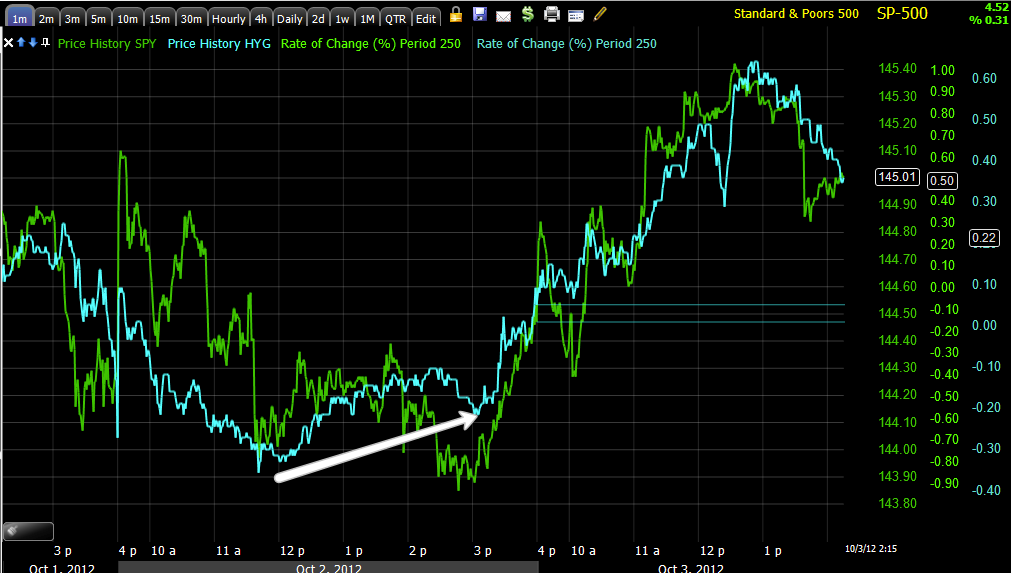
High Yield Corp. Credit (blue) vs the SPX (green) showed relative strength in credit and as we have sen over and over, Credit tends to lead stocks, even on an intraday basis.

I now there are several emails I need to get to, but I really want to be paying attention to the market in front of the ECB tomorrow, I'll get to the emails.

As far as Risk Assets today and longer term...

Risk assets are vs the SPX, the SPX is always green.
As for HY Corp. Credit today, it looks to be in line, but if you look closer, the SPX broke lower at the green trendline while credit has held up at the same area in intraday.

 In this chop area, Credit looks a bit weaker overall than the SPX, that usually isn't a good sign for the SPX, but it isn't that bad of a divergence.

 Here in the run up to the QE-3 announcement, Credit discounted or front ran the F_E_D more than equities and that's saying something, HYG credit broke down at the first when looking at the same relative position on the 13th, it also is leading lower and not confirming the SPX's most recent reaction high, this isn't great for the market, but is very much on par with the murkiness of the market which I still believe is being caused by asset re-allocation, expensive stuff being distributed, cheaper stuff being bought in some cases, so instead of our normal directional market, we have a fractured market-breadth readings should be very interesting.

 High Yield Junk Credit looks like HYG Credit above.

 Intraday High Yield Credit is showing the first bit of weakness I've seen there in a week or more as it had been mostly in line with the market.

 Yields were also one of the assets used yesterday for intraday analysis as they held up better than the SPX and they have a leading component to them, you can see the SPX's reaction from the small divergence, today not so good.

 Longer term yields (which are like a magnet for stocks), don't look good at all, this is the biggest negative divergence between the two since we have used yields which have called every major reversal this year.

 The Euro (I need to look at underlying trade in the FX space), also showed better relative performance yesterday in white, although the market did rise with a rising dollar which is not typical toward the close (red), thank AAPL. Today the SPX is returning to short term reversion to the mean.

 Longer term, the Euro and SPX are both risk on assets and have tracked well, but have since come unglued since the 13th as you can see negative dislocations in arbitrage correlations.

 I know the RBA cut policy rates by 25 basis points yesterday, still the $AUD underperforming the market like this can't be taken as good news short term or intraday.

 Here's where the $AUD gave the market support in white and is now negatively divergent in red.

 Commods also held flat yesterday while the SOX made a lower low, a positive divergence for the market, today, not so much-thank Syria and Turkey.

Here's sector rotation since yesterday, Financials in, Energy out, Basic Materials where a lot of high Beta stocks are, out, Industrials moving out, Tech looks to be in and Discretionary is holding its own.

Defensive sectors are just as impressive today as the risk on Financials, Utilities, Staples and Healthcare, BIFURCATED!

Oil Didn't Appreciate the Syrian/Turkish Exchange

This afternoon Turkey and Syria exchanged shells with several dying.


  • *NINE INJURED AS SHELL FROM SYRIA LANDS IN TURKISH TOWN: NTV
The Turkish foreign ministry has held emergency talks and, according to Zaman, Turkey has now begun firing 'warning' shots into Syria and 'the bombardment continues to be heavy'.
  • *TURKISH ARTILLERY BOMBARDS SYRIA IN WARNING, ZAMAN REPORTS
And it would appear things are escalating:
  • *TURKISH FOREIGN MINISTER CALLS NATO AFTER SYRIA BORDER SHELLING
Oil's reaction...

 Any progress being made in Light Sweet crude futures essentially stopped.

As for USO, it didn't help at all, but I'm not sure all is lost there as the 3 min chart still is in decent position.

Market looks to be finding some support

As the IWM and DIA are both around their close from yesterday, there are some initial or possible signs of support, they aren't impressive or even worth capturing the charts for the averages, but ES does look a little interesting, the NASDAQ Futures less so at this point.

Remember though, not every decline is bearish and not every advance is bullish, there's often underlying trade that you'd never know about if we didn't have the tools to unveil some of it.

ES-S&P E-mini futures
 The 1 min chart has a bit of a leading divergence, this may just be a reaction to several averages hitting support levels where they often linger for a bit, but as the small divergence earlier today turned in to something later, we want to keep an eye on all of this.

 ES 5 min chart is still negative at today's highs.

 NQ-NASDAQ E-mini futures were negative at the intraday highs and are a bit less negative than in line right now.

NQ 5 min chart, negative at the intraday highs today.

GLD / GLL Update

I've been okay with holding the GLL (Ultrashort Gold) long on a risk basis, but I'd never hold it if there weren't some signals there.

I know what the conventional wisdom regarding gold and QE is, however over the last 2+ weeks gold hasn't done anything with QE3 out on the table, it didn't take gold long to move up in 2010 after the Jackson Hole speech telegraphing QE2 before it started. I am not going to pretend like I know what's in store for Gold over the long haul, but I will show you a chart. This is simply why I chose not to fight the F_E_D, but to look to the data, to listen to the market. Had we wet our pants and reversed every position on September 13th we wouldn't be very happy right now, that doesn't mean we stop listening to the message of the market and assume we know what the market will do.

As for gold, GLD and the GLL long, here's the updated charts.

 Since 9/13 (QE3 announced), GLD has been a good "relative" performer, it hasn't been a great performer on any other basis than relative vs the market and it hasn't done anything resembling QE3 expectations as buyers stepped in big time on the 13th.


 First GLD timeframes...
 1 min GLD shows  a head fake move on the 1st of the month, 3C didn't support the move up and was negative instead, it's remained in a leading negative position roughly in line with price (where have I seen that before? Almost everywhere in the market averages!).

 The 2 min chart was (as is usual) in a relative negative divergence at the first head fake false breakout and then went to a stronger leading negative divergence at the second head fake false breakout.

 The same theme can be seen on a 5 min chart which gives us pretty good confirmation between timeframes, the yellow boxes are the two failed breakouts that had no 3C support.

 The 15 min chart shows a very fat positive divergence just before the F_O_M_C  on the 13th, smart to buy down there for smart money as there was plenty of retail buying on the way up, built in demand to sell in to. The 15 min chart has been progressively worse, again both attempted breakouts (more likely head fake moves) saw distribution in to them, now the 15 is leading negative just about to where it all started on the 13th.

Now GLl (ultrashort GLD), which I'd be happy to see a swing move in, but I try not to set expectations on moves, I just watch the underlying trade like yesterday when it said it's probably time to take profits or at least some in RIMM.

 The trend on the 2 min chart is just about the opposite of GLD, although GLL's lower volume makes trade a bit spottier. There's a positive divergence at the head fake break below support on the first.

 The 5 min chart shows a quick negative divergence on the 13th before the F_O-M_C, since it has seen a decent leading positive divergence that also caught the break on the first with a positive divergence.

 The trend of the 15 min chart is interesting too, it has been in line with the move down and only recently has gone positive or leading positive to be more precise.

The 30 min chart has less noise and the trend is clearer, again it is leading positive and positive at both downside shakeouts. This is why I'm wiling to hold GLL open.

As for the longer term prospects in GLD, many of you may remember when we were waiting for GLD to hit the 150 day moving average to buy GLD back in 2011, we didn't because something didn't look right, sure enough, since the 9/2011 top, GLD hasn't really done much.

And there's the intraday reversal

AAPL Update-Example

In the second market update today I wanted to explain why something that doesn't look very troubling can quickly turn, if there's one thing about a choppy market like we have sen the last week or so, it's that things can change pretty quick.

AAPL looked pretty darn good this morning, not too many reasons for concern, here's how fast a divergence can migrate if the underlying activity is there and suddenly threaten the outlook. I'm not trying to say that things have gone that far for AAPL, it's just they have moved quickly.

 The 10-15 min charts are pretty important timeframes and they are positive for AAPL, which fits right in with our analysis earlier in the week that AAPL was likely to see symmetry in the price pattern and make a second shoulder which it started yesterday, or so it appears. This timeframe is still healthy, it is still where the probabilities are.

 However look how fast the 2 min intraday chart turned down, killing any momentum to the upside.

 That migrated to the 3 min chart fairly quickly with a relative negative and a leading negative divergence.

And now the 5 min chart is seeing the migration of that negative divergence, "IF" the 5 min chart gets ugly, then it will almost certainly move to the 10-15 min timeframes which are the ones supporting AAPL's move higher, even if it is only to put in a second shoulder. A H&S top isn't a H&S top until it's complete, at any time a broadening top can break first.