Monday, March 4, 2013

Is the UNG Trade Even Bigger Than Thought?

We have been watching and getting involved in UNG for well over a year, we knew something was going on when no one aw anything but a downtrend, we were buying UNG near the very bottom, I have said numerous times, "This is one of my favorite long term long positions, a secular bull trend that could last years, more like an investment than a trend".


Guess who else seems to agree with us?


Shell Predicts That Natural Gas Or Solar Will Become The No. 1 Energy Source


The UNG chart looks even better to me than the home-builders that were under accumulation in 2000 during the Tech crash, how they knew housing was going to lead the next bull market after the advent of the Internet is beyond me, but the accumulation was there as well as a 2500% gain, UNG looks even better so far.

POMO and Futures...

I'm not making a case for or against the effect of the F_E_D's POMO, certainly in the past it has been very clear with the first two operations, when POMO was in effect and when it was not, however I am making the case that you should think for yourself and while history may rhyme it rarely repeats.

One of the events that taught me this was the announcement of QE3, which everyone seemed to think would set the market on fire and whoa to anyone who was short. I wasn't fighting the F_E_D or trying to be a contrarian for contrarian's sake, we just had a strong negative signal going in to the September 13th announcement and while I openly admitted that the emotional side of me wanted to close all shorts and go full long (because of past experiences with QE), I decided not to move anything around, respect the signal that was there, respect past experience and gather more data. The more data I gathered, the more it looked like we were not just going to have a knee jerk rally on the announcement of QE3 as much as everyone seemed to think we were destined to, instead this is what happened.
From the June 4th lows to the Sept 14th highs, we saw about a +14.7% move to the upside, at the yellow arrow on Sept. 13 QE3 was announced, we rallied 1 day and after September 14th it took 4 months to see that price level again. We've moved approximately +3.5% since retaking the Sept. 14th highs until present.

After QE3 was announced the market drifted slightly lower for about a month, then we lost nearly -7.5% over the next month.

Conventional Wisdom with regard to QE3 being announced was very wrong, this is why I say respect the past, we learn from it, but don't let it determine your future, anyone who did so on September 13th of 2012 lost money because of pure laziness.

I read ZeroHedge talking about January and the P_O_M_O results for January, 

"In brief: of the 15 POMO days since January 9, the market was up 13 of them, or an 87% hit rate."

Now I didn't go through every day's operations in through February because there was a P_O_M_O every day of the month except for 1, in fact the F_E_D was expected to purchase 75% of all new 30 year Treasuries offered. While I just used the schedule which you can see below...

As of February 12th, the F_E_D had bought more US government debt in 2013 than the Treasury even issued so I figure the schedule is probably pretty close to the actual operations. Below you'll see the month of February (and the first 2 days of March).

Above price I listed all the days the F_E_D was scheduled to commit a P_O_M_O and a "Y" for a day that closed up and a "N" for a day that closed down. Because of a lack of space, below I put the maximum expected purchase size, this is telling because on days such as Feb 4th, we had a large POMO scheduled and a big day down, by contrast Feb 5th was a decent day up, but a scheduled max purchase half the size of the previous day. In fact many of the largest scheduled purchases saw pretty large down days.

 Of the 18 scheduled purchases (only 1 day was there no scheduled purchase) 7 of those days were down giving a "Hit Rate" of 61% or just barely above 50/50, the gain for Feb. was 1.1%.

I decided just to look at some random other February years which had no P_O_M_O...
 During the Bull market, the month of February 2005 saw 68.4% of the days close up and a +1.89% gain, this certainly doesn't seem to indicate that a month with a scheduled P_O_M_O EVERY SINGLE DAY save for 1, had much of an advantage over a month/year with no POMO at all.

 I looked at Feb. 2007, only 47% of days closed up with a -2.17% loss on the month. I have done some research, it is not exhaustive, but it does suggest that even during a bear market we typically see about the same number of days closing up as down, it's just days like the last one of February above really make a big difference.

I went back to the early part of the bull market in February of 2004, we saw 47% of days close up with a 1.15% gain on the month.

While this is hardly a significant sample size, I think it's enough to inspire you to think for yourself and realize that while a similar program may be running, it doesn't mean the market will act the same, it may act much worse, maybe it even acts much better, but there are few things in the world as dynamic as the market with as many possible influences so while I find books like the Stock Trader's Almanac fascinating, I'd never trade by them.

Just some food for thought.

I'll have more shortly. For now, futures aren't looking very good, we of course have a long noght ahead of us, but something doesn't appear to be sitting well with futures and I expect we'll see some adverse price reactions shortly.

 ES futures 1 min with a very deep leading negative divergence.

NASDAQ futures with the same.

CONTEXT for ES has deteriorated as well

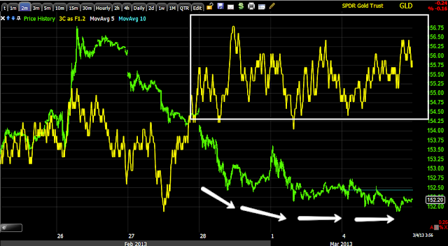
QUICK GLD Update

I didn't even see this, but I'm glad one of our long term members was paying attention when I have talked about Channel Busters, this just makes me like GLD even more and I'm sure he won't mind me borrowing his chart.

 We have a downside Channel Custer in GLD, do you remember what this means, it's the same concept as upside break of a channel, it's good if you are long GLD.

 The YG/Gold Futures on a 5 min chart...

 2 min GLD with a nice rounding bottom, it looks to be at the mid point with a leading positive divergence.

The 5 min like the YG futures, leading positive at what I thought might be a double bottom.

Bottom line, I still like the GLD position a lot, not making any changes there

S&P / NASDAQ Futures

The futures are looking a lot like the major averages, ES looks more advanced than NQ, but that can change fast.

 ES 1 min

NQ 1 min

Chart Examples

These are the charts I promised in the last market update a few minutes ago.

First the normal momentum tools that anyone can construct and use.
The symbol here is the SPY (1 min) as we are using this for intraday changes, but it works well for other timeframes too.

 First the TICK with a simple linear regression trendline on the SPY and the TICK below it, they should move together, here the breadth of the market as represented by the TICK readings is much thinner than it should be, that's a warning sign.

 This layout is a bit crowded, but in the top window with price is momentum which is failing, RSI which is negative, MACD which is negative and Stochastics which I use for embedded signals is no longer embedded.

 The 1 min DIA is the example of what I meant when talking about the intraday 1 min 2, and 3 min. Note where the 1 min chart not only on the DIA, but all of the averages, goes negative, right as the DIS passes above Friday's close, like I said there's not much of a price gain, only +0.14%, but the intraday volatility can make people more emotional and believe something that hard figures and facts don't support. The market gives us so much information you could justify any position you wanted to take, I've seen some really strange ones, I mean like tin-foi hat strange.

 DIA 2 min is in a relative negative divergence, but it needs to work through this as well just like the 1 min chart.

 The 3 min chart shows a small amount of accumulation in to the lows giving us the intraday volatility, but as you can see, it looks like those shares are already being sold off.

The longer the chart, the more important, at 10 min on the DIA I don't even have to draw on it, the signal is pretty clear, those 1, 2 and 3 min charts would have a lot of work to do to overcome this signal on this timeframe.


 AAA 1 min is in line until it passes Friday's close, then starts going negative

The same with the SPY, the white trendline is just Friday's close.

Market Update

The very short term charts in all of the averages are starting to go negative and lose momentum, most have to migrate a bit and work through 2 and 3 min charts, but I don't see thins move as anything special, just more volatility at this point, I also wouldn't open new short positions, but rather keep what's already in place, that last position may change if the charts change very fast.

I'll post examples next

UNG Update

I'm getting a lot of emails about UNG's move today and the possibility of a breakout move coming, it's just easier to post an update than try to explain it in numerous emails.

 Here I'm trying to represent UNG's move down to the move toward accumulation and the move up and moving out of the basing area, today it just so happens to be right in the area of a breakout.

 Here's a closer look at more local resistance, although it stretches back a little further. Whenever UNG has needed some extra gas to push through resistance it has pulled back to collect it.

 This is just meant to show there's very little movement on the 30 min chart, it's nearly perfectly in line with the price trend or confirmation.

 The more important hourly chart leaves me little doubt UNG will push through this resistance, I'm not convinced it will do it today or tomorrow though.

The shortest chart at 1 min looks almost exactly the same as the 30 min chart, it's almost perfect symmetry between the two flows, one will have to give way at some point, with plenty of room to pullback without doing any damage, that's what I'd think is most likely, but I personally would not try to trade around it, UNG has given us a few major upside surprises before and as I said from day 1, this is a longer term position.

It's not the % Gain-there is none, It's the Volatility

The characteristics of the market right now are why we have been able to d so well with 1-2 day weekly calls and puts, otherwise this is a pretty darn difficult market to survive, especially if you are short sighted and chase the first emotional momentum spurt.

As I said, it's not the percentage gain because there is none. The SPY just moved +.65% in the last 2 hours, but over all the volatility, just look at a 15 min chart on the SPY going back to the morning of Feb. 15th, price is at the exact same spot as it was then 11 market days ago!

So I have to wonder if what I thought this morning is taking place (increased volatility-increased rate of churn) or if this is just part of the same volatility with no real movement.

In any case, I'm rebooting the screen capture software, but ES is negative again on the day, NQ is moving that way, today's volatility since about 12:30 looks impressive on an intraday chart compared to Friday as Friday remained in a narrow op-ex pin range.

I have not changed any of the option positions since a small partial position change Friday, still with GLD April $150 Calls, SPY March $155 Puts, QQQ April $68 Puts and GOOG April $810 Puts, I don't have any plans to change them any time soon.

Here's the capture of volatility I mentioned before, it just loaded.

Price now at the same as Feb 15th, lots of volatility though.


MArket Update-Some Developing Indications

Earlier today I expressed the disappointment in having looked at a number of assets and saw little more than a market that looked to be literally sitting on the fence, not part of some ploy, it looked genuinely like it was either being pulled in two different directions or that no one was willing to take any position in size, almost every asset except the Yen was extremely bland, which is not that unusual for a Monday morning, but to this degree.. Not usual.

Since then we've had some signals slowly developing, some hints here and there, but movement is the best environment to really see what's going on. There are numerous assets I could cover, more coming up every minute and many I haven't had a chance to look at yet, but here are a few that interest me.

 The TICK earlier was almost as bland as the market at +/- 750, it managed a more extreme -1200  and then quickly changed trends, something there was very little of earlier. Since capturing this chart first, here's the updated TICK chart.

 It is already falling put of the rising channel.

 Last week I mentioned how the Volatility Futures (ETF) like VXX and UVXY had shown a very strong signal in one timeframe, but the same in all 3 ETFs which is unusual, it was as if we caught an accumulation move right as it happened in a chunk, part of a larger order broken in to chunks. Today while most charts are still bland and have little to offer, that same 3 min chart is looking very positive in VXX.

 The same can be said of UVXY in the same timeframe today.

 The daily VIX since the buy signal, the Bollinger Band Squeeze and break out...

 The daily VIX-last week I mentioned the Rising 3 Methods Candlestick pattern, usually it's 3 candles inside the real body of a large up candle, but there are no rules as to how many, so long as they stay within the real body of the first large up candle which all 5 of these have, this is still a very bullish candlestick formation for the VIX, which trades inversely to the market.

Treasuries as the flight to safety trade also show a clear divergence, something we had very few of earlier today, but are seeing more pop up every minute, but I did think this move in TLT was worth noting as well.

I think it's still way to early in the day to assume any trend will hold, usually we get two meaningful trends between now and the close so we'll see what we get, in the meantime I'm looking for the clues as movement has shaken some traders off the fence and forced their hand.


Futures Update

As mentioned earlier at 12:12 today in this post, "Maybe some clarity is on its way" it wasn't the pre-market I was so much interested in as it was what happened after the open of regular hours, ES continued leading negative and NASDAW futures went from in line to negative.

The result thus far is far from conclusive, but is the movement needed to make important observations...
 ES since the 9:30 open

NQ since the 9:30 open

CONTEXT for ES since approx. the 9:30 open.

Time to make some observations.

GOOG Charts

The recent GOOG Trade Idea basically dates back to this post, although this has been a position we've been fooling with for a while, this was posted Wednesday of last week (Feb. 27).

I've put up a number of updates, reminders, etc. Here's the GOOG Puts position started Friday at half of intended size. The area in which I wanted to fill the rest was above $808.


Here's what the updated charts look like right now, even though this is a bullish looking, strong breakout, this is also the exact area I was looking for GOOG to move above last week to fill the rest of the Put position as a head fake move.

 There were two head fake areas I was looking at, the first is the larger, when we entered the Q1/2012  very profitable BIDU short, it had hung above the head fake level for several weeks, however GOOG had created such an obvious resistance area, it would be very high probability that it would be used to get not only better prices, but the other thing Wall St. needs as they are filling much larger positions, DEMAND/VOLUME and since most traders chase, that's what they got.

Today's move above the area I mentioned in the first post...

 Intraday here's what the move above looks like... Note the increase in volume right as GOOG breaks resistance.

 However even the shortest, fastest timeframe would not confirm this move up, it shows distribution in to the move, but that's on a smaller scale.

Even the positive divergence to send GOOG above resistance is seen here, it is likely so small it won't be seen on more important longer charts that show larger flows of underlying funds.


 The 2 min chart is a slightly larger scale.

 The 3 min chart even larger and more negative.

 The 5 min chart is where we get in to more serious flows and 3C signals, as mentioned, no hint of the short term positive to send GOOG above the resistance zone.

The GOOG 15 min chart in to the breakout move doesn't even try to confirm the move.


Filling Out April $810 GOOG Put

This position was started last week, I left some room because there was one area I hoped to see GOOG pas above, it did that this morning and I like the way it looks here so I'll fill out the rest of that position, I think for those who don't want as much risk, GOOG makes for a decent equity short here, the upside risk is easy to handle, basically decide how wide you want your stop, you can even keep it pretty tight here, just a bit above the intraday highs, but away fro whole numbers

Maybe Some Clarity is on its way

3C's ES and NQ futures have not been in line with the market, this may be the first of a more interesting movement in to the longer timeframes to settle the earlier issues. CONTEXT is also getting worse. For those long UNG, keep an eye on it as it approaches a pretty important area of resistance.

 ES 1 min leading negative, I'm not so much interested in pre-market, but what has happened since the open of regular trade.

NQ moves from in line to negative.

MCP Follow Up

MCP was posted as a trade idea last Thursday this is what the charts looked like and one of the defining features was the probability that Thursday's move below support was a likely head fake move to knock out stops/weak hands, one of the things we like about these head fake moves is that they typically occur just before the real move launches, there's more on that in the follow up post on Thursday with charts... 
The break of support at the yellow arrow or head fake move mentioned Thursday.

MCP just made a pretty volatile move, but from the charts I posted and the position I was looking at Thursday, this is hardly the move I'm looking for, but it is a good sign.


The white arrow is where MCP was featured, the box where there was some upside volatility this morning.

You can see the charts I liked in the post linked above or right here...  Nothing has changed there so no need to report them, but they are also much bigger than just the quick move this morning, I wouldn't enter a trade like this if this is all I was looking for.

However there are two charts that tell me it's time to keep a closer eye on MCP for a move to the upside.
 The 5 min chart looks like it was bought heavily as price slid a bit and right before this morning's run.

The next timeframe at 10 mins has the same feature and a leading positive divergence now, it looks like it wants to run again, I'm looking for a longer, more sustained move, this may have been a trial balloon.