Tuesday, July 10, 2012

AAPL Follow Up

As mentioned, I closed the AAPL trade out of an abundance of caution being there seems to be a very rapid shift in the tine and character of underlying trade throughout the market, not in just a fe places, but nearly everywhere I look. This change in character seems to have accelerated through the day, I may be paranoid (but what trader isn't and rightfully so?), but it seems to me as if someone was privy to some conformation (obviously not released yet), while others may not have been privy to the information, but took notice of the change in character of trade, you have to understand they aren't just seeing simple price, they are seeing order flow, the size of the orders, who's placing them, changes in FX and credit markets, etc-all things the average trader would never look for nor have the capability to look for.

AAPL's underlying trade was significantly bad enough to justify the put position and even as AAPL gapped up this a.m., as I mentioned yesterday, the extent of the 3C charts did not have me concerned at all. What does have me concerned is the very high correlation in the market, meaning if the market moves in one direction, most stocks (more than usual) are going to do the same , whether they fundamentally/technically deserve to or not; that's why I too a quick 1-day profit in AAPL and closed that trade down.

A 12% 1 day gain, in this environment, I'll take it.

If I don't understand what is going on or the trends are quickly changing, I'm going to react.

A far as the extent of change in AAPL, as mentioned also earlier, if this were just AAPL and everything else was moving as would be expected on a day like today, it wouldn't have been a big deal and wouldn't have seen me close the position, but after seeing several assets move VERY quickly and very strongly toward the end of the day, the movement in AAPL took on an entirely new meaning, I'd rather take the profit than wonder what's going on and if that profit will be there tomorrow.

I have no problem with the short/put position in AAPL as far as 3C charts go...
It's the market correlation that bothers me.

As for AAPL charts...
 1 min negative divergence with a VERY typical had fake move today that we see so often before a reversal (in yellow).

 Here's the head fake move, a gap above resistance, note the big green volume bar, so retail took the bait and AAPL closed down 0.94%, even more considering the gap up that retail bought.

 The 1 min chart shows a small positive divergence, this alone is not bothersome to me, it would be perfectly normal.

However the 3 min chart leading positive in the last hour with many other stocks/risk assets, was a little more bothersome.

If this turns out to be nothing, I'd be more than happy to re-enter AAPL short or with a put.


Risk Asset Layout Update

First remember the very fast change in USO's 1 min chart to a leading positive divergence above the intraday highs in 1 hour. Now take a look at ES. ES lost 26 points today from regular hours highs to lows, yet in the last hour was able to put together a leading positive divergence like this, hitting a new high on the day as ES is just barely of the lows in price, it seems to me that there's a very fast change in underlying institutional activity, as if something has come to light that only Wall Street knows about as of yet. Remember, most people are only seeing price and standard indicators, very few people are seeing what we see.

ES's leading positive divergence in the last hour, making a new high on the day after a 26 point drop!

 Yesterday's commodity activity was a little more enthusiastic than the FX correlation that normally drives it and was quite a bit more enthusiastic than the SPX. Even today as commodities slipped -1.6% vs the SPX's  -0.82%, the relative performance on the day shows the SPX making  new low as compared to yesterday while commodities stayed off that new low as compared to yesterday. There's more to relative price performance than just percentage moves and that's why this layout is set up the way it is.


 Like I mentioned in the last post, Credit is a huge market, it's the playground of institutional money and I would think that if there's a quick change in positioning, they aren't going to be able to hide it through quiet accumulation. If quiet accumulation was the goal, they'd likely only be able to accumulate about 10% of the size position that they could accumulate if they just bought in the wide open, but as most retail investor aren't even aware of credit's role as a leading indicator, retail isn't going to be watching, however, other institutional money would be watching and that may explain some of the very quick late day positive divergences as institutional money that may not be privy to whatever is causing this noise/,changes in underlying trade, would notice a change in credit such as this one today in High Yield which dramatically outperformed the SPX, this is a positive divergence and under normal circumstances with our use of this layout, it would be a tell that credit is leading and equities will likely follow.
 Here you can see the leading quality of Yields which went negative on the 5th vs the SPX, the lack of confirmation would be a negative divergence and yields tend to attract equities like a magnet, today's flat trade in yields may not jump off the chart, but it is an important indication.

 The $AUD is in line with the SPX, no information there.

 The Euro was a little more enthusiastic yesterday on a relative basis vs the SPX, commodities followed the path of the Euro yesterday, but were even more enthusiastic, the late day positive divergence in the Euro vs the SPX is interesting, although it is small, I probably wouldn't mention it if we had not seen other 3C charts make dramatic moves in the last hour or so of the day. My gut feeling is almost as if someone knows something and as trade developed during the day, smart money that wasn't in the know, at least noticed changes in trade and also started to grasp something is up, even if they may not know exactly what it is, much in the same way we are approaching this.

Finally High Yield Corporate credit is pretty much in line with the SPX today, however I do want to see what if any underlying 3C signals may be present in this risk asset. I'll let you know if I find anything.

Risk Asset Layout

I want to check the 3C charts and underlying activity of the risk assets in the layout, but there are a couple of strange/unique signals here too. Credit is a LARGE market, as such any quick adjustments that need to be made in credit are likely going to show up in price as they don't have the time to quietly accumulate, there's at least 1 quick change in High Yield Credit which is one of the first choices among the different credit instruments for a risk on move.

This is one of the reasons I decided to pull the plug on AAPL, not because of AAPL's charts, but because of the high degree of market correlation right now. AAPL's 1-3 min charts are also showing a rather fast change in character, if it were just the AAPL charts alone I wouldn't have touched the position, it's putting all of the pieces together that the AAPL 1-3 min charts give me pause.


Charts are uploading

ES movement toward the close

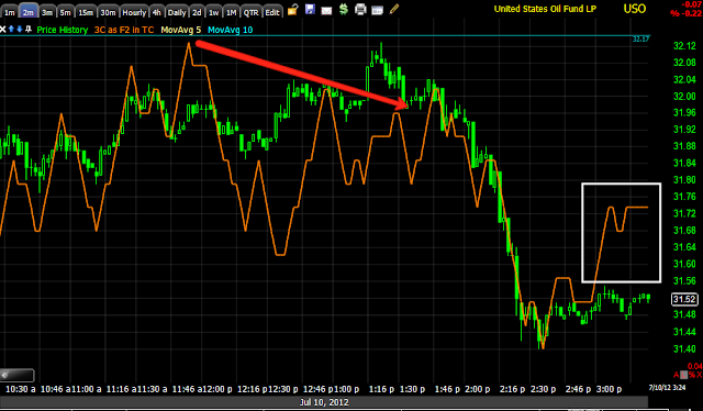
Leading positive 1 min ES, similar to USO's very quick rise.

Closing AAPL Puts out of abundance of caution


Checking the Risk Asset Layout... In the mean time

Take a look at CONTEXT.

This is an earlier capture from today
 The underlying risk assets that go in to putting together CONTEXT's proprietary ES model have been seeing what appears to be improvement. This would include Credit, Treasuries, etc. CONTEXT is a quick and dirty look at underlying risk assets and what they are doing, they form a model of ES fair value and judge it against Es with a histogram, that has been improving.


A more recent capture shows risk assets seem to be improving even more. I'm going to take a closer look at our model.

USO Update

Even more strangeness found in USO...

 USO 1 min trend, this is quite negative and it appears that USO has been under distribution for a move lower for some time, where it gets strange is this afternoon, although there were some earlier signals that I was not comfortable with and thus did not take a position in USO.

 It's not as visible on the longer term 1 min trend, but looking closer at today's intraday action, the 1 min chart went from a negative divergence, price moved down as would be expected and it seems it has moved down in to accumulation as we now have a fast forming leading positive divergence on the 1 min chart formed over the last hour alone that is now hitting nearly 2 day highs, that's a fast divergence and would suggest strong underlying activity underway. Although oil does have it own set of unique fundamentals, for the most part it is considered a risk asset and typically is going to move in similar fashion to the market, certainly with what we are seeing in the Euro/Dollar.


 Being the divergence is only an hour old, it is just starting to migrate to the 2 min chart.

If I were smart money and had some new information that would move the market up, I would absolutely allow prices to drop and buy on the cheap. What most people see is price alone, we are looking at underlying institutional activity so most people would have no clue.

I can't get too overly worked up about a 1 min divergence, but this is being seen almost everywhere I look.

 The 3 min in a relative positive position rather than downside confirmation.

 The 5 min which was bothersome to me earlier, in a stronger relative positive position.

There's no migration to the 15 min chart, I wouldn't expect it as the 1 min leading positive is only an hour old, but again, something strange seems to be underway, almost as if there's some information Wall Street is aware of that changed very quickly.

Maybe not just noise?

Once in a while, we see changes pretty quick that don't seem to make any sense, but if Wall Street has new information, they will change positions on a dime, the market can be predictable often, but we can never forget that the market is dynamic, the economy is dynamic and policy is dynamic. Thus, (it doesn't happen often), but we can see sudden and dramatic changes.

For now th AAPL put from yesterday is going to stay in place as the AAPL charts don't look very good and are not seeing this same noise, but I'm a bit hesitant about new commitments until I have a better understanding of what is going on or developing or perhaps just noise.

I decided to look at the Euro/$USD, in a pullback the Euro should see weakness, the $USD should see strength, there are some curious charts here as well.


 As noted last night, the 1 min negative in the Euro has worked as it should have with the Euro lower-the market is lower with the Euro as the correlation would suggest and the chart is pretty much in line.

 At 2 min we have the same negative from last night, but this chart isn't as negative as it should be today to be in line with the price trend.

 The 3 min chart from negative last night with the price drop today, but today's intraday action has a leading positive divergence, this suggests there's some strength building in the Euro, which would suggest support for the market.

 The 5 min shows the same

 Even the 15 min has a relative positive today followed by the start of a leading positive divergence, it almost seems as some new information is being discounted in underlying trade.

The $USD -remember it has an inverse correlation with the market, when the $USD is down, stocks tend to go up and when it is up, stocks tend to go down. We would expect to see the $USD getting ready to strengthen on a market pullback.

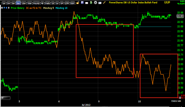
 We saw a positive divergence last night to a small extent and the $USD higher today, thus the market moving lower, but the underlying 3C trade shows a negative divergence in to that price strength.

 The 2 min chart is leading negative, this would suggest the dollar is getting ready to perhaps move lower which would be supportive of the market.

 The 5 min chart shows a leading negative yesterday-this makes sense from the gap up standpoint of today's open, but the continued negative leading divergence today does not fit well with what the charts had been showing us.

Even the 15 min has a relative negative divergence.

I'm really starting to wonder if there's some new information Wall Street is acting on, in essence re-positioning themselves on "new" news, whatever that might be.

As mentioned earlier, the AAPL puts will stay in place, I'm not looking to enter new positions until this is cleared up, the core portfolio has long and shorts at a profit and is hedged pretty well so it will stay as is.


The DIA and QQQ showing the same...

 DIA in line same as the SPY

 The DIA 2 min is inline

 The 3 min is relative positive

 as is the 5 min

 Like the SPY 15 min, the 30 min is leading negative

 QQQ 1 min is inline like the others

 However the 2 min is still in positive position

 As is the 3 min

 And the 5 min

The 30 min which is a much more important longer term trend, is leading negative like the DIA/SPY.

This is the noise that I'm trying to figure out, is it just noise or is there something going on in the underlying trade?

The Noise

Here's what I'm talking about with the noise mentioned in the last post. I will say that expectations were for a move in to the gap and then that move to fall apart, expectations have been met.

 1 min timeframe is negative in to the opening gap up in to Friday's gap area and 3C is pretty much in line with the move down.


 When looking at the 2, 3, and 5 min charts to follow (2 min above), we have to keep in mind we had a pretty decent leading positive divergence as of yesterday, so 3C was elevated, this is what was telling us we'd see the opening gap higher today. However as you can see the 2 min timeframe is not moving down like the 1 min timeframe, the typical migration of a divergence from the 1 min chart to longer charts is not occurring here. This is why I'm a bit hesitant to say that this is the break I have been expecting leading us to a decent size pullback, without any further attempt at more upside, even if it is slight.

 The 3 min chart is still in relative positive territory.

As is the 5 min.

As you saw, remove the noise and the 15 min chart is very negative. The 15 min chart trumps all of these as far as the trend and importance goes, these charts are more just tactical intraday or day to day movements. I would not be going long much of anything right now as the next decent move as shown by the 15 min chart is down.


Lots of noise

I'm looking at different timeframes and assets and there's a lot of noise, ES still has a positive divergence suggesting there's still a decent chance of more upside before the close, the one thing that is pretty consistent is the 15 min charts being negative.

I'm still digging through these charts looking for the probabilities, I'll post shortly on what I think that's going to be. In the meantime, ES

Intraday positive divergence still suggests ES and the market could still move higher in to the closing hours.

I often say, when in doubt, go to the longer term charts where we can take away noise and reveal the major underlying trend...

The strategic view looks pretty solid with this SPY 15 min lading negative divergence, meaning I want to trade form the short side for the next move, however the tactical entry is where the noise is. Unless you simply take a longer term view and have a wide stop, then it looks like a no brainer. I prefer though to get the best entry possible, at this point that has to be weighed against missing the move.

More to come shortly as I sort through charts looking for that key hint.

FB Update

I really like the trade we made in FB, we were long and making money while everyone was shorting every move higher. As you know I still feel FB has good upside potential on a stage 2 breakout in to mark up, which would be a breakout above this level...

 Above the lateral trendline.

Why?
I know this is horrible scaling, but it's the only way to show you where the 60 min FB chart started when it first went public and where it is now, a very impressive leading positive divergence. This makes FB a stage 2, mark up, trending candidate, but first it has to break above that resistance level shown on the first chart.

I don't fall in love with stocks and follow them around like a puppy dog because of past victories, I continue to watch and follow FB because of the potential seen on the chart above.

That being said, very early yesterday, to me it looked like the pop in FB intraday was forming a rounding top

It turns out my gut feeling and 3C were right...

Based on that information from early yesterday, members "could" have entered some options/puts and made some quick money, it isn't a trade I would personally take or advocate as I prefer to try to trade with the most likely, strongest trend.

In any case, I thought it best to just see what FB does on the suspected rounding top an afternoon decline as the 2, 3 and 5 min charts were pretty negative. If those charts were to gain in strength and really put in a strong showing, then maybe FB is preparing for an attempt to break out above major resistance that really lads us to the next level in the FB trade, likely an even stronger trend. Otherwise, I have to assume FB is likely to follow the path of least resistance for the majority of stocks and trade with the market (as yo know the next semi decent size move expected in the market is a pullback). I have mentioned recently that this IS NOT a stock picker's market as correlation between stocks and the market is very high, FB was on example of a stock that was immune to that as it marched higher despite what the market was doing from day to day, but we can't just make assumptions that aren't based in evidence.

So lets look at the FB evidence that has developed today and see where FB is likely going and where the opportunities are likely to be found.

This may be one of the funniest things I've seen happen in FB, as we know, the FB shorts and haters have been out in full force, it seems like yesterday some of them had enough of watching their shorts get shredded and finally decided to jump on the FB train (chasing the trade-absolutely deadly in this market).

 After pulling back (buying a pullback is a concept of technical analysis) and after breaking above "Tweezer top" resistance at the white arrow, it seems some former FB haters decided to switch sides.

Take a look at the volume on the move up early yesterday above that resistance level I just mentioned and then look at the volume on the way back down. Two things I would like you to consider, 1) human emotion-you can't really truly understand a price chart unless you can translate it in to human emotion and what happened yesterday seems to be that hesitant, and newly reformed FB haters and shorts decided to chase the move in FB higher and were promptly slapped down.  How do you think that may have influenced their attitude toward FB? Secondly, consider the role Wall Street might have (likely did) play in setting up thi little emotional roller coaster (it even looks like one) and why would they do that, how could that benefit Wall Street in the long run? I'll give you a hint, if FB is to break out to stage 2 mark up, having a healthy short presence would be most helpful in sending FB higher.

Right now, FB is in a little congestion pattern at what has this far been the only real support trend line that can be drawn.

 Here's the 5 min intraday chart which went leading negative yesterday as can be seen in yesterday's updates, suggesting the "U" shaped downside reversal. Right now as we are at an area of support, congestion is expected and thus 3C is pretty much in line short term.

 The 1 min chart's trend gives us a pretty good idea that yesterday's move up was noise, perhaps a little psychological warfare against retail traders who decided, "If you can't beat them, join them" and were promptly thrown in to the meat grinder.

 The 1 min chart close up was negative at the top yesterday, as the market looked to gap up this a.m. (as mentioned late yesterday) it appears there was some market maker accumulation for a second round of buying that gap, it's small accumulation and that was promptly sold in to with a leading negative divergence this morning, this chart also is in line as we are at the major/only support level of consequence. I expect some congestion here, I don't expect much of a tradeable move.

 The 2 min chart was leading negative (it is much clearer as it was happening yesterday) and we see the distribution of the opening gap up and an in line status now.

 The 3 min chart has a relative-nearly small leading positive divergence, this is not what I'm looking for to start a long position, I consider this more noise which we'll see in more detail soon.

 The 15 min chart is important for the next move of consequence or the next tradeable move (speaking generally of the market), I don't like how the 15 min chart has deteriorated here even more, this to me suggests FB will indeed pullback and hopefully on a pullback, gather strength for a move through resistance.


 Even the 30 min chart shows some negative relative divergences, although the round of accumulation that had me unsure of whether FB was going to try to make a breakout move, now seems to be revealed as a head fake move that may pay some dividends in future moves to the upside as tentative former shorts got burned on long trades yesterday. People take trading very personally so they'll likely have a renewed hatred for FB.

 When we look at the 60 min chart, we are looking at a different trend, just like the market averages. This appears to suggest (as of now), after a pullback, we will likely see a move to breakout to stage 2 mark up.

As for the trend channel, on a straight long, FB gained 18% (although many of you used options for far greater gains). Note where the Trend Channel stopped FB out. If you measure where the Trend Channel stopped out FB to present price, you have a 0.28% gain. This is why I take my Trend Channel stops seriously, yes there are often some slight additional gains, but the time, volatility, risk and opportunity cost are rarely worth it once the Trend Channel stops out the trade.

For now I will continue to monitor and wait on FB to show me something that makes me want to enter the trade, but in the near term I'm not expecting much on the upside and I'm not willing to short it with that 60 min positive leading divergence in effect. Patience and hopefully FB comes to us.

It seems the question of breakout or pullback is now leaning pretty solidly toward pullback which is fine, it may be the best thing for FB's longer term future.

I'll be on the sidelines for now.