Friday, March 15, 2013

Turning up the Volume

Other than the market breaking its winning streak, the Dow not posting an 11th consecutive green close, volume was one of the most noticeable things that was night and day...

However this was completely due to quad-witching that happens 4 times a year, the last time actually posted heavier volume and that was December 21st, right in the middle of the exceptionally low volume holiday season.

The other was High Yield Credit giving up the entire year's gains in 2 days...
Amazingly, this form of risk on (rally) credit, wanted nothing to do with holding positions any longer or over the weekend, I honestly don't recall the last time I saw an asset drop like this that wasn't earnings or scandal related. The financial mantra is, "Credit leads, stocks follow" so things may be getting very interesting very soon. European credit did and has been doing the same thing.

Some other basic leading indicators didn't look too hot today either...

 High Income Fund, HIO first broke before the SPX and other averages hit the trend channel stop, but since this last melt-up, it too has made new lows wiping away all of this year's gains, but added to that with an exclamation point today.

Oddly for another large move over the last 2-days, yields plummeted, we call yields,"A magnet for stocks". Apparently if there's any rotation between stocks and bonds it seems to be heading toward bonds/treasuries. Stocks obviously closed near their highs, however the 10-year bond closed at the lows of the week (strangely as a lot of other metrics like credit went south the last 2 days in a big way), the low yields are an indication of demand for safety, not usually something seen very long with stocks near their highs.

The last couple of weeks we've noticed unusual activity in TLT, the 20+ year Treasury ETF or the flight to safety trade, today was no exception 3C spiked toward the end of the day.

A huge leading positive move in TLT today.

The recently hot IWM lost the momentum game today...
The Momo Indicator with price went negative, RSI went negative, MACD went negative and Stochastics lost the embed and this is not the normal 5 min chart, but a longer 15 min, the 5 min lost it badly.

We saw several new large sell signals today in the DeMark inspired custom indicator...
 Dow Transports gave a sell signal on a MONTHLY chart, that's huge and rare, you can see how the last two signals worked out, the 2009 low buy that led to a +140% gain and the 2011 high that led to a 30+% downside correction.

The Russell 2K has a 7-day (usually 1-day signals make for sharp moves, longer signals make for larger moves).

Every measure of breadth I have been posting (Percentage of stocks above or below their 40/200 day moving averages) deteriorated today, every one of about 12. Interestingly I ran across a proxy index of the most shorted Russell 3000 names, which have outperformed by a large margin over the last month or so, however they fell the last two days as well, which should be showing up in the form of even worse breadth readings as the short squeeze in these names that propelled them higher is seemingly at an end.

I've been thinking a lot about the Q1 period of 2012 when it was incredibly clear to anyone who read beyond the headlines of economic reports that they were coming in with headline beats, but the data inside showed how weak they were, it was all due to seasonal adjustment which we covered last year almost daily and many times could find no benchmark for the seasonal adjustment, they were pretty much headline beats and then whatever adjustment had to be used to get them there, around March we started coming out of that period and CITI's Surprise Economic Index went from up to nearly straight down as the seasonal adjustments ended, it was an incredible insight in to just how manipulated Q1 data was, although as I said, if you read the reports and not just headlines, you already knew that, this caused us to build up large core short positions and by May 1, every short was in the green, by June every single short was at a double digit gain. So I had been messing around with some graphics software trying to overlay 2012 over 2013, I'm not as computer literate as you might think, I made a mess, but I found this chart today from Bloomberg that did it for me...

  Kind of interesting huh? Unfortunately the Citigroup Surprise economic index is no longer available  on Bloomberg without a paid professional subscription. However going down memory lane, here's one I published from last year around the same time...
This is what happens as the seasonal adjustment fades away. From a quick Google Search, I see lot of articles about the Index posting "Red Flags" recently.

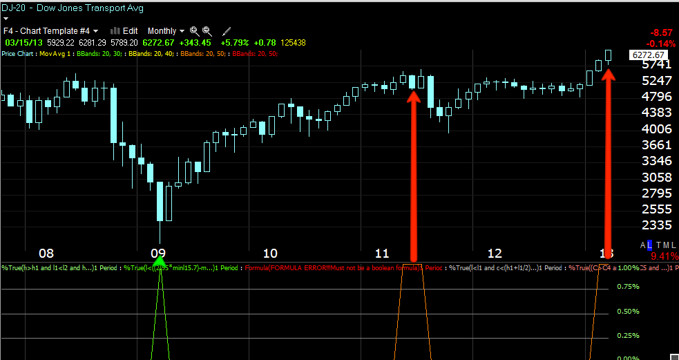
However, by far (and this can't be taken alone, you have to consider breadth, volume, desperate measures with the VIX and the fact it does have a point in which it can't go any lower, leading indicators, money moving out of the market, safe haven trades seeing money move in, treasury Yields moving to lows, the Italian election, re-newed problems in Greece with the Troika, the recent 2-day data decline and perhaps the real dark horse, China and their inflationary stance against the world), this chart takes the cake for perhaps one of the most important developments perhaps of the year, 1 simple chart...
The absolute, outright price destruction of HY Credit, this chart is the worst/sharpest leading indicator I've seen since we put together the Leading Indicator layout to give more specifics than CONTEXT could give us.

I'll be covering currencies later this weekend and I'm thinking to cover Bellwether stocks, the momo plays and their 3C charts. Before I was using 3C, I had a good feel for the market simply by looking at a lot of charts, when there were more short or long candidates by far, you knew which way the market was heading, taking a look at underlying trade just gives us a head start.

Have a great weekend.


GOOG Update

The same concept in GOOG remains, timing is longer. Shorter term GOOG has put in a larger positive divergence, I still want to use it to short in to strength for a longer term trade, whether longer dated puts or a straight equity short.

 GOOG 2 min

 GOOG 5 min

 This is the first time GOOG 10 min has gone positive

 This links up with  GOOG 15 min chart.

 And we have a relative positive 30 min for the first time, I'm guessing it can bounce to $840 area, which is where I'd like to add to existing positions.

 The negative charts for the longer term positions already in place haven't changed, still 60 min leading negative

 2 hr leading neg.

 4 hour, showing 11/16 lows accumulation

And Daily chart negative, which is the big one.

VIX

This is a 5 min chart of the VIX with short term VIX futures overlaid (VXX)

IWM Update

The fill on the last IWM Put position was $1.85 as volatility has picked up, so do the prices, I should have opened it when I saw the first Futures divergence earlier, but that's always my last priority when I have other things to look at, I'm glad I didn't miss that High Yield Credit move.

Here are the charts for the IWM...
 IWM 2 min

 IWM 5 min

 IWM 15 min

 IWM 30 min-again does the area look familiar, hint, "Snake"

 IWM Trend Channel, the Trend Channel uses the recent volatility of whatever asset it is applied to, it creates a channel that is a SD above and below the "Normal" behavior for the issue, if volatility changes the Channel accommodates it, it's when volatility changes so quickly that it breaks the SD that something has changed, after years of using this channel, I have rarely regretted taking the signal and moving on, I know by design it will never exit at the exact top and there's usually volatility after, but it's rarely worth trying to capture and those lessons as to why are learned when you go back and look in the future, like HY Credit today taking out an entire year of gains, moves like that occur .

Additionally the 20-day ATR of the IWM moved down at the red arrow, it should have been increasing, that was a red flag we discussed when it happened, shortly after the Trend Channel stopped out. The ATR has increased as it should at a higher high, except it increased on lateral chop and decreased on rally, the EXACT opposite of what you want to see, so what looks good is actually worse.

 The long term 30 min IWM, as I told you yesterday, when they track price well for a while and then go off on a divergence, it tells me the timeframe wasn't picking up any distribution in size, when distribution in size appears, something has changed. People have a hard time with the concept of distribution in to a rising market, I can tell you that with the exception of AAPL after Third Point Dumped it from their top 5 holdings, I can't remember the last time I saw distribution in to a decline, smart money is out by then and they use higher prices and demand to get out.

 The 60 min IWM chart, this is an even stronger divergence

 I never thought to try it, but Peter Worden, the son of the man who created all modern money flow indicators and MoneyStream, said last night he was concerned about the monthly chart, I never though to go out that long, but it shows 2007 distribution, 2008 distribution, 2009 lows accumulation, distribution as QE1 ended and distribution ever since, if that's hard to believe, check out volume. Last night I posted a chart that showed increasing volume during the 2002/2003 through 207 bull market, volume increased at every new high, VERY different from this move, of course this is a VERY different move that the market as never seen a bubble with no asset-A Central Bank Bubble.

 This is the 5 min chart of R2K Futures rolled back to earlier this week as I can't show the entire week's history on this 5 min chart. Something started Wednesday night/pre-market Thurs.

 Here's the same chart rolled forward to present.


 The 30 min R2K futures

 The 60 min

The 4 hour-Remember I told you there was large accumulation in to the November 16th low, here it is, this is how a typical cycle works, accumulation of shares and then selling them in smaller positions in to strength as to not upset the Supply/Demand balance.

Adding to yesterday's IWM April 20th $95 Puts

I'm not a huge fan of leverage like this, so I try to keep these positions at a speculative level being they are straight buy/sell positions.


Credit is SCREAMING

These are the kind of charts that I describe as "Jumping off the chart" and as you know, "Credit leads stock", this is scary.

First I borrowed a chart of European Financial Credit.

It started diverging at the new year.
I like HIO as a leading indicator because it has no correlation to anything other than the attitudes toward risk, look at the attitude toward risk starting  around the new year and progressively worse, especially today

 Closer view of HIO, the last 2 days have really made a statement if you are listening.

 With the $USD down this much, this market had to be monkey hammered yesterday? And what about today? I suppose Quad Witching could be responsible so we'll give it a pass, but not for the previous 2 days.

 Yields? Uh that's a flight to safety.

 And commodities as a reminder are a risk asset that get bid up in a healthy market, what happened here?


THIS IS TRULY THE SCARY CHART OF THE WEEK, MONTH, MAYBE YEAR.
 HIGH YIELD CREDIT IS HOW THE BIG BOYS PLAY RISK, WHAT DOES THE LAST TWO DAYS TELL YOU?

WAIT, GET SOME PERSPECTIVE...

The last 2 days gave up the entire year's gains and in a big, big way!

Financials-1 more warning before the REAL POST

Remember I posted JPM because in one sense I thought it was indicative of what was coming in Financials. Earlier there were few good intraday signals, now as more op-ex positions are wrapped up we start seeing more movement.

This is quick, I could post a lot of charts.
 Now Financials are moving, not just XLF, not just a 2 min intraday chart, FAS is moving down even worse, FAZ up.

 This is a serious timeframe at 30 min, the negative divergence and leading negative look familiar?

That would be right at the break of the Trend Channel.


Quick Update

You already know what the market looks like, this is just a reminder of a couple things, by the way , I'm liking that April IWM put position from yesterday even more, a lot more because the next post I show you is the REAL problem for today.

 Just a reminder of how THIN the NYSE TICK is, and on quad witching? UNREAL!

 Of course intraday the SPX is moving as it indicates

The kicker is the IWM, I still think it's worth entering the April IWM put even here. I didn't draw on this chart on purpose.

JPM Follow Up

First just the charts, then the bomb.
 Staying in the Trend Channel keeps the stop process objective rather than subjective, you'll never get out at the highs, but because of the way the channel is coded, you'll get out before there's a major change in character which is often high volatility with a lot of risk associated with it, what's in the channel is easy money, after the break-very risky. Yellow arrows signify head fake moves like the new high yesterday that failed today, "From failed moves come fast moves".

 JPM intraday 5 min

  JPM's intraday charts have been going negative, but it's not that, it' the migration of that divergence across longer timeframes, this is identified pretty early so we'll see how far it goes, but it seems there was already a quiet exodus of capital before JPM was hauled in front of the government which they spent tons of money lobbying.

2 min

 3 min intraday

 Now moving to 5 min

 This is the break where it appears there was a large, quiet exodus, it's around the same time the Trend Channel was broken not only for JPM, but most market averages.

 Usually this wouldn't be my cup of tea, but I'm going to watch it. The reason why is reversals are very rarely "V" shaped, which means JPM would most likely chop around between this area and $46 or so, however they did make a big mistake using what Warren Buffet calls the "Financial Weapons of Mass Destruction", derivatives-we already saw a lot of traders/banks get their butts handed to them on derivatives in the EU.

These are the losses taken in JPM's Synthetic Credit Portfolio
 Synthetic credit products are derivatives that generate gains and losses tied to credit performance without the owner buying or selling actual debt. The losses occurred as JPM sought to unwind a portfolio of the instruments used to hedge JPM’s credit exposure.

A similar large loss was taken by another notorious investment group that was founded by 2 Noble Prize winners who won in  Economic Sciences for a new method to value derivatives, the Head of Bond Trading from Salomon Bros. , basically the all star team. Here's what happened to their returns as they tried to unwind a large position in to an unfavorable market, jut like JPM.
If you haven't read about Long Term Capital Management you must do so when you have time, this is the ultimate argument for consistent risk management.

Can JPM end up  like LTCM, an event that nearly took down the US Financial System?

They certainly have no business trading where they are.