Friday, June 3, 2011

Gold Miners Trading System 2

This is the second system I mentioned, I did a little work to the signal line and smoothed it a bit, the results were fewer trades (about 1 less winning trade and 4 less losing trades, reducing total trades over a 6 month period by 5 to 17). The equity line also performed better at 76% over the 6 month testing period (the period was so short because the ETFs are new).

So if you entered DUST today on the first system's signal, you may feel better about that being the second system (which I just ran) gave a signal today to buy DUST at the open on Monday. Whatever the opening price for DUST on Monday, deduct 3% for your stop loss and you are set.

The last trade in this system produced a loss of 2%, the trade before that, a gain of 16.6%.

I may do a little more work on the system and test it to make sure it's an improvement, but that last loss of 2% was just barely stopped out by a slight fluctuation in the signal line. If it weren't for that fluctuation, that trade would have produced a gain of 6.5%

Gold Miners Trading System-Signal/Stop

Last night I put up a signal from the first NUGT/DUST trading system, as I explained, it was the original system and I've made some improvements on top of it, but I left it up to you as to whether or not you wanted to take this signal.

The trade should have been executed on the open today and despite what you may have paid for DUST, the 3% stop rule which is pretty effective n dealing with false signals, is calculated off the actual opening price of $43.46 so the stop ON A CLOSING BASIS AND EXECUTED THE NEXT MORNING ON THE OPEN, is $42.16. This is not an intraday stop, it's not a stop to be executed the same day as the signal, it's always executed the next day at the open.

So system 1 (the original) is now long DUST and effectively short the gold miners. I'll alert you to any changes, whether it be a stop, a close of the trade at a profit or a new trade in NUGT.

Remember, the average losing position is about 2 days and the average profitable position is about 5 days.

Another market update

 DIA breaking the trendline, this was needed to produce a short squeeze

 It looks like the break was accumulated, DIA is not in too bad a shape at this point

IWM's divergence keeps getting stronger, it needs to show some price action along the lines of the divergence.

 SPY break of trendline, again this is what was needed to produce a short squeeze, again like the DIA, it appears to have been bought by W.S. The SPY needs to close above this trendline for me to feel ok with holding short term trades in leveraged ETFs.

The TICK chart has finally reversed to the more bullish side.

Market Update

As suspected, the S&P took out support, this is where we want to see positive divergences, we want to see those stops accumulated and a fairly quick rebound before market close. If that fails to materialize, I wouldn't feel very comfortable holding leverged ETFs over the weekend.

As I mentioned last night, the Greek situation has come around almost exactly to my description. I'll follow up on this in a bit. I need to check the timestamps on some of the releases.

 DIA 1 min

 IWM 1 min still looks the best

SPY 1 min, there was no pos. divergence before the break of intraday support.

Commodities Higher?

I'm looking at the CRB (Thomson Reuters/Jefferies CRB Global commodity Index)

 Starting with the 60 min chart, the various swing cycles are evident , currently there's a couple of positive divergences that may be part of a larger cycle to the upside.

 On the 30 min chart, again various swing cycles are evident, however recently there has been several positive divergences that may be part of an overall bigger cycle then previous cycles.

On the 15 min chart there's one that stretches about 3 weeks and a current leading positive divergence.

Just something to keep an eye on and consider where it may fit in broader analysis of oil, the dollar, etc.

Market Update

 IWM 1 in positive leading divergence

 QQQ 1 min positive leading divergence

The SPY is close enough to a major intraday support zone, we may see a shakeout below that trendline before the market attempts to move higher from here.

Currently the DIA/SPY are both trading in line with price.

USO-The Big Picture

Next week OPEC will meet in Vienna, according to the Financial Times, they are considering increasing quotas on production. The wild card here is that Iran's president, Ahmadinejad , who is locked in a power struggle with the Supreme Leader Ayatollah Ali Khamenei, has taken over the position as il minister. So not only does Iran control OPEC's revolving presidency, but Ahmadinejad himself is the president of OPEC. Who knows what will come out of that.


In any case, there are concerns among OPEC members that $100 oil will cause economic contraction which will ultimately hurt the OPEC members.


In looking at the USO chart, something I suspected, looks like it may be taking place. Taken with the possibility of quota increases and lower oil prices, it could be a very real threat.


This has been discussed recently so you should be familiar with it, what we have on the daily chart is a large bear flag (not a text book bear flag, but close enough). The consolidation portion showed some accumulation so a breakout was very likely and has since occurred. These days however, every breakout must be viewed with a degree of suspicion as there are so many false breakouts. You can see above the actual breakout only lasted 1 day before moving below the apex of the consolidation.

The price pattern target implications are serious, if this played out as a typical bear flag, w could expect USO to be trading around $33 which is an area USO has spent a lot of time at (approximately 2 years).

The Hourly USO chart shows confirmation to the left (green) which turned into distribution on May's negative divergence sending USO 5 or 6 points lower. There was an accumulation zone inside the consolidation which produced a short lived breakout. One of my suspicions has been that this breakout would fail and USO would start the next leg down, although it's never quite as simple as that.


 The 10 min chart shows the failure of the breakout and a positive divergence early today that allowed for a quick trade up to the gap. There still appears to be some strength left in USO, but not a lot.


Here's today's 5 min chart. There was the opening positive divergence that sent USO up to fill the gap and a negative divergence since.


I think it is possible that USO makes one more rally attempt. As of now, to most technical traders the consolidation has failed and that means in historic technical analysis vernacular, that USO is a short. We know how the market likes to shakeout positions so one final move back into the breakout range would squeeze the shorts and possibly pull in some longs which ultimately would be left holding the bag if/when USO breaks back down.


Although there's some money to be made on these daily gyrations, long term long positions should be watched carefully as it looks like the path of least resistance for USO in a macro sense, is down.


We'll see if USO can muster another bounce into the breakout region around $40+, at that point USO may be in very good position as a high probability, low risk short position.


One bridge at a time, but I think it's important to consider the macro implications in USO.

Dollar Chart Request

I just explained a theory regarding the market and the dollar to a member who emailed me. As you know, I've expected a shakeout move to the upside, around SPY $135+. The market doesn't look good at all when we view the macro trend as I showed you last night, but tops take awhile to set up and one of the best indications of a market that is really ready to break down is when a false breakout occurs. We have seen this time and time again whether it be an intraday move, a swing move or a major top. As unlikely as that may seem given the market's nasty tone this week, I think the possibility is still there, especially given the charts I just showed you of the market's leveraged ETFs.

Generally speaking, for the market to have a bullish tone, the environment in the dollar needs to be weak as there's an inverse relationship between the two. I have speculated several times this week that the dollar is under accumulation, that typically occurs with falling prices or within a trading range or both. So if I continue down this path, which is some what speculative, accumulatio in the dollar should provide an accomdative environment for the market to move higher. The point of the market moving higher, especially if it were to make breakout highs, is to set up a bulltrap/false breakout. With a large accumulated position in the dollar, once it starts moving up into stage 2 "mark up", the environment for stocks becomes bearish. If these two events coincide with each other, there is th possibility that my original thesis will occur. The longer the dollar accumulates, the bigger the move up in the dollar and the more bearish the environment for stocks (in my speculation, the start of the move up in the dollar would coincide with the breakdown in the market).

Thus far the action in the dollar i supportive of that theory.

Here's UUP which is the proxy I use for the Dollar Index being I can't get intraday information on the actual dollar index, but UUP seems to work fine.

 This is an hourly chart of UUP, I know it looks confusing, but stay with me. During late April/early May, there was an accumulation period in UUP or the dollar, it lasted 5 days. Currently at the white arrow there is another similar positive divergence/accumulation which thus far has lasted 4 days. In early May, after accumulation was completed (and please note that it started into falling prices and then settled into a range) the "mark-up period began in which the dollar moved higher. In red, you can see where distribution began. It's important to remember that the position accumulated over 5 days is pretty big, it can't be sold all at once without sending the dollar much lower as supply would overwhelm demand. However, also take note that distribution did not begin until AFTER UUP had moved up beyond the accumulation zone, so in effect, distribution didn't begin until the position was already at a profit.  5-days of accumulation produced 13 days of rally in the dollar.  There were 5 days of rally before distribution even began. It appears that the positive divergence in UUP is still in the early stages, accumulating into falling prices. That suggests that this accumulation period may be much larger the the April/May period, producing a larger move in the dollar and putting more pressure on stocks.

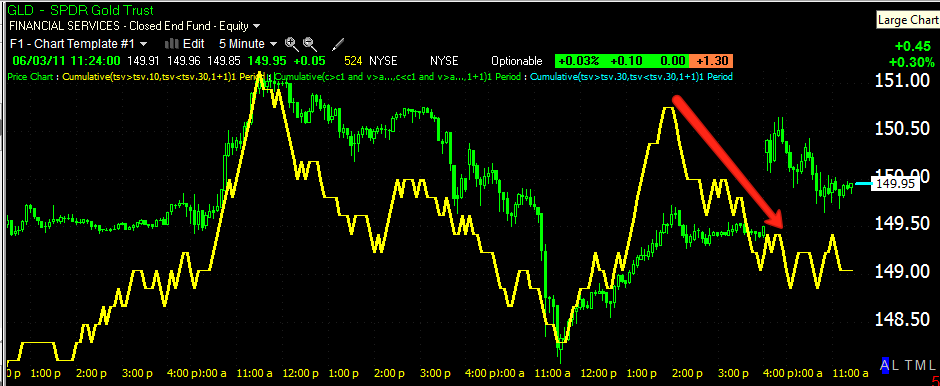
This is a 30 min chart of UUP confirming about 4 days of accumulation thus far. The Greek situation, being as fluid as it is, could further influence the outcome in the dollar as the dollar will likely fall upon a resolution of the Greek debt deal. I don't think that is something the market can accurately discount so we may have a surprise in the mix.

Here's the last chart showing the inverse relationship that is common between the dollar and equities.
The S&P-500 is in red (click on the chart to enlarge), the Dollar via UUP i in green. Note that the S&P hit its highs at the bottom of the dollar accumulation period in early May. Once the dollar started moving up, the S&P started trending down.

It seems there's still a possibility that the original scenario I had envisioned can still play out.

3C=Compare, Compare, Compare

Yep, that's what 3C stands for, a friendly reminder that the more comparng you do, the more reliable your conclussions when things all start to align in a particular direction.

With the price action this week, it has been difficult to imagine that the false breakout that I've been looking for in the market is still possible.

So I went to some of the leverged ETFs to compare the signals among the bull and bear ETFs for the S&P, DOW-30 and the NASDAQ 100 and guess what I found? Consistiency; not only among the long/short of each average, but in all 3 averges. In all there's something like 18 charts, all pointing in the same direction, suggesting the market wants to move higher. If this was the case, I'd expect to see positive divergences in the bull ETFs and negative divergences in the bear ETFs. Here they are....


The Dow Ultra ETFs
 Dow long 5 min-Positive leading divergence

 Dow Short 5 mins. Negative leading divergence

 Dow long 10 min Positive divergence

 Dow Short 10 mins. Negative divergence

 Dow Long 15 mins. Leading positive divergence

 Dow short 15 mins Negative divergence

The NASDAQ 100 ETFs
 NAS. long 5 min. Leading positive divergence

 NAS. short 5 min. Leading negative divergence

 NAS. long 10 mins. Leading positive divergence

 NAS. short 10 mins. Leading negative divergence

 NAS long 15 min Positive divergence

 NAS. short 15 mins. Negative divergence

The S&P-500 ETFs
 S&P long 5 min. Leading positive divergence

 S&P short 5 min. Leading negative divergence

 S&P long 10 mins. Leading positive divergence

 S&P short 10 mins. Negative divergence

 S&P long 15 mins. Positive divergence

S&P short 15 mins. Negative divergence

So there we have 6 different ETFs (Long/Short) on 3 different averages on 3 different timeframes, ALL AGREE. The bottom line, it looks a whole lot like the market wants to move up from here.

Market Update

I suspected that last neg. divergence in the market on the  min may have been a consolidation, it's looking like it was and the market is going to take another crack at filling the gap and seeing what it can do from there.


GLD/SLV

Strange, gold gaps up, silver gaps down this morning.

Lets start with gold, you may recall my macro outlook for gold summed up as a decent size pullback, then there's a good probability that pullback will create a buying oppurtunity (we'll have to confirm that on the pullback, but that's the plan as of now).

GLD's short term action (this morning)

 5 min 3C GLD- There was a negative divergence on GLD on the open, the exact opposite of silver in every way.

 GLD 10 min 3C, still negatively divergent even at higher prices this morning.

 The 15 min chart which tends to be the most influential as to swing moves and longer has been negative and did not improve even by a tick with the gap up this a.m. In fact look at where 3C is compared to yesterday and look at prices right now compared to yesterday. That's pretty darn close to a leading negative divergence.


Of course the daily still looks bad.

So my position on Gold/GLD remains the same despite the gap up this a.m.

As for Silver, I do believe as stated yesterday that there's a very god chance silver will continue lower off the bear pennant price consolidation. However, in the short term (the next day or two maybe), it looks like silver wants to move higher, maybe test the $37.50 level in SLV.

 SLV 5 min positive divergence (leading)

 SLV 10 min positive leading divergence

 PSLV 1 min Positive divergence

 PSLV 5 min positive leading divergence

 As for the longer term discussed, this doesn't change that analysis, the 15 min chart is still negatively divergent.

As is the 30 min chart

This looks to be a bounce of probably a short duration. Silver is headed lower intraday, but if it can form a range and continue positing positive divergences, it will give it that much more power on the bounce.