Wednesday, March 27, 2013

GOOG Charts

This post is in reference to the afternoon GOOG April 13 $800 Calls, even though there's a GOOG April (monthly) Put in place. First of all I wanted the week before, expiration the 5th, but something went wrong with one of the sliders.

I see this as an Ultra-short term position, most likely closing tomorrow like we did Tuesday with SPY Calls.

I'm just kind of guessing here, but one reason I can think of to torture every asset possible to try to hold the market up or move to the new high (which it almost seems as if they don't want to do, or at least not yet), would be the end of quarter which for all intents and purposes is tomorrow as the market is closed Friday and Monday is April. As far as trades that count on Q2's prospectus, those would have had to be in days ago because of the T+3 settlement rule (Trade plus 3 days to settle) so window dressing in the sense of a fund's holdings doesn't seem to be the issue, but as they are looking for a flow of new money in to all kinds of assets whether they be 401k, IRAs, Mutual Funds, Hedge Funds, CDs or other derivatives linked to the market, there would be no better time to let that sink in than the lat day of the quarter with a 3 day weekend and news screaming about the Dow and S&P at new all time highs.

What happens? The Greed effect take over, the "I missed all of this when I was only getting a fraction of a percent on my CDs, I'm getting in the market" and that creates a feeding frenzy for Wall Street, except they are the sharks as you'd expect and nothing good is going to come from making a decision to enter the market on the greed effect of propaganda, but to me, that's the only reason I can see that this market has been within fractions of a percent and not been able to cross the line.

So if this has any truth to it, the GOOG and AAPLs of the market will see a nice move, however I am not looking at the charts and trying to make them fit the theory, I'm looking at the charts and trying to find a theory that fits them.

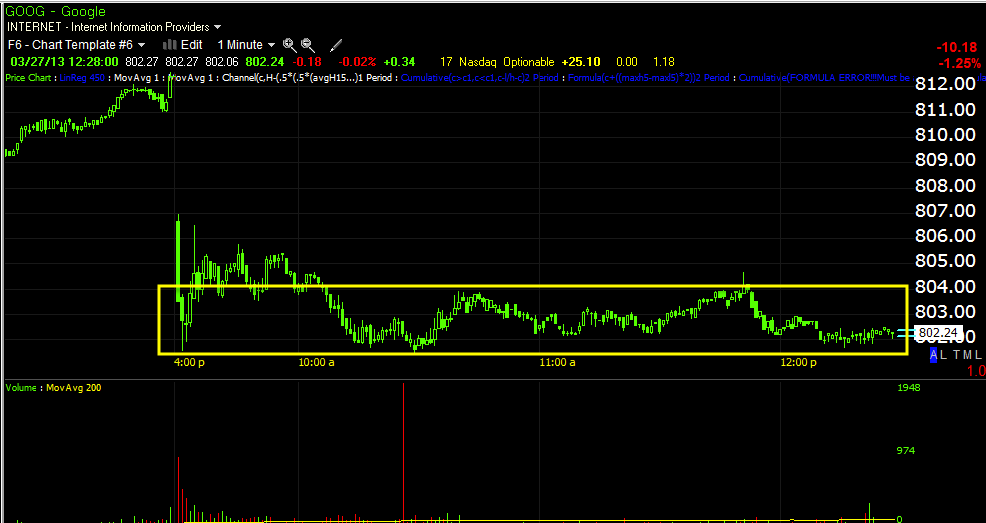
Here are the GOOG charts, but I'm not drawing on them, I'm going to let you look at how 3C moves where it should (before reversals) and moves in line or confirmation with price and to the right you should be able to see on your own where something is standing out.

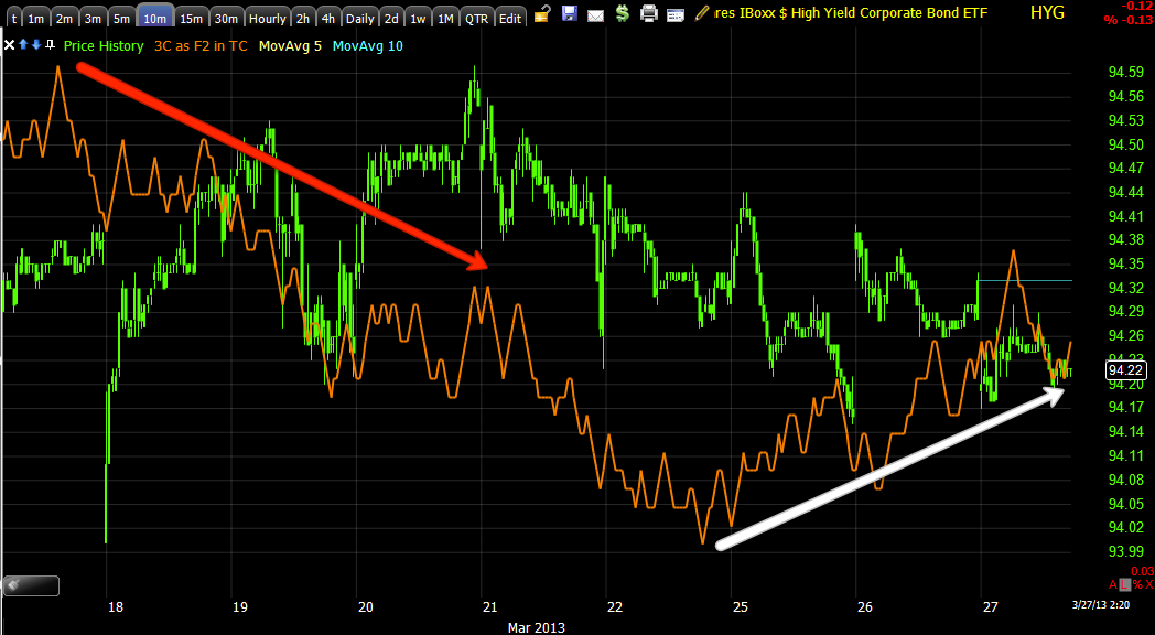
The other comment is that this is not long term accumulation, it usually takes a little while before accumulation signals show up on a 30 min chart, it's a process, but in this case it's very immediate which would mean that the buying would have been very sudden and very large for a normal day, but not large enough that it threatens the longer term puts because you simply can't accumulate that much in a day without sending price rocketing higher. It looks to me like a large trading position was picked up and that it will be dumped pretty fast as well.

Enjoy...
 2 min chart-again the longer view so you can see how 3C moves with price and where something is out of place to the far right of the chart, where we live.

 Close up of 2 min chart

 10 min chart

 close up of 10 min chart

 15 min chart

 close up of 15 min chart

 This is the one that did it for me-30 min chart

Close up of 30 min chart.

Now as I said before, a divergence that big in 1 day means there was a lot o activity and there was a flat range for it to happen in. The thing is, the longer the timeframe, the larger the underlying flows of money we are looking at so a 10 min chart is way more important than a 2 min chart, a 30 min chart in a day is something spectacular. I never skip over signals this strong unless I can explain it away.


GOOG

It's going to take several minutes for the Screen capture software to reboot. In any case, you know I've been expecting a short term move p in GOOG. The support level at $801.47 was taken out this afternoon on a hammer candle and about double the average volume, not a huge spike, but it was there.

What tipped me is the fact the 10, 15 and especially 30 min charts went leading positive late today for the most part, the 30 min was incredible. Usually a divergence on a 30 min chart is a longer term affair, this was a single day or afternoon, which tells me a big position was bought quickly, but no where near big enough to be a threat to the puts, just enough for a quick ride up.

I'll show you ASAP.


GOOG April 13 $800 Call

Somehow I ended up with April 13th at $9.00, that's not what I wanted, but that's what I have, I wanted April 5th.

Charts coming. This is a really quick trade idea

Opening GOOG $800 Call/ April 5th Expiration

I know with the put it doesn't make sense, I see this as a short, very short term opportunity.

This is VERY speculative.

Charts coming.

AMZN- Trading With Wall Street

I believe that's exactly what happened today when we closed our AMZN Calls. As you know because I didn't fill out the AMZN short, but added to it, I think we have a little more upside to go because Wall Street has to sell in smaller chunks over a longer period of time and I believe that we were on the same page today.

 Remember our target at the gap in yellow? For an options position, momentum is sometimes more important than higher prices if the higher prices take a longer time and have less momentum, this is one of the tricks that turned my options trading around, respecting time decay.

 Here's the 1 min chart and when it lost 3C momentum, but when price loses momentum there's no reason for me to hold this asset any longer, it's losing $ on time decay and presents open market risk I don't need to be taking.

 The 5 min chart is showing signs of distribution picking up as we move higher, this is NORMAL institutional distribution.

Note they accumulate at the lows and the sell in to the highs, they don't buy breakouts, they are in long before then and they don't sell at the top, they sell in to the top.

 This 10 min chart seeing such a drastic drop today right as momentum died tells me Wall St. was selling at that same moment, maybe not everything, but a decent chunk to show up here.

 The 30 min chart has presented the cleanest trend so we know it's still alive, but this is also slower to respond and higher prices may not be worth the momentum we were able to sell in to.

Ultimately the daily chart is the scary one and gives credibility to what looks like a H&S top at the end of the 2009 run.

CORRECTION-NOT ES, TF

It wasn't ES, it's Russell 2000 futures. Maybe there is a trade.

Horrified

I'm absolutely horrified to look at ES 1 min, it is so negative I'd almost short the SPY if we didn't have the quarter's end

Futures

The Euro looks like it may get some upside support shortly, perhaps this is finally it.

 EUR/USD futures 1 min suddenly strong leading positive divergence out of nowhere.

 ES 1 min doesn't look good here, but it can hold on if it gets some support and drafts stronger averages like the Q's

 ES 5 min isn't at a high probability option short/Put, but it could be without too much trouble.

 NQ 1 min is very strong right now, if AAPL kicks in, it will be even better.

 The 5 min shows a good put position to the middle of the chart, not there yet, but again it doesn't take much or long.

Russell 2000 Futures don't look good here, they started off good, but haven't held up well on the 3C chart.

A Few things I don't like

I haven't even gone in to the 3C charts, one of the basic ideas is that most traders are not going to want to hold risk over a 3 day weekend as the market is closed Friday so if they are going to get the SPX thing done before quarter's end, it's now or never.

Here are a few of the things that bother me...

 Commodities are doing better than they should be again today.

 Commodities vs. the US dollar, this is a completely flipped correlation, it's normally the opposite,

 Apparently again oil is leading commodities, I believe this has to do with Cyprus/Russia and the EU.


 CONTEXT looks horrible with a more than 18 point negative differential and it's no wonder...

 SPY Arb so far hasn't seen any levers kick in. Maybe there's some short term accumulation, but the differential is getting wider.


 HYG is not being used as a lever

 Here's today

 3C 2 min suggests we will see some movement in HYG to the upside

 So does the 10 min chart, I think this could be the last stand for new highs on the SPX.

 TLT 3 min is seeing a little distribution, but the flight to safety trade I've been telling you is happening is now seeing movement

 VIX intraday as a lever is being used a little as the market has responded to the negative divergence this afternoon, not much beyond this though to help the market.

 Look at the drop in Yields, FLIGH TO SAFETY!!!!

 Not only were last week's lows taken out, but a low that goes back more than a month, this is pure Flight to safety.


 The Euro longer term is providing no support, this market is in trouble, don't think this chart is a mistake or anomaly.

 Intraday the Euro is of very little help

 The market is still fighting though even against the $USD

 AAPL's 15 min chart is why I wouldn't hang around long.

The 2 hour chart says something may be brewing, something bigger, but AAPL is not ready for it yet.

AAPL Update

I'm finishing another post, but I wanted to get this out. AAPL is seeing recent improvement and it's pretty strong considering how fast it developed.

 2 min is flying

 Huge gains in the 3 min today

 Even the 5 min has substantial gains for the time period

Now 10 min is seeing migration. I think AAPL goes, but I wouldn't hang around long.

AMZN Equity Short

I had originally closed half of a full position equity short in AMZN when I went with the calls looking for higher prices to add back to AMZN, so the 50 % I cut I intended on adding back at higher prices.

I'm going to add half of that 50% now and wait on the remaining 25% to complete the full position size.

There are simple quite a few things in the market I really don't like the look of and I did what I set out to do, cover some AMZN at a profit and add it back at better prices.

GOOG Full Update

We have GOOG April Puts open as well as a longer term equity short position.

In the very near term GOOG isn't too dissimilar from AAPL or AMZN, at least in the approach and concept, "Let the trade come to you", which is mostly for those who want to add or start a new position.

Here's what GOOG looks like from top to bottom. I must warn you, some of the longer term charts are graphic and not meant for GOOG long's eyes.  In fact some of the longer term charts are so disconnected from the trend that you might doubt them, understand this though, I have applied 3C to just about every bull and bear market of the last century and 1929 wasn't the surprise that most think it was, the charts were really ugly before the Black day hit. I have seen what the homebuilders looked like in 2000 while the Tech bubble was blowing up and spurting semiconductors all over the place, there was a staggering amount of accumulation and back then when Juniper or Cienna was all anyone would talk about, a rally in the home-builders and housing prices leading the next bull market seemed about as far from reality as you could possibly get, but smart money knew several years in advance and made well over 2500% so as unbelievable as some of these GOOG charts may look, I'll just remind you that people were dismissive of the negative AAPL charts as it hit $700 and the overall market when it had a larger negative divergence as QE3 was announced (we got 1.5 days of rally and then dropped from Sept. 14th to November 16th-no one wanted to believe that either, 'Don't fight the F_E_D". I'm just saying, I've seen these extremes and they don't look reasonable or even possible and it turns out, most of the time, they are!

 GOOG's trend line has been broken, I've been expecting a "volatility shakeout" which would send GOOG back above the trendline, that's what most Technical traders/shorts will be watching and that's where they'd be shaken out. We're also below the first and smaller head fake level, the larger one is below around $775.

Today's trade has thus far held up above support at $801.47, but only by $.03 cents as the low has been a very round $801.50, I believe the $801.47 support area will likely be broken before GOOG even considers a run higher, it should also bring some decent volume in, if it does, then you know the shake out of the stops worked and shares would likely be accumulated (we'd have to wait for the event and check the charts) as there would be lots of supply at relatively cheap levels considering the locality.

This is the basic fuel that jump starts a move to the upside, the short covering is like the second stage booster rocket, Wall Street has to do very little at that point as "Escape velocity is reached, they can sit back and spoon out short term accumulated shares in to higher prices and demand until they are out and the rocket falls back to earth. We want to add or initiate just as the rocket loses upside momentum and just before it turns nose down.

 In Yellow we have a beautiful example of a head fake move or a failed breakout, it lifted above local resistance bringing buyers in who are chasing price and at the same moment Wall St. is distributing in to the demand from retail, you can see this is a microcosm of what we re looking for as described above with the rocket analogy.

Note volume today as morning lows were broken.

 Here it is, but there's a very flat, tight range, I'd suspect accumulation based on price action alone.

 Longer term or highest probabilities, my Demark inspired "Buy/Sell" indicator gave 4 signals, buy at 2009 lows, sell at 2010 highs, again at 2012 highs and right now. I think its only fair to recognize the track record here is pretty darn good.

 This is the daily Money Stream chart, I show it because it's a totally different indicator than 3C and it is showing an extreme of distribution throughout the last year.

 My X-Over system to avoid false price moving average crossovers (otherwise known as whipsaws) is now giving 2 of 3 signals, the 3rd is very close.

 Short term here's the 1 min chart during the very flat intraday range mentioned above, so this fits with expectations.

 2 min chart

 5 min chart- all fit with short term expectations.

 The 15 min chart is leading negative, but has a less powerful, but still meaningful positive divergence within it, I could say this is like a counter trend bounce.

 The 60 min chart is leading to a new low

 The 4 hour chart that has confirmed the GOOG trend for a couple of years at least shows a much stronger negative divergence than ever seen on this timeframe.

 This is the difficult chart, the long term daily where I use to do all of my trading from when I first created 3C. We have the 2007 distribution, 2009 accumulation, small distribution at 2009, small accumulation at 2010 as well as the same at 2011, in to 2012, things change dramatically for GOOG.

This is a bad leading negative divergence, but I've seen worse completed with price moving as suggested.