From last night's Daily Wrap,
"Finally, internals...
The Dominant Price/Volume Relationship wasn't great and as usual didn't include the Russell 200, but it had 12 Dow stocks, 52 NDX 1000 and 231 SPX 500, they were all Close Down/Volume Down. Other than being the thematic relationship during a bear market, this is the relationship with the least next day influence, I have nick-named it, "Carry on" as in keep doing what you were doing as it doesn't have a strong oversold or overbought bias, allowing the market to carry on in the trend it is usually in, however that trend is just about flat right now so it's not of much use."
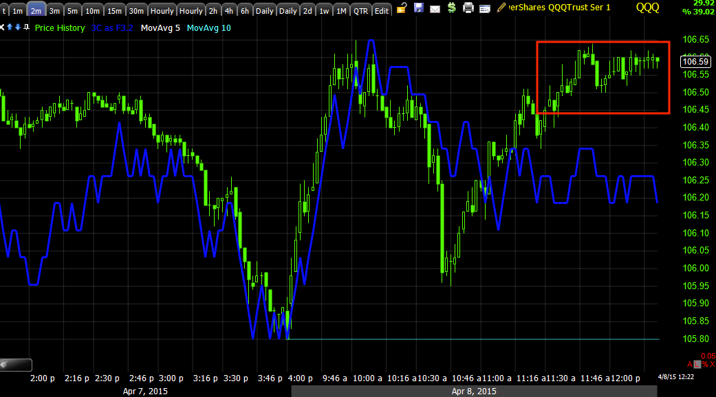
Although we closed higher in the major averages, take a look at price action compared to yesterday's price trend and daily range...


And the Russell 2000 is about the same.
Despite the percentage gain on the day, in terms of where the market has been the last 2 days, it's not very different at all, meaning last night's analysis of the Dominant Price/Volume Relationship which said that the relationship typically means "Carry on doing what the market was doing", which I thought was useless last night, actually held meaning.
The larger point is that volume analysis, whether the Dominant P/V relationship or that of intraday or Primary trends is taking on a new importance , one that it once had before central bank intervention and one that most traders have either long forgotten, don't care about or never learned.
Beyond that, the F_O_M_C minutes from the last meeting came in mixed with some believing they were slightly more dovish, some that they were slightly more hawkish. The minutes will say something like "A few members thought June rate hikes were the right time", but they will not identify who the F_O_M_C members are or the real count of how many a "Few" means. In any case, that was a mixed bag and I don't think the minutes revealed anything that wasn't already out there and with the added aft-knowledge of the horrible jobs report on Friday, I suspect most traders would have taken them much more bullishly than they seemed to which as I stated earlier I believe was because Bill Dudley (F_E_D member) came out pre-minutes release this morning and essentially said that the Friday NFP jobs report was short term noise and inferred that it would not influence the decision about rate hikes.
We did find out what had already been hinted at, that the F_E_D is more or less terrified of a strong dollar and for the exact reasons we surmised, that it would hurt US exports and thus the economy.
Although we knew that the global economy was a concern, I think a slightly finer point was put on that concern directly mentioning Greece and China which is in the midst of its own stock market bubble. There was additional concern about what foreign central banks might do, some may have been calmed with the Bank of Japan's 8:1 vote to leave QE as it is and not increase it, but on the other hand they didn't decrease it either. From my perspective, this seems like a somewhat silly concern, one that they have no control over and the kind of concern that you generally have AFTER you've made a decision and are worrying about the consequences. I think the F_E_D for all of their Green-speak, have been rather transparent. The conclusion of QE3 was debated at each meeting, but ultimately came right on schedule as the market had expected at the end of last October.
The F_O_M_C removed the "Patient" language at the last meeting for a reason, it was to give themselves the ability or elbow room to hike rates as soon as they want. This was not done because of soaring inflation or an extremely robust job market or economy so in my view it still feels like theoretically they shouldn't tighten policy right now (although I don't believe we should be sitting at ZIRP as long as we have and shouldn't be there at all right now) and they probably feel that, but I do believe there is something else that they are far more concerned about that may compel them to act and chose the lesser of two evils.
I could speculate all day long as to what that was and maybe even hit it on the head, but with the conviction that I have with regard to this subject, I don't think jobs or inflation data are going to matter when it comes time to hike rates as economists give all of the reasons why the F_E_D will do this or that based on those realities. The F_E_D built in ambiguity, first by changing forward guidance which had always been Quantitatively based (time/dates) to Qualitative Guidance (incoming data) and then they lowered the bar for Qualitative guidance by saying they would hike rates even if their objectives had not been met, so long as they "FEEL REASONABLY CONFIDENT" that the objectives will be met. YOU DON'T REALLY GET ANYMORE AMBIGUOUS THAN THAT.
Even Dudley's comments this morning about the March jobs data and how he essentially chalked them up to statical noise argues for the above positioning of the F_E_D in which they can hike rates at any time as long as they use the very subjective and probably misleading and or untruthful, "We feel that ..." something will happen. In other words, even when moving to data that the market can clearly see and interpret , they've left themselves an escape clause to do whatever they want as long as they let us know that they "Feel" inflation will move toward their target, theoretically, even if we are in a deflationary environment !
I appologize for the rant, but I have been paying attention to what the F_E_D has been saying and doing and so far they have done exactly what they've said, QE3 is GONE, tightening is on its way. I wouldn't offer these opinions if I didn't find there to be some value in the actions and comments the F_E_D has made that seem to make their true intentions fairly easy to predict, even if we don't exactly agree with it or understand what is truly motivating them.
Moving on...
As you know my triangle based/pinching volatility breakout/head fake move (false/failed breakout) forecast not only depends on the move which so far we have only really seen Monday, but depends on the 3C charts for the averages deteriorating...CHECK! The 3C charts for my watchlist of stocks deteriorating...(See NFLX as an example today)...CHECK... and both Index futures and Leading Indicators deteriorating... This is where we haven't seen that much movement yet, but the 3C charts of HYG which is a leading indicator has softened considerably in the short term for this week and is already very bearishly displaced from the market in terms of the primary trend or what we'd normally call a bull or bear market.

On a primary trend basis, High Yield Corporate Credit is pretty much already in a bear market. The Wall Street maxim is, "Credit leads, stocks follow" and this is one of the most liquid and also one of the most short term manipulated credit assets out there.
When I use to teach Dow Theory "Trend Classification", a hard subject, I had a system using moving averages that was always pretty close to the Dow classifications and a downward slopping 200-day moving average such as the one above with price under it was classified as a Primary downtrend or a bear market. We'll come back to Leading Indicators.
As for Index futures, last week their charts in the 7-15 minute timeframes were supportive of the move up expected this week, those are the charts I also want to see deteriorate and they will do that a lot faster than the market averages (SPY, QQQ, etc.), but as of right now, they haven't made that move which is why I still believe we have more upside to go this week which really hasn't moved very much at all.

This is not a matter of, "I have faith", this is a matter of OBJECTIVE EVIDENCE.


And remember the weaker IWM 15 min chart that was not positive like the SPY, QQQ or DIA?

This is the Russell 2000 futures 60 min chart and note how it looks different, much weaker than the ES or NQ 60 min charts above and confirming what we are seeing in the averages... This is a leading negative divegrence, highest probability of all these Index future charts as far as the resolution of their move (head fake/false breakout) goes.
I also saw some initial evidence that the $USD which has been strong even this week is likely to make a move lower, at least initial signals are building in that direction...

$USD 7 min negative.
It looks like the Euro and Yen will both gain against the $USD, I wonder what the catalyst will be, but don't forget, this is the bigger picture, the carry trades, the F_E_D and rate hikes, keep your eye on the $USD and you have your eye on the ball.
As for the other set of indications, Leading Indicators...
Today the Spot VIX which I mentioned last night as coiling up in a triangle below its 50-day moving average was in line with the market while VXX (Short term VIX futures was a bit weaker, I suspect VXX is being accumulated and buying low is buying best, see VXX charts that have been posted, they have had strong positive divergences this week and overall on a larger basis for the year. I suspect another reason VXX was weaker intraday, especially toward the close was the fact that the Dow and SPX almost didn't close green and needed a helping hand.

These are the averages for the day, the SPX (green) and Dow (white) nearly closed red and it's more likely than not that VIX was whacked (especially VXX as part of the SPY Arbitrage) to keep them in the green. Transports in salmon which have been very weak or recent closed at the highs of the day and at the release of the minutes, it looks like there was a shakeout move down and then up, but no knee jerk reaction.
HY credit short term which has supported the market and I'll show you how as it is one of our best early warning indicators, especially 3C divergences before price even moves, needs to fail and diverge short term for the longer term dislocation to pull the market lower.
Remember that HY Credit and stocks are both risk assets, it's just smart money trades HY Credit whereas dumb money doesn't. Theoretically they should move together in a rally, when they don't, smart money is doing something different. Thus the saying, "Credit leads, stocks follow" as I'll demonstrate.


On a primary trend (6 hour chart) basis, HYG was in line at the green arrow and moving with the market, smart money was on board, then at the red area HYG makes a series of lower highs and lower lows which is also called a downtrend and in this case, a primary downtrend, just like the 200-day moving average of HYG I showed you above. Remember, "Credit leads, stocks follow", smart money has left town and is not buying risk, they are SELLING IT!
Our other Leading Indicators are starting to come around for the week like our Pro sentiment...

Note the indicator (blue) vs the SPX today is not only trending down, it was negative at the release of the minutes today and ended the day at the lows. These are the kinds of signals that are on the checklist we need to see not only occur, but show large divergences for timing of this move.
Although we had a strong 10-year auction today and saw significant yield curve flattening (bearish, has happened before just about every recession since WWII) right now they didn't have much of a leading indication today or for the week yet, these are some other assets we need to see move.
Commodities fell off as one of our leading indicators today, this was obviously largely due to oil's increase at the 10:30 EIA petroleum report with another record 13 consecutive week, build as we posted earlier this week in believing oil was ready for its pullback.


USO in orange vs the major averages dwarfed them at a 5+% loss, but note where both saw declines, first at the 10:30 EIA oil inventories and then at the 2 pm Minutes. Note the market's correlation at these areas? Since Qe3 ended, commodities which are also a risk asset have been acting like the leading indicator they once were, disrupted by QE.
Tuesday's analysis finally suggesting a pullback in oil as the last week or so it has seen strong confirmation can be found here, USO Update, and today's updated analysis with a possible trade set up can be found here, USO Update and F_E_D Minutes.
Gold also pulled back today as we have been expecting on a swing trade lower,
 I suspect we get a little intraday bounce from the pullback that started at Tuesday's open , but should be much larger heading toward the lower end of this range on a swing basis. A little bounce intraday could be a nice opportunity for anyone looking to get involved in a swing trade with GLD, although remember our longer term analysis suggests we may be moving toward a Gold uptrend on an Intermediate or Primary trend.
In my opinion, we are not quite where we are suppose to go for the week and then resolve to the downside, even our very effective SPX:RUT Ratio indicator is pointing toward a better upside move...
 Note the indicator in red led the market with a positive dislocation last week for this week's forecast of a breakout from pinching volatility. Then the last 2 days it has declined and the market has done literally nothing these past 2 days. Today it is leading positive again suggesting our move, which I expected to be quite a bit larger by now, should continue or at least do better than we have seen before resolving to the downside. However, this is not an especially strong signal today.
As for internals today...
The Dominant Price/Volume Relationship Finally includes the Russell 2k after over a month of it strangely missing.
The dominance today was strong, 15 Dow stocks, 55 NDX100 stocks, 817 Russell 2000 stocks and 204 SPX 500 (of the 4 possible relationships). All were Close Up / Volume Down. THIS IS THE MOST BEARISH RELATIONSHIP OF THE 4. Often this will lead to the end of a move and a move lower the next day, it's the market's upside running out of steam (via volume) and bearish any way you cut it, even if the averages are up 2% each tomorrow, this is EXACTLY what we want to see in the process of a bounce out of the triangle volatility pinch.
As for Sector Performance...
Seven of nine closed green, approaching an overbought condition which would fit nicely with the Dominant Price/Volume Relationship, it's really exactly where I'd like to see it if we only had a little more upside in the actual price trend given the 3C charts in the averages, the developments in Index Futures starting on 30/60 min charts and some of the Leading Indicators starting to move.
As for the Morningstar Industry groups,
There were 182 of 238 groups in the green, again along the lines of the S&P sectors and not quite at an overbought level on weak internals, but very close and moving that way. I suspect that we'll finish this cycle out by the end of the week and have the timing signals to enter various positions including assets like NFLX, GPRO, AAPL, Transports, and many others at better entry points, lower risk and strong timing signals, to the point they should even be well set up for option trades which I always look for the very best timing possible.
The VIX continues to coil and build energy under its 50-day while VXX shows a strong leading positive divergence and a bottoming like formation.
Overall I'd say the market is a bit weaker so far than expected for the week's forecast from last Thursday, the distribution is much heavier than expected at this point and the other indicators are starting to turn right on cue, it's really up to the market to give us a decent pop we can use to enter positions at a better area, take GPRO for example or Transports, they have great looking longer term charts, but in the near term, tactically we want to enter at the best price and lowest risk as well as best timing.
Finally, as for Index futures tonight...
The EUR/USd looks like it's getting ready to make an attempt to move higher, partly on $USD weakness that is developing mentioned earlier.
 EUR/USD 1 min leading positive divegrence.
 $USD 1 min leading negative divegrence.
There are also some weaker signals that USDJPY may be headed for some downside. There are some stronger signals that also back this up in the $USD , Euro and Yen futures, although I'd call it either a short term move or perhaps early indications of a stronger move, we'll obviously know more as the charts continue to develop, but right now my money would be in some overnight EUR/USD upside and $USD weakness.
I already touched on the broad strokes of gold as ongoing analysis and expected swing trade trend, I'll likely put out a more comprehensive Gold/Miners update tomorrow if we get some of the intraday strength I suspect that can be used to enter a position if you would like to and haven't already.
I've already gone over Oil expectations starting with the posts linked above from earlier in the week before the fall as well as this morning's A.M. Update with futures charts showing the probable USO/oil decline and this afternoon's follow up in which a position may still be had on an intraday bounce for USO short Swing trade...USO Update and F_E_D Minutes
The Oil (Brent) Futures chart looks like this (an update since the same chart was posted this morning before the EIA inventory build sending oil lower as anticipated...
 CL / Brent Crude futures 30 min updated chart.
As for Index futures, I did post an intraday chart above, although that was a bit ago as it usually take me a couple of hours to get this post together, since...there hasn't been any improvement, in fact they look worse going in to the overnight session.
 ES leading negative since the cash close, perhaps on Alcoa's earnings as they kick off the earning's season and Wall St. is in a dour mood over earnings' expectations?
 NQ 1 min (NASDAQ 100 futures) also looking worse since the cash market close at 16:00
 And TF (Russell 2000 futures) leading negative since the close.
I'm hoping the 5 minute charts don't go too negative overnight or else our 7-15 min charts will fall quickly as the 30/60 min Index futures above are already telegraphing that this won't end well, but we knew that as of last week when forecasting the volatility-pinched induced bounce.
I suspect this is likely a reflection of the mood toward the US earning's season as Alcoa (AA) did beat EPS consensus, but missed on revenues and saw annual sales declines across 3 of its 4 revenue streams, not a good sign despite the head line EPS beat. Additionally, while it's beyond the scope of this post, Alcoa resorted to some accounting gimmicks to even get where they did on earnings, if this is a harbinger of things to come, well you can see what the market's reaction was...
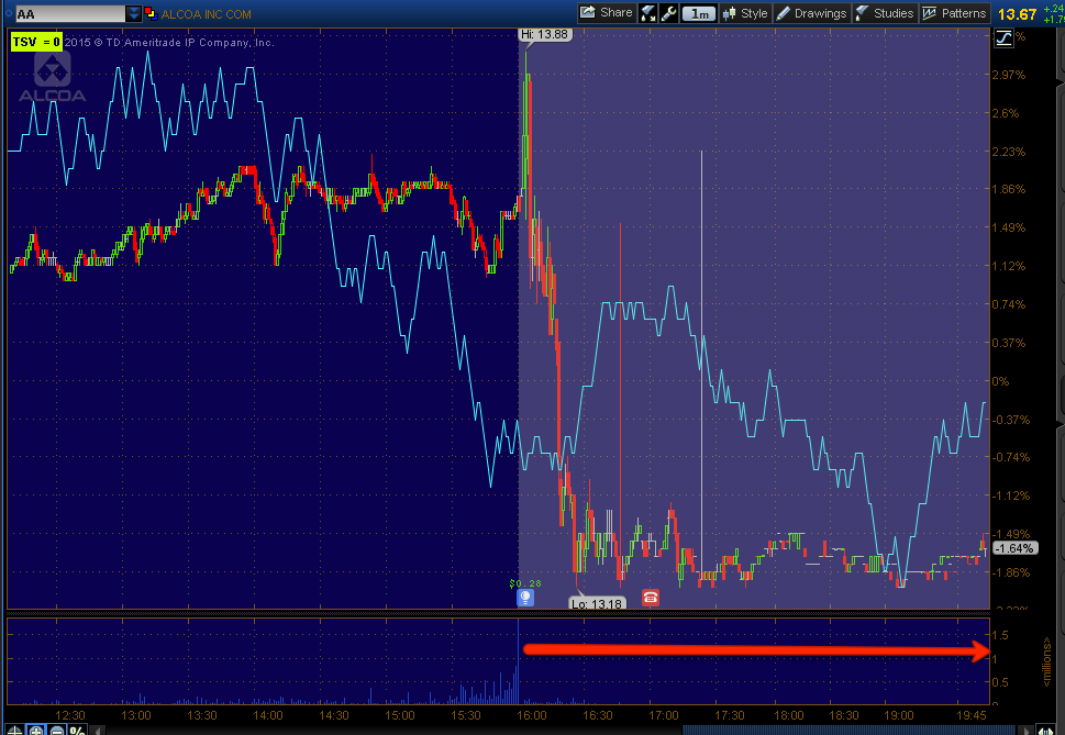 Alcoa (AA) regular hours and after hours as they report earnings.
The market is going to see all kinds of accounting gimmicks, share buybacks one of the popular ones, but Wall St. is a bit smarter and is not about what you did or what you manipulated your books to look like you did, it's about what you'll do next quarter or over the next year, PERCEPTIONS and the perception towards Alcoa is not a healthy one judging by the AH earnings reaction.
And AA is a bellwether for the global economy as aluminum is used in just about everything the world economy generates, not a good sign for the global economy and not for the market.
That will do it for now, as always I'll check futures before turning in for the night and let you know if anything has changed materially that we need to prepare for, otherwise, it's just a little patience and I do mean a LITTLE and we'll have the best shot at trade set ups we can get other than what we've already entered like NFLX at post-earning's highs, exact highs to the day.
Have a GREAT night!
Tuesday's analysis finally suggesting a pullback in oil as the last week or so it has seen strong confirmation can be found here, USO Update, and today's updated analysis with a possible trade set up can be found here, USO Update and F_E_D Minutes.
Gold also pulled back today as we have been expecting on a swing trade lower,
In my opinion, we are not quite where we are suppose to go for the week and then resolve to the downside, even our very effective SPX:RUT Ratio indicator is pointing toward a better upside move...
As for internals today...
The Dominant Price/Volume Relationship Finally includes the Russell 2k after over a month of it strangely missing.
The dominance today was strong, 15 Dow stocks, 55 NDX100 stocks, 817 Russell 2000 stocks and 204 SPX 500 (of the 4 possible relationships). All were Close Up / Volume Down. THIS IS THE MOST BEARISH RELATIONSHIP OF THE 4. Often this will lead to the end of a move and a move lower the next day, it's the market's upside running out of steam (via volume) and bearish any way you cut it, even if the averages are up 2% each tomorrow, this is EXACTLY what we want to see in the process of a bounce out of the triangle volatility pinch.
As for Sector Performance...
Seven of nine closed green, approaching an overbought condition which would fit nicely with the Dominant Price/Volume Relationship, it's really exactly where I'd like to see it if we only had a little more upside in the actual price trend given the 3C charts in the averages, the developments in Index Futures starting on 30/60 min charts and some of the Leading Indicators starting to move.
As for the Morningstar Industry groups,
There were 182 of 238 groups in the green, again along the lines of the S&P sectors and not quite at an overbought level on weak internals, but very close and moving that way. I suspect that we'll finish this cycle out by the end of the week and have the timing signals to enter various positions including assets like NFLX, GPRO, AAPL, Transports, and many others at better entry points, lower risk and strong timing signals, to the point they should even be well set up for option trades which I always look for the very best timing possible.
The VIX continues to coil and build energy under its 50-day while VXX shows a strong leading positive divergence and a bottoming like formation.
Overall I'd say the market is a bit weaker so far than expected for the week's forecast from last Thursday, the distribution is much heavier than expected at this point and the other indicators are starting to turn right on cue, it's really up to the market to give us a decent pop we can use to enter positions at a better area, take GPRO for example or Transports, they have great looking longer term charts, but in the near term, tactically we want to enter at the best price and lowest risk as well as best timing.
Finally, as for Index futures tonight...
The EUR/USd looks like it's getting ready to make an attempt to move higher, partly on $USD weakness that is developing mentioned earlier.
There are also some weaker signals that USDJPY may be headed for some downside. There are some stronger signals that also back this up in the $USD , Euro and Yen futures, although I'd call it either a short term move or perhaps early indications of a stronger move, we'll obviously know more as the charts continue to develop, but right now my money would be in some overnight EUR/USD upside and $USD weakness.
I already touched on the broad strokes of gold as ongoing analysis and expected swing trade trend, I'll likely put out a more comprehensive Gold/Miners update tomorrow if we get some of the intraday strength I suspect that can be used to enter a position if you would like to and haven't already.
I've already gone over Oil expectations starting with the posts linked above from earlier in the week before the fall as well as this morning's A.M. Update with futures charts showing the probable USO/oil decline and this afternoon's follow up in which a position may still be had on an intraday bounce for USO short Swing trade...USO Update and F_E_D Minutes
The Oil (Brent) Futures chart looks like this (an update since the same chart was posted this morning before the EIA inventory build sending oil lower as anticipated...
As for Index futures, I did post an intraday chart above, although that was a bit ago as it usually take me a couple of hours to get this post together, since...there hasn't been any improvement, in fact they look worse going in to the overnight session.
I'm hoping the 5 minute charts don't go too negative overnight or else our 7-15 min charts will fall quickly as the 30/60 min Index futures above are already telegraphing that this won't end well, but we knew that as of last week when forecasting the volatility-pinched induced bounce.
I suspect this is likely a reflection of the mood toward the US earning's season as Alcoa (AA) did beat EPS consensus, but missed on revenues and saw annual sales declines across 3 of its 4 revenue streams, not a good sign despite the head line EPS beat. Additionally, while it's beyond the scope of this post, Alcoa resorted to some accounting gimmicks to even get where they did on earnings, if this is a harbinger of things to come, well you can see what the market's reaction was...
The market is going to see all kinds of accounting gimmicks, share buybacks one of the popular ones, but Wall St. is a bit smarter and is not about what you did or what you manipulated your books to look like you did, it's about what you'll do next quarter or over the next year, PERCEPTIONS and the perception towards Alcoa is not a healthy one judging by the AH earnings reaction.
And AA is a bellwether for the global economy as aluminum is used in just about everything the world economy generates, not a good sign for the global economy and not for the market.
That will do it for now, as always I'll check futures before turning in for the night and let you know if anything has changed materially that we need to prepare for, otherwise, it's just a little patience and I do mean a LITTLE and we'll have the best shot at trade set ups we can get other than what we've already entered like NFLX at post-earning's highs, exact highs to the day.
Have a GREAT night!