I know you've had to wait for a bit and you may or may not get through this post, but I figured I'll put it out there.
Honestly I don't even know where to start. Today the averages (and interestingly we just talked about this last night) were dispersed with the Dow and SPX at -0.06% and 0% respectively, flat for all intents and purposes, the HDX was up +0.21% due to AAPL and the Composite was up +0.14% which again for all intents and purposes is less than 2/10ths of a percent. The standouts were the Russell 2000 which was down -0.21% and the Dow Transports which were up +0.40% as the clear winner.
In the Sub-Industry groups, "Music and Video Stores" were up +6% which was due to HAST up +21.46% and NFLX up +6.06% (also putting NFLX in the exact area I suspected Wall Street would need it along with numerous other stocks just a little bit away from that potential head fake area institutional money needs to move positions because of the size of their positions) and on the other end of Sub-Industry group performance, "Wholesale Building Materials" were down -2.39%.
Volume today was shoddy, ES was about 40% lower than average.
In fact I looked at my screen for
"Dominant Price/Volume Relationships". This looks at all of the component stocks of each major average and tells me whether there was a dominant theme in the average of four possibilities for each component stock: "Price Up/Volume Up, Price Up/Volume Down, Price Down/Volume Up and Price Down/Volume Down.
Today had a rare Dual Dominance that went like this:
SPX: Price Down/Volume Down=245 & Price Up/Volume Down= 179
DOW-30: Price Down/Volume Down=16 & Price Up/Volume Down=12
NASDAQ100: Price Up/Volume Down=59 & Price Down/Volume Down=37
Russell 2000: Price Down/Volume Down=842 & Price Up/Volume Down=563
In every case the dominant theme was volume down.
Price Down and Volume Down is the dominant theme in a bear market and doesn't carry any real bias, however among the 4 possibilities Price Up and Volume Down is the most BEARISH of all 4 possibilities, so today we had both, but I would not call today a dominant day other than low volume.
The carry driver today was clearly the AUD/JPY as JPY saw weakness since the open of trade last night for FX.
The AUD/JPY is in red/green candlesticks and ES/SPX futures are the purple line, not an exact correlation, but the closest of the 3 popular carry crosses.
While we're on
currencies, I took a look at the single currency futures...
The $AUD (30m) is losing some of the 3C backing, I'm not ready to say the $AUD is done on the upside, but clearly it's seeing distribution in the area and will likely start pulling back perhaps later this week.
The same could be said for the Euro, however it looks to me to have a little bit more sloppy of a trend with more weakness in place.
The Carry crosses did well for the most part today all things considered (how flat everything was) and that was almost entirely due to the Yen weakness since Friday which wasn't helped with last night's 15th consecutive trade deficit, however as this 30 min chart of the Yen shows, I believe this is a pullback like a bull flag and there's a substantially larger base that can be seen at the white arrow so Yen strength should douse the carry pairs as it starts to regain its footing. Also Yen strength is likely to send the Nikkei lower. I'm not sold on an imminent Nikkei move lower, but I do believe it's in that process as is evident on 30 min charts.

The $USD is interesting, it's either strong and helping stocks through a carry cross or it's showing some signs here and there of the opposite, the $USD Legacy Arbitrage when a weak dollar means equity, oil, commodity, and precious metal strength, who knows which way it will fall on any given day. I do believe there's a pullback coming, but I think it's constructive and will form a larger foot-print or base to sustain a larger upside move that hasn't started yet.
The 30 min and 15 min $USD charts were showing this positive divegrence, now it's out to the 60 min chart since Congress temporarily resolved the debt debacle. I'd expect the $USD to pullback near the area where it says (Lo) to form a stronger "W" like base.
As for Precious Metals...
I think Gold and Silver will be a little more similar than I had anticipated. The 30 min Gold Futures 3C chart above shows a decent base and what appears to be a pullback/consolidation at the red arrow, this is in line with
today's earlier analysis of gold and GDX.
Gold 5 min futures look like a pullback is in the works and I suspect the gap in GLD is the target area, see the linked post above for more on gold and gold miners.
SLV's 30 min chart is gappy, but it;s also a clear range if you step back, The positive divegrence here is similar to gold's. I think some of those gaps will be filled and silver/SLV will make just as good a long as Gold/GLD on a pullback, which we will confirm at the time as well.
The 15 min silver futures 3C chart shows a divergence that clearly looks like Silver ought to pullback soon.
I have some
Market Breadth charts I want to show you, some longer term, some near term.
*The following charts are all breadth indicators in green and compared to the SPX in red unless otherwise noted.
This is the percentage of stocks trading ABOVE their simple 40-day moving average (green) vs the SPX (red). As you can see the early trend from late last year was strong, breadth however topped out early in the year and continued to fall apart as the year went on, there has been recent improvement, but considering the SPX is just at all time new highs even with 76.5% of all stocks > their 40-day, that's not so great when compared to the 85% of all stocks back in January when you consider the SPX is about 17% higher.
The percentage of all stocks above their simple 200-day moving average saw a similar decline and went from 81% and as the SPX gained about +17% that has fallen to a current reading of 54%, just a little more than half, many people use the 200 and a stock's relationship to it to judge the primary trend, I'm not saying that is correct, but...
The percentage of stocks trading 1 standard deviation above their 200-day moving average fell from 65% to a current 42.6%
This shows the NASDAQ 100 A/D line vs the NDX in red, you can see there's some obvious deterioration in the Advance/Decline line.
I took a closer look at the NASDAQ 100's recent breadth...
This is the swing off the Oct. 9th lows to today on a 10-min chart, we are looking at
the percentage of 10-min 250 bar new highs. You can see it increases early in the trend as it should, but recently has fallen off and we are seeing fewer and fewer 10-min 250 bar new highs.
This is the same timeframe with the
percentage of NASDAQ 100 stocks above their 5-min 50 bar moving average, a popular intraday timeframe/average for trades, we can also see that falling off in to the 18th and continuing to deteriorate.
This is a
15 min advance/decline ratio for the NASDAQ 100, clearly the same trend is in place here as well.
Finally momentum for the NDX and a custom indicator for breadth, both falling off as well, this would be consistent with a topping process.
Leading Indicators...
*All leading indicators are compared to the SPX in green unless otherwise noted.
Commodities intraday have lost momentum, we use these because they often tend to lead the SPX.
This is a longer view of commodities vs the SPX on a 2 min chart showing the trend since the 10/9 lows,
you can see clearly commodities were leading the SPX at the lows and already trending higher before the SPX even bottomed, now we have the opposite as commodities are leading the SPX lower.
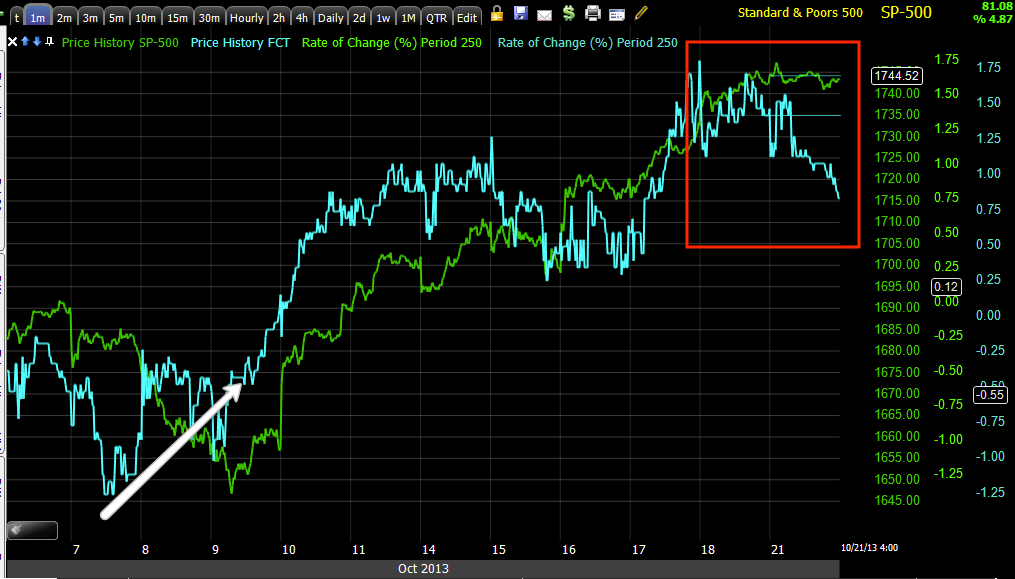
FCT is one of two assets we use to get a feel for professional sentiment, it's not correlated to any manipulation games like other assets and gives good signals most of the time with large signals being important. Since last Friday and especially through today, sentiment has not been as enthusiastic as the averages might have you believe.
In fact...
Here we can see a clear leading trend from FCT, leading the SPX at the 10/9 lows and also leading now to the downside.
The long term signal is what is really important and I said this way back then, "May 22nd will be looked back historically as a pivotal day". that's the day we had a
key 1-day reversal and sentiment has just deteriorated massively ever since, whereas before it was leading the SPX.
Our second asset used for the same purpose, HIO...
Shows intraday deterioration just like all the other indicators above including breadth and 3C across the board pretty much.
Long term sentiment here too fell off, it use to lead the SPX, but May 22nd really changed a lot of institutional views of risk.
This is VXX, short term VIX futures, I have inverted the SPX's price (green) so you can see how VXX has performed, the natural correlation would have the two moving in sync. Friday this is the first thing I saw, VXX starting to outperform the SPX and suspected hedges and protection via the VIX futures were being bid, you can see that outperformance continued today which may have something to do with tomorrow's BLS data dump.
However what really strikes me is VIX futures themselves. The last time this 15 min chart had a 3C divergence, it was negative going in to the VIX sell signal we had on 10/9 and the market bottom that accompanied it, since then this chart has been in line with price until Friday that is when the 3C indicator took off on a very strong leading positive divegrence (because of the timeframe) and it added to that today.
Yields as always are a great leading indicator (vs the SPX in green above), at some point the SPX reverts to yields, they tend to act like a magnet and pull equities toward them. You can see they give fantastic leading indications and the leading indication now is leading negative or SPX downside.
One of the most important, CREDIT, as they say, "Credit leads, stocks follow" because it's a much better informed market. I only have access to a few forms of high yield or risk on credit, this chart adds two more and you can see clearly...
Credit is not buying whatever it is equities are.
We saw this VERY clearly in the HYG negative divegrence from Friday and today as well as it is used to manipulate the market short term as the computers/algos read HY credit or HYG specifically being up as institutional money buying.
Here's HYG and others...
HYG fails to help the market attempt a late day EOD ramp and moves the opposite way.
The long term divergence in HY Credit is what's really important to the big picture, Credit is seeing something completely different than stocks and they aren't taking the chance.
As far as the near term HYG manipulation as it's an easy way to move the market by fooling the computers (VXX and TLT are used too), take a look at the 3C charts that were 1 and 5 min negative as of Friday...
Note that HYG was ready to go and supportive before the SPX ever hit it's 10/9 lows and VIX's sell signal on the same day. Also check out the recent action.
The 1 min HYG chart went negative very fast Friday, I even said it got my adrenaline going as it was so quick, something was going on.
The 5 min chart which was accumulated at the lows was also showing distribution Friday, but it added a lot more to 3C's leading negative divegrence today, this is where the divergence stopped.
Today the divergence was strong enough to migrate to the next two timeframes.
The 10 min chart
And now the 15 min chart are leading negative. At this rate HYG is going to be in full distribution and likely most of that short selling as distribution of longs is most likely done by now, it was a nice run up, they made some money, supported the market, but it looks like they're ready to make some money on the short side.
HY Credit also fell out today and is long term dislocated...
This is High Yield Credit which was also very supportive of the SPX before it bottomed, but recently it has been selling off.
This is what HY Credit looked like at the Oct. 9 lows, it was leading and supporting SPX/the market for a move higher, but that seems to be unwinding ever since Friday, actually a little earlier here.
Finally I'll just say for now that the 5 min charts in all of the Index futures are quite negative, they aren't looking good at all. I'll check them later tonight, but for now...
All of the 5 min Index futures look like this, 1 min doesn't hold overnight, but 5 min does.
Furthermore, for the utilitarian ,move I suspected this to be, I said yesterday these kinds of charts, which there are a lot of, don't surprise me, they represent selling in to higher prices, but aggressively, so keeping in mind the short term thread is dangling above...
This 60 min leading negative in ES Futures is not surprising at all, I had said the exact same thing about several other assets that looked the same. I never believed this move had anything to do with new highs, we aren't at quarter's end, I believed they had to do with setting up head fake moves, I said this before I had any evidence of it just by the sheer number of charts that were "That" close, then 3C started confirming, then the VIX sell signal and the rest is history,
which you can read here which I posted last night.
Tomorrow will be interesting as the BLS which has been shut down with the government will be releasing the employment report tomorrow so watch out for volatility, Remember earlier and near the EOD today I said I thought a head fake move was probable and in Financials (XLF's) case, I'd see if we get one to open a put position or maybe go long FAZ, perhaps tomorrow we could se that, whether intraday or on the day.
Either way, between all of the charts above and the BLS employment data at 8:30, I suspect it will be a volatile day which is great for setting up positions. I'd like to see a head fake move on the upside in Financials/market and see distribution in to that, if we get that, I'll add XLF puts or long FAZ or SKF and maybe add other positions as well.
I'll check in if futures act up, but I doubt they'll do much (just like today( in front of tomorrow's BLS report at 8:30 a.m.