SPY breaking below yesterday's lows, usually on a break of important support there's a test of the failed support, we'll see if that comes.
This illustrates both the fractal nature of the market (due to emotions) as well as the manipulation of long standing (100 year old) technical patterns that traders have grown so accustomed to, while Wall Street runs head fakes on these patterns as technical traders still haven't adjusted to Wall Street's games. So here's a head faked triangle on a small scale.
Here's a head faked triangle in the SPY on a larger scale, the trendline represents the apex of the triangle and where the move would be considered a false breakdown, another apparent head fake on a larger (fractal) scale.
The current bounce in my Trend Channel has broken through the stop out point and typically means a reversal s at hand. ADX also turned down from above 40 signaling the trend (up) is ending.
SPY 1 min thus far is in line confirming the downtrend.
The 2 min chart may not have caught up to the downside, but as it stands there's a slight positive divergence which would suggest an intraday bounce, maybe to test the broken support of yesterday's lows.
Longer term where we can reduce noise and see the longer term trend, the 30 min chart is now leading negative to the downside, so although we may see counter trend bounces, dead cat bounces, etc, 3C is signaling that the trend has changed, distribution has already happened and there's little to no underlying money flow support for the uptrend.
The hourly chart which is more important to the longer term trend looks just as bad.
The DIA has also broken yesterday's lows which would have been local support.
The trend channel is also signaling a break of the uptrend as well as ADX in the lower window.
The DIA 5 min chart is in line with the downtrend/confirmation .
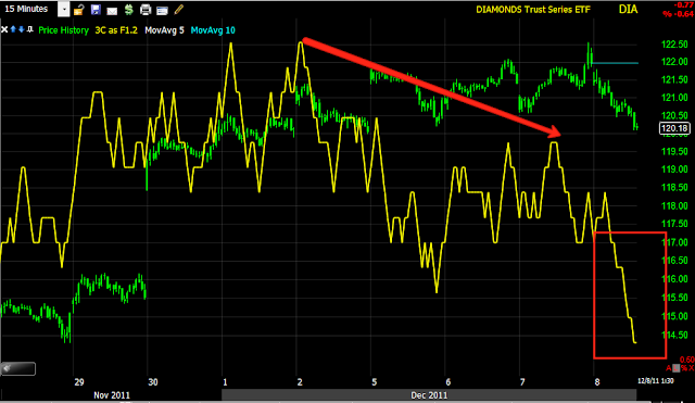
The 15 min chart which is an important transitional timeframe is now leading negative and pretty sharply as most of the leading divergence is from today alone, which is unusual to see this early on this timeframe.
The DIA 30 min chart looks really bad and leading negative.
The 60 min chart looks equally as bad.
As of this capture, only the QQQ is yet to break yesterday's lows, which may provide the market an area to stage an intraday countertrend bounce.
However the q's have broken below the trend channel stop out for a long position, usually signaling a change in trend.
The 5 min QQQ chart is inline, but also at an area of a relative positive divergence which could produce that possible intraday bounce mentioned.
The long term QQQ chart is horrible and this is a close zoom, the real positioning is below.
As you can see, there was accumulation for the October rally, but now we have a new leading divergence, my guess is this is the lowest reading for the entire year and well below the October lows.


