Monday, October 20, 2014

DAILY WRAP

Today wasn't all that interesting unless you look at a chart of ES's volume and whether it's trading above average or below average. From 10/9 through 10/16 ES volume was above average and every day it trended lower. Over the last 2-days ES volume has been below average and it obviously has trended higher.

The Dow closed at +.12%, under-performing the pack as Big Blue shaved -80 Dow points off the index on earnings. As I had said earlier, the NDX looked like the best performer as far as 3C went intraday and the NDX moved in a diagonal line with few ;pullbacks almost as if it was in a short squeeze, apparently in front of AAPL's earnings in which they came in right at the whisper number which was about $.15 above the consensus on $1.30 (actual $1.42). Rev beat, EPSe beat, sales of everything beat except Ipads which missed  at 12.3 mn vs 13 mn consensus. There was an additional $17bn in buybacks bringing the 2014 total to $45 bn vs fiscal 2013 at $22.9 bn in buybacks.

AAPL seemed like it was destined for the psychological $100 before earnings, closing just off at $99.76. One thing of note in one of the world's largest hedge funds you never heard of, AAPL's short term marketable investments (stocks/bonds, etc.) fell from $24.8 bn to $11.2 bn... Is AAPL calling a market top some wonder?

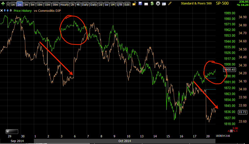
For ES's part, it was glued to EUR/JPY all day...
 ES (purple) vs EUR/JPY carry. However, how long can this hold?

This is the 1 min Euro (/6e) chart with a negative divergence right now and...

The 15 min Yen with a negative mid-last week leading it lower, but a positive building now which would send EUR/JPY lower.

T/he averages were mixed on the close as far as 3C charts intraday, but interestingly, not so much in Index futures.
 Es 1 min with a sharp negative divegrence in to the close and after hours...

NQ/NASDAQ 100 futures with the same

And the 5 min charts are still in bad shape, TF/Russell 2000 above...

As well as the 7 min charts as shown earlier, NQ/NASDAQ 100 Futures above and...

ES as already mentioned earlier, pointing to a near term pullback as forecasted for the early part of this week in Friday's "Week Ahead " post.

It looked like they were huffing and puffing all they could to get the SPX back up to its 200-day moving average, it fell short by a couple of points as it sits at $1906.39 and this on a BELOW AVERAGE VOLUME day in ES.
The Ultimate Oscillator in the middle window on the daily SPX chart, but note how close the SPX came to its 200-day after breaking below it last week.

Transports once again diverged from industrials today, up +.98%, but Big Blue , as mentioned, shaved 80 Dow points off on their miss. The NDX, as suspected by intraday 3C trade was the leader at +1.43%, Isn't it great to have volatility back? Remember just several months ago , weeks and months on end with nothing above or below +/- .50%?

I'm still looking and trying to decide whether to play a short term trade, it's a heck of a lot easier to keep your chips than it is to make them back. I'm sure you've hears this, but a 50% loss takes a 100% gain just to get back to break even so I'm cautious in what trades I take on at this point, especially shorter term.

bThe $USD was whacked lower by .4%, mission accomplished F_E_D as they jaw-boned it lower Draghi style last week with mentions of QE3 not ending too early although that statement was retracted in hours and an earlier, "Perhaps QE4", of course it's a;; jawboning the $USd lower and that's it. We could have saved them some trouble as we have been forecasting a $USD drop right in the midst of 12 consecutive weeks of gains.

$USDX 4 hour 3C chart/negative divegrence. This should benefit dollar denominated assets like oil and gold at some point as QE ends and we return to the legacy arbitrage relationship between $USD and dollar denominated assets.

Most of today's $USD weakness was on the back of $EUR and GBP strength.

As for leading indicators, other than what you've seen, not too much too interesting, of course the SPX/RUT Ratio and VIX term structure, calling for a short term pullback and higher prices followed by a new lower low.
The 1 min chart of the last several days as SPx/RUT ratio fails to confirm SPX prices and the VIX Term Structure falls out of inversion, but the buy signal is still active.

One of my other favorite leading indicators, yields which tend to pull prices to them like a magnet are leading the SPX lower here.

And the very spot on Commodity correlation of late vs the SPX also calling for a short term move lower...
Commodities in brown negatively diverging vs the SPX...

As for breadth indicators, the New High/New Low Ratio as well as the 4 week, 13 week and 26 week version are all higher, but other than that, nothing too surprising. As for NYSE stocks,  only 27% are above their 40-day moving average and only 37.46% are above their 200-day moving average...OUCH!

As for S&P sectors, 9 of 9 closed green today with Materials leading at +1.52% and Industrials lagging at +.29%. Of the 238 Morningstar groups we track a whopping 219 closed green. BOTH OF THESE ARE 1-DAY OVERBOUGHT INDICATIONS AND THE MARKET TYPICALLY CLOSES LOWER THE NEXT DAY AND OFTEN DAYS TO COME.

Adding salt to that one is the Dominant Price/Volume Relationship with 23 Dow stocks in the same category, 80 NASDAQ 100, 1001 Russell 2000 and 328 SPX-500, a VERY solid Dominant P/V relationship which was PRICE UP/VOLUME DOWN, the MOST BEARISH of the 4 possible relationships, ALSO often resulting in a 1-day overbought condition and a close lower the next day.

I'm not a big fan of 1 min Index Futures' charts over night, but with them as negative as they are right now with the 5 and 7 min charts negative and the VERY dominantly overbought (1-day) breadth conditions, tomorrow should be interesting and we may need to make some quick decisions as to whether it is worth making a fade/pullback trade.

We'll know soon enough!


USO Follow Up

This is the chart follow up to the late afternoon Trade Idea/Management (Options) USO post.

This idea was an add-to position to the initial super speculative, October 13th ("Funny Money") entry in a USO November 22nd $32 call or as a stand-alone new position.

Crude has been hammered horribly since June with WTI (West Texas Intermediate) which USO is based on (rather than BTO which is Brent Crude), down more than -20% since June,  however I don't like it because it's a falling knife or a contrarian trade, I like it because of objective data.

 "TO MAKE MONEY YOU HAVE TO SEE WHAT THE CROWD MISSED"

In this case, that can be as simple as looking at a 5-day candlestick chart. You'll notice a good majority of the bottoms in this wide, multi-year range are defined by bullish candlestick reversal patterns like 1) a bullish, "Harami/Doji Star"; 2) a long lower wick (similar to a hammer) candle followed by a huge bullish "Engulfing" candle; 3) a series of (3) bullish "Doji Stars" followed by a large "Bullish Engulfing " candle; 4) a "Tweezer Bottom/Bullish Engulfing Candle"; 5) currently a large lower wick, meaning lower prices have been tested and rejected and on huge volume, often indicative of a selling climax or capitulation, especially given lower prices were tested and failed to hold.

It can be as simple as that, but you have to look outside the box, seeing what everyone else sees can be an advantage, but not if you are doing what everyone else is doing.

 Again, like GLD's trend lines, note the downtrend line (which we draw by connecting the highs rather than the lows as we do with an uptrend line), and then note the increased DOWNSIDE ROC (Rate of Change", a "seemingly" super bearish event, however it is changes of character like this that lead to changes in trends. Taken with the exceptionally high volume and the daily candlesticks with the weekly rejection of lower prices, I'd say there's a good chance USO has experiences a capitulation/selling event.

 My custom DeMark inspired "Buy/Sell" indicator shows several sell areas in orange/red and a couple of buy areas in green, one of which we have right now in multiple timeframes.

 The early to react 60 minute X-Over Screen has gone from a solid confirmed sell signal and continuing trend to a price moving average buy signal with the custom indicator (middle window/yellow) also crossing over its blue 22-bar moving average giving a confirming buy signal and Wilder's RSI moving above 50 with the 3rd of 3 needed signals to give a confirmed buy signal so we can avoid false/whiplash signals that plague moving average cross-over systems.

 While the daily 3C chart is not positive, we can see the negative divegrence leading to the latest downtrend and a confirmation signal from 3C which is better than a leading negative signal.

 On a very strong 2-hour chart we can see the last accumulation zone  and keeping with our "Head-Fake" concept, we have a head fake/stop run at the last accumulation stage 1 area just before a reversal to the upside which is why we look for head fakes, for timing as well as excellent entries, especially for option positions like a call. 

We see the negative divegrence at a H&S-looking top area and a positive divegrence in to the downtrend as the increased ROC in price develops.

A 30 min chart shows a distribution period or small double top to the far left,  also note the HEAD FAKE move above resistance just before the top turns to stage 4 decline. 

The positive divegrence in to recent capitulation/selling climax is also notable. Large supply at cheap prices all at once, available to be accumulated without anyone really thinking twice about who is on the other end (buying) of the trade and why?

 We also have a very clear 10-min leading positive

a 5 min leading positive

And we have a reversal process that is fairly mature with several daily candlesticks showing Doji stars.

GLD Charts

These are the charts from the earlier GLD Put position post, Trade Idea (Options) GLD PUT

This is a pretty broad overview since we haven't really looked at gold in a bit broadly.

 This weekly chart has a lot of stuff on it, but from left to right: "A" is a nice trendline with expanding volume on the rise. Gold is often bought before inflation on inflation expectations. With the F_E_D's QE and the devaluation of money by printing more of it, inflation expectations were high and for a while input costs of commodities soared before they were brought under control around Operation Twist. This was also one of the first signs we had that there may be big trouble brewing in China's manufacturing sector, which it turned out, we were right on. 

At "B" the trend accelerated as gold could do no wrong and lord help the person who had anything negative to say about it. I had been noting distribution in to 2011 and had recently established a relationship with a fund manager who is also a pretty prolific blogger. When I mentioned that gold was under distribution and moving toward a large top, I don't think I have ever been so ostracized by a professional that should know not to fall in love with an asset, but gold was just that popular at the time. Even my friends who knew nothing about investing where buying up gold coins, one of them had bought several fakes as you could see the seam on the side of the coin where two halves (front and back) had been joined. Note volume at "B", it is no longer rising as it should in a healthy trend.

At "C" we see the increased "seemingly" bullish upside Rate of Change (ROC), as I had, "seemingly", this is almost always a warning that you are approaching a major top..."Changes in character lead to changes in trend.

We had been following gold and its relationship with the 150-day moving average and were looking to re-establish a pullback position when everything changed in 2011 and a large triangle top (remember this is a 5-day chart) formed. These large triangles are either tops or bottoms, depending on the preceding trend, in this case a top; they are way too large to be considered consolidation/continuation patterns like their smaller 1-2 week cousins.

At "D1" we saw a break below the triangle's apex drawing in sellers and short sellers, creating a lot of supply at cheap prices that was accumulated for a large Crazy Ivan which took place at "D2)  with a break above the triangle's apex, the area short sellers would have placed their stops, giving GLD upside momentum on a short squeeze and new longs chasing momentum, often seen as a precursor to a decline which we predicted in 2011 would be at least an Intermediate (Dow Theory) decline, it turns out it was that and then some with the second (real) momentum break at "E"  and then large volume as stops were hit en masse at "E2" which was straight line triangle support, thus stops, new shorts, etc. al lined up to create major supply.

At "F"  there's something some of you may recognize as a bearish descending triangle, a consolidation/continuation price pattern which after consolidating sideways, continues the preceding trend leading in to it which was down. However, once again this price pattern is way too large to be a consolidation pattern which are typically a few weeks to a few months at maximum, however most traders don't make the distinction and are likely looking at this as a bearish price pattern.


 This is a 1-day chart of GLD, you can see for years the 150-day moving average was a reliable pullback / buy area, until it wasn't.  The near parabolic upside ROC in price should have been the first warning to stay away from GLD's next pullback to the 150 as a long entry as things had changed.

 This is the current daily chart view, again this is way too large to be a consolidation/continuation pattern,  but Wall Street won't mind if you view it in this manner. I think the allure of technical analysis is laziness, not that I believe in fundamental analysis either, you can't come up with reliable data when all the input data is corrupt and even if it weren't, do you think you really have an edge over a multi-million dollar fundamentals department at a major like Goldman Sachs? If you don't know what your edge is, you don't have one or as Warren Buffet said (paraphrasing), "If within the first 5 minutes of a poker game you don't know who the dupe is that will be supplying the game's winnings, then it's you".

 My gut instinct tells me that this price pattern, whether intentional or random, will be used against traders so we have to determine how. I believe that GLD has been making a large base, GDX as well (Gold miners). One of the easiest ways to create upside breakout momentum above the large triangle is to use momentum which can be created cheaply with a head fake move rather than actually spending hundreds of millions in driving up the ask. One of the easiest ways to create upside momentum (And this is covered in "Understanding the Head Fake Move" part 1 and 2 which are always linked at the top right side of the members' site)is to run a head fake move BELOW obvious and major support, triggering numerous stops as well as drawing in short sellers; this creates enormous supply that can be bought on the cheap without attracting any attention and then with the skillful working of the bid/ask, spreading a few rumors, using cheap options to create a false bullish perception, all it takes from that point is a break back ABOVE former support/now resistance as all the new shorts will have their stops sitting right above the trendline, THUS I SUSPECT A DOWNSIDE MOVE THAT IS USED TO CREATE SLING SHOT MOMENTUM FIRST THROUGH A SHORT SQUEEZE, THEN FOLLOWED BY BUYING DEMAND ON THE STRENGTH OF THE MOVE IN THIS VOLATILE MARKET.

From there, a breakout above the triangle's resistance (diagonal , downward sloping line) would create a whole new herd of momentum chasers driving price even higher as the bid up a market in which supply has been already bid up by a short squeeze.

HOWEVER, THE FIRST MOVE SHOULD BE TO THE DOWNSIDE AND THE SCENARIO DESCRIBED ABOVE IS A GUT FEELING BASED ON WHAT I SEE AND WHAT WE'VE SEEN, THE WAYS WALL ST. OPERATES BY USING TECHNICAL ANALYSIS AGAINST TECHNICAL TRADERS.


 The daily 3C chart is a very strong timeframe with an exceptionally strong leading positive divergence in side the triangle so someone has been accumulating, all they need is some upside momentum to create a major profit and in the course of doing so, create another opportunity to buy more gold on the cheap and in large supply as described above in a head fake move / Crazy Ivan.

 Note the 2 hour chart's divergences, accumulation at the lows and as price rises there's distribution, just enough to send prices back to the lows. This 2 hour chart's most recent leading positive divergence may have you wondering why I like GLD as a short, remember I used options which I almost only do if I expect a trade might be short in duration, thus the added leverage gives me the profit possibilities to make it worthwhile.

 When we get to a more detailed 30 min chart we see not only the accumulation of the last area of lows, but fast and strong distribution in to the rise in prices which is why I believe the scenario laid out above is just as reasonable as any.

 The 15 min chart confirms the 30 min and our most recent divergence is negative among longer term positives so a break below support creating sling shot momentum looks to be high probability and using puts/options' leverage should make the trade worthwhile.

 The 5-min chart shows the same thing so we have good confirmation among multiple timeframes.

 And as for timing, the intraday 3 min chart is already leading negative, so timing which is essential when trading with options, looks pretty darn good here. There may even be some sector rotation out of flight to safety/inflation hedge gold and in to risk assets/equities as the F_E_D has been talking down their concerns about inflation,  remember gold is bought on INFLATION EXPECTATIONS.

And the 2 min chart shows an in line status followed by a sharp leading negative that never recovered, if it had 3C would be at least at the highest point on the chart or at a new high.

All in all, I like this position a lot and there may be additional time to get in if you find it appealing as well.

Quick Position Update

Obviously I haven't added any pullback trades other than the GLD put position, but I'm more specifically talking about the major averages or industry groups, this is for the reasons mentioned earlier, the risk/reward ratio and intraday signals.

However I have been watching them closely and looking around at quite a few assets, I may get in to a few others that are looking interesting such as UNG soon or UGAZ, but for now, among the major averages or industry groups, I'm leaning more toward the SPY than QQQ which has the best 3C relative strength or IWM which is just being squeezed.

One group I'm finding very interesting and was very close to placing an order (short-actually long using a leveraged inverse ETF) is the NASDAQ Biotechs, IBB. The asset that I'd be interested in is the inverse, 2x leveraged BIS (long), thus if I opened a position there it would have the effect of 2x short NASDAQ biotechs (IBB). Again this is a pullback position and as such, I'm still not sold on the risk/ratio relationship just yet.

I still feel the same as earlier, a strong probability of a broad pullback early this week and a stronger probability of a continued move to the upside for the broad market, call it an oversold bounce, thus any constructive pullback (the kind you want to buy in to as the pullback shows accumulation) is essentially a market gift or a second chance buying opportunity.

I can't stress enough how ugly the 5 & 7 min near term Index future charts are. At the same time VIX futures (/VX) are starting to improve with more positive action. VXX or VIX futures move opposite the Index futures so the negative 5-7 min (and even to 15 min is some cases, although minor) Index future signals make sense with improving VIX futures as VIX futures would rise as Index futures fell (their natural correlation).

I'll have a wrap up, but let me get out some of the charts like GLD, USO, perhaps the Biotechs, etc.


Trade Idea/Management (Options) USO

On October 13th I opened a "Funny Money" (play money that I can afford to lose, the low end of speculative) November 22nd Call position in USO with a strike of $32.

I still like USO/Cal option and even if I didn't have the initial USO call, I'd be looking to add a speculative size November 22nd $32 call, so I'm going to go ahead and add to that position as it is at a discount.

Ill get some USO charts out as well. I'm just not crazy about the WTI crude leveraged  ETFs

Trade Idea (Options) GLD PUT

It looks like GLD is going to see a pretty decent pullback, I can't say it will be too much below the $116 area and for that reason, I'm less interested in the 3x short gold, DGLD and beyond that, the liquidity in DGLD is atrocious.

I'm going to open a partial GLD (about half size) November 22nd (monthly) Put with a strike of $120, just in the money.

I'll have some charts out in just a few minutes, but there's not much time in the day and I wanted to get this out there.

Market Update and Leading Indicators

Although this is not the high probability trade I prefer to enter, mostly on the risk/reward ratio side, it still may be enough for me given a few intraday signals and maybe a little more of a parabolic move or something that gives it that extra little edge.

I'm still 90% on board with a near term pullback and I'm still 90% on with that pullback being constructive as in building or finishing building that larger base which just means it can support a larger upside move,  that's the trade I'm most interested in near term, longer term SHORT is all I'm interested in, but perhaps there's a short trade on the pullback that has enough risk/reward ratio to make it worthwhile, it's not about probabilities, it's the risk vs the reward, I usually prefer at least 3x more reward than risk as a bare minimum.

Some of the trades I'm considering would be VXX long (lots of ETFs or calls); TLT long, although I don't see enough reward even using the inverse ETF, TBT and shorting it (as well as poor liquidity in the puts); SPXU; SQQQ, SRTY, FAZ; BIS, or TZA. GLD is also looking interesting for a pullback, although I don't see the same in GDX.

Lets start with Index futures as a quick substitute for the averages...

 TF/Russell 2000 futures 5 min are clearly negative, I haven't seen too many assets run opposite a signal like this. In fact, usually the 5 min index future signal is what I use to confirm a short term/swing trade.

The 7 min NQ / NASDAQ 100 futures (and almost all look the same in each timeframe, I'm just trying to show multiple timeframes and assets in as few charts as possible) were in line and on the move up you can see they are going negative on this stronger timeframe than the 5 min above.

ES / SPX-500 E-Mini Futures on a 15 min chart, so while there's a small negative on the chart reflecting the weakness in the 5 and 7 min charts, it hasn't made a big impact on the 15 min chart,  which falls right in line with a constructive pullback that can be bought (long) after it completes for a move higher, significantly if it makes this base nearly double the size on the pullback.

On 1 min intraday charts, they are not looking good and a pullback looks imminent, this is ES/SPX...

 1 min NQ/NDX

1 min TF/R2K

As for Leading Indicators, this is our SPX/RUT Ration and VIX Term Structure (Inversion in white is a typical buy signal) and I'm showing 3 different timeframes (multiple timeframe analysis)...

First in the intraday near term 1 min chart, the recent bottom strength sending the averages up higher is fading, we saw this Friday in the SPX/RUT Ratio as well as the VIX Term Structure falling out of inversion. The divergence should be clear.

 A slightly longer 5 min chart shows SPX/RUT Ratio giving a positive signal in to the lows with the VIX term structure moving to inversion (white) buy signal and to the left is the most recent signal short term, the chart above this one, just to give perspective and build the case for a constructive pullback which will help build a bigger, stronger base and ultimately bounce/rally.

 And a long term 30 min shows the negative SPX/RUT signal in July lreading to a -4% SPX correction and about an -8% R2K correction in to the first week of August where we saw positive 3C divergences along with a positive SPX/RUT Ratio and VIX Inversion buy signal (white) which led to about a week long base and the August cycle/rally.

We have from left to right a stage 4 decline followed by the early August stage 1 base in to August's stage 2 mark-up or bounce and in to stage 3 top/distribution where the SPX/RUT ration went negative again vs the SPX and that led to stage 4 decline which did as we thought  back in early August when expecting a bounce followed by a new "LOWER LOW". 

In to that lower low we have a SPX/RUT positive divergence along with a HUGE VIX Inversion buy signal, a base that seems to be much larger, starting around Oct. 2nd with a move below (head fake) which looks to now be forming a "W" bottom .

In yellow these are my expectations, a pullback to the former pivot lows, a head fake move/stop run just below that followed by stage 2 mark-up through the "W" base and making a substantial rally from there.

 Intraday VXX (Short term VIX Futures) fail to make a lower low as the SPX makes a higher intraday high, there's obviously pressure bidding up protection in anticipation of a pullback.

The same is true for spot VIX.

HIO, one of our professional sentiment indicators is going negative intraday after early confirmation.

Our Yields indicator which tens to pull the SPX (green) to it, shows a positive divegrence in white leading to some higher SPX prices (green) and a negative divegrence in to those.

 This is commodities (brown) vs the SPX (green), they gave a leading signal (negative) on an SPX bounce, they then continue lower together and right now we have the same exact signal, commodities are not confirming the SPX just like the last time.

The NYSE TICK has been very mellow, I overlaid the SPY (red) on today's action, almost nothing beyond +/- 750 until just recently.

So I'm going to keep watching the 1-3 min charts, that's really where the intraday timing is, the 5 min charts are pretty much set, the Index futures are set for a pullback, HYG's intraday 3C signal is set.

So Again, I'm watching for that risk/reward ratio to improve and make the trade worthwhile as well as the intraday signals and exactly which asset I like the most.


UPRO, FAS, QQQ Follow up

Again, here's a quick look at the charts, this time specific to each of the assets, but showing the same thing as the major average and Index futures from this morning's Opening Indications post. Truth be told, I really wouldn't be too worried about holding UPRO (3x long SPX-500) and FAS (3x long Financials) during such a pullback if I wasn't able to trade more actively. Even the QQQ call position wouldn't be a huge concern being it has quite a bit of time (November 22nd) until expiration, but why sit through the drawdown, especially in the QQQ calls in which that time decay is gone and gone for good?

The intraday target I was looking for on the upside was about last Friday's intraday highs.

The P/L....


The P/L was +1.7%


The P/L was -0.77%


The P/L was +10.95%

Really nothing to write home about, but again, why have open risk on a highly probable pullback which will allow us to repurchase these or other assets at better prices, less risk and without any tail risk or risk of unforeseen events?

The charts...

 UPRO intraday was pretty much in line, as was SPY and SPXU, however beyond the slightly longer 2 and 3 min intraday charts, the NYSE TICK was turning down.

With such minimal gains, especially the QQQ calls which could quickly flip from a 10% gain to a 10% loss, I didn't see much point in waiting around much longer.

The UPRO 3 min with the overall, strongest feature being the positive divergence , but the near term negative is just as legitimate and not a contradiction of the earlier signal, just the next turn on the road map as we still head for the same destination.

The UPRO 15 min leading positive divegrence as well as larger base, not only in timeframe (15 min timeframes were the signals we always used for SWING trades before QE and I suspect after QE). Of course the other notable feature is the size of the base area. Remember, the area in which we first saw a 3C divergence, even though there may be additional accumulation at lower prices creating a much lower average price, is almost always far exceeded; so if you bought on the first sign of the divergence and waited long enough, you could be virtually guaranteed (according to the probabilities) that the position would end with a gain.

FAS-3x long Financials
 The intraday 1 min chart going negative this morning

The 2 min which went in to Friday's Week Ahead  forecast and its negative divegrence as well as this morning's general target area around Friday's intraday highs.

And the longer FAS 15 min positive divegrence, again with a larger base with almost all showing some sign of having started around Oct. 2nd, just after Window Dressing and Q3 were complete as we speculated the last week of September. As these bases build out further to the right, the divergences become more pronounced.

QQQ (November 22nd $92 Calls)...
 The 1 min intraday lagging as QQQ moves toward Friday's intraday highs.

And the larger 30 min base area, again October 2nd being a prominent feature of the larger divergences as this one goes from a weaker relative positive to the stronger leading positive form.

*I suppose you could fade a downside move or pullback and play it with some leveraged ETFS (short / inverse) like SPXU, SQQQ, SRTY, FAZ, etc... ), however, at this time I'm going to likely just wait largely in cash for a more enticing opportunity, although if charts change and probabilities change, I'll of course bring you the new data and new considerations.