Monday, September 24, 2012

Risk Assets and odds and ends

First before I forget, the dominant Price/Volume relationship among all 4 major averages was easily Price Down/Volume Down, this is the least influential theme, it i also the most common theme during a bear market (not that I'm suggesting that is the case, just a tidbit of information). This at most tells us that Friday's very high (NYSE 13 month highs) volume from Friday is rolling back to the lower volume environment we had seen recently.

As for Risk Assets...
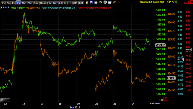
 Commodities underperformed today (brown) vs the SPX (green), but hung very close to their FX relationship (Euro in light blue).

 Longer term commodities out-performed on a relative basis before QE3 and have underperformed since, the question being were they marked up pre-QE as commodities have always fared pretty well in QE periods and are now being sold in to or are they being dropped to pick up on the cheap, we can't tell from the index alone, but rather have to look at each class. As mentioned earlier today, USO/Oil looks set for at least a bounce higher, if there's decent negative divergences in to a mov higher, that helps answer that question.

 Yields have acted like a magnet for equities in the past and have called some decent reversals for us, they have broadly underperformed, especially longer term.

 A bit longer...

 Since they reached reversion to the mean on June 4th at the market bottom, they haven't performed well and this would normally be considered a very negative signal.

 The $AUD isn't telling us much, but it doesn't seem like the carry trade is being put back on at this point.

 A little longer term, the divergence isn't horrible here.

 The Euro under-performing a bit on some $USD strength.

 Euro a little longer term, from the signals available in the Euro, it looks like near term (5 min chart) we'll see some upside in the Euro, which would generally mean broad market upside with it, however thus far the charts beyond 5 minutes, 10, 15, 30 and 60 don't look good, perhaps a bounce followed by a lower low? Believe it or not, the $USD thus far has almost the same confirmation which doesn't make a lot of sense in a dollar debasement environment.

Energy has lost all momentum here on a relative basis since QE 3, I covered the USO short Friday I believe, but as mentioned today it does look like USO will see a bounce. Again, short to intermediate charts look good for a bounce, longer term (but still post QE3) don't look so hot, similar to the currencies that it is closely tied to.

 Financials have also not performed well, but they also have a shorter term positive divergence building, but once again around the 10-30 min timeframes they don't look very good.

 Tech pre and post QE 3, they look like they should at least fill the gap, I'd think with the environment described so far, probably a bit more, but once again, 10-30 min looks very bad, leading negative pretty deeply so a bounce would provide good information just as the dip has provided some decent information, which is to say there are some positives, but they aren't anything out of the norm.

 High Yield Corp Credit has finally broken down, the performance today was not on par with even the SPX, but the momentum on the downside has subsided, I believe it could bounce, but it is showing weakness even close in at 5 mins. Perhaps Credit diverges from a bounce?

 a little longer term...

 This Junk Credit, the same is true for JNK as HYG.

 Sectors today saw defensive areas pick up like Utilities, Staples and Healthcare, Industrials were also up while tech was off.


Sectors over the last 2.5 days, it appears to me that Tech and Financials could be near a rotational low which would fit with a short term bounce.

As for futures tonight...
 Crude shows a 2 pm positive divergence, I posted on a positive divergence in UO as well, even said I'd consider a speculative trade there long.


 While ES (SPX Futures) are up in overnight trade, they still have a weaker 3C disposition than the NASDAQ futures as seen most of today in what looks a little like a bifurcated market.

NASDAQ futures are broadly in line on the 1 min chart thus far.

The SPY as mentioned in the market updates today saw the 1, 2 and 3 min charts get ugly after looking very strong toward the end of the day, however the 5 min chart as I posted is still in a positive position, this makes sense with everything else above so a continued effort to close that gap at least seems very likely and I'd imagine with the downdraft in the market since QE3, it's probably time for an upside correction at least, so seeing how 3C performs in such an environment could really answer some questions and even open up some nice trades. The problem I see for the SPY on the upside is that after 5 mins, everything starts to weaken, the 10 min is marginally positive, but lost some ground and the 15 min is not at all in a position I would consider positive. This would be typically at least a swing move on a 15 min chart and it's not there as of now. The 60 min and 4 hour post-QE3 have deteriorated badly as well and as shown today.

The DIA is one of the better looking of the averages with at least a 10 min positive divergence. We'll see if CAT has an effect on the Dow as they came out with some not so great news after the close.

The QQQ looks good too to about the 5 min range, it is the 10 and 30 min charts overall that look bad.

AAPL showed some late day positives, but again all positive momentum in 3C stops at 15 min and the 30 and 60 don't look good.

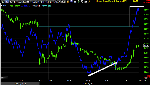
Finally the IWM has good positioning relatively speaking on the intraday charts, but again at 10 mins there's ugliness and 30min especially with the hourly deteriorating.

I'd think if the market was brought down to accumulate, we'd be seeing much larger divergences and on timeframes that are significant like 15-30 min and that in most cases is where they get ugly.

As it stands, on some price weakness for those who are nimble, you might consider some speculative longs, I wouldn't want to over-commit to anything until we see what happens on a move up as it appears that we'd likely see negative divergences which would set up some short positions, if they were really bad they might set up some very nice short positions, but we need that movement to see. Since the 14th it's been pretty much downhill which gives us information, primarily at this point that the divergences aren't huge which if the market was being dropped to buy weakness for QE3, I'd expect much bigger positive divergences.

We haven't had much of a chance to see any real upside and how the underlying trade behaves in that case, GOOG may be a preview as it saw negative divergences in to upside today, as I stated I don't think GOOG is done as we don't typically see "V" reversals, it's more of a process, but if GOOG continues to go negative on higher prices or a rounding/flattening, I suspect we may se something very similar in the broad market.

Others Much Smarter Than I Arrive At the Same Ideas...

I'm not known for my brevity in posts, my apologies, I'm trying to be more succinct; however it comes from a good place. I could post just brief trade ideas, but one of my goals in brining you value is not just to give you analysis of the markets, but to try to pass on the concepts and behavior so that you may apply these principles to your own trading rather than just follow along. To be succinct, "I'd rather help teach someone to fish than simply give them a fish".

As I have been putting together pieces of data since QE3 to better understand whether the market has indeed priced in QE3 or whether we need to reset charts and look at things with a new perspective, I have highlighted several issues regarding QE3 that I think are important to address. These ideas may not be correct, but ignoring them and simply accepting the conventional wisdom of trading during Quantitative Easing is not giving you anything more than a ridiculous mantra such as, "buy the dip".

Those who bought this dip probably weren't too happy with the results.

 S&P-500 daily chart-July 18th, 2011 with a -3.53% "Dip"...

 S&P-500 daily 3C chart during the same period shows deterioration through Spring and much more serious deterioration in to the summer dip.

The Result?
An approximate -18% move in the S&P alone, many stocks with higher Beta would see a decline typically about twice that.

The market becomes very dangerous when traders are conditioned to mottos, expecting nothing has changed or will change.

While I'm open to wherever the data leads, there have been several themes that are unique to QE3 that I have tried to illustrate, they seemed to be very common sense ideas to me, yet I hadn't heard too many people espouse the same until recently.

In the interest of brevity, I'll bring you these comments that sum up a couple of thoughts I've had about the complexities of the market that we shouldn't take for granted, I don't think anyone would argue against the statement, "The market is dynamic".

David Rosenberg- You can find out more about David here at Gluskin Sheff under the heading, Investment Management/David Rosenberg. His resume is impressive, I'll just take one snippet...

"Ranked most accurate forecaster of 2011 by MSNBC"

Much of what I have been talking about recently is covered by David, in some cases near verbatim even though this piece was just published today, take a look at some of the themes that make this time different.

While we share many of the same thoughts (it would be a long post if I listed all of them, but you can read them at the link above), I'll just cut to the last paragraph:

"What makes QE3 different and maybe even less potent than its predecessors is that the trend in global economic activity is still down. In the prior QEs, activity was already reviving and actually this may have played a more significant role in stimulating investor 'animal spirits' than the actual liquidity boost. Let's not also forget that earnings, both operating and reported, are now contracting sequentially. And the ISM is in a multi-month sub-50 pattern. This was not the case during these other QE episodes and serves up a greater hurdle for market performance this time around."

Furthermore, if we go back to my post, "The History of QE" from September 14th, I provided all of the previous LSAPs from QE1 to the extension of Twist, what you will notice is the market was at depressed prices when QE was announced except QE2, but that was only because it was telegraphed by Bernie at Jackson Hole a few months before it started, at depressed prices. 

I also noted the dividend yield for at least QE1 and pretty close on 2 was 4%, now 2% and the Price to Earnings ratio was 10 as opposed to 14.9 now, which means stocks are much more expensive with less income not to mention the fundamental global economic trends which David covers most I have brought up.

Several other differences I have noted off the top of my head include the divergence between transports (really we are talking about manufacturing here) this time vs all other times, the difference in the Economic Surprise Index vs the SPX this time vs all other times (both charts are posted here from yesterday) , many posts addressing the inflation problem for consumers and manufacturers and how QE is inflationary and how it can and likely will create a negative feedback loop which is completely at odds with the stated goal of fostering employment and the "conditionality" phrase of the QE program "Within the context of stable inflation" which you may recall received a bad reaction from the market when Bernie was asked about this during the press conference, that exact minute was the high of the day and prices dropped from there as the market seemed to recognize that while buying expensive stocks, at any moment inflation could cause a pause or change to QE creating uncertainty.

I certainly am not the only one who has talked about the possibility or even probability given the exceptionally weak macro economic data, that QE had already been priced in to the market by the time it was announced. However today for the first time, a member pointed out something I hadn't considered with regard to the 92% of Hedge Funds underperforming the SPX which is ridiculously high. At first it seemed, "Maybe smart money isn't so smart" until this member email today put things in a different light worthy of consideration....

"Hi Brandt,

3c explains why hedge funds have been doing so bad lately, if 3c is accurate then they have been dumping their holdings and shorting into this move higher right before the QE announcement."

Said another way, Hedge Funds may be using the pricing in of QE3 to dump positions, essentially selling into the news. Maybe 92% aren't the dumb ones, their year isn't over and the SKEW Index (Black Swan Index) may indeed be pointing to a rather sudden and nasty event.

I first pointed out the bothersome Rate of Change in the Skew Index on August 31st while SKEW seemed subdued at 119, only 4 points above the historical average, but the Rate of Change is what was bothersome (again ROC is one of the most valuable, least appreciated indicators out there, apply it to almost any other indicator and see that indicator's signals become more valuable).


Sure enough, as pointed out in last night's post, the SKEW as of Friday's close had moved in the direction ROC was pointing out while few others would have noticed this as ROC is not a new, fancy indicator.


The SKEW Index (put out by the CBOE as a measure of the probability of a highly improbable event occurring or otherwise known as a Black Swan market crash) jumped over 11.5 points to 130.60.

Now for the second point released by Morgan Stanley today is a theme I have covered extensively as each week we see worse and worse global manufacturing data, today we saw even more in the Chicago F_E_D National Activity Index , where as usual, the devil is in the details.

Taking just an excerpt from Morgan Stanley's QE3 analysis...

"It would appear from this final chart that a great deal of the current market is pricing in Fed action - as more than a year of rolling returns are now negative if it were not for the actions of Bernanke...


What Might Be Different This Time?
 One big potential difference between today and prior periods of unconventional policy is the price of oil. Will QE3 drive further commodity price inflation? And, if so, will there be negative feedback into the economy and equity markets? We suspect so given the fragility fo global growth."

In capping off this post, I'll just remind you of how many EU policy initiatives we have picked apart the day they were released based simply on common sense: 
1) The Ultra-leveraging of the EU's EFSF bailout fund as the EU came under pressure to find a solution before the upcoming G-20 meeting. The EU decided to leverage the EFSF to over a trillion Euros!
Result: They assumed China would provide the funds, they did not and went looking for opportunities in Africa instead and now in Afghanistan. One of the first auctions of EFSF bonds to leverage up the fund was a mere $3 billion Euros, the auction was a technical failure and they couldn't even cover the $3 bn issuance, much less the Trillion.
2) The Greek Bond Holder Haircut that would allow Greece breathing room and return to the debt markets in a few years... 
Result: Greece is already in need of another bailout, the bond holder haircuts scared bond traders and yields soared in countries that weren't in immediate danger lie Spain and to a lesser extent, Italy. If they could force 50+% losses on the holders o Greek debt, why couldn't they do it to any other sovereign nation?
3) The Spanish Banking Bailout Bazooka! Spain at the time may have needed about $65 billion Euros to bailout their insolvent banks, over a weekend conference call the EU decided they'd shock the market in to relief by offering up $100 bn Euros.
Result: We immediately recognized the problem, the ESM bailout facility was to be used (which by the way still isn't ratified or active) and by doing so, all debt including sovereign debt (bonds) would be subordinated and hold junior status to the ESM's loan. That day I said that the solution would likely take Spain from a banking sector bailout to a full blown sovereign bailout. Immediately as bond traders realized that they'd be last to be paid debt payments/interest while the ESM would be first, yields crossed the 7.5% mark, effectively locking Spain out of the debt markets.

4) Draghi's OMT bond purchasing program. The ECB had been supporting bonds of various countries whose yields were rising to unsustainable levels by buying debt in the secondary market, they shut down this bond buying for several months and came back with the new OMT program which promised virtually unlimited support for sovereign debt, thereby holding the Euro-zone together.

Result: As predicted, the North (countries like Germany with Aaa ratings and money) were even more deeply divided in what I have called the "North/South Divide" as the Southern countries, also known as the PIIGS had the votes, but not the money so of course they voted the OMT through, in the process causing a divide between the ECB and Germany/Bundesbank where all the money essentially comes from.  Draghi attached "conditionality" to any purchases which meant any country needing support would have to request it and then be subject to the austerity and other conditions the ECB decides to impose, if they fail to do so, their bonds will be sold right back in to the market. Spain had already made clear that they would not accept any aide with conditions tied to it, Spain being the last domino to fall before the Euro-Zone collapses is now in a position in which politically it is VERY difficult for them to request aid, making it likely that Spain will have to be destroyed in the bond market before aid is requested at which point it is too late. Furthermore, the southern countries and the ECB did nothing but tick off the Germans whose contributions to the ECB and bailout mechanisms are by far the largest, making it more likely that at some point Germany simply decides the costs outweigh the benefits and walks away from the grand experiment that is the EU.

These are but a few examples of Central and political planning causing unforeseen collateral damage, but I'm no economist or expert by any means, if you just have a basic knowledge of what is going on you can see the flaws as clear as daylight and given enough time the flaws become real damage.

The point simply being, either there are large flaws in the thought process of QE3 or perhaps as former F_E_D governor Kevin Warsh said,  the F_E_D panicked in a time in which we aren't in a panic, unless they know something the rest of us don't? As QE has never been proven to be effective in lowering unemployment, the fact employment was used as the cover seems odd. I'd like to think the F_E_D is smarter than the ECB/EU and I believe they are, the question that is scary is, "Do they indeed know something we don't?"

To sum up the circular and downward spiraling logic of QE to stabilize unemployment, I'll just repost the idea from last night's post.

"If the F_E_D's goal is to lower unemployment with QE3 (and recall that the goal was stated as "lowering unemployment within the context of price stability") which is half of their mandate, the other being price stability, it makes no sense whatsoever to introduce QE3 that is not sterilized (meaning that doesn't create more money out of thing air, rather than sterilized in which the money supply remains constant). Manufacturers the world over are seeing a decline in orders, they have stock on their shelves and as a result they aren't using their manufacturing capacity and are letting employees go; in addition their input costs are rising due to inflation. Debasing the dollar makes purchases more expensive, savings are worth less, prices for every day consumer goods like gas and food are higher. Manufacturers need consumer demand, but consumers are already feeling the pinch of food/gas inflation and QE would only make that worse, it would also make input costs for manufacturers worse. How does this lead to a rebound in manufacturing and thereby an increase in employment? The only way would be to make US goods (exports) cheaper, but as we already saw in Japan as a response to QE, other countries Central banks will fight back so their currency doesn't rise killing their own manufacturing/exports." 
In no way am I going to write-off QE as this post would seem to suggest, I understand the power  the F_E_D has wielded and the effect it has had on the market which is ultimately our goal, to understand the probabilities and opportunities in the market. I'm simply pointing out the glaringly obvious dichotomies that exist and pointing to others much smarter than myself who are arriving at the same conclusions (although I'd be more content to call my analysis of QE, ideas and not conclusions). We will still look for the hard evidence that suggests the path of highest probabilities, whether that be a total risk on environment,  total risk off or as I have noticed recently, a bifurcated market in which some assets seem to be ok and others are on less stable ground.

GOOG Charts

These charts, especially the 5/10 min ones, look very similar to what we saw in AAPL Friday, even the price action intraday as it rounded was similar.

As I said in the last post, it's pretty rare to go from extreme upside momentum to a next-day reversal, usually there's some lateral movement or a slowing of momentum as a divergence builds. Reversals are a process, not an event so there's no need to rush out and short GOOG, let it develop, let the probabilities build and if it stays on this trajectory it should make for a nice position that came to you.

Actually I see several stocks today that look even worse, I'd love to see a gap fill in AAPL and I think it can, but intraday trade wasn't good.


 This is post QE3 trend 1 min, it definitely has fallen apart here, this 1 chart may not be very convincing  alone, but....

 The 2 min looks exactly right

 As does the 5 min, remember migration so the shortest timeframe should be the sharpest.

 Now the 5 min intraday with a positive divergence, not very big, but obviously enough. It looks like it didn't take long for distribution in to demand to start.

The 10 min is now below where the accumulation started. This is going to be an interesting chart to follow, we may have a trade here in a day or two.

Beware GOOG

Thanks Mike for the head's up, GOOG is giving some nasty negative signals in to today's move, it is leading negative on the 1-3 min charts, but gets especially ugly at 5 min & 10 min.

I might give it a bit more time to se if it keeps migrating through the 15 min chart and because few reversals are "V" shaped, it's more of a process than event, but what an ugly chart on this move.

And this is how fast it can fall apart...

 Remember how impressive that 1 min "looked"? Now look at it leading negative. For now it appears as if it was as expected, a gap fill.


The divergence is strong enough to migrate to the 2 min chart, but the key to this analysis as this mov in the SPY certainly isn't worth risking money for, will be what happens next to the 3 min and the 5 min chart, this is a very important development. Should that 5 min build, then we are almost certainly going higher, should the 2 min migrate to the 3 min and the 3 min to the 5 min, then we have a totally different situation on our hands.

USO Update

On September 20th at 3:06 p.m. I closed out a core short position in USO (pure short-no leverage) at a slight gain.

I of course want to se where the probabilities are for any new positions, but it does appear USO will make a move higher.

If I had time I might even take a speculative long position for a swing move, non-leveraged.

 This break from the channel which first failed to meet the upper channel is a very obvious technical short set up, you know I never like to short the first break and I'm not even sure I want to short oil until I see how it reacts on a move up, if there's distribution, but from a manipulation of technical trader's standpoint, a new high above at least where it broke down would be the most probable outcome just from a market behavior standpoint.

 Here's where the short was closed in USO.

 This 10 min chart is the one that interests me for an upside move.

This 4 hour chart is why I want to pay attention to underlying trade in any upside move. We do have inventories Wednesday which may be a catalyst.

SPY as an example...

As I mentioned when referencing the 1 min positive, "It can fall apart just as quick as it went up". The QQQ 1 min is holding on, the IWM has fallen apart, the DIA is in line and deteriorating.


However lets look at multiple timeframes.

 The SPY 1 min positive doesn't look so impressive anymore as it reached the gap fill.

 The 2 min is starting to see a little migration from the 1 min, although it never really was that impressive.

 The 3 min looked impressive for a short time, not so much anymore.

 Here's where it is interesting, the SPY 5 min chart shows a clear positive divergence, being the 3 min hasn't seen significant damage the 5 min wouldn't be effected yet, but on the other side of the 5 min chart...

 The 10 min looks decent, but not like the 5 min, it didn't migrate a strongly to this chart.

At 15 min, it didn't migrate at all, this is largely what I pointed out earlier, the divergence's amplitude looked impressive, the amount of time it formed was quite short, you can only accumulate so much in a short period.

I'll continue to update as it develops and get the risk asset layout posted, there's not too much there that is impressive, that leads me to believe thus far we are looking pretty much at a gap fill.

Futures Hiccup

I pointed this out in the last update specifically on ES, it didn't look like a big deal, but it is having an effect, as to how much of an effect (a temporary consolidation or something uglier), I don't know, but it's also now showing up in NASDAQ futures.

I'll update the market as soon as it loads as I was just capturing Risk Asset Layout charts.

 3C on ES above should have been making a significant new high along the lines of price at the two relative highs, instead it made a slight lower low, however the rate of change was the most interesting thing, not the slight negative divergence.

As NASDAQ futures have seen 3C roaring all day, they also are showing a hiccup in the most recent 3C position or rate of change between the two most recent highs. in 3C, this is worse considering how much lower price was at 12 pm

Market Update

I'm not sure if there's news/catalyst for the recent move, the only thing I see that looks to be similar across the board are 2 pm lows best seen in the IWM, the SPY has caught up, DIA not so much, ES not so much.

We're headed or are at the gap fill which has been a consistent feature of the market for quite some time since HFTs started dominating the market. Now is a good time to check the Risk Asset Layout.

 DIA 1 min "looks" impressive, but it's a rather small positive divergence around the 2 p.m. dip which was the lows of the day for the IWM. The rest of the day in the DIa is in line before that 2 p.m. point so while it looks impressive, it's really not that large compared to what it could have been (all day).


 The 5 min is in line, not nearly as impressive as the QQQ 5 min still

 ES is just in line, I searched for a divergence here and couldn't find anything, this may be temporary, but currently it's a bit negative as price is above the morning highs, 3C is not.

 The IWM 1:30-ish lows do have a positive divergence, the first of the day, the light blue line (very thin) is Friday's close and where a gap fill would be complete.

 IWM 5 min again with the first positive of the day at those lows this afternoon.

 NASDAQ futures still look much better than S&P futures, but it also has a ways more to go to get to a gap fill.

 QQQ 2 min also picked up on the afternoon reaction low, the thin blue line is the gap fill.

 QQQ 5 min still looks better than anything out there.

 SPY 1 min put in a minor positive divergence at the same area and is leading, but as quickly as that materialized, it can come back down just as quick, we'll see what the closing stats look like.

SPY 5 min also improved at the same area and looks impressive, it's the very short duration that is questionable.

I'm going to check the risk asset layout, the FX legacy arbitrage doesn't seem to have anything to do with this except following, it didn't start it.


9:30 open in green.