For any and all of our Vets, one day can never thank you for your service, but hopefully we can all take some time to remind ourselves of your sacrifices.
As for the market, I keep up with breadth charts/indicators at least several times a month and it's been one of the most dramatic pictures of how bad a shape this market is really in, however if we look at the very near term we can find some utility in those charts as well for our current situation.
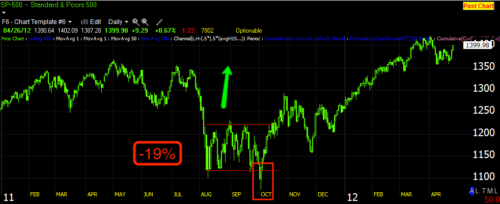
First I want to show you a period in the market (SPX) that reminds me in a smaller way what my expectations for the market have been and continue to be.
First the SPX...

This is a much larger period with much bigger and longer moves, but the concept is the same. We expected the market to take a dive, the SPX lost nearly -19% in one move, we had no way of knowing the severity, but a few days before the end of the move down we started seeing the end of the move coming and called it out. The trading range from August to October was a FANTASTIC time for us, while most traders were being whiplashed out of positions left and right, we called EVERY top and bottom and used leveraged ETFs to make what would have been a 70+% total return in those 2 months alone! You see, after a decline like that, there are rarely "V" shaped reversals to the upside so any reversal would need a trading range and time. As the range went on and became more clear we fine tuned our forecast and expected a new low to be made (A head fake move) that would launch a "Strong" rally, although again we can't predict how strong that rally would be. In October we saw our new low, it was obvious the range was used to accumulate for the strong move up and that's the basic concept. Now I believe we are in a micro version of this same concept.

Here we are now, the Mid-October decline from the last reaction peak was called out and we were trading both leveraged long and then leveraged short ETFs all in the same week. Before we even knew the end of the downside move was near, we expected a range to be established because once again, we rarely see "V" shaped reversals (Wall Street is just too big of a ship to make tight turns like that), we saw the range, a head fake move below the range would be the next obvious step and this isn't unique to this range, as long as the supporting signals are there for a head fake move, we see them before almost every reversal to some degree or another. We have charts and indications that the move below the range is indeed a head fake move and like the October low in 2011, I'm expecting a strong rally to come off this recent break to a lower low. I also expect that will ultimately be a failed rally and will set up nice short positions, but for now we have positions in place to play an upside move with leveraged long ETFs/ So in a similar way, this period is a micro version of the 2011 period above, there are several concepts here that just hold true a majority of the time so long as we have the confirming signals in place.

While this isn't a huge find, it is often useful. When price closes under the Bollinger Bands and then closes back inside them the next day, we often have a buy signal.

Also interestingly, at the suspected head fake area below the range Thursday and Friday in the SPX and I think 1 other average, just formed a Harami bullish reversal or what we call in the west, "An inside day"; volume was good on Friday for such a signal as well.
Now, although you or at least I wouldn't think the breadth charts would offer much for shorter term analysis on a daily chart, surprisingly they do.
These are the Worden T2 series Breadth Indicators and the indicator will always be the green line and the comparison symbol will always be the red line and the symbol is always the SPX unless otherwise noted.
First, some Advance/Decline indications and related indicators.
With the recent suspected head fake move below our range, note how the A/D line hasn't confirmed the downside move in the SPX, this reminds me a bit of
this post from Friday looking at the NYSE TICK chart intraday . You may recall the finding was that the early momentum in the market did not see the kind of TICK breadth/strength that the afternoon session showed even though the afternoon trend was nothing like the earlier upside momentum, the afternoon had stronger TICK readings than the earlier momentum move.
In a way, the failure of the Advance/Decline line to confirm the lower low of the suspected head fake area is very similar to the TICK readings Friday.

The Bolton-Tremblay Indicator is read like an Advance / Decline line and is pretty much almost the same thing except it uses the calculation of unchanged stocks as well in it's composition, again the B-T did NOT confirm the SPX move lower.
Although there are several ways (one complicated) to interpret the Zweig Breadth Thrust, I have always found it useful as a divergence/confirmation indicator. For example, note the positive divergence in the ZBT at the June lows, the same lows that we called out, expected weeks before they hit and also used a head fake move to a new low there to establish long positions. If you look now, we see the negative divergence as the SPX rolls over, but there's no lower low the last few days also giving a similar non-condfirmation signal like we see in the A/D indicators above.
Please don't misconstrue my thoughts on the big picture in breadth, it is horrible and the market looks horrible overall, but nothing goes straight up or down and we can take advantage of these wiggles.
The Absolute Breadth Index is a bit complicated to explain, but again it is useful as a divergence indicator and low readings are bearish, more likely to be a top as high readings are bullish and more likely to be a bottom. Short term we wee the negative divergence in the SPX by September as well as a new low, but recently we see a positive divergence at the suspected head fake lows and our range.
Finally the McClellan Oscillator can be used in several different ways, but again the most reliable and useful way to use it in my experience is as a divergence indicator. The MCO also called the June lows as the market made a head fake move to a new lows below a bearish continuation price pattern, we knew it was a head fake and used the lows to buy longs. Now the MCO shows the negative divergence at the recent top, but again the MCO fails to confirm price action in not making a new lower low with the SPX.
If we use a 10-bar ROC of the MCO (remember I told you applying ROC to nearly any indicator or even price is an effective way to increase the sensitivity and see early signals that others would miss) look at what we get...
ROC of the MCO gives us the negative divergence leading to our range and suspected head fake move lower, but it also gives us a large positive divergence at our range and the suspected head fake move lower.
I just thought I'd share some of the things I've been looking at this weekend as well as the knowledge that breadth indicators seem to give useful signs on daily charts even in shorter term situations.
While I've been putting this post together, the EUR/USD (FX markets) just opened for the new week.
While this opening indication certainly isn't a big deal as we have an entire overnight session to go through, the EUR/USD is opening the week a bit higher and from a bullish ascending triangle, even though technically it does not appear at the correct place within the price trend, still even as a triangle, it is interesting that is formed here.
A stronger Euro/weaker dollar as we are seeing so far is helpful to the equity market.

Here's a closer look at the open on a 5 min chart.
I'll update as the situation warrants or events develop.