Friday, January 31, 2014

Come Monday

There were so many charts flying around so fast in the last 2 hours, it was nearly impossible to keep up with everything that was happening and seeing where each of those pieces fit in the puzzle especially as the puzzle itself was changing nearly every 15 minutes.

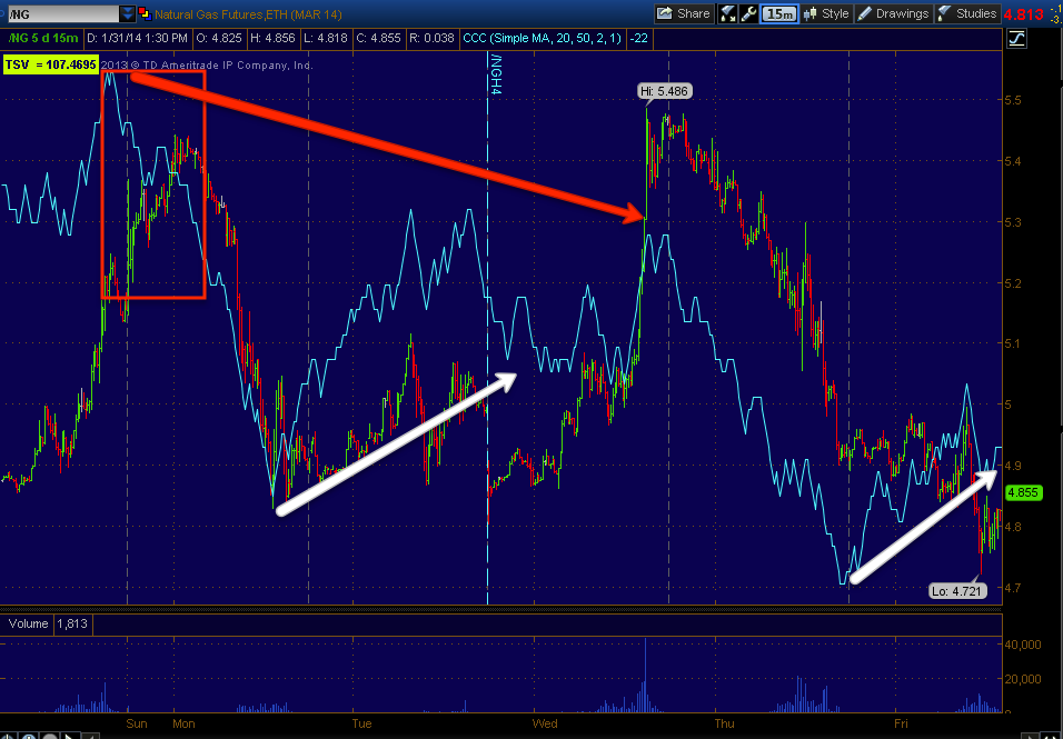
I was spending a lot of time focussing on the Yen and $USD as that has been leading the market and has been giving us correct directional calls every signal day this week in addition to the correct directional call for the week (lateral range).

In the end I had to go with what I know to be the highest probability concepts and those were all confirming. There were a lot of minor elements (which may be major elements by now or by the time futures close) such as the way High Yield Credit was acting or Treasury Yields, Gold's signals were a big one, the outperformance in VIX short term futures, the 5 min charts of the Index futures (usually these are very clear with a move about to take place-they were lagging more toward a downside move, but not very strongly which would indicate a head fake move as it's not real distribution), the hum-drum sentiment indications, the currency futures were not making a lot of sense, but those were 1 min charts and they rarely will make it through a weekend, but the longer 5 min charts which will last through a weekend, did make sense.

Ultimately though it came down to the 3C concept of "3C signals picking up where they left off on the next trading day" whether that be the very next day or over a 3-day weekend. 

The other concept that has very high probabilities is that of a head fake move before a reversal  or in this case, before a breakout from the week's lateral range which is normally at 80% of the time. The longer the defined range is,  the more probable a head fake move is to occur and we had a week long defined range.

The Bellwether stocks were in agreement, which makes long entries in them very enticing on a head fake move, that's actually the best entry we can get as far as price and profit , risk and timing since a head fake move occurs just before a move.

Since the major concept and most probable concept that will likely define the start of trade next week and the move that comes after is almost solely the head fake move, I think it is of utmost importance that you understand what this move is, why it occurs, what the signs of it are, what the effects of it are and how you can use it as one of the best trade set ups available, I'd like to give you the links to the two articles I wrote specifically on the subject and even if you've already read them, it wouldn't hurt to skim through them again. If you have not read them, I think they'll provide you with information that you can use immediately to enhance your trading results.

Here are the articles which are always linked at the top right sidebar of the members' site.

* Understanding the Head-Fake Move Part 1

* Understanding the Head-Fake Move Part 2

Now, to show you some of the charts that tipped my call toward the most probable market behavior...

 Since there's a defined range, stops and limit orders are going to congregate below the range, smart money or any decent trader knows this by instinct, but even easier, they can see it in the order book (not level 2). A run of those stops below support of the range sets off the numerous effects of a head fake move, lets just say, "From a failed move comes a fast reversal" (see green arrow).


 As far as the concept that 3C signals pick up where they left off, note Thursday's negative signals and that resulted in a gap down today. Today we ended with negative signals, that should result in lower prices Monday.

This SPY 5 min chart shows the exact same concept, Thursday the negative divergences picked up where they left off and Friday we opened lower.

Don't forget the Price/Volume relationships on Wednesday that predicted a higher close Thursday and Thursday's (last night) that predicted a lower close today.

This 15 min chart of the SPY shows the range, I suspected the range would develop in to a base with accumulation, the 3C divergence confirms this. The "X" is where accumulation would have occurred low in the range.

 Even the 30 min chart is positive

Remember though that our big picture trade is to sell short in to market strength, this 4 hour (highest probability of all the above charts by far) has enormous distribution, this is why we want to sell short in to strength when we have the opportunity as the probabilities are extremely bearish, far beyond former bear market tops I've studied going back to the early 20th century.

 The SPY daily chart just reinforces this and shows how much worse things have gotten through the second half of 2013 and through 2014.

The other averages show the same two concepts of a likely head fake and a likely rally from that head fake.

The Q's 5 min left off negative so Monday we should see price weakness.

However the larger chart of the entire range (10 min) is leading positive showing us this range has been accumulated all week.

The head fake move is the pinnacle of the concept, "Price is deceptive."

The IWM 5 min chart (and other intraday charts) left off negative at the close for the near term trade Monday.

However once again the range this week shows clear signs of heavy accumulation and there's only one reason for that.

I have a number of stocks that I really like as short term trading longs in to a head fake move, some are set up and look like they are confirming that there will be a head fake move. Others I really like as assets to short in to. Actually all of them should work out to be assets to short in to, some just look like good longs on the way up and those would include: AAPL, FSLR, BIDU,  MCP looks exceptionally good.

A few shorts: PCLN, NFLX, AMZN, and GOOG.

I might get some examples up , but I'll probably spend a lot of time resolving different market assets as futures and FX wrap up for the week.

Have a great weekend.

Went With GLD March $120 Calls

I would have preferred something a bit lower like $118 or so, but this is what I knew I could get a fill on

Opening GLD Calls

I'm not sure which strike, the expiration should be MArch monthly, this is likely a 1-day trade. The 1, 2, 3, 4, 10 and 15 min charts are positive, the 15 very positive. What fits with the theory of the last two posts is the 30 and 60 are negative this would fit with a quick move up in Gold Monday and a move down in the market followed by a strong move up in the market and a strong move down in gold as the 30-60 min charts are negative.

I'll let you know what I go with ASAP

AAPL As a Market Proxy

AAPL may be another good example in the same manner I just used the Q's, I am VERY happy I entered the AAPL $500 March calls, in fact I'd be very tempted to add to that position and if I didn't have any exposure, I'd likely add at least a partial position to make sure I had exposure and try to add the second half of the partial position on a potential move lower Monday, another likely head fake move.

Look at the charts.
 This 10 min leading positive went leading positive as stops were hit at the $495 level, this divergence on its own is more than enough for me to go long AAPL for a quick trade, but it doesn't stop there.

 A 15 min chart is extremely strong leading positive, this is a VERY strong timeframe and I often will trade 15 min divergences. The area of the stops is at the small white hash.

However, amazingly it doesn't stop there.

The 30 min chart is leading positive which is pretty amazing over such a short period

And now even a 60 min chart is leading positive in a signal day, that is huge accumulation in AAPL.

So why not go full long right now?

The 1-5 min charts are negative in to the intraday advance suggesting AAPL will pullback 1 more time, the only real reason to do that with such strong divergences in place is to create the momentum effect a head fake move provides on a new breakout. Above on the 60 min chart you can see the rounding area or reversal process, we almost always see a chimney on that dome on the far right side just before the move to the upside, that's the head fake move.

So AAPL, a market Bellwether is showing similar signals. If we do get a head fake move lower in AAPL Monday with confirmed accumulation proving it's a false move, I will add to AAPL calls.

Market Update

I've been quiet the last hour or so because I've been going over numerous charts, I'm hoping the last hour is going to clear some things up.

The QQQ "seems" like a good example for one side of the data.

 This is the 1 min intraday chart in confirmation now of the gap fill, but this seems to be very weak underlying movement pushing it because you don't need to go far to see distribution in to this move.

The 2 min chart shows distribution in to this move.

This would be the equivalent of a market maker working the bid/ask and price higher, but selling in to that move higher.

 At 10 mins we have a nice positive divegrence through the entire range this week, the 3 and 5 min charts between the 2 min above this chart and the 10 min are both negative, not as negative as the 2 min and the 5 min is not as negative as the 3 min so it's migration of the divergence with the strongest intraday negative at 2 mins, then 3 min and then 5 mins.

The overall trend for the week's range is leading positive on the 10 min chart as this is much too strong a chart to register intraday distribution.

However it is interesting that there would be intraday distribution unless THE MARKET WERE PLANNING A HEAD FAKE MOVE BELOW THE RANGE BEFORE A MOVE HIGHER WHICH IS NEARLY STANDARD PRACTICE (4 OUT OF 5 TIMES WE SEE A HEAD FAKE MOVE OR STOP RUN IN THIS CASE AND ESPECIALLY WHEN THE RANGE IS SO DEFINED).

The 30 min QQQ is also positive during this range so it looks like a very strong accumulation period has taken place, but I suspect a move Monday below the support of this week's range to run stops BEFORE a move higher.

There are a lot of charts going a lot of different ways so I feel less sure about the head fake move and timing than I did last Friday when predicting a range and accumulation of that range.

However, from a market behavior / Concept point of view only, a stop run as I've drawn on the chart above is pretty standard practice before an upside reversal, in fact if you've read my two articles, "Understanding the Head Fake Move" that are linked on the right side of the members' site, you'll understand exactly why we see these head fakes so often (about 80% of the time).

There are some other charts that don't quite fit with this scenario, but the last two hours is where we get the most reliable data on Friday and some of those charts are changing fast (during these last two hours).

One area that I've seen and am on the verge of taking a call position out on is GLD, you recall yesterday I just closed a GLD Put opened the day before on market strength, if GLD is looking like a good call position right now, that would suggest GLD strength Monday and market weakness and that market weakness could be the head fake move drawn in above.

I'm going to keep looking at these charts and try to keep up with them and maybe even get a trade or two out if we start to see things lining up a bit better.

I also noticed HY Credit is not buying today's gap fill, but it's not deteriorating either, to me that would suggest the probability of a head fake move as well. Yields are moving up, but underperforming while the VXX's correlation is out performing, both of those would also suggest a market move lower Monday which would very likely be the head fake move we see right before a reversal (up).


The Yen futures so far are negative across the board, this is one area that doesn't agree with the above theory, however the $USD futures are broken up and not consistent like the Yen futures. I'm wondering if the Yen futures will flip before the close.

Also the 5 min Index futures charts should be very strong right now if a breakout move were coming Monday, they are not, in fact while they are not negative, they are lagging enough that the head fake move would make more sense as they could accumulate that move like AAPL did with stops under $495 today and those charts would be positive by the end of Monday in time for a breakout move as early as Tuesday.

Let me see what else I can find.


UNG / DGAZ Update

Long term I love UNG as a long term (Primary Trend long position) and as such, as core long position I always carry UNG long (+12% right now), but the expected pullback that was traded in the trading portfolio using DGAZ seems to have been hit by some fundamental surprises causing the market to discount the new information in the way of several unprecedented Polar Vortexes, I had never heard of them before this.

In any case, on the other side of the coin has been 2 CME margin hikes in the last week, the first an additional 20% margin and the second an additional 26% margin, which if you recall was part of what caused the 2011 gold market to top (CME margin Hikes), although these aren't as ferocious as the gold ones were, they still put downward pressure on prices.

As far as the current charts... These are actual Natural Gas futures
 60 min chart has a relative negative divegrence, not the strongest divergence type, but on a chart this long (60 mins), it's respectable. Furthermore there's a slight leading negative component just added recently.

The 15 min chart is very interesting because I have mentioned several times how the futures version of 3C (above) differes from the equities version in timeframes so the timeframes shouldn't be compared in the same manner. Look at the 3C divergence on the 15 min NG futures and next...

Note UNG, a totally different asset (the same idea-natural gas) has  a 3 min chart that looks exactly the same. Both feature a larger negative divergence, but in to the decline from that divegrence, both show a smaller positive divegrence which looks like a normal corrective move to me, not a trend changer.

The intraday 1 min chart is a little sloppy, but again the main feature is a larger negative divegrence with a drop in price that is seeing a smaller positive divegrence, once again looking like a normal corrective move within a larger trend.

The Daily UNG chart with RSI is showing a negative divegrence as well currently, I bring this up because of the following charts.

This is the breakout in UNG we have waited for going on a year and a half so it's a strange position to be in, loving this stock as a long term play, but I'd like to see it come down in the very near term. Volume yesterday was quite large on a rejection of higher prices with the longer upper candle wick. Today's candle thus far makes sense with some of the intraday signals we are seeing as it is a hammer, a short term support candle.

Looking at a 5-day chart, it looks like the breakout is being tested as the most current candle is a long-legged Doji Star, the epitome of indecision and on huge volume, as a UNG long this is not a great candle to see, although I suspect it would be a temporary event to overcome, as a trading short in UNG, I'm glad to see it. Also as a long I'm glad to see it because I would like to add to the UNG core long trending position.

 UNG 1 min is choppy like NG 1 min charts, but a recent weak positive divegrence along the lines of a corrective move in the recent down  trend (of 2-days).

 UNG 2 min shows the same theme, a larger negative divegrence and price moving down off it and what looks to be a corrective bounce, I would guess it wouldn't be able to go much further than the gap, in fact that may be resistance if it gets going.

 The 3 min shows the same theme, a large negative divegrence and a smaller corrective positive.

DGAZ 10 mins shows the initial or original positive divegrence for the long trade that was run over by extreme weather events being discounted. The current signal is leading, if it adds a second stage on the upside of 3C right now, it will be a very strong signal.

This is the intraday DGAZ chart, it actually looks pretty good so I'm wondering if the intraday positive in UNG that looks to be corrective is actually going to be corrective or if it is just enough to cause a temporary lateral consolidation.

Still long DGAZ.

Market Update

I'm not sure what caused this intraday bounce, but something seems to have lit it and it's not the Carry correlation (not AUD/JPY, not EUR/JPY nor USD/JPY), take a look.

 This is the USD/JPY (candlesticks) vs ES (purple), the correlation alone suggests this move will fail, we've seen this happen with larger moves this week both on a fail and a bounce.

The only thing I can see here that "MAY" have caused a bounce (because it wasn't intraday averages either, you saw them in the last post going negative) is the fact that USD/JPY $102 was tested and held at $101.94, close enough.

However I can't see this break from the correlation lasting, I'm more interested to know what caused it.

Just like the SPY, QQQ and IWM I just posted, ES futures intraday (1 min) are negative on the move.

NQ (NASDAQ 100 futures) intraday are REALLY leading negative

And even though TF (Russell 2000 futures) had a nice positive divegrence at the lows pre-market, it too is showing a strong intraday negative divegrence.

Even the VIX futures correlation (opposite the market) is showing a negative at the market lows from which they bounced and a positive developing as the market bounce seems to be failing.

This "could" be op-ex related and I'm not curious to know what caused it for curiosities sake, I need to know for analysis and make sure nothing is changing.

In any case, I'm going to keep looking, I thought this was at least useful concepts you could use and possibly useful information if I have to build on it later.

Quick Update

The quick bounce intraday looks like that's exactly all it is thus far, this is part of the boring aspect to Friday's with these weekly options now.

 SPY 1 min

QQQ 1 min

IWM 1 min
Custom TICK indicator vs the SPY.

AAPL Update

I entered some AAPL March $500 Calls, I might be tempted to add to that position if things really look more enticing, although I don't expect to see a whole lot of that until after 2 p.m., I'm guessing the AAPL Pin is probably at the psychological magnet of $500.

I wanted to show some short term (call position) charts, some slightly longer term (equity short) charts and the probable future of AAPL.

This is AAPL in a monthly Trend Channel with the respective gains for each trend before being stopped out.

At the yellow arrow, this is the ROC in price to the upside that almost always is a warning sign that the stock is about to top. I'm sure if you thought about things from an institutional investor's perspective or "Think like a Crook", you can figure out why. Part of the reason I love multiple timeframe analysis is it allows you to see what everyone else misses on a daily chart, take for instance the perfect 3 candle Star Reversal, it's almost a "Tower top", then the stop out of this channel. On a MACRO basis you can see the volatility following a stop out that I often talk about and how dangerous it can be, if you were trading this timeframe. 

I think AAPL's growth story is done, I'll show you why at the bottom.

 As far as the very near term, I chose AAPL Calls because I don't see a high probability trade lasting long enough to make an equity long worthwhile, thus the need for leverage to make it worthwhile. So far the trend of the intraday chart has been beautiful as AAPL makes a "Rounding" like bottom and I say bottom because of the accumulation we see above, it's likely a reversal process.

The 2 min chart is showing a little leading positive action today, you can see a parabolic move in red that was knocked down, they usually don't want to fill orders on moves like that, they try to keep things flat and quiet at the lower end of the range.

I know a lot of traders who scan for volume spikes and breakouts for long candidates, but the most underlying action is going on during the dullest periods, I'd much rather scan for a tight, flat range. These are the price patterns that no one pays attention to and like troublesome kids, when no one is paying attention, they are up to something and they usually don't want the attention while they are up to that something.

 AAPL 30 min shows why I like this as a short term long (Call position) and a longer term short (equity position).

Take a look at the same chart scaled out.

 Remember we didn't do much with AAPL for a while as the 30 min chart remained strong, then suddenly it gave way to a deep leading negative divegrence, soon after a gap down. I'd like to see AAPL fill the gap and move somewhere toward the top of that yellow box to enter a short equity position or add to one, of course we need to verify that there's distribution in to the move up, but I suspect that won't be an issue based on longer charts.

For instance take this daily chart, I had been warning the AAPL bulls who we obstinate that AAPL was going to $1000 and even $1500, they just couldn't imagine AAPL ever dropping and the more momentum it had, the more stubborn they became although we know what we know about changes in a trend/momentum, in addition we also had more than 1 leading negative divegrence such as the one you see at AAPL's top; from that point AAPL lost -45% or $390 points in 8 months.

Area "A" was a area that lasted a while, we could tell something was going on, but weren't sure what. A counter trend bounce? Something else? I think at least part of that was Carl Icahn and Street whispers of his involvement, I never had a chance to check his  10-Q filings to see if he had a quarter in which the SEC allowed him to not declare his position in AAPL as they will sometimes allow if it will have a material impact on the position being put together, Warren Buffet did the same with IBM. The point being, he may have been involved through that entire period or just the end part before the run up.

That area labelled "A" would be stage 1/base, and in red a stage 3 top, s smaller cycle, but still a cycle so the next should be stage 4 decline and that's why I'd be looking for an entry in to a core short position or trending short on a bounce in AAPL.

 I see AAPL is moving now as we had some decent divergences early today.

In any case this is MSFT during it's momentum /growth phase, AAPL was far from the first as MSFT put in a gain of 24,190% from 1987 to 1999, then it kind of turned in to a range stock and one of the things that seems to have changed the story there was the declaration of a dividend such as AAPL recently did.

 MSFT is more or less a dividend stock, from 2000 to present we have about a 4% gain, of course that's subjective according to where you start, but there's no arguing the character of MSFT changed forever and I think AAPL is heading down that same road.

Here's AAPL from 1987 to 2012 with a 7282% gain. I think the short is worth trading, but I would suspect after a few years AAPL will be another MSFT.

I'll let you know if I see the kind of intraday divergences that would cause me to add or open a new or additional AAPL position.