Tuesday, August 26, 2014

Daily Wrap

SPX-$2000.02! I'm not sure I'd be celebrating the SPX making a new high above the massive psychological magnet of $2000 by a mere $.02 with no follow through, no short squeeze, dispersion in the averages and transports (SPX +0.11%, Dow +0.17%, Dow Transports - 0.39%, NDX +0.10% and the saving grace, the laggard R2K comes alive on a short squeeze finishing at +0.85%) which is a bit interesting given all of the averages had dominant P/V relationships that were "blah", except the R2K yesterday.

The Dow, SPX and NASDAQ are all clustered in the middle, just over yesterday's close (a range in the three averages from +.10% to +.17%). The R2K is in yellow flying on a short squeeze which is somewhat evident in the MSI, but more so in the R2K A/D line readings for today. Dow Transports are the laggard at the bottom on a -0.39% loss and now red on the week.

The Dow Transports/IYT is a short position I left in place and posted on 8/20, IYT/ Transports Trade Set-up ,

"I'm very close to pulling the trigger here to fill out the IYT partial position which has room for about another 1/3rd addition."

As you'll see, that was a timely post and they are just about as ready as they'll be for a new or add-to position.

This SPX $2000 and 2 cents came on the third consecutive day in which volume has made a new low for the year (excluding holidays).

The SPX/SPY had to fight for it today as the European close definitely has something going on that translates in to distribution in the US.

 Intraday as suspected this morning before the European close, the SPX made its high right in to the European close and fell from there, it struggled the rest of the day to hold 2000.

 The 2 min chart's trend shows the same European close change in character intraday and puts us at a new leading negative divegrence as the SPX gained a little (they usually don't distribute in to lower prices).

 And speaking of new leading negative divergences since the base for the move formed 8/1-8/8...

The Q's were in line all day, but did virtually nothing,

The positive/base divergence for the Q's at 15 min has fallen apart.

And while the IWM put in a strong performance today, underlying trade shows distribution through the day starting at... The Europpean close!

 Last time we entered transports (still holding the short) was the day after the channel buster above the Ascending (bearish) wedge, the 3C divergence developed extremely quickly. As you can see above, transports already have a good reversal process underway, but there's a pretty clear line of resistance so I'll likely look for a head fake move to add the rest of the position, otherwise I'll add it at slightly lower prices with broad market confirmation of the pivot, you can't really get much better positioning than our original short position.

And the Transports 60 min chart, as I said, last time distribution was fast on the Channel Buster, this time it's just much sharper/deeper as we'd expect for a double top pattern.

The Most Shorted Index looks like it was trying to help the SPX toward the end of the day, but I suspect this was more about the R2K considering the intraday distribution there ad well as the A/D line for the R2K today.
MSI (yellow) vs the SP-500 intraday. I believe the move in MSI was part of the Russell 2000 short squeeze more than anything.

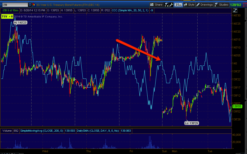
I posted earlier today, TLT / Treasuries, that it looks like Treasuries (which lost -.32%-TLT with a bearish engulfing candle) will pullback, but it looks like a longer term buying opportunity, if you're interested you might put some price alerts, I'll be following the progression.

Yesterday on the CITI news in this post , $USD / GLD / GDX Macro Trend, (which they'd normally keep quiet unless it serves a purpose) in which they closed their $USD longs ass it looks overbought (making a 13 month high today) I said,

"I think what is going on here is a bit larger then the knee jerk moves on CITI's news this morning, and smart money doesn't disclose their positioning unless there's something to gain form it, whether long gold already or looking to pick up $USD at cheaper prices, whatever the case, CITI was out of the $USD before making that known to the world this morning"

Gold was up+.50%, but our choice as we saw all 3 looking good last Wednesday, GDX , NUGT & GLD Charts was miners (GDX) and more specifically the 3x long Gold miners, NUGT which was up +6.19% today and it looks like other than some very short term jiggles, it has a lot more upside to come.

The market still seems a bit confused as to whether it's risk on or Flight to Safety, but when you move from one you want to do it at the best prices and demand and move in to the other. In any case, despite our short term view for TLT/Treasuries, there's a clear dysfunctional divergence as there's a risk on equities move (or has been) at the same time there's a Flight to Safety Treasuries move...
Since the base for the market's leg up, 30 year Treasury yields have fallen (they move opposite the treasury). At any other time in the market this would be taken as the red flag that it is, but in what traders have convinced themselves is "The new normal", they ignore everything and whistle past the graveyard such as the SPX making an all time high at $2000 by 2 cents and barely hanging on at that on a +.11% gain on the day. Again, at any other point when the market had sanity, the lack of volume alone would send people running for the hills, but lowest volume of the year for 3 consecutive days, that's a record they ignore. THERE IS NO NEW NORMAL, there was F_E_D printing, that's has ended. I suppose they think interest rate hikes will send the market higher as well, it is F_E_D action after all (sarc.)

Of the 9 S&P sectors, barely 6 closed green, Energy led at +.51% and Utilities lagged at -1.19%.

There was only 1 Dominant Price Volume Relationship today which was the Russell 2000 at Close Up/Volume Up, the most bullish of the 4 relationships, but also the one with the highest probability of creating a 1-day overbought condition typically sending the average closing lower the next day.

As for breadth, the A/D R2K line was up nicely on a short squeeze. In my estimation after watching breadth all year, the Percentage of NYSE Stocks trading Above their 40-day moving average is over half at +.59%. The entire bounce idea came after a close of -2% in the SPX on July 31st in the Daily Wrap.

I had said,

"I've been posting breadth charts and credit charts as well as bonds for months and last night I showed you some breadth charts I've watched for 15 years and only seen them look like this twice, the last time was the 2007 top, well if you think last night's charts were scary, wait until you see today's."

"And the best for last,  Percentage of NYSE Stocks Trading Above Their 40-Day Moving Average... This is a pretty standard measure, yesterday less than half of the NYSE were above their 40-day at 40%, that was nearly cut in half today to a mere 24%of NYSE stocks above their 40-day, again THIS COMING FROM NERLY 75% LAST MONTH!"

"The one thing I see for sure in breadth and the S&P/Morningstar performance is this market is now, very oversold on a breadth basis, so I think out position taken up today was the right thing to do and we did it based on the signals which just happen to fit the breadth oversold condition.

We'll piggy-back that trade and when we get to a little correction there are numerous shorts (some of which we have calls in now) that will be at beautiful set-ups if you need short exposure, I think most of us have been ready for this day."

The point being, this entire post was about a market bounce due not to an oversold price or indicator condition, but breadth and the very next day we started building a base, a reference was made to moving in to a position that was consistent with an oversold bounce on July 31st. 

We're now no longer near that record oversold breadth condition which apparently was the cause of the base/bounce. However we have an all new set of weak conditions like the average volume being half of normal all last week and 3 consecutive new lows in volume the last 3 days with very weak market tone and right around the area of a reversal process.

The rest should be pretty evident just based on objective evidence.


Quick Market Update

Friday the 15th of August in the week ahead post, the forecast was for about 2 good more days of bounce before distribution set in heavily and started the reversal process.


A quick look at Es/S&P futures shows this process right to the day.

There are the two following days for ES, Monday/Tuesday still remaining strong enough to continue a solid bounce, by Wednesday however the heaviest of distribution started in,  this is also about the time we started seeing half average normal volume days in to the end of the week with new low volume days for the year two consecutive days in a row.

Look at the SPX right now, a mere .75 cents from losing 2000, no follow through, no buyers pushing, no short squeeze. This is a pathetic market at this point.

HYG and Breadth indications still stand as the two most likely earliest warning indications and they are already at least a week in to the warning for both, much the same way they were about a week and 4 days in front of the market before the bounce launched.


GLD / GDX /NUGT Long Positons

While there has been some small intraday divergences (profit taking ) in all 3 assets and there's a possibility of a gap fill on NUGT's +6.3% gain today, I'm not changing or altering the position at all and leaving it long.

The charts that really matter in the 5, 15, 30 and 60 min ranges show we have a lot more fuel in the tank and I wouldn't try to get too fancy trading around pullbacks with charts looking like these 3 assets' charts do.

FEYE Update

In last Friday's FEYE Update there was a shift in character and thus opinion...

"Initially I expected a faster, shorter term move from FEYE to the upside.

At the time (this last week or so) I didn't like FEYE for anything more than a quick upswing, but there are some improvements that may kick a longer term base in to action. If there are continued improvement along this timeline FEYE may just make for a decent long equity position."

These changes included 15 and 30 min divergences (positive) when previously we only had 5 min positives and the location of them, this is the chart from Friday showing what could form in to a longer term base able to sustain a longer term move beyond today's.

This is the potential longer term base that could be in play as posted last Friday. The yellow area would be a head fake move as it breaks support and hits stops allowing shares to be accumulated in size and on the cheap, I don't know if anyone remembers the viral video of a Japanese video game mistranslated that has subsequently made it to the market, "All of your shares are BELONG TO US!!!"

There is another potential level, although it looks like a lot of stops were hit on the break of first support.

 Here's today's daily chart, still no breakout and...

Today's intraday action which is showing 3C profit-taking which we have seen before in FEYE which brings prices back down to an accumulation level.

 I think this 60 min leading positive chart is key, when this looks very strong, I think we may have a large base capable of supporting a multi-month move depending on its intensity.

 It was the 15 min chart above and

the 30 min chart above that caught my eye and made me think there's something more to FEYE than just a short term pop trade.

 This daily chart would suggest the same, but I can't see this ready to go without a stronger 60 min chart which has gained every day since it first started leading.

The 10 min chart in line with the move today meaning there wasn't any heavy distribution, as such any profit taking was mild, heavy distribution would be saved for much higher prices.

The 2 min chart shows there's barely any distribution beyond profit taking which you can see below.

Intraday 1 min profit taking leading negative pulling price back down.

And the most current...
That's a decent retrace on profit taking, it seems to me this move may have been a test. We'll see, but I think the 60 min chart is key to a real move that lasts more than a day or two.

Market Update-Leading Indicators

There's definitely something to the European close, it seems the early gains or overnight gains in the US are faded at the European close, although I suspect there's more to it than just that.

SPX 2000 holding to the close or not is really not an issue beyond media headlines, any way you llok at it, there's no follow through on the move above, there's no breakout buyers, there's no short squeeze and volume has gone from consecutive 40% below average to -45% below average to 55% below average to new low volume for the year 2 days consecutively after the low volume the preceding week. The R2K is the only performer out there today and that's because it has laggged badly.

I think people put a bit too much emphasis on catching "the top", despite it being a 0.15% move, which if you wanted to, we warned of the base several days in advance, we warned of the bounce almost a week in advance and almost all of our upside targets posted 12 trading days ago are hit. PErsonally though, with a move that is above 2000 with these kind of technicals, I'm long gone and waiting for the pivot trade set up (I did play a few piggy back longs, but for what they were, speculative as the market has shown us through internals).

Other than the normal reversal process, which may be changed with a +2000 close as that can serve as a head fake move, I think a lot of the indications of where the pivot is other than a very obvious head fake move, will be found in the same two places the base and bounce were found a week ahead of the actual move, that's in the manipulative market lever of HYG and maybe more importantly in market breadth.

July 31st was the first time I posted that despite all of the red flags in the market and a SPX that was down 2 percent that day, the market was deeply oversold and ready for a bounce and that wasn't based on the -4% drop just preceding, it was based on breadth uglier than ever (20% of stocks above their 40-day moving average). Thus I think this too will be one of the main areas we see significant changes such as those posted last night Daily Wrap,  not a single breadth indicator has improved since last Tuesday despite any gains the market has made since then. This is not an interesting aside, this is the same kind of information that led to the July 31st  after hours warning of a bounce coming , Daily Wrap still an interesting read.

As for HYG, this is one we can see during the day...

 Yesterday's HYG (blue) vs SPX (green) break at the European close losing SPX 2000 and by early afternoon HYG seeing short term accumulation apparently to give it another shot using the lever of HYG, note how they line up almost perfect today (arbitrage between algos interpreting HY Credit as risk on and equities as risk on. HYG led the bounce in much the same manner.

 Intraday arb between HYG and SPX. There's no coincidence there.

HYG led the market's base by 4 days and led through most of the move up, the lateral turn to the right in HYG or the reversal process is now on its seventh day,  again HYG is leading the market, but unlike the bullish leading in early August, it's moving toward bearish leading ...actually already there.

 The 2 min chart's trend is probably the easiest way to see HYG's underlying trade as a manipulation lever.

The 5 min chart just shows the depth of the distribution in the reversal process, again non the 7th day today.

And HYG over a longer period was never given enough gas to move these charts in the 15 min + range, it was always meant to be a manipulation lever which was obvious while the market base was still in a choppy/lateral and slightly falling trend.


 HY credit is giving out as well, interestingly though the sharpest areas of selling at right at the European close.

 And certainly interesting today was the VIX's outperformance vs the market (SPX prices inverted to see what the normal correlation should be-they should move together).

This even as SPX has captured 2000.

The same with VIX Futures, protection is obviously being bid.

VIX's daily chart is one of the better examples of a reversal process along with HYGs.

AAPL Stopped Out

If you work with something long enough, say a tape measure as a builder, you learn to identify small increments accurately. Yesterday I posted, AAPL Update / Trade-Set-up / Bellwether and this chart of a declining Rate of Change in AAPL's Trend Channel which has held it's entire move up from the 8/1-8/8 base.

 AAPL 60 min Trend Channel and declining ROC, "Changes in character lead to changes in trends, which is exactly what the Trend Channel was designed to do.


 This morning at 11 a.m. there was a confirmed AAPL Trend Channel stop out. For some of you not as familiar with the Trend Channel, it was one of my first custom indicators that won an award and I've been using it for years as an objective stop out rather than guessing which level is the right level on often sloppy and contradicting technical signals.

Once we have a stop out that doesn't mean a higher move can't be made, in fact they often are, but the easy money of the trend is now done and it is very susceptible to a reversal. I've noticed over the years I'm almost always better off exiting the trade when the Trend Channel issues a stop out than trying to capture a few extra percent as there's usually a nasty surprise and the money can often be used in better performing assets as the reversal process, which AAPL's declining ROC already shows it to be in, is often a choppy, meat grinder and any additional gains are usually pure luck.

 Here's the stop level intraday, the 11:30 hourly candle close below that level was confirmation, but notice AAPL is seeing resistance around the area which has nothing to do with any technical levels from the Trend Channel (like some stop out systems use a pair of moving averages, thus price lingering and testing one would not be unusual, but the Trend Channel relies purely on the behavior of the asset itself).

 If you look at yesterday's post, almost all of the 3C charts have deteriorated even more today, including this long term 60 min chart which often takes longer to move, it remains in a deepening leading negative divegrence. Again, at this point AAPL long looks like more risk than it's worth.

The 30 min chart has also made a new leading negative low today so there's heavy underlying flow in AAPL toward distribution  which is interesting because I noticed the same in XLK, Technology sector.

 The 15 min chart leading negative as well

The 10 min chart making a new deeper leading low.

I am not getting too much in to the intraday charts as there's usually more lateral slop,  the one thing I will look for is any kind of resistance forming, IF YOU LOOK AT ALL OF THE BASE CHARTS ABOVE WITH POSITIVE DIVERGENCES FROM 8/1 TO 8/10, YOU'LL NOTICE A HEAD FAKE MOVE TO THE DOWNSIDE JUST BEFORE AAPL TAKES OFF TO THE UPSIDE, THE SAME IS TRUE OF A DOWNSIDE/TOP REVERSAL PROCESS, A MOVE ABOVE RESISTANCE JUST BEFORE A TURN TO THE DOWNSIDE IS HIGH PROBABILITY.

Therefore the 1-3 min charts will come in handy in such a situation. Beyond that I'll be setting price alerts for AAPL including downside moves , head fake moves as well as resistance/support areas like the 5-day moving average, the last high in 2012, the 10-day and 22 day moving average and the 50-bar 5 min and 30 min charts. I want to know about any significant technical moves as I'm looking at an entry at this point.

TLT / Treasuries

There are a lot of dynamics in play re: treasuries, from the simple flight to safety to banks VERY short on high quality collateral as the F_E_D has absorbed a good portion of it through QE, rising rates and although I don't think there's enough detail out there or surety about the situation, the F_E_D has said more than once that they are no longer taking the "Hold assets on the balance sheet until maturity", but rather moving toward the idea of "Shrinking the balance sheet", which may be necessary for a couple of reasons, one being the bloated balance sheet of the F_E_D from some $850 bn before the financial crisis to $4.43 trillion dollars, the largest balance sheet expansion in F_E_D history. The Bank for International Settlements in its yearly report pointed out the US F_E_D as "Leading Central Banks" in saying that they're balance sheets are so bloated that they may not have the capacity to deal with an "Average" recession, much less another financial crisis. Another reason has been seen in month end and quarter end Financial/bank window dressing in which they used the F_E_D's 1-day reverse repo facility on April 30th to make it look like they were in far better collateral positioning than they were, of course that all went back to the F_E_D the next day after the month end report was finalized showing those "borrowed" assets as being part of their collateral, that set the second highest use of the 1-day F_E_D facility ever and on June 30th at the end of Q2 as they window dressed, 94 banks borrowed an unprecedented !/3rd of a trillion for window dressing setting a new record high use of the facility which promptly shrank the next day as collateral was returned, all to fool investors and regulators which is ironic as the banks' regulator was the one lending them the assets to falsify their financial condition.

In any case, banks are in need of high quality collateral like treasuries which the F_E_D ha absorbed.

Here's TLT, it looks like it's going to pullback, but I don't see this as a TBT (20+ year UltraShort) trade opportunity, but perhaps a treasury pullback buying opportunity if you are looking for something very long term.

 Here's the daily 3C chart of TLT (20+ year treasuries) with a positive divergence / large base in to 2014 and subsequent uptrend. Isn't it interesting that the debate within the financial media as to "Who's right, the bond market or the equities market" has all but disappeared in to what seems to be accepted as the new normal, yet 2014 marks a very clear deterioration of market breadth with large funds like Appaloosa saying at a Financial conference in May of 2013 that they have been selling "Everything not nailed down" for 15 months, something easily verified by their filings. If they are selling equities over that period (and remember for a fund that size, a Billion dollar position in one asset would be "moderate"), what are they buying to replace them? It would seem the answer is Treasuries as you can see a clear trend of Treasuries rising as the F_E_D phases out QE and is almost done.

The longer term TLT position looks secure for more upside.

If you look at the daily chart above there's a negative divegrence coming out of the channel in late May, this shows the same negative divegrence followed by a positive divegrence (accumulating the pullback) sending TLT higher.

Currently the 60 min chart is in line so it doesn't look like there's any major downside trouble on the horizon.

The 15 min chart shows the same negative divegrence late May and positive on the accumulation of the pullback  and is in line or confirmation.

Even the 10 min chart is in line or 3C/price trend confirmation.

However some nearby charts are seeing some sharper negative divegrences, here a 3 min and the 5 min is negative as well.

The 1 min trend shows the clearest underlying trend of distribution(short term or on a smaller basis) so this would indicate a TLT pullback in the making.

I looked at both the 30 year treasury futures above and the 10 year T futures (not posted), they both look the same.

The 60 min chart is seeing a pullback, but not going negative, as if it were accumulating lower prices which is what I suspect is happening, but I also suspect we'll see even lower prices/pullback before this is done.

 The 30 min chart for 30 year treasury futures looks the same.

 It's here around the 15 min mark that there has been recent distribution, I don't think the kind that is actual distribution as in trying to exit a position, but the kind that creates enough supply to create a pullback that can be accumulated in size.

The 5 min chart shows the same just as TLT and just as the 10 year Treasury futures.

As for TBT, the inverse 2x short TLT (20 + year Ultrashort), it is seeing some accumulation on the 1 and 2 min charts.

Even out to 5 mins there's a slight sign, I would NOT take this trade long, it just doesn't have the base or divegrence, although it should move, it's just too weak of a long position for me to risk anything on, but does show confirmation of all of the above charts.


At 10 mins on TBT, it is in line with no positive divegrence, thus not worth the time.

However if you are interested in owning the long end on a pullback, I'd keep treasuries on the radar over the next several days/week.