Monday, November 12, 2012

RIMM Long Trade Idea

I'm actually quite upset with myself. We have made some really great trades in RIMM waiting to see what it wanted to become and while I was looking the other way at stocks I thought were more important to our overall analysis as well as individual ideas, RIMM went and grew up. I'm guessing this has something to do with the perceived if not real, dent in AAPL's impregnable armor. The IP5 I think really highlighted AAPL's transition from an innovator to a renovator. The smaller I-pad is another example of AAPL going after the competition (Kindle, etc) rather than leading the competition.

Nothing lasts forever, take a look at a 15 year or so chart of MSFT. Interestingly, like AAPL, once they declared a dividend it seemed to mark the end of the growth phase. So is RIMM going to present some potential competition? I really don't care, I just care about what the market sentiment is.

Here's a little longer look than I'd like, but I think RIMM has to be put in to perspective.

 Look at the HUGE accumulation back in 2002-2003, this is when the new bull market started. This 1 day chart shows when RIMM started seeing distribution, not all out selling, but someone already made 2500% on a large position and they were starting to sell that in to demand, if you are on the institutional side, you don't want to watch a 2000-3000% gain evaporate as there's not enough demand left for you to get out of your large position without knocking the stock down 3% every day you try to sell a chunk, this is how the market works. By the 2007 top it looks pretty clear smart money was gone, probably short as 3C is leading negative.

If I HAD to guess where RIMM is 1 year from now, I'd guess it's lower, but the further out you try to forecast the less accurate your forecast is, I'm just trying to show you that RIMM had its day and give you some idea of where we are in the story.

 Zoom in a bit tighter on the same chart, RIMM wasn't a beneficiary of the QE regime, most likely because AAPL dominated the space. However something recent has changed for the better. Remember after QE3 was announced I said that it seemed like a lot of the stocks that have already been marked up are looking ugly, while the stocks that look more like a bargain are looking better? RIMM is a great example of that, my guess is no one wants to be caught in a 20+P/E stock if the economy improves and the F_E_D cuts their QE buying as they recently disclosed in the last minutes, they are looking to transition from time based guidance to economic based which is FAR less certain and leaves a lot ope to interpretation, unlike "We will keep rates at ZIRP until August 18th of 2015".

 A look at the recent price action this year looks like a CLASSIC rounding bottom, in price anyway.

 And as we reach summer, AAPL and RIMM are close to mirror opposites, look at that daily leading positive divergence at new highs going back in to 2011! The yellow arrow is a little head fake move.

 On a 60 min chart, here's that little head fake move, it's small, but volume responded.

 The 60 min chart gives you some idea of where the positive divergence really took hold, right around the same area the daily chart shows, July.

 The 30 min chart ends any disagreement.

 On a 5 min chart we see some shorter term, smaller size accumulation and distribution, pay attention to the positive divergence around the 31st. Also note currently on the 5 min, there's no negative divergence at all.

On a 3 min chart, again the area running in to the 31st shows a pretty decent accumulation zone, again currently on a 3 min chart NO DISTRIBUTION/NEGATIVE DIVERGENCE.

 Here's a closer look on the same 3 min chart, this makes it very easy to see how smart money operates, they sell in to strength and buy weakness, even though in this case I think they are only selling strength to buy at cheaper levels and in bigger size, to accumulate.

 Only the 1 min chart, that shows a decent positive divergence in to the recent dip, has a negative divergence. This is a VERY small amount of selling, MAYBE enough to fill the gap (yellow) and if it did that, I'd take a good hard look at RIMM as a long position. I hate chasing, but even where RIMM is now, I'd be tempted to phase in and buy some here, add if we get a little pullback.

I do not think RIMM has anything to do with the market cycle we've been following, I think this is separate and probably has more upside, but a strong market certainly won't hurt RIMM's performance.

On the flip side, I don't see this as a new primary Bull trend for RIMM, but it could make quite a splash before it makes a turn to the downside.

Liking RIMM Long

Of course I mean within the confines of the move we are expecting. If RIMM fills the gap which it could, I'd look at that as an opportunity. I'll get some charts up probably AH.

UNG Update-Don't Try to Thread the Needle

UNG has been a long time stock of interest, then a long time favorite as one of only a handful of stocks that looks like it's truly entering a primary bull market and early in the process. For many of us we have profits between 25% and nearly 40%, but from day one when we started phasing in to UNG I have always said and never wavered, "This is a long term long position", it's not a trading position.

If you spend too much time trying to thread the needle here you'll be left behind.

There are a lot of reasons Natural Gas is an interesting choice for a bull market in the coming years, I won't get in to that, just where we stand now.

 The 5 day chart, I think you can figure out what we like about this, there's a change in the air.


 Take a look at the rough trend, for me, anywhere around that bottom support line is good enough to start or add to a long position, in my opinion we are still in the Stage 1 Base and have not entered Stage 2 mark up where the real trend and move starts.


 Our M.A. Crossover system with a long signal.

 Out Trend Channel Stop with a custom indicator that shows the "Close within the bar's range" on a 5 day chart, obviously becoming more and more bullish.

 The 3 day 3C chart, don't ask why, but I've looked at a lot of charts and this seems to have the most confirmation, that's a huge leading positive.

 60 min and still in the base as far as I'm concerned, it needs a high volume day with a decent price percentage gain to attract buyers and enter stage 2.

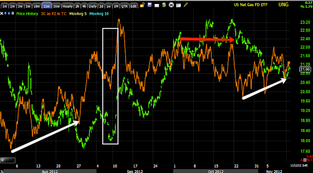
 15 min with a recent pullback, nothing to worry about in my opinion, just an opportunity.

 10 min is the same.

And the more detailed 3 min. I think this is as good an area as any to start or add to a long in UNG, just remember it's a base, it's volatile, it's longer term.

The BIDU Update

The 1 min chart in BIDU for the second half of the call position from earlier today is getting harder to ignore.

I have other duties that come before positions, but if I had time now, I think I'd take the chance on filling out the BIDU call position from earlier today.


Volatility - VIX

This isn't something I'd normally cover, but apparently its getting a lot of attention from the press and therefore I'm getting a lot of questions. So lets take a look at the VIX, the CBOE Market Volatility or "Fear" Index.

First real quick, the VIX moves opposite the market for the most par, once in a while the VIX can act as a very short term leading indicator, there are several different setups including the Bollinger Band one that many of you are familiar with.

When the VIX ix low (and it has been SUPER low recently), there's less fear in the market, this usually corresponds with market tops. When the VIX rises or hits high-end extremes, this is a lot of fear in the market and usually correlates to a market bottom.

Recently on August 17th we hit about 5-year lows in the VIX. From there the market moved up to the September 14th top, the day after QE3 was announced (more evidence of the F_E_D Knee-jerk reaction I always warn of in which the initial reaction is almost always wrong as it was this time), from that point the VIX started moving up and the market started moving down with the VIX hitting its closing high of $19.07 on 11/7 last week.

Today the VIX is down -9.13% and is getting a lot of attention as to what it means. I'll give you some information, you can decide what it means for yourself, there are a couple of camps that have very different opinions on what it means, some think it's the resolution of the Fiscal Cliff being priced in and representing the other side, Zero-Hedge thinks,

  " Investors had bought short-term VIX across the election and are unwinding that protection in the November futures contract but at the same, they are actively bidding for protection across the event-horizon of the fiscal cliff - out to Fedb 2013."  

 I'll let you know what I thin after you see the charts.

 First of all, well before the election the VIX was showing signs on the daily chart that it was hitting a sort of resistance, note the long upper wicks of the candles, the small bodies, some hanging men (although they were after the election) and today's move down toward complacency.

 Looking at the daily 3C chart close up we can see several positive divergences followed by moves up in the VIX. The most recent positive divergence is still impressive and would tend to lean toward the market seeing a nasty downside event, but that must be taken in stride when we consider we are looking at nearly 2.5 years of data here.


 A closer view of the recent daily positive divergence shows a head fake in yellow on a  negative divergence, a strong positive divergence with the VIX moving up after that and a recent smaller negative divergence with the VIX moving down. This last divergence may be politically related, in which manner though I can't say. The 11.22% drop is from last week's high the day after the election.

 Here's the VXX (30 min) used or intraday with a nearly perfect 3C/price confirmation trend at the green arrows until recently with a negative divergence, again after the election.

 VXX 10 min shows a positive divergence and a negative that is clear again, after the election.

 This is VIX which is the Daily Inverse VIX Short Term ETN, there's a nice recent leading positive divergence, this is part of why I like this one long for a volatility play right now, it also fits with our bounce expectation. This 10 min chart's leading positive divergence is impressive and in the right timeframe and place for our bounce expectation. However, even though this went positive before the election, it went leading positive right around the resolution of the election.

XIV on a 1 min chart is leading positive today which makes sense with the VIX's dive today.

I don't know what camp is correct, but what I see is near term VIX downside and longer term VIX upside, this fits exactly with my expectation of a strong bounce in the market followed by a real and serious drop to the downside, one like we haven't seen since 2011, maybe even longer.

I suppose in a way, both camps could be right, they just aren't looking at the market as dynamic and trying to establish it as a monotone, one directional beast, we all know it's not.

Dow Theory-Transports

I don't argue that Dow Theory regarding the Industrials vs. the Transports is not as useful as it use to be being the US is not the same kind of Industrial power it use to be, but it is clear that the "theory" still provides excellent confirmation and areas in which reversals are highly probable.

For instance, in two charts...

 The Dow-30 in green vs IYT (substitute for the DJ-20 as it's pure transports) in red. You can see they mirror each other nearly perfectly and if it weren't for a slight scaling issue in 2011 (although the movement was the same), I could show you how long it has been since we've had a real divergence like this one to the right which is actually largely a negative divergence, but has elements of a smaller positive divergence, just as we expect.

On a 60 min chart you can see where transports went negative before the Industrials and pulled the market down, however since then the transports have been out-performing and making higher highs, suggesting an upside move in the industrials just as we expect, but still the overall divergence is still negative, meaning once again as we expect, we see a move to the upside (the shakeout) and then a new leg to the downside (the reason we want to short price strength during the shakeout).

In no way do I expect these to be sub-par or average moves, I expect them to be emotionally torturous and to really move market sentiment, you may not even want to stick to the plan after it unfolds, that is the point and to be effective you have to make people believe.

BIDU Trade (long)

I think BIDU can be traded with equities or options, obviously there's some risk:reward differences, but the point being is I think even without the leverage, BIDU is still a worthwhile long and without the leverage, much easier to manage from a risk perspective.

BIDU was one of our core short positions we entered back in April after it made a head fake upside breakout which we used to short BIDU, I believe the average entry was in the $147 area, that's only a few points away from the top. It also provided a nice percentage gain as a core short that was eventually closed as we saw the probability of a counter-trend move to the upside as being very high and that move came.

Here are the charts, I believe there are several trades here depending on how patient you are.

 On a daily chart, ultimately I think BIDU is a great short opportunity... eventually. I can't see this kind of damage on a daily chart being fixed without this stock giving up something probably approaching about 75% of its price, but that's another post-just so you are aware.

 The 15 min chart is a respectable timeframe for a decent size trade and that's where the BIDU long originates, a positive divergence (leading) on the 15 min chart after it has gone through the process, the steps...

 Closer, the 5 min chart is leading positive, this to me is kind of like the rocket being fueled up.

 The 3 min chart is also leading positive

 And the 2 min, after putting in a few intraday head fake upside moves saw a clean and clear negative divergence sending BIDU to the area in which I believe market makers are stocking up for a trade they likely filled for a much bigger client.

 The 2 min chart zoomed in looks like it's in line with price, but it's really leading positive by a lot, it was in line at Friday morning.

Here's the 1 min, this is why I said only a half position, I'll wait until this goes positive and try to open the second half.

One thing I see intraday that may be of some interest for price alerts....
Although the range was taken out around $105.90 and thus this could be considered a head fake move, it's not as deep as I would expect on a eyeball scaling basis, meaning just taking a look at the scale and getting a gut feel, the break lower wasn't a big emotional event as far as I can tell so with the triangle-like price pattern in place, a break below the apex is one area, below a tweezer bottom support area is another and finally below the triangle itself is another.

I think the 1 min chart should give us an idea of when the downside move is wrapping up.


Starting 1/2 position in BIDU December $100 Calls

Buying the December $100 calls, half position as I mentioned, a pullback looks likely.

Really Liking BIDU Long

I wasn't able to get those BIDU calls Friday, I'm willing to go after them today even though Friday was better.

There's a chance intraday BIDU pulls back a bit, but I think this may be the last chance to get BIDU calls at a decent Risk:Reward ratio without chasing them. I'll be putting the charts together and positing it next.

Market Update- Technology

Earlier today I mentioned a gut feeling that today might be the perfect time to launch this move, you may recall on Friday in the earlier part of the day we saw momentum to the upside and I WAS NOT comfortable with it, later in the day things looked more like they should, but so far today things look pretty good for this move to finally get kicked off.

We looked at Energy, Financials so we might as well throw Technology in there.

First the Tech Sector (XLK)...

 We'll start with the big picture-30 min chart, this isn't a big enough divergence to create a primary bull trend, but it's more than enough to shake the shorts out and then some. While a move up from here may look like an abrupt turn, there's an entire process that we've seen time after time and every element of that process is on this chart, this is what helps us identify areas where we want to phase in or out of positions or add to positions or take profits. The point is there's a pattern visible on this entire chart that repeats over and over in every timeframe, if you understand the pattern, you understand a lot more about the market, how traders are taken advantage of, how Technical Analysis is used against you and how the market really works and most importantly, WHY it works that way.


 A 10 min chart just before the break below the range area with a leading positive divergence as we've been down here.

 Looking from the other end, the  intraday timeframes, he 1 min is leading positive as of this capture, the open had a small negative divergence.

 The 2 min chart leading positive-again all of the signals we've been seeing in other groups and the market all make sense with what we are seeing here.

 Leading positive 3 min chart and in a big way, very quickly.

 The entire process from the trend of the 3 min chart.

The 5 min chart with the downside reversal, the range, the head fake move below the range and a huge leading positive divergence.

This is TECL the 3x leveraged Tech ETF and my choice for Tech exposure, again if I could have add I would, but I'm pretty much all set and positioned already.

 1 min leading positive.

 2 min


 3 min

 10 min

 And 15 min with the entire process, remember it all started with, "We are very unlikely to see a V shaped upside reversal, reversals are a process not an event" and that's what the process looks like, each a little different but all of the components are there.

 The 30 min chart, leading positive.

I'm not including all of the timeframes as it's a waste, but a few important ones in TECS-the 3x leveraged short Tech ETF-the signals should be opposite of the ones above.

 2 min intraday today leading negative

 15 min leading negative

30 min leading negative.