Thursday, March 29, 2012

ES After Hours Update

After this afternoon's positive divergence in ES mentioned in this post at 12:42 p.m. ,

" I suspect this is probably a good timing signal for a move higher "


The move up started right after that post in ES as well as the broad market. ES started to go negative, suggesting some distribution/profit taking. However in After hour that divergence has really deepened and I suspect we will see some downside in ES shortly.

Risk Assets

For now we bounce..

 Commodities are lagging intraday, mostly oil is holding them back, but I have a lot of other charts to look at.

 Here again commodities have been useful as a leading indicator, thus far today they are not synced with the market, we'll see if the move in line tomorrow, it's probably early to call this a red flag.

 Longer term commodity underperformance is a red flag, which makes sense with the short term 3C charts (bounce) and the longer term showing trouble in the trend.

 Longer term, commodities are signaling a red flag for this trend in the SPX which I think is in the volatile proces of rolling over. This also represents problems with China's growth, Sunday night when their Flash PMI is announced, it may have very dramatic effects on the market, thus this may be why they are trying to bounce it now before the Chinese data.

 This i a bit of a red flag, High Yield credit which would be an obvious choice for a risk on move has sold off all day, perhaps that is what gave the market pause seen in the short term 3C charts as a consolidation.

 Longer term, a major red flag as the position in HY Credit is being unwound, note the divergence and HY Credit can not make a higher high since early February. Credit traders are a lot more in tune with the market then equity traders.

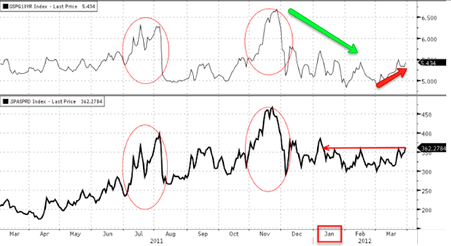
 As usual, rates have been an excellent leading indicator, they signalled the decline to the left and they also went positively divergent vs the SPX.

 Longer term in the trend, they are faltering. Again this makes sense with what we are seeing in 3C, short term bounce, but trouble in the uptrend.

 Very long term, look at the scope of this divergence, yields easily called the 2011 top leading to a 20% sell-off, they even called the bottom before equities in October, although it may seem small and insignificant, it is nearly a month long signal. The fact they are so dislocated from the rally is a major red flag.

 The $AUD does it again as a leading indicator, short term it bottoms before the SPX and is in line intraday.

 Longer term the carry is being unwound and the divergence here is quite scary, this is why I would only be long for very short periods of time as when this cracks, it will be ugly.

 High Yield Corp. Credit is in line with the market intraday.

Longer term it is faltering and dislocated creating a very unstable trend in the SPX.

 Here's about a 3 day look at sector rotation, clearly financials leaked off badly (this is relative performance), Defensive sectors like Utilities, Healthcare and Staples came heavily in to rotation as a safe haven trade started. Energy fell off badly as did Basic Materials, Industrials to some degree and Tech is starting to roll out, most notably discretionary is falling out on this chart.


Looking at afternoon late day sector performance, the bounce is clear in intraday rotation, financials maintained, Defensive sectors fell out, Energy which is down,did show a late day surge, but still  closing down. Basic Materials came back in with Industrials, Tech was a bit weaker relatively speaking and discretionary saw a slight bump.

So now I'm going to dissect the market in more detail and see where the opportnities are shaping up.

GLD / SLV / GDXJ

I had a problem uploading as the album was full so this is not as timely as I'd like, and I see we are seeing some market movement now as the positive divergences suggested.

Silver/SLV

Today's 1 min with positive divergences, and a recent negative, that was obviously a consolidation.

The 2 min chart which shows the positive divergence that prompted my long call on SLV/GLD last week and a leading positive divergence in to the pullback.

The 5 min chart w/ last week's positive divergence and a leading positive divergence on the pullback.

Longer term on the 30 min, a nice long relative divergence going in to a common head fake shakeout in the white box, like I always say, the head fake/shakeout move is one of the last things we see before a move up on a positive divergence or a move down on a negative divergence. Basically this chart is inline with price and as I said last week, I expected this to be a move similar to a swing trade.

GLD
GLD's accumulation today, that red arrow was obviously a consolidation


 The 5 min chart showing a cleaner positive divergence which is leading positive here.

 The longer term 5 min chart showing the reason for last week's long call in the PM's, again in the white box below the red trendline, a shakeout move that was accumulated before GLD moved higher. Tight now the leading positive divergence suggests more upside for GLD as well.

 This is the 60 min longer term trend, the head fake move we made 215% on is visible around the 28th of Feb, this appears to be the cleanest positive divergence in GLD since that head fake move that sent GLD lower.

GDXJ-Junior Miners

 1 min positive divergence today, and that red arrow was obviously a consolidation

 The 2 min chart showing decent accumulation near the lows

 The 5 min chart remains leading positive despite the pullback.

And the hourly shows a strong positive divergence, I favor the junior miners over GDX. I think there's probably quite a bit more upside in this move so if you like it, you may want to consider buying a pullback or you could just jump in here or phase in and add on a pulback.


Market Update

 DIA 2 min , this is a strange divergence, there's a clear positive divergence, but between 1 and 2 pm today it's going a little negative, pullback/consolidation maybe?

 Just for perspective, the same chart showing the longer term trend and this was a difficult one as the market went higher earlier in the week and 3C not only didn't confirm, but consistently went lower, well in the end it was right, but those few days were tough.

 ES is strange too, it went positive, we started to see or are seeing the market turn up in a "U" shape intraday, but like the DIA chart above, recently it's gone negative here. Again, pullback? Consolidation? Distribution ? It's hard to say from this chart. I just can't imagine that these divergences aren't enough to bounce the market.

 IWM 5 min showing a good positive divergence for a bounce

 The same chart for perspective is leading negative territory.

 Ad the IWM 30 min saw some damage as it led lower negative. So the short term bounce is going up against this longer term more important 30 min leading negative, or in other words, short term bounce, but longer term trend is deteriorating bad here.


 The QQQ 1 min still seems like this is the weaker of the averages.

 The divergence is not very clean on this 5 min chart, but it is still there and positive.

 Again, interestingly, the 1 min chart from 1-2 pm is intraday negative within a bigger positive divergence, not sure what that is about, but it is a consistent theme. Maybe they want the bounce to occur at a certain time to align with some news or a gap opening.

 The divergence looks pretty good on the 2 min chart, although for newer members, you have to remember this is still a short term chart representing a short term trend, but I can't see how this doesn't bounce the market from here.

 The 5 min chart has a much cleaner divergence, partially because the noise of the 1 min chart isn't seen as this is akin to a longer term moving average vs a shorter term moving average, obviously the longer term has less noise.

The divergence stops at 5 mins though, the 15 min chart still showing no hint of the positive divergence and has seen some significant damage done as it leads lower.

I'll try to get up a PM's update, then I want to loo at our Risk layout.

Tracking the European Carnage

After several months of quiet on the European front, undoubtedly helping US equity markets, a little over a week ago I started seeing initial signs that trouble was picking up again as I warned, "Europe has been out of the news cycle, but I suspect they are about to come rolling back in". Sure enough, it has started as everything in Europe seems to be coming unglued from a brief several month long respite.

First, I posted the Euro Top 100 Index yesterday which was hitting 14 day lows, nearly 3 trading weeks and just broke the 50-day moving average, take a look at the Euro close today.

This close is the lowest in 16 days (over 3 trading weeks) and well below the 50-day average. Today's close was at $219.15 was a mere 6 cents from making a new 40 day low, nearly 2 trading months!

It's not just the market that is coming unhinged,

This is both the major European market averages and major European Credit, both are falling apart this week.

Take a look at Italian Banks...


It doesn't stop there though, the LTRO, "Save the day, Hail Mary" ECB program seems to have lost its charm and sovereign yields are moving higher once again with Spain a notable problem.

These are sovereign debt yields, since the 27th, they have moved notably higher, both Italy and Spain among the worst.


Here's a long term chart of Spain's 10 year yields, they were trending down  until March, they are now closing in on 5.5%, 6% is considered unsustainable, They are also back to where they were in January, so the LTRO effect is over. Italian yields are back above 5%, gain 6% is where Greece, Ireland and Portugal all had to go for bailouts. The short lived trend down in yields seems to have reversed.

Greece isn't any better...
 Their new bonds are trading under 20EUR which means they are trading at 20% of face value! This is clear confirmation from bond traders they have no faith in any sort of Greek recovery and expect another bailout will be needed or default.

Also remember the charts I posted that showed how European banks are using about 200% more leverage then US banks and EU corporations derive 70% of their financing needs from the banking system vs 30% in the US. Well take a look at the bank run in Greece, even politicians have been caught sending Euros out of Greece as the general public pulls its money out too.


Finally, according to Mark Grant  Spain’s OFFICIAL debt to GDP Ratio of  68.5% is way off the mark and Spain’s ACTUAL Debt to GDP Ratio is nearly double that at 133.8%.

The big problem for the EU is they can't afford to bailout Spain.

As pundits have made the argument that the US has decoupled from the rest of the world, while others believe it is only lagging, the trend in the macro economic data over the last month seems to be showing the US slipping badly. The real question is whether this is a new trend or whether it was always there and just masked by seasonal adjustments that can no longer be made to hide the true scope of the US economic data.


ES Update

I was surprised not to see any positive divergence in ES this morning, it's there now and right at the lows of the day.

ES divergences tend to be a good timing instrument, the only time ES stayed negative for over a day and didn't respond price -wise is when we were at the top of this week's market move up, ES was showing an extended longer term negative divergence from which the market fell. It is rare when ES posts those kinds of divergence as it generally is more intraday oriented, but it was showing the underlying action. In any case, I suspect this is probably a good timing signal for a move higher and thus some trade set ups

Took Profits on AAPL

Yesterday I mentioned the April $615 puts I used in AAPL, I just closed that at  +12.55% profit for less then a day of trade. With the market showing some positive intraday divergences, I figured why not take the profit and reposition.


AMZN Update

I've heard from quite a few members since yesterday that made a nice profit on a quick trade yesterday using puts in AMZN and are now looking for the next set up. I'm really happy to hear not only of the profits, but more importantly that they used the updates to put on trades that fit with their own style. Or in other words, I'm proud that members are out fishing on their own. While I try to provide updates and ideas, more importantly I want to provide the concepts that help members enhance their own trading, that is what makes me most proud and when I hear those stories, it really energizes me.

OK, on to AMZN...

 This is the suspected head fake move above resistance and more importantly above a centennial mark/even number of $200 which the human mind gravitates toward. I'd like to know how many traders placed limit buy orders right at $200, I bet a lot. On the daily chart we have the strong breakout candle followed the next day by not only ZERO follow through buying, but a bearish Shooting Star reversal candle. Yesterday the 3 candle reversal of a "shooting star reversal" was confirmed with a bearish engulfing candle that closed near the lows, but found support at... You guessed it, the $200 area. This is short term and probably pretty decent support, although the breakout/head fake confirmation level is a bit lower defined by former resistance.

 Here are the levels on a 60 min chart, $200 where AMZN found support yesterday and $196.70 which is the breakout level. A move below $196.70 confirms the head fake move and puts a lot of longs at a loss, which in turn creates the snowball effect summed up in the saying, "From failed moves come fast moves".

 On the short term 2 min chart, there's the same positive divergence most of the market saw yesterday, this was enough to keep AMZN from breaking $200 and may provide some intraday lift. The ideal scenario for entering AMZN again would be a bounce off short term support in to a negative divergence that starts to turn down and a close below $200, the deeper the better.

 The 5 min chart shows again the same positive divergence that went in to a relative negative at AMZN's highs yesterday. The yellow square is an unknown at this point, whether it provides another 5 min positive divergence or whether it just hasn't caught up yet and moves lower.

 Here's the longer term 15 min chart relative negative divergence which played a part in turning AMZN down from it's local highs, that chart saw some damage yesterday in a leading negative divergence.

 Again on a 60 min chart, AMZN saw a larger relative negative divergence at the recent highs and even the 60 min has some leading negative action which usually take a lot longer to reach this time frame.

 On a daily basis, Money Stream confirmed AMZN's move higher through 2010/2011  and went negative at the 201 highs, since then it has gone leading negative, this is the long term trend deteriorating badly.

Another mark of danger for AMZN is a break of the daily Trend Channel which held the move down in late 2011 and has held the March move up, a break below what will probably be around the $195 area will be a different trade altogether and more of a trending trade.

So we'll be watching for any intraday strength in to negative underlying action to short in to, otherwise, a break below the two levels I mentioned earlier in another play that can be considered. I would also make a note of the long term trend and the Trend Channel's stop as this would be another trade entirely and more of a trending trade.