With Equity Index weighting, the true composite picture of market action can be deceptive as an advance in a heavily weighted stock can make an average look strong on the day, while the stocks with less weight may in fact have seen a majority decline, this would not be evident by looking at the market average's return alone, so we look at market breadth to get a clearer picture of the trends among all stocks without the weighting scheme that can cause distortions with regard to the market's true nature or action among stocks.
Breadth indications can also be leading market indicators as well.
As a quick example, perhaps you might be considering buying a breakout in the NASDAQ 100, would you feel more comfortable knowing 80% of the NASDAQ stocks advanced in the breakout or only 20% of the most highly weighted stocks while 80% declined?
This is reason enough to keep tabs on market breadth.
These first several indicators show all NYSE stocks and are compared against the S&P-500 (red)

This indicator in green represents the percentage of all NYSE stocks trading 1 standard deviation above their 40 day price moving average, for the most part these are strong momentum stocks. Since the new year we've seen a high of 78.5% of all NYSE stocks trading 1 standard deviation above their 40 day moving average. The dip in the S&P during the end of January was a -1.00 pullback over 3 days and saw the percentage of these stocks dip to 68%, still a healthy majority for strong stocks. The dip in the S&P in early March was a similar 3 day pullback, this time -2.26%, the number of stocks that remained 1 standard deviation above their 40 day moving average fell dramatically to only 15%. After the first dip in yellow, the S&P advanced 7.32% higher from the reading of 78.5% of all NYSE stocks, however the percentage of stocks as of Friday still 1 standard deviation above their 40 day price moving average has fallen by more then half (-57%) to a current reading of 33.68%. Put differently, the % of strong stocks has fallen by more then half even as the market advanced 7+%.

The opposite, stocks trading 1 standard deviation below their 40 day moving average, weak stocks was at a low of 6.44% around late January, at the early March pullback that % of weak stocks rose to 24%, a nearly 400% increase. At the Latest Match dip, it increased eve more to 34% from 6.44%, over 5 times more stocks have fallen a standard deviation below their 40 day moving average even though the market moved higher. Currently the percentage stands at 27.83%, more that 4 times as many stocks while the S&P has advanced

This is just the simple percentage of stocks trading above their 40 day moving average, you can see they led the market as leading indicators in June/July 2010, moving up while the market made a lower low, they also warned at the 2011 congestion/top pattern and again just before the market plunged 20% in late July. This indicator also showed more stocks advancing in to the October bottom while the market was making a new low, another leading indication. Currently they have diverged away from the market's advance in the red box.
Around early February about 88% of stocks were above their 40 day moving average, even while the S&P has advanced since then, the percentage as of Friday, which has been falling ever since early February is down to 53.7%, or
just barely half of the market is above their 40 day moving average.
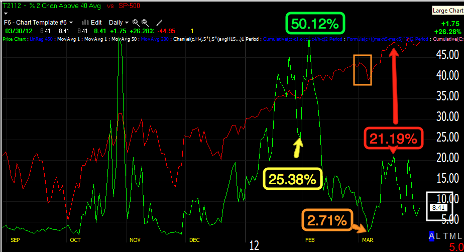
The very strong stocks that are 2 standard deviations above their 40 day moving average peaked during late July at about half of the market, 50.12%, the first dip in January saw that percentage fall to 25.38%, it hasn't recovered since. The early March dip saw only 2.71% of stocks still 2 standard deviations above their 40 day moving average, falling from 25.38% from the previous dip. The recent March highs saw less then half the amount of stocks still above this measure, falling from over 50% to 21.19% and currently at a meager 8.41%. That's a huge decline!

Meanwhile, the weakest stocks trading at least 2 standard deviations below their 40 day moving average had been at a low of only 1.96% in January, at the March dip this number multiplies by 5x to hit 10.82% on a dip. At the most recent dip, 14.62% of stocks were trading more then 2 standard deviations below their 40 day moving average and this coming from a low of 1.96%. Each dip sees more and more stocks fall significantly below their moving average.
The MCO which I like as a leading indicator through divergences went negative just before the July decline of 20%, it also went positive at the October lows, now it is showing a huge and long negative divergences from Feb through now.
The advance decline line for the NASDAQ Composite, all stocks trading on the NASDAQ electronic network, warned in 2011 as the A/D line fell vs the Composite Index, it fell significantly just before the late July sell off.
Again the NASDAQ Composite's advance/decline line (advancing issues less declining issues) has diverged away from the composite and refuses to make a higher high sine early Feb., a much worse divergence then seen in July before the market fell 20%.
The Russell 3000 Advance/Decline line is showing the worst divergence now since the 2007 market top.
Here's the R3K A/D line in 2007 qt the market top.
This is what the Russell 2000's A/D line looked like at the 2007 top.
Currently this is the worst divergence in the Russell 2000 A/D line since the 2007 top.
The MCO summation index is often used as a trend following tool by applying a 10 (yellow) and 20 (blue) day moving average to the index in green. Crossovers of the index through the averages and the averages through each other give buy/sell signals for trend followers, as you cane see, the Summation index is not only negatively divergence with the market, but also has crossed to a sell signal.
Some still claim it's Dr. Copper that is a leading indicator for the market, others now believe lumber is the better leading indicator for the market. This is a lumber average, before the July decline, it diverged away from the SPX badly from April-July. As you can see it has done the same during this current rally.

Applying a 1 month (22 day) rate of change to WOOD shows the warning in 2011 at also is warning now.
If you still prefer Dr. Copper, loo how Copper has failed to confirm the rally, but worse still is in a full on decline in the yellow box.
Using the same Rate of change indicator applied to COPX, there were warnings in 2011 and a more severe warning currently.
A few other leading indicators...
Commodities have underperformed badly, they are usually in near perfect sync with a rally so there's definitely a warning signal to pay attention to, but the larger warning signal may in fact be the global growth engine of China starting to fall apart. While commodities failed to keep pace with the market, more dangerous is the turn down fro mid Feb. through the present.
High Yield Credit is also known to be a leading indicator, Credit markets are much larger and mostly traded by smart money. HY credit should lead a risk on rally, yet HY Credit has failed to make a higher high since Feb 6th. As the Wall Street saying goes, "Credit leads, equities follow".
Yields have provided excellent leading indications on every timeframe including intraday, this recent divergence in an area in which the SPX almost looks like it is completing the right shoulder of a H&S top is another clear red flag.
The $AUD or more specifically AUD/USD carry trade which is often hedged with USD/CAD appears to be in the process of unwinding. The $AUD itself has a good correlation to the market and this recent divergence between the $AUD and SPX is yet again another warning signal, this also works well on intraday timeframes and has called many moves recently intraday and day to day, but the larger picture here is one of a red flag.
High Yield Corp. Credit is also warning. At the 2010 pullback lows, HY Corp. Credit led the market higher, it warned in 2011 before July and is warning again as it has not been able to surpass the 2011 highs at the yellow trendline, diverging with the SPX.
Here's a closer more recent view, HYG itself as an ETF has seen no new share creation and the trend here is at best a triangle, but more then likely the decline from the tops of HYG are again another warning as once again, the SPX has the look of a market coming off a right shoulder in a H&S top.
I'll be covering Friday's action this weekend as well. We saw a good bit of what we expected to see as of Thursday, however there were several averages, the Q's and IWM specifically that did not participate, I knew from the Thursday positive divergences that the Q's looked the weakest, I still expected them to move. Perhaps the rally early in the week and the consistent distribution throughout that rally, sending it lower, did more damage then we realize.