Thursday, July 11, 2013

The Carry Won't Carry Us

Sorry this took so long, there was a lot to include, I hope you explore the links I provided and the charts on them.

With a post like this, I'd almost need a publisher to put everything in place so hang in there with me.

First for those who may have head the phrase, but were too embarrassed to ask (Ask away, if I can help I will), this is the definition of a "Carry Trade"

OK, now you have the basic idea, popular carry trades center on borrowing the Japanese Yen and typically buying the AUD (Australian Dollar as they have a pretty decent interest rate), the Euro or the USD. You may recall about 4-5 months ago I was tracking these carry trades very closely almost every day using some white currency charts, as the market started to get toppy and volatile we saw nearly all of them shut down. The carry trades started in earnest early November 2012 just before the November 16th market bottom that came as a result of the 7-8% pullback after QE3 was announced on September 13th.

Who, Why, When and How?

A lot of carry trades are used by institutional investors and especially Hedge Funds. Hedge Funds have what's called "AUM" or Assets Under Management, a hedge fund can increase their effective buying power or create leverage by engaging in a carry trade, but unlike the typical explanation of "Carry" where the trader is trying to capture the differential in interest rates, hedge funds are using massive leverage on these trades of 10 to 1, 100 to 1 even 200 to 1, which increases their buying power/leverage; that's the who and why (at least one version). Typically they engage in these trades when they are pretty sure things like interest rates are stable, when the F_E_D was giving express calendar dates for when QE would start and stop and when the earliest time they might consider raising rates, this made for a more stable environment in which the traders could count on things staying relatively the same. Imagine a 300 pip move like last night and say you're making/losing $10 a pip at 10x leverage that's a $30,0000 loss on 1 contract, now imagine how many contracts they have open and/or a higher leverage multiple. They can do really well or they can lose their shirt in minutes so a stable environment is important.  Finally the "How",  would you be surprised to hear that most of these hedge funds are not content making 3% or so (even leveraged) and typically use the proceeds to invest in equities and other risk assets hoping to make a larger return, for hedge funds that leverage is the primary allure to the carry trade and it typically goes in the market.

What does this mean to us?

On Tuesday (July 9th) in the "Daily Wrap" I said the following...

"The open and close of the last two days is virtually unchanged as you can see above on the candlestick charts, meaning almost all of the gains came from overnight futures trade....I identified the currency cross that was driving overnight markets earlier at the open, it was the AUD/JPY, but if you superimpose the pair over ES you can see the two never really separated the entire day. I can post a bunch of charts, but it really doesn't matter much, however after looking at the individual $AUD and JPY charts, it looks fairly clear that the $AUD is going to come down in the near term and the Yen rise which does in that pair"

The earlier "Pre-Market" post from Tuesday morning that I was referencing can be found at the link with the charts that showed why I thought the Carry Pair would be moving down. This is an excerpt from that pre-market post Tuesday morning...

"As far as FX carry trades, nothing looks very interesting except the AUD/JPY, but it looks like it's losing some steam, if it does as I suspect it will, we'll see what that does for the market after a pretty nice overnight session."

The main point is the pullback I first identified was directly responsible for yesterday's market gains of 0.02% in the S&P-500, the overnight ramp led by the carry pair wasn't there to gap the market up and as we had already seen the previous days, the market had very little strength during regular hours as evidenced by the closing candles which were dojis and stars (meaning the open and close were almost identical), in fact I posted this chart  and comments to make the point in Tuesday night's "Daily Wrap"

"Almost every day in this leg up has been a Star or a Doji, I guess that is not shocking during last week's holiday shortened week, however the open and close of the last two days is virtually unchanged as you can see above on the candlestick charts, meaning almost all of the gains came from overnight futures trade."

I don't remember which post, but some time yesterday I mentioned that the observation I had made pre-market the day before (Tuesday, July 9th) about the AUD and Yen 3C charts looking like the AUD/JPY pair was going to come down which it did and continued overnight so Wednesday the FX pair couldn't drive the market higher overnight (because that's where all the gains were occurring-on the gap in the a.m.), that left the market flat yesterday until the Berni...

Yesterday's closing gain even with the minutes volatility was 0.04% for the SPY and 0.02% for the SPX.

The point thus far is that beyond the negative divergences, leading indicators and anything else, there was only the overnight carry ramp to drive the markets higher. In fact yesterday's nearly flat close needed a lot of help just to do that, remember yesterday's SPX arbitrage being used to hold the market from falling apart?

$1.15 in positive SPY Arbitrage yesterday just to get to a flat close, if they hadn't pulled the levers imagine where the market would have been.

Last night in, "Now That AH is Closed" I posted this CONTEXT ES model chart with the following comment...
 "CONTEXT continues to widen, I'll be interested to see if they adjust the model to reflect the craziness in currencies, but I'm not sure that they will, it's not like a carry trade closed."

It turns out I was right and sort of wrong, CONTEXT above from last night at -30 ES points was reset this morning, take a look at the new chart below...
The reset was precisely from a Carry trade being closed as carry trades are part of the model, remember this post today "Leading Indicator FXA or AUD/JPY" and in that post I included a link to ZH about a carry trade being closed that a member has sent me, I had not read the article at the time I posted it as I made clear in the linked post above, this was the ZH article from 11 a.m. this morning, "The Day the Carry Trade Died (Again)"  I didn't get a chance to read this until near the close, the key parts were...

Here they are talking about the AUD/JPY Carry that has been driving the market in overnight gains being dead this morning...

"Another day, another 3-sigma swing in one of the biggest and most important FX carry-trades. AUDJPY is collapsing this morning as the smell of leveraged trades being tapped on the shoulder is all too fresh...."

Here they correctly identify the type of market conditions that are ripe for carry, "Low-volatility" and as we'll see, they say they were starting a large carry position again recently which we will see from my earlier posts is correct.

"Critically, carry trades are predicated on leveraging low returns in a low-volatility world; the shocks from a few weeks ago saw carry unwinds en masse - but all it took was a handful of Fed officials and Draghi/Carney's chatter and they are backing up the truck of the carry-express once again "

This part they either got incorrect as we identified the start of the decline in the carry trade early Tuesday morning OR... the market knew about it. You may recall in my post on the subject today before I had read this I said,  

" Something changed in the AUD/JPY and fast, I didn't read the article from earlier, but from the looks of 3C, I'd say something like a carry trade being closed quickly was what happened here."


"On a 2 hour chart where trends are visible without noise/details, the accumulation is clear, but so is the very sudden change in character as the most recent divergence is very sharp, very strong.

It does look like the AUD/JPY pair was closed out, I still haven't read that article, but perhaps something there makes sense with the above."

In fact, other than this post, the earlier post, "Strategic Update" which those comments came from today may have been the most important post all week, it's not long, I strongly suggest just taking a look at the charts again, the "Backing up the truck" or large positive divergence is very evident as it the very fast negative change.


OK, now the premise is pretty much laid out, lets look at the facts.


The charts below are of ES (S&P E-Mini Futures) in red and green candlesticks and the AUD/JPY "carry trade" in purple. There's no 3C on these charts, just a comparison between the price action between AUD/JPY and ES.

 This is a 1-day chart that stretches back to August of 2012 to present. Remember I said above that the carry trades (that included EUR/JPY, AUD/JPY and USD/JPY) started around the start of November in to the November 16th market bottom. 

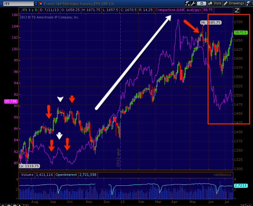
Right at November 16th, you can see the correlation move from lower prices in the carry that essentially means they sold assets to close the carry trade to the carry trades back on and the two moving in tandem together.

Note that around March the carry pair started to decline, this is about the time I suspected they were being closed out, you may remember I was following all 3 every day looking for changes in character that led to reversals in trend. To close a carry trade, the leveraged equity trades that were financed have to be closed, and the borrowed money (Yen) returned. The start of that process coincides with the market top and the trade is in what might be called a "Leading negative" position vs the SPX.

To give you proof of these trades being closed out, just think about the Market Breadth charts, other than what 3C is telling us, there must be other evidence of a mass migration out of stocks. Here's 1 example...

This is the SP-500 in red and a custom indicator in green, "Percentage of All NYSE Stocks Trading Above Their 40-day Moving Average". In any normal, healthy trend, higher prices should mean more stocks trading above their own 40-day moving averages.
From the November 16th low the SPX and the percentage of stocks above their 40-day moving average were both growing. In January 85% of all NYSE stocks were above their respective 40-day moving averages. In April that number is 64%, late May/early June that number is less than half of January's reading at 32%, even though the SPX is nearly 10% higher than the January reading, the percentage of stocks is less than half that are above their 40-day moving average, meaning a lot of stocks were falling so much they fell below their own 40-day m.a. In June that number reached 16% on a pullback of -3.3% !!! Today the indicator closed at 45.54%, nearly half of January's reading while the SPX is just a few percent away from an all time new high!


This is the same AUD/JPY (purple) vs the SPX on a 4 hour chart so you can see how closely they are correlated.
 That's the 11/16/2012 low at the far left.

This is the same 4 hour chart showing February to today.
 Notice the decline in the AUD/JPY is preceding the top of the SPX, however the sell-off of the carry pair is so deep now, it's what we would call a, "Leading Negative Divergence". If you recall some of the 3C charts of the Index Futures I posted this morning, 3C looks VERY similar to the currency pair currently as the market makes a weak attempt higher (I mean weak because volume is anemic, the daily range is tiny with the close very near the open and barely any intraday gains being made).

Here's the post from earlier today, "Additional Charts" showing the Index Futures and 3C charts, just compare one or two of the charts of 3C (and Money Stream to give you two totally differently coded indicators and market averages)  to what you see above.

 The DIA since the 2009 market bottom until today, note the leading negative 3C divergence.

The SPY and Don Worden's MoneyStream with a similar leading negative divergence showing heavy distribution.

This is a 60 min chart of the AUD/JPY vs. SPX futures (ES).
 Look at the mid-June negative divergence to the left, the accumulation area in white and the very deep and sudden plunge in the FX pair in the red box.

In somewhat similar fashion, here's a formerly perfectly in line (trend confirmation) 3C chart (30 mins) of Russell 2000 Futures suddenly plunging on a serious timeframe to a huge leading negative divergence, these charts formerly were all in line.

TF-30 min

This is a 15 min AUD/JPY carry pair vs ES

 The point here is to show in white the overnight ramp of the market by the carry pair leading to Monday and Tuesday's gaps up, but remember I identified a problem and said the pair would fall apart, thus in red the futures were not ramped via the AUD/JPY overnight and there was no gap up Wednesday and the market closed (SPX) at 0.02%.

Look at how badly the FX carry that has been supporting this market since November 16th, has fallen off;  it reminds me of the 30 min 3C chart of TF above or this 3C ES 15 min chart from this morning's post linked above.
ES 15 min from a strong negative divergence to an insane leading negative divergence.

This is the FXA (AUD ETF) I showed earlier today vs the SPY, it's hard to get the scale correct here, but...


If I zoom in a bit, you can see how the market traded right with the AUD and thus the AUD/JPY.
FXA (red) vs SPY.

The only disagreement I have with ZH's article is that they say the sudden panic to exit the carry trade (which means stocks would have to be distributed to close it, explaining why the 3C divergences are so sharp) was because of Bernie's comments last night, but as I've already clearly showed you with a linked post, Tuesday morning we were already seeing 3C distribution in the pair severe enough for me to say,

"As far as FX carry trades, nothing looks very interesting except the AUD/JPY, but it looks like it's losing some steam, if it does as I suspect it will, we'll see what that does for the market after a pretty nice overnight session." 

So that may mean someone knew in advance what Bernie was going to say after hours the next day or there may have been another reason, either way, there was serious accumulation of the AUD/JPY as pointed out in linked posts above and it was suddenly and sharply distributed.

This leaves the market on a very precarious limb, not only distribution throughout and for some time, but sudden panic in the FX market up to 48 hours before Bernie ever spoke.


I have a great post for you

I'm putting this together now.

It's often frustrating to see a signal and not know what it means, it's even more frustrating to see a signal that just doesn't seem to be doing anything.

In this case, especially if you take the post from this morning (right here if you want to review which I would encourage you to do, become familiar especially with the Index Futures signals) this is one of those rare instances when the mechanics actually come together, you can understand the signals and in this case I think you'll see they are worthwhile.

So check back in about an hour, there's not too many times when things make sense at the time rather than after the fact, but I think this is one of the times.

Positions

Beyond those opened or closed today, I wouldn't take any more at this moment, perhaps tomorrow, the one exception would be an AMZN put as a short term "Fade" trade, but considering tomorrow is Friday and a typical op-ex pin, I think I'd wait on that as well.

MCP Update

If you are short term trading MCP (I'm consider it a long term position and leave it alone), after yesterday's 16% move understandably there's profit taking, "if" you are short term trading it there are profit taking signals so I would at minimum, have a trailing stop in place.

I would say use a 50-bar 15 min, but in this case I think the Trend Channel is better, the current 2 stops (1 a bit tighter) for this swing up are $6.62 and $6.74, the TC will keep moving to lock in more gains so if you need an updated stop, email me with that in the subject line, I'll try to get charts up AH.

AMZN Now looks to be the Fade Trade

You have to be nimble, especially going in to a Friday known for op-ex pins, but AMZN was throwing off the signal, I forgot that in my own update (yesterday?) I said $300 would be a magnet, now that $300 is hit...

$300 is right where AMZN lost momentum

Strategic Update

I can take some of these positions that I have opened this week, especially the last 2 days, because I know what's pushing the market, I know what the market looks like without it pushing it and I know that what's pushing it is fading.

I didn't read the article about the carry trade, a member that I trust sent that to me and I had been talking about the AUD/JPY anyway as the overnight risk driver to lift options amidst light volume. There's the signals as well, and then there's the signals in the catalyst that look like the signals in the market/futures.

Let me get right to it.

We just had an intraday bump in the road...
 You can tell right from the NYSE TICK chart (all NYSE advancing stocks minus declining stocks), the channel coincides with the move in the market, the break of the channel coincides with the interruption of that move, often TICK will warn before market averages do, that's why I rec'd watching it from time to time.

This is the SPY (green) and the $AUD (FXA) in red, this represents the carry trade AUD/JPY, the AUD's ETF is FXA so it's not perfect, but close enough as you see.

Now about the pair...
 After heading down there was a positive divergence in the AUD/JPY pair, but 3C on FX crosses is only generally good on intraday charts, after that there's more of a flat line so I need to look at the individual currencies that make up the pair, in this case I really only need to know what the $AUD is doing, although knowing the Yen is helpful as well.

 Something changed in the AUD/JPY and fast, I didn't read the article from earlier, but from the looks of 3C, I'd say something like a carry trade being closed quickly was what happened here.

The 15 min is leading negative like the Index futures on the same timeframe.

The 30 min chart shows a decent area of accumulation, the $AUD should have run a lot more than this, but there's also a very sharp and quick negative divergence.
 
The 60 min shows the accumulation of $AUD, then look at how fast the 60 min chart shoots down to a leading negative divergence and very recently.

On a 2 hour chart where trends are visible without noise/details, the accumulation is clear, but so is the very sudden change in character as the most recent divergence is very sharp, very strong.

It does look like the AUD/JPY pair was closed out, I still haven't read that article, but perhaps something there makes sense with the above.


USO Equity Position (DTO long)

This is an Equity position only, I 'll use DTO 2x long Crude. The stop in this case I plan on is $31.40 and the target is $40- $42. A pullback to the $33.10 area would be nice and I may try to wait that out.

This will be half a normal full size equity position as it is speculative.

Here are the USO and CL (Crude Futures charts...
 USO intraday has been fairly in line, it did go negative intraday yesterday at the highs.

The 5 min chart is leading neg.

The 10 min chart and 15 are leading negative.

DTO is leading positive out to 30 min, about the same as the futures indicate.

Crude Futures...
 The CL 1 min chart suggests a bounce (pullback for DTO) intraday, that would lower the risk.

However the 15 min is very nasty looking

As is the 60 min.

These really look worse than anything I've seen in oil and I've stayed away from it, here I'm, willing to take a small chance on it with a fairly tight risk management plan.


Leading Indicator FXA or AUD/JPY

The market short term is still being drug around by the nose by the AUD/JPY, it has been this way in after hours or overnight trade all this week, the day I said the pair was coming down was the only day the market didn't gap up the next day as the pair did come down.

ZH has an article about it this a.m., I haven't seen anything beyond the title, but it may have some interesting nuggets for those who want to understand carry.

For those who want an early warning, ,use FXA vs the SPY.

 FXA is just the ETF for the AUD, but that is a big part of the pair, this is AUD in red vs SPY in green, I showed you earlier in the week the correlation between the two as well.

This is the actual pair from 3 a.m. this morning to present.


Closing an Old GLD $132 Call

This is at a loss, I figured it would expire worthless, but today gives it a bit more value.

I'm closing it now.

AMZN

Excuse my last AMZN  post, AMZN wouldn't be a fade until $300, the last AMZN update said AMZN will likely be pulled to $400 as a psychological matter, those centennial numbers.

AMZN

Nice move in AMZN today, if you were interested in fading the move, AMZN looks very close to being topped for the day.


Quick Market Update

I'm still waiting on good intraday signals for some positions, there's rotation among the averages intraday and the Index future intraday signals confirm these exactly.

For example...
 The DIA/Dow is in the worst shape intraday, it looks ready to make a move lower, when all look like this that would be a great intraday signal.

This is the 1 min.

 DIA 2 min is really bad

And the 3 min zoomed in is bad as well, but I'm trying to give some context within the trend here.

The IWM looks to be the next to make a move, the Q's were the last to.

AAPL seems to be directly responsible for the Q's action as it is the heaviest weighted stock on the NASDAQ 100.

The SPY is going negative, somewhere between the DIA and the QQQ

Could the TICK chart actually break out of the channel? If the IWM makes a move, I'd say yes. I'd also keep an eye on the TICK chart, I think there's good data there in advance.

AAPL to take the Q's lower

Looks that way, since the negative in AAPL,  (I'll be slow on emails again for obvious reasons)

 QQQ 1 min intraday

QQQ 5 min intraday

NQ / NASDAQ futures intraday

AAPL Intraday Update

I still haven't changed my mind on the AAPL long equity position, I'll still leave it open because I think what is going on with AAPL is unique, after a 45% loss, this looks to be a well put together bear market (AAPL's bear market) rally.

As far as intraday for those with Calls or anything like that, I'd at least have a trailing stop in place based on this intraday chart.

Financials / FAZ Position

I'll be taking up a position long FAZ (Bear Financials 3x leveraged) I'd think at some point today, the intraday 1 min signals is not where I'd want it to be, but considering the bigger picture, I might just pick it up and not worry about the perfect intraday signal/entry.

Here are 3 different ETFs, because of their volume being different they can all have different signals, but typically they will confirm each other if there's a trend between the 3 so I'll show you XLF (Financial Sector), FAS (Bull 3x long financials) and FAZ (Bear 3x short financials).  For confirmation, XLF and FAS should have negative signals and FAZ should have positive signals.


XLF-Financial Sector
 The 1 min intraday chart here is the best signal actually, from a leading positive intraday 1 min late yesterday to a leading negative right now

 3 min longer term trend, but also a leading negative signal

The 27th is the day (Thursday before the 4th of July week) in which negative signals first started showing up.

 XLF 5 min trend, nice and clean, a clear leading negative

The 4 hour (see FAZ 1-day as well) in line and right now because of where price is, the deepest leading negative signals it has had at least as far back as I can see on this chart.

This is why I'm choosing an equity position rather than an option, I believe there's enough evidence here to suggest a longer downside trend.

FAS 3x long Financials
 3 min from accumulation to a leading negative divergence.

 10 min from accumulation to the same, although the current leading negative is the worst of the lot, remember the concept I posted either yesterday or the day before about where a 3C divergence first starts and price on the reversal surpassing that area, the first deep divergence started right in the middle.

 FAS 15 min shows virtually the exact same signals, which is good confirmation within the same asset.

FAS 30 min in leading negative position, also showing earlier distribution.

FAZ 3x bear/short Financials
 3 min intraday is in leading positive position, this is confirmed by all of the averages as their 3 min charts were all leading negative position.

5 min

15 min trends, this would be the strongest divergence positive or negative on the chart.

This is the daily I mentioned above, just under support as almost all double bottoms (vice versa double tops as well) now do.  The point is a  daily divergence is quite strong to show up on a chart this long and this is leading positive from an earlier downtrend with good 3C confirmation.

I'll let you know if/when I enter, but it will be an equity long FAZ position