Thursday, February 7, 2013

Daily Wrap-if that's possible


I don't even know where to start tonight. Lets start with what the averages actually did, the S&P, even though it ramped from 11:45 on after opening lower on a devastated Euro, closed in the red at 0.19%. The Dow-30 ramped too from about the same time to close down 0.31%, the R2K was essentially the same story at -0.36 and the NDX turns out was the right pick if you were going to pick any of the averages for buying calls today at 10:50, about 10 minutes before the NASDAQ 100 reversed to the upside for the day to close the best of all the majors ar dead, flat break-even or 0%, the calls themselves as of the close were worth about 6.6%, not exactly what I was hoping for, but with a little AAPL help near the close they added a bit more in after hours as the NASDAQ futures headed higher for another hour.
If there was a pick today in the averages, AAPL was it, hopefully the calls that are now in the green retain some value and add to it.

There are two things (essentially) I'm expecting, Trend 2 to the downside, but before that a bounce to the 
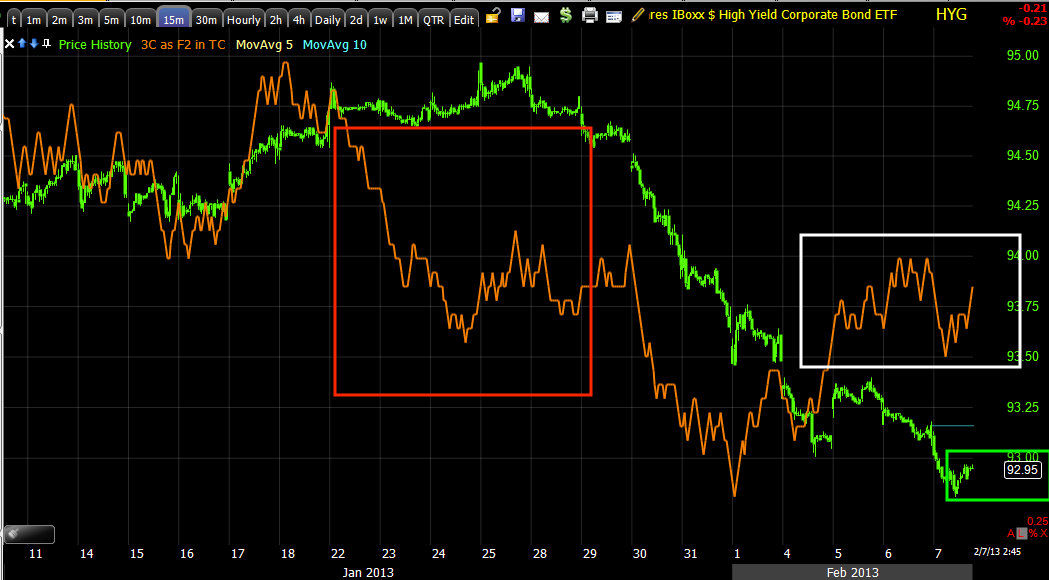
upside as HY Credit can be called oversold pretty credibly and has a positive divergence that suggest it wants to work off a bit of that tension or for whatever reason. Actual performance of HYG today fell behind that of the SPX, as did Junk Credit so the divergence remains, but the downside song remains the same, which is part of what is making trend #2 look so nasty to the downside.
 HY corporate Credit lost more ground today, bounce or not, it's pretty darn hard to come back from this large of a dislocation and while some claim the POMO train eaves the station late morning, to noon, why isn't the most discounted High Yielding asset part of the party, a party that is going no where fast as you can see by today's returns, but has all the volatility and making of a scary top?

O the other hand, the only reason I think the market has a chance to move to the upside at all is because of a positive divergence in the very same asset, positive as it is, I still can't see the market escaping the massive dislocation seen in credit-talk about a manic market!

However, High Yield Corporate and Junk Credit aren't the only leading indicators leading to the downside, the $Au$$ie has gone so negative, it's far below the start of trend #1 and is all the way back to the start of the new cycle at the November 16th lows.
As a leading indicator among the currencies, the Australian dollar has to be one of my favorites, perhaps because it is a favorite of the carry trade crowd and responds long before the market as you don't take guesses with 200 to 1 leverage. The $AUD is the worst looking leading indicator we track, while most are bad enough at new lows on the year, the $AUD is at the lows of November 16 that started this new cycle, that's a huge divergence.

After the ECB decision to leave rates alone and Goldmanite, Draghi spending the rest of the time trashing the Euro-zone, he managed to knock the currency down without cutting rates, today was the first day the currency really decoupled with the 
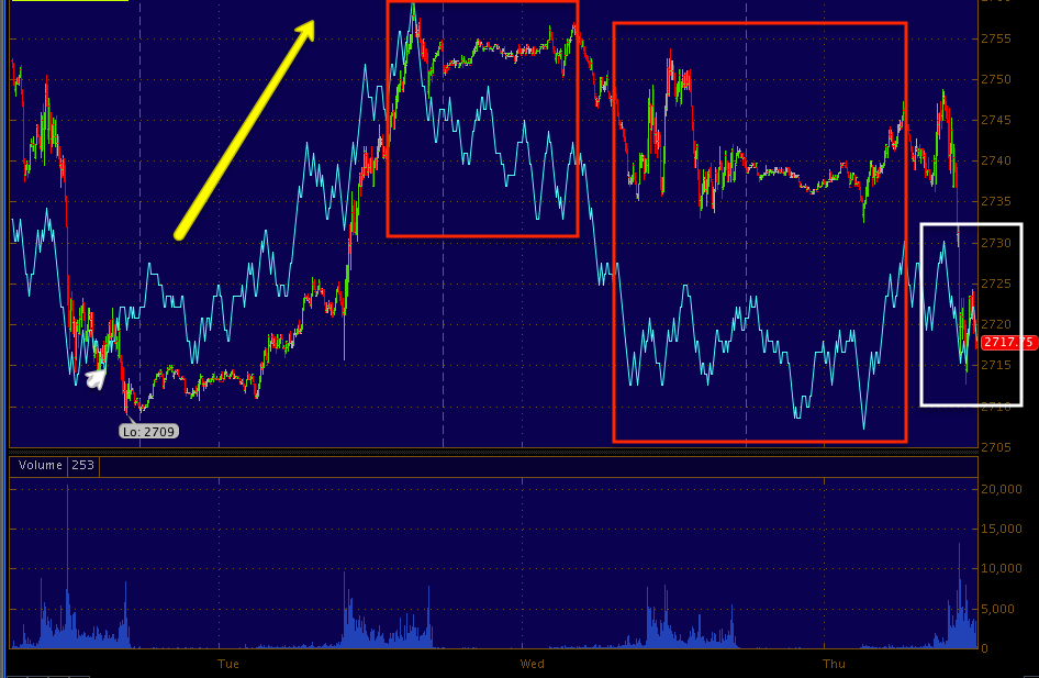
SPX, so what did they use to lift the market off the lows?
That's the Euro in orange vs the SPX in green...

It looks like the 2013 old standby, the VIX.
 To whatever degree the market was saved today from a worse fate, it seems the VIX was again the asset of choice.

However as I mentioned, once, twice and just last night to my recollection, since the buy signal in the De_Brandt-icator or the SLOT (I hope I don't make a spelling error on that suggested name), the VIX has seen what must be a year's record in huge volatility to a squeeze indicative of a highly directional move, but one I have suggested at least 3 times, has more time for price to loiter in and around the Bollinger Band Squeeze, but that can't last forever and I really don't see a highly directional move to the downside in the VIX after it has recently hit something like 6 year lows.

The Yen which is flat and threatening just about every carry trade basket remained flat today which is a lot different than the recent past when it was nose diving, whether the threat is serious or not, it's there.

Meanwhile the $USD/Dollar index continued to gain for the week (+.73%) being the biggest 4 day move in 7 months, this seemingly having a lot to do with the recent increase in volatility now that investor sentiment is at ridiculous levels clearly consistent with a market top and bad news to follow for all the new dumb money as I have shown the last several week, but again today in a couple stunningly beautiful charts. The first, the oxy-moronic Investor Intelligence survey with a 33.6$ spread of bulls over bears seen here 


In addition to all the other evidence, we have Mass Psychology, a study unto its own, flashing major red lights.

Still in Leading Indicator land, Yields were negatively divergent again today as they have been throughout this increased volatility, HY credit hasn't moved for days, not even with the volatility, and commodities-that “other risk asset group, was taken today with the falling Euro and rising dollar that it couldn't get off its back all day, not to mention the group hasn't made a higher high since November 21st of 2012. In fact the in what may be a sign of the future of risk assets, the volume dependent CME for the first time I remember in quite some time actually cut margin requirements for Gold and Silver along with a slew of others by 10% and 14% lest all business run dry due to a lack of volume as seen below in GLD.

This is another asset I have only wanted to trade very short term, but see something developing, perhaps this was that something and we start to see a more workable set of underlying divergences to give us an edge that lasts more than a few days and is actually worth putting some capital in to.

However the biggest early morning and end of day news may be AAPL which I recently looked at, decided something is going on there, but not having a solid grip on what, what timing, what kind of move, decided to wait for the charts to provide more of an edge than just, “Something is going on”.

This morning the news was out that fund manager from Greenlight that I just talked about mere days ago, David Einhorn who like many AAPL long fund managers has watched his profits erode, some have seen more than profits erode, is suing AAPL. Einhorn more or less wants to be compensated for his losses (although his lawsuit is saying that, not his words) so he is more or less demanding that AAPL take those record cash profit they have amassed, of which approximately 70% is located off shore in managed accounts and only 30% is free, and create and pay him a preferred class dividend. For most of the day until about an hour or so before the close when AAPL said they are more or less open to returning more cash to shareholders, even as they have already paid out $10 billion of $45 billion over 3 years. AAPL's management more or less said,

Apple's management team and Board of Directors have been in active discussions about returning additional cash to shareholders. As part of our review, we will thoroughly evaluate Greenlight Capital's current proposal to issue some form of preferred stock. We welcome Greenlight's views and the views of all of our shareholders.”

From there, here's what happened...

 On the 10 min chart something is going on in AAPL, there's just not enough collaborating charts to make a judgement about what kind of trade and more importantly when, this isn't the first bullish divergence in recent months we have seen in AAPL to only see it go through a series of Crazy Ivan head fake moves.
Here's the move on the release of the statement, now you want to see something that confirms the fact that some people get information well before others as there's no money to be made chasing this short duration parabolic move, by the time you get filled, there's not much less unless you are an HFT. However, with the right timing and confirmation, we can still compete, although I personally wouldn't have this time and make no apologies about it.

For a statement released about 3:38, there were signs of someone knowing something as early as 2:15, for sure by 3 p.m., but as I said, I wouldn't have jumped in to this, at least I don't think so and here are two reasons why. The first is right above, this is a 1 min chart only, that's not heavy accumulation, it's more likely market makers or someone getting word AAPL is coming out with a statement which is something AAPL never did under Jobs. Second it looks like the move was sold in to as you see the red negative relative divergence at the highs.

 Third, the divergence wasn't strong enough to hit the 2 min chart, Monday morning quarter-backing is ok with the Superbowl, but we live at the right edge of the chart where you never know what is coming next and 1 chart, a 1 min chart, is simply not enough to jump in to a trade like this, not for a couple of percentage points.

Moving forward, looking at Futures, although it's very early, they aren't knocking my socks off, but I will be fir and say they aren't so far gone that they can't stage a comeback overnight in the 3C charts, although tomorrow is op-ex and even the weeklies lately have been very slow days, typically starting on a Thursday and today qualifies as slow, so we'll want to watch futures in to the end of day trade, that's where we picked up last Friday's money making trade sold on Monday.

 Although positive earlier and worth taking, ES is now very blah on the 1 min.

 More importantly is the 5 min, it's not so far gone that it can't be salvaged, but much more deterioration and I have to wonder where the HYG rally is going to come from.

 NASDAQ futures are staging a bit of a comeback after the after hours AAPL ramp was sold in to, so a comeback is possible.

 Again the 5 min chart is not too far gone, but it's not signaling a lot of confidence.


However Gold futures which have been in line are showing a positive disposition since before the CME margin reduction came out, this is one we will want to watch, there may be more opportunity here than dumb luck based on lower margin costs.

Lastly as for the Dominant P/V relationships today, the Dow had the most bearish of the 4 with 1/3 of the components closing up on lower volume, usually a sign of faded momentum.

The NADAQ luckily was on the opposite side with Close Down/Volume up at 40%, which is typically seen at the bottom of a move before a 1-day reversal to the upside.

The Russell 2000 was just barely dominant with the bearish Close up/ Volume down.

Finally the SPX had no dominant relationship.

I'll be looking for the Q's to hopefully make good on the expiring weekly calls tomorrow, I think our best chance based on what I know now is to look toward the afternoon trade for a set up in to next week.


UNG Charts

Just last night I was in the car and scanning radio stations and the 5 seconds it was on one local station that carries a nationally syndicated show I heard the words, "Natural Gas" in the context of MENA instability, especially growing instability in Egypt which is the center-piece of stability in the region with Israel and with regard to U.S. energy independence. Everywhere you look, Natural Gas is becoming a bigger part of the national debate.

Today was EIA Natural Gas Inventories and for a 3rd week inventories fell 118 billion cubic feet, down from the prior week's -194 draw.
Released On 2/7/2013 10:30:00 AM For wk2/1, 2013
PriorActual
Weekly Change-194 bcf-118 bcf

On a year/year basis, we are getting near the low end of inventories.


 There are no revisions to this data, it is "as released" and I really don't know what consensus was, they use to provide it, but thy don't anymore.

I know there have been 3 consecutive weekly draws, the first one saw UNG rally, the last two have seen it fall, down today -4.24%, but buying UNG on a pullback like this within the context of how I feel about UNG long term is of little consequence to me, actually it's kind of a sale and it may indeed have been a planned sale unless the EIA is leaking again like it use to about a year ago on the petroleum reports.

Here's the charts ad there are a few that are telling us we're at a special area.

 The white arrow is where we really first started paying attention to UNG, the volume was a give away something was changing with the stock. The large ascending triangle is certainly a base, the last yellow box denotes a head fake / false breakout area, which at the time I said would send UNG lower to accumulate to make a real run at a breakout and stage 2 mark-up, where the trend is. After the pullback, so far we've seen a higher high and a higher low, the start of a trend up.


 Here's that same head fake area, the first helped to complete the ascending triangle which made it easy to manipulate technical traders because they have a good idea of the price pattern and what they expect it to do, again you see the higher low and high.

As far as the head fake...
From left to right we have confirmation of the downtrend on a 4 hour 3C chart, leading positive divergences through the base area with relative divergences at resistance (weaker divergences-enough to turn price down, then we get a leading positive divergence around September, it is possible there was a real breakout attempt made here and they found they didn't have the timing in the market or the interest to draw the volume spike needed to signal a stage 2 breakout and abandoned the idea, that's conjecture, alternatively it could have been increased accumulation as the elections looked like they were going one way or the other. What is clear is the negative divergence at the last head fake / false breakout sending price below the triangle, creating a lot of supply to accumulate as stops are hit en-masse. Since, as I first proposed before we even had a break below the support of the triangle, we have a leading positive divergence suggesting exactly what I was thinking, between the supply available on the stops and the lower price, it looks to have been accumulated in some size.

As for some interesting other signals...
Money Stream is showing the same as 3C, large accumulation in a base area.

This is a second version of my DeMark inspired series of indicators on a 4 -day chart, I asked for some help with the name, I have the "DeBrandt". Throw some more ideas my way, or you'll have to live with that!!!

We have 2 major buy signals and 1 sell, note the recent buy is right at the bottom of the head fake pullback, you can't really ask for a better buy signal.

This is the original version on a daily...
Excellent sell signals or pullback and again the same buy at the bottom of the head-fake pullback.

As far as the report and possible leak I mentioned, there was a distribution signal on a 5 min chart yesterday...
A leading negative on a 5 min chart yesterday and a leading positive starting up today, I like price here, as far as an options trade, I'd want to see the indicator lead positive more and a rounding shape like so...

Just as the top rounded, so should the bottom, it allows for accumulation. Note the stops hit exactly at 10:30 and 10:35 on heavy volume, making it easy to pick up a lot of supply at great prices for Wall St.

These are some other indications you can use for momentum, most of these indicators are widely available and quite useful for tactical planning... use them on a 5 day chart for strategic planning, scanning and finding candidates.
 The 5 min-50 bar moving average is widely watched by traders so it can be helpful in knowing where they will react, we want to see the average turn up and price cross above it, although option trades should probably be placed before price turns up.

 I have a momentum indicator on price that went negative yesterday and positive today, Wilder's RSI-NOT RSI which is different and a setting of 6 which is faster than most people use, it went negative yesterday and positive today. If you were short term trading or trading options over a day like we have been, these would be essential signals to sell before you lost momentum and premium.

I also have MACD, but I use a long setting of 26/52/9 or 52/104/9 rather than 12/26/9 as my settings reveal the trend better and they are something no one else is using or seeing. I also have along setting Stochastics of 50 period, I want to get out of short term trades when the embedded green +80 is broken and get long when the embedded +20 is broken to the upside. I want to stay in the trade as long as the signal is embedded, believe it or not, this is one of the best trending back-tested systems I've tested.


Finally, The short term 3C also shows distribution yesterday before the report and a leading positive today, for an options trade I'd want to see some more accumulation and hopefully an entry before price turns up too much.

Remember this is a long term/investment type of trade, give ti some decent room on the stop.

Euro to let up some pressure?

I think so, again it's a matter of timing.

 This is a 15 mi chart of the SPY (green) vs the Euro, note the divergence i the Euro to the dwnside, more importantly for your tool box, note where SPY/market volatility picked up in relationship to where the Euro went negative.

Understand what that means, it's really about the $USD, it's stronger and causing resistance, the Euro isn't there to support the move and volatility is picking up as any little break in pressure allows the market to shoot up, a return to pressure tries to bring the market back down tward the arbitrage correlation. There are all kinds of assets that could cause this, but the $USD is one of the most fundamental.

 Here's the EUR/USD with the leading positive, it doesn't look huge here, but since the capture it is now just shy of the highs to the far left.

 The Euro (really the $USD, but they are so heavily correlated) is acting as an anchor on the SPY, if the tension lets up, the SPY/market likely snaps up in volatile, fast form.

 1 min SPY is negative, but has been mor like a consolidation than anything.

The 2 min could go positive here , it's not far gone at all, so watching the EUR/USD will be an early warning as to what the market does and when.

Adding to UNG Here-May consider (calls) options later

I'll post some charts next, but I'm thinking this is a good area for an add to-I'd prefer to do this in two stages (there are two options as you'll see) because I like it here, but I also think that it could use some lateral or "U" shaped movement. The second half would be at what I consider the best timing and price, the first half is because there's a good looking divergence here which you will see in the next post.

The other (second) possibility is to just add here like you normally would on the equity long position and save the second area for a call trade, that's really what I'm leaning toward.

3C charts on the Averages

Are also clearing up and moving from 1 min consolidation or negative relative divergences to either momentum toward a positive position or in a positive position, in other words, they are getting stronger too

Short Term Change of Character

The EUR/USD positive 1 min divergence has been a relative divergence all afternoon which has kept it lateral or consolidating through time, it just started leading and it's getting some (3C is) momentum behind it.

The TICK is getting volatile, but I could see some more bullish price action in to the close from what I see now.

Perspective

I want to post this to give you some short term (as in what's going on now) and longer term perspective, each of us is unique, we have different risk tolerances, we have different priorities as to whether it's more important to be fully in a position and ready or whether it' more important to get the best price with the lowest risk and the best trade, but be willing to risk not being fully loaded or set or more likely the happy medium between the two.

I'll use the SPY for an example and a few other charts and try to make this as simple as possible.

I have to start out with the caveat obviously that momentum can change very fast, especially as we get in to a more volatile market, look at the Euro pre-market vs the Euro now, it went from 100 mph to 3 mph. Also the further we are along in this process of topping/reversing, the less predictable or less reliable the probabilities as market participants take a "Whoever sells first, sells best" attitude; this is EXACTLY what happened with AAPL, all of the concepts and signals said we had 1 more good move to the upside and that's where we wanted to be short AAPL, but every hedge fund out there wanted out of AAPL all at the same time so the usual behaviors and probabilities became much less reliable as we have large funds fighting for their very existence and multi million dollar jobs (or a lot more). Keep all of this in mind, it's not a "Weatherman's, Partly Cloudy" caveat, "well it could rain because there are clouds, but it might not because it's partly cloudy", this is just the truth as AAPL revealed painfully.

 SPY 1 min momentum is fading here, a 1 min chart's negative divergence can lead to a correction/consolidation laterally through time.


 The 2 min is still in line, if it were negative too, it would be more likely that we correct to the downside or even move lower.

 This 3 min chart still has a decent head of steam, so until or unless the 1 min negative migrates and turns these negative, I have to assume the chances of continued upside are still good within a reasonable timeframe of a day or so.

 At 5 mins, this is where we kind of hit the median or neutral point and start moving toward the more negative charts, the bigger picture, the highest probability trend looking forward, etc.

I looked at leading indicators and they don't look all that strong on the positive side at all, in fact CONTEXT shows how poorly other risk assets are performing today, like credit...

 ES in red is trading significantly rich to the model at -12 differential, that's substantial as the model (green) is more in line with where ES should be trading. Looking at leading indicators, I have no argument with this chart.

Here's a sticking point, High Yield Corporate Credit loos about the same as the SPY on the timeframes above, but this 15 min chart is pretty darn reliable and it's saying HYG wants to move higher, this almost certainly moves the market higher, short term though I'm thinking HYG travels laterally in the green box which means down from these levels a little bit.

Ultimately the divergence/dislocation between credit and the SPX is far too great to overcome and it's pretty much a done deal for the market, it is now a question of when and where, not if.

The SPY 30 min or 60 min which I didn't put up, are really ugly, another reason it's not really a question of if, just like it wasn't with AAPL. I'm thinking with the SPY, ultimately we have something like what you see in yellow as potential upside or areas where it would be best to short as long as we have some of these signals and the HYG positive 15 min chart.

If we look at the big picture, this is probably what we are talking about...
The potential upside or best area to short with the least risk is still in yellow, the probability of trend #2 over time, not in one straight move is below the November lows, it's possible its even below the June lows. So you have to weigh that when making the decision as to what the positioning is worth, I tried to get the best positioning with AAPL and was trying to get ...

Trying to get short at the yellow box in that area and it looked likely as a complex top that should make 1 more shoulder and shake out more traders, but it never did and missed the red arrow move.

The closer we get, the more the herd starts to break apart instead of flocking together, that's why (as I mentioned with AAPL) and what they motivations are and why the outcomes that are normally VERY high probability see an increase in risk as well as volatility.

Just keeping it real...


Market Update

I'm getting the feeling we are VERY fragile here, more so than I thought earlier.

We are seeing negative 1 min divergences, there are still positive 2, 3 and in some places 5 min, but it's feeling fragile.

The one thing that still has some positive aspect is HY credit, it is also a bit weaker in near term 2 min or so charts, but 5 min , even 15 min seem to tell the story that there will be a much stronger move still on the way. I'm trying to figure out what comes between the actionable right now and the promise, so to speak, of something more extreme and I'm not getting a lot of flashing lights.

The EUR/USD / Market Update

It looks like the Euro is losing or has lost enough downside and the $USD has lost enough upside momentum to take pressure off the market and let it lift, it's already evident in the TICK.

Not enough for a really inspiring move, but enough to take the boot heel off the market's neck for a bit

Volatility (Intraday) - VXX

A quick recap- yesterday based on the charts I made an assumption of what would happen with the ECB meeting and rates, unless you are trading on something like "Intrade" and trying to make money on what the ECB actually did, it's irrelevant. What was relevant was what I saw on the charts and what it meant to me essentially summed up as, in the very close term as this volatility continues, we get a move to the upside, credit and the positive divergence there was one of the big clues as far as that goes, but the expectation of trend 2 continues, everything in the market that is happening is on course or typical of a reversal to trend 2, the increased volatility, the hyper-negative divergence between credit and the SPX, the 3C charts, Leading indicators, the probabilities in the carry trade, the VIX Bollinger Band volatility squeeze, the trend coming undone as published on the 5 hour chart of ES, etc.

So I'm still thinking at least some upside is likely and I still want to short in to that. I still want to use what the market is giving to try to make money, right now it's giving increased volatility, a larger ATR (average true range) and a choppy market with good signals, so the short term leveraged trades are the vehicle/trade of choice to take advantage of that while building a longer term position or filling in out.

The short term VIX futures like VXX and the leveraged version, UVXY are giving the same signals and they are in line with the QQQ calls as well as the longer term short positions.

 VXX short term intraday 1 min chart which has a leading negative divergence suggesting the VIX/VXX/UVXY move down at least intraday, which is what you should expect if you think the market is going up from the lows today.

 The 2 min chart is negative also, so there's more than just a consolidation.


 At 3 mins, still a short term intraday chart, there's confirmation, this is where the pivot is, so this tells me that the move to the upside is short lived, I thought that to start with otherwise I'd have considered longer expiration calls.

From 5 min on we grow consecutively more positive.

The longer term, big picture as in the completion of trend 2 (or somewhat close to it, enough to give you an idea of how bad it will be) is very negative for the market as the VIX and these related short term futures ETFs trade the opposite of the market.

We're still on track, both short term like the QQQ calls and looking to short strength in price as there's no underlying 3C strength on the charts.

Meanwhile...

The QQQ Cals with an expiration of TOMORROW are currently down - 2.63% which is a lot less volatile than I had thought they might be.

As for the Futures and specifically the 1 min vs 5 min charts (you may recall I grew concerned the other day over the 5 min chart not acting as it had over the last week and a half or so), there's some new or old developments.

 Here are the S&P 1 min E-mini futures with a leading positive divergence intraday.

 Here's the ES 5 min chart that was working great before the yellow arrow where we saw confirmation which concerned me as it was a change, but now we are getting back to the former behavior.

 The NQ / NASDAQ E-mini futures ar also showing a relative and a leading positive divergence here, thus the QQQ Call position earlier.

 Here's the NQ 5 min chart with that same area of concern in yellow and more recent behavior acting like the older behavior which was very helpful. Note the current, small positive divergence.

This is the EUR/USD, to the far left at "22" on the time scale, that is 10 p.m. E.D.T. (last night), "3" is 3 a.m. when the European market opens, can anyone explain the sudden ramp of EUR/USD on the European open?

You'll have to decide what you think the large leading negative divergence through a flat trading range (one of the most common price formations where divergences are noted) means. Just coincidence? Noise? Sentiment? A Leak? Pre-arranged market manipulation?

I don't think a signal with a trend that clean is coincidence.

I see the NYSE TICK is improving....