Earlier today in the AAPL update I showed you a VERY obvious triangle in AAPL. After the recent move up of the last couple of days, technical traders were almost 100% going to view that triangle as a bullish consolidation triangle, according to Technical Analysis dogma which wall Street uses against traders every day, AAPL should have posted a clean breakout from that triangle today and started its next leg up.
I warned about the triangle,
" This would suggest a highly directional move, being it's 1 p.m., there's certainly enough time for several shakeout moves above/below the apex of the triangle."
The fact that AAPL could not break out of the triangle cleanly and on increasing volume is not good, even though the daily return seems to show follow through from yesterday's move, the intraday action was anything but as all of AAPL's gains came in the first hour of trade, the other 5.5 hours of the day, AAPL did nothing except shake out traders.
True to form, that's exactly what happened on the last day of window dressing as the T+3 settlement rule makes today the last day funds can make trades that show up in this quarter's statement and for prospectuses.
Lets take a look at the charts because I believe AAPL is near a reversal. Last week's bearish trade in AAPL was a change in character, but nothing in the market happens as quickly as you think it will and the extremes in the market are often more extreme then you would anticipate. I like to compare the market to a pendulum, it swings way too far one way and then way too far the other, parabolic moves are a good example of this.

Here's the triangle today I was talking about, the breakout area is at the white trendline, first note a dip or a small shakeout on the downside, it didn't do much and I wouldn't expect it to, AAPL longs wouldn't be stopped out on such a small move, the next move saw volume increase as AAPL broke above the trendline, the very same 1 min price bar. Just a little after 3 p.m. AAPL started churning, above average volume wasn't moving AAPL any higher. Most often churning in this position is strong hands selling to weak hands, the bullish opposite of churning would be capitulation. Note the volume increase as AAPL broke the trendline, from there AAPL only managed to kiss the apex of the triangle.
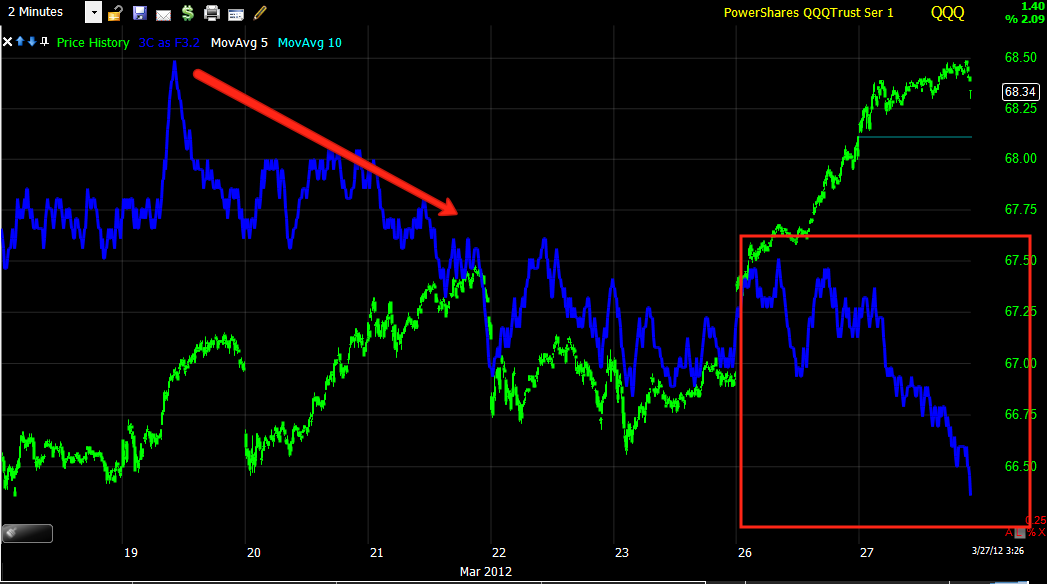
This is pretty much the same depiction except adding the yellow box which look a little like a bear flag, although the volume isn't exactly right.
Here's the near term 3C 5 min chart, it went negative in to the triangle and subsequent breakout, there were already signs of distribution earlier when I first posted AAPL today.

The expanded view of the 5 min chart shows some serious longer term relative divergences. 3C doesn't average the raw accumulation/distribution data that it counts every bar, it has a look back period instead which forms the cumulative indicator. I don't like averaging this kind of information because you lose data any time you apply an averaging mechanism. So in essence what 3C is showing us is that at the 19th of March there was a certain amount of institutional/smart money support in AAPL. When prices moved higher on the 21st, 3C was lower, meaning there was less smart money (lets just call it money) at the 21st even though prices were higher. This would imply that as prices moved higher, there was institutional selling in to the move higher. There are two relative divergences between the 19th and 21st, each peaking lower, that's our negative divergence and AAPL fell pretty hard on the 21st and then more on the 22nd nd 23rd. Remember, the indicator can't tell the difference between selling and short selling as both are registered as selling so AAPL could have fallen on a lack of institutional support to drive it higher or actual short selling. What we see between the 3C high at the 19th and the peak at the 26/27 is the same amount of money in the stock, however prices are over 15 points higher, again this is the same concept that sent AAPL lower on the 21st, except the 21st prices were lower then they are now. In the red box there's a leading negative divergence, this is worse then a relative divergence in most cases, although this relative divergence is so large that I probably can't say that looking at the bigger picture. However what it is showing is as AAPL was at stable prices (lateral), there was less 3C support as the day went on. When institutions place a buy order or sell order with a market maker (NASDAQ) or a specialist (NYSE) they have an average price in mind, this is why the VWAP indicator is so useful because institutions use it as a measure of how well their order was filled by the market maker. A flat area like this often is where we see accumulation/distribution because it is a stable price area and may in fact be the target area an institutional client wants to sell at. That could explain the leading negative divergence today, market makers filling an order to either ell or accumulate a short position for an institutional client.

The 15 min chart shows less noise and a clearer trend, the divergence in to the 21st is clear as is the divergence today. The 15 min chart today is leading negative, this is something you don't see too often in one day on a 15 min chart. Note that the divergence is worse at the highs of the day as that would give the market maker the best execution of the order.
The longer term trend in AAPL on the 30 min chart shows 3C moving in a trend down while AAPL is moving up. One large hedge fund's order may be tens of millions of shares. When Paulson had BAC as a top 5 position, he had over 100 million shares, so it takes time to feed out all of those shares and keep price rising, this is simple supply/demand dynamics. If a market maker sells too much in a chunk, they'll drive prices down, which is the opposite of what they want to do, "Buy weakness" and "Sell in to strength".

The 60 min chart shows a clear trend in which there is confirmation of prices in early March, the target area for an institution to sell may have been >$600. The start of the divergence here drove AAPL lower on the 21st, the market maker may have very well have pushed it too far and needed to get prices back up, if the market maker continues to distribute shares in to weakness the law of supply/demand takes over as retail alone can't support a stock as big as AAPL, often what is needed to bring buyers back in to the market is a technical move like a breakout high above the 21st and we see 3C move lower in to that price strength. This is why we see so many false breakouts, they don't have the support (money) to move higher as the breakout move is being used to sell in to. I suspect that may be what is happening in AMZN right now. Bernie's Monday morning comments were a fundamental surprise for the market, they were ambiguous enough that he can easily deny he was hinting at QE3 as JP Morgan pointed out and the timing was certainly suspicious after the first week in the red all year going in to the last two days of window dressing. Jamie Dimon has done Bernie some favors, especially in 2008 by taking over Bear Stearns and Bernie has done some favors for Wall Street as the Primary dealers like Goldman made billions of risk free dollars every week by simply buying treasuries at auction and flipping them to the F_E_D for monetization during the POMO events of QE2. In return, the PD's would take that risk free money and buy equities and ramp the market higher. Bernie even testified before Congress that the Russell 2000 being higher was creating a "Wealth Effect" for average Americans, we all know the truth though as to who was really reaping the rewards and I suppose that's easier then having to bail out one of the TBTF banks. I wouldn't doubt for a minute that there' a quid-pro-quo between the F_E_D and Wall Street.

Ironically and probably coincidentally, the break of the triangle's apex that stopped out traders was also at the same time the 50 bar 5 min moving average was broken.
As far as judging where a change in character and possible head fake reversal may occur, the 10 min Trend Channel has held the move up of the last several days, it was broken today.
The 15 min Trend Channel broke on the 21st, but otherwise has held the trend down and up, it also broke today.
The 30 minute held all 3 trends on this chart, it is close to breaking,
The Trend Channel is one of my proprietary indicators, although a famous technical trader came up with the exact same channel, I have the award I received for the indicator and it was years before Price Headley came out with his version. To understand the importance of the Trend Channel and breaks, you have to understand what it does. It takes a 10 day average of price so if the trend in price changes quickly, the channel can respond quickly and then it adds standard deviations above and below the moving average based on the volatility of the stock over the last 10 days, not the moving average, but the high to low range or the ATR. So as a stock becomes more volatile, the channel will expand, as it becomes less volatile the channel will narrow, it's unlike Bollinger bands which can be extremely volatile and are set to a static setting and unlike an envelope change that is also set to static settings. The Trend Channel responds to changes in the individual stock automatically. So when there is extreme volatility beyond the recent character of the stock that is enough to move through the standard deviations applied to the channel, we know something has changed in the stock and in a pretty big way; changes in character almost always precede change in trends. The inspiration for the TC came from the Turtle Trading system.
AAPL still has not broken the daily trend channel which ultimately is the most important, but using intraday charts we can sometimes get advance warning of an impending change in character before the daily channel breaks at which point price has traveled quite a distance from what may be a more timely set up/trade.

Intraday on a 1 min chart, we see some small accumulation areas, these were likely used to support AAPL and move it higher in to a distribution zone. These divergences are not large enough to suggest institutional buying, thy look more like a market maker soaking up supply short term to move prices up. Note how much bigger the negative divergence is. As I have explained to some of you, if a market maker needs to sell 50 million shares of AAPL or sell short 50 million shares, they will if need be, go ahead and buy maybe several million to get prices moving up again so they can sell a larger amount in to strength. It all works out to an average position.

Looking at the 1 minute chart's trend, note the negative divergence sending AAPL lower and then a small positive divergence after AAPL held support 5 times, which would be viewed bullishly by retail AAPL longs. This is a hypothetical example, but the market maker who has access to the total order book and knows how much buying and selling pressure there is, may have realized that he wouldn't be able to sell or sell short remaining shares to fill an institutional order as he or she saw buying pressure falling off. Knowing that the "Buy the Dip" crowd is thoroughly brainwashed, the market maker may have instigated the sell off to bring buyers back in to the market. With the positive divergence (the market maker accumulating some shares or in effect changing the supply/demand balance) the market maker may have instigated the move through another centennial mark at $600, bringing dumb money back in to the market so the market maker can continue selling in to strength and by the looks of yesterday and today's leading negative trend, it appears that may be in fact what happened. If you look at a 5 min chart of AAPL, note the strength of the advance and volume as it moves through $600.

$600 not only is a centennial mark (if you want proof the human mind gravitates toward whole numbers like $600, just go in to any store and see if you can find something for sale at a whole number rather then a 599.99), it is also a resistance area, so a breakout there would kill two birds with one stone.
So that is what I think is going on in AAPL . However I still would recommend price confirmation of a reversal, it may very well come on a morning gap down as they can slice right through stops and create more downside momentum, we saw a lot of that last week in AAPL and the market. Waiting for confirmation may cost you a few percent, but stocks fall a lot faster and deeper then they rise, so there should still be plenty of opportunity to make money while the buy the dip crowd provides the shares needed to sell short into.
The SPX from the start of the new bull market in 2002 to the top is about 5 years to build that rally, it took about 15 months to take it all back and then some.
I had my order screen up today looking to nibble at some AAPL $615 puts in the event AAPL moved convincingly below $612 today, ironically, that's where it found afternoon support so it may be the right level to at least nibble at some puts.
We'll keep watching AAPL for an opportunity as well as AMZN and many others. As a friend of mine says, "Failed moves lead to fast moves".