As I was drug away from my computer most unexpectedly today, there's always lots of catching up including going minute by minute through the trading day (or the parts I missed) and just being in the moment to get the feel. However there are some events and charts that I feel you should be aware of as we try to make sense of the charts, events and probabilities before us.
We'll never understand what is going on in the market until it's too late to make money, you can have certainty, but by the time you get it you won't be able to make any money off it; but we can gain an insight in to what smart money is doing which brings us back to the age old question,
"Do you want to be right or make money?"
It would seem you have to be right to make money, but there are a lot of inconsistencies in the market such as the pre-QE3
"Bad news is good news". Five years ago if we had a Chinese Flash PMI print and European PMI print like we did today, the Dow would be down -200 points. Five weeks ago the same information sends the market up as the more bad news, the greater the hope QE3 will be unleashed. Now we are in a possible/probable new era in which either news doesn't matter at all - only F_E_D liquidity does, or it does matter. Whether that be "Bad news is good news" or "Bad news is bad news" remains to be seen, but I'm guessing anything inflationary will be not welcomed. We may very well see a stock picker's market again as assets all go their own ways depending on how much exposure they have to particular events and thus we are quickly trying to get our bearings in this new market epoch.
After a very disappointing strong of PMI's overnight, Initial Claims really wasn't good (which may be why the market bounced off the opening gap lower as the yardstick of F_E_D success is unemployment); the only way Initial Claims beat was by seeing the prior week's print increased for the
86th CONSECUTIVE WEEK!!!! Therefore, comparing today's IC vs. the revised IC, the headline reads, 'Initial Claims Beat!" that is until next week when this week's claims are revised higher. Think about those revisions, 86 weeks of them and all higher!
After disappointing Initial Claims for those who understand what is really going on at the BLS, the Philly F_E_D Survey was released at 10 a.m.
Released On 9/20/2012 10:00:00 AM For Sep, 2012
| Prior | Consensus | Consensus Range | Actual |
| General Business Conditions Index - Level | -7.1 | -4.0 | -10.0 to -0.2 | -1.9 |
The Survey actually came in better than consensus, better than previous, but still negative for the 5th month in a row, however there were some bright spots. New Orders came in at +1.0 which is the first time there has been growth since May. However shipments lost ground, the gain in New Orders suggests shipments will improve, but it's not a huge gain. Employment remains in contraction, prices are not improving much. The bright spot was 6 month expectations/sentiment which improved in a huge way, so while there's still contraction, there is a sense that 6 months from now, things will be better.
Japanese Intervention:
September 19th's Japanese addition of $10 trillion Yen to their QE program (bringing the total to 80 trillion Yen)
first mentioned at 12:54 a.m. on September 19th, came with this warning only about 45 minutes after the BOJ actually intervened as a response to US QE3,
"Japanese policy interventions have a reputation for a very short half-life."
Short indeed! Here are the USD/JPY currency charts (before ES could even really rally the move was over-you can see all the charts at the time in the post linked above at the very bottom).
Here's the $USD briefly spiking on this 5 min FX chart vs the Yen, note the parabolic move up and remember what I always say about parabolic moves, "They tend to end badly" just as this one did.

This is a daily chart of the $USD/JPY showing the Yen gaining strength against the $USD, common logic regarding QE is that it will devalue the $USD and we can already see a trend of the $USD falling against the Yen, which makes the Yen worth more and makes Japanese exports much more expensive. It seems every time this pair reaches the $78 area, Japan does something to try to devalue the Yen and make their exports cheaper, however as usual, the Japanese policy intervention by the Bank of Japan has less and less of an effect until the actual life of a $10 Trillion dollar addition to Japanese QE purchases moves the market for less than a day. This also underscores the lessons learned by Emerging Markets and developed nations as they were the recipient of the US's primary export, INFLATION to these countries as you can see with the falling value of the dollar vs the Yen. So expect to see many more countries intervene in currency markets, start their own QE programs and do whatever they can to combat the effects of inflation that US QE programs bring to their shores, the BRIC countries are particularly sensitive (Brazil, Russia, India and China).
FX/Currencies
While we are on the topic of currencies, a quick look at the "Risk Sentiment" pair of choice, EUR/USD (although the $AUD provides a much better leading indication for important moves in the market rather than short term/ intra-day or day to day moves).
This is the EUR/USD through today's US regular hours (9:30 am - 4 pm EDT), as you can see the Euro price action was very similar to the overall market action.

Since the close, this is what the risk-on Euro has looked like, it saw a bump around 6 pm and has drifted a bit higher, but this isn't really an important chart in the scheme of overnight trade as well as all of the events tomorrow from Quadruple witching to CDS rolls to the rebalancing of the S&P-500 which may of course cause rebalancing of SPX derivatives like the SPY for example -Credit should also see some moves. While we want to gather as much data as possible, there are so many events tomorrow outside of the norm that I'd be a little careful in reading too much in to price action either way, even the underlying action could be skewed as component stocks are have their weights readjusted to the new S&P weighting schedule (Conservatively, there are probably 100 or more ETFs, ETNs and other derivatives that rely on the S&P weighting so it's not just the SPY).

The pair since QE3 was announced (yellow) and the end of trade last week on Friday (red) as well as the FX market open Sunday night. Again, does the price action of the Euro remind you of any other major average?
The long term daily chart of the EUR/USD with a primary downtrend since mid 2008. The $1.30 level seems to be important as we see support, resistance in several areas and some resistance in this area as the Euro has crossed above, but on weak daily candles with a recent confirmed daily reversal candle pattern that has brought the pair back below $1.30.
European Markets...
A picture is worth a thousand words, a chart is worth even more...
It should be VERY clear where and when QE3 was announced as risk assets all clumped together in a move higher, however since then there has been (not unlike the US markets this week) an unwind of that excitement. Nowhere is this more apparent than the FTSE/MIB Italian Index in red which is down 5% from the post Q3 highs as the short selling ban on financials is lifted.
Italian Debt and Negative Forecast Revisions Double or Worse in Some Cases...
Also from the Goldman Sachs installed leader of Italy and GS alumni (much the same as the head of the ECB, Drahi), we get this news today.
Italy's 2012 GDP is going to be twice as bad going from -1.2% to -2.4%. Forget the +0.5% growth expected for 2013 GDP, that was slashed to -0.2%. The Deficit target has been raised from 1.7% to 2.6% and the 2013 deficit vs GDP is 3x larger than expected in the revision from 0.5% to 1.6%. Both 2012 and 2013 debt levels of over 126 % were higher as well. As liquidity crunches take hold, bank runs and capital flight, new austerity measures introduced and heaven forbid they agree to ECB conditionality in exchange for bond support, expect all of these to get worse, the same as we have seen in Spain which went from a banking crisis to a full-blown sovereign dent crisis in a matter of months.
Bond Traders Ahead of the Curve, This Week They Target Portugal...
In Credit/Bonds (they have been right more often than the market and lead the market), September 18th saw a huge move up in Portuguese 10 year benchmark bonds, over 8%. Not far behind, Italy and Spain's 10 year debt is rising, but nothing really comes close to the move in Portugal this week. This should tell you something about bond traders' confidence in the ECB's replacement program for the SMP, the OMT. If bond traders believe the ECB is there to backstop any rising rates in yields, then they must not believe the countries will agree to the conditionality attached to the ECB's buying which can only take place after the country asks the ECB for support, thereby agreeing to the conditions which are still hazy. Spain has on a number of occasions said it will not agree to conditionality and domestically it will be hard for any politician to survive if they do, just look at the march/protests in Spain and Portugal last weekend! Furthermore look at a country that is the canary in the coal mine so to speak, Greece. With the agreement to the Troika's "Memorandum of Understanding"-the conditions- since then the pro-bailout and two biggest parties were defeated in one election and nearly defeated in another by Syrza (against the bailout), furthermore the Neo-Nazi party is going from obscure to a real contender in parliament. In fact a poll was released today the "Golden Dawn" neo-nazi party now has 22% support, an incredible move since their May support of 12%! Also in the poll, 7/10 Greeks are against the Trokia/EU bailout terms and 85% believe the structural reforms that have been demanded of the Greeks will have direct consequences on them or their family members. Combine youth unemployment with Greek doctors willing to set themselves on fire rather than face a future in which they see themselves as having to dig through garbage cans for food, can only be bad. At this point all it takes is a strong leader to unite Greeks, Spanish, Portuguese or any number of countries and move toward nationalism, all the pieces are there and the results have had dire consequences in the past, especially on that specific continent.
Spain
Spain does have a hefty amount of debt coming due in October, if they do not request a bailout by then, the bond market is not going to be happy and Spain may be completely locked out. Why exactly Portugal's yields are rising so dramatically, I'm not sure I understand all the nuances there.
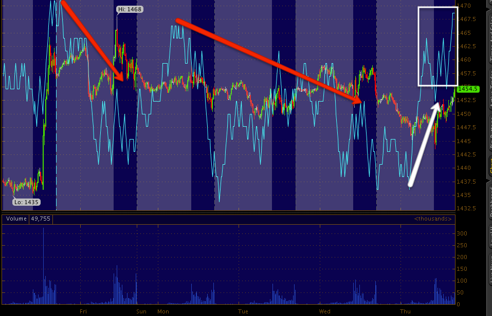
Charts... There's More Here Than I Realized...
This is a chart of Light Sweet Crude Futures from QE3 (yellow arrow). Note 3C is more or less in line up to the highs of the QE3 announcement, then a sharp leading negative divergence and the next bar the fall begins, Crude retraces all of the QE gains (yellow trendline) and as mentioned today, we have a positive divergence in Crude/USO. This is a respectable divergence, but not the type you would see as a base for a launching pad is put together, that would be longer in duration, still a nice divergence.
Commodities vs the SPX (green) also retraced all gain from QE3 at the white arrow.
Intraday commods are not very interested in following the market higher in to afternoon rallies or rally any at this point.
Here's the same Index on another chart, QE3 at the white area. Interestingly, most of the assets assumed to benefit the most have done the worst or very little, this isn't conclusive of anything yet, but it is a good start.
The $AUD as a leading indicator among the currencies is one of the best, on this chart going back to May you can see confirmation with the SPX and then in August a divergence with the SPX and another in September recently in fact with the $AUD being a poor relative performer from the August to present highs of last week.
$AUD since QE3 , the negative divergences seen at yesterday's closing and afternoon rally area are also picked up in assets like the $AUD in which it clearly diverges at the highs from Wednesday.
The Euro also showed similar red flags Wednesday and saw a deeper correction today than the SPX on relative terms.
Here's the actual EUR/USD pair since QE3 was announced at the green arrow, the Euro has nearly retraced all of the QE inspired rally.
The Euro intraday vs the SPX, again relative momentum falls way off, which makes me wonder why the SPX outperformed, but didn't put in an impressive performance? The only thing that makes sense right now is an op-ex pin tomorrow in the area.
Yields have long been the magnet for equities, here we see the QE3 announcement and yields slightly diverge at the rally top and then again as with other assets above and 3C in most of the charts I showed you today, the move yesterday was divergent with yields, today's move lacked relative strength.
The larger perspective as Yields were in line early in the rally from the June lows and started diverging in August, that has grown much worse in to September as Yields fail to make anything resembling a higher high. This would by far be the largest dislocation of yields we have seen, the March-May dislocation was large and led to a trend down, but not close to the size of this dislocation. Equities tend to revert to yields at some point, thus why I say they are like a magnet.
Yields from the June lows.
High Yield Corporate Credit has been one of the assets that has been a holdout on a solid signal in the Risk Asset Layout, today there was a CDS roll, HYG did not perform well at all today and that may be directly related to the roll, but even then it suggests that longs in credit were not willing to roll in to the new index. Tomorrow is probably going to be muddy with all of the events, but still I'd like to see the follow through in High Yield Corporate Credit. Note also in the matter of a day, this Credit has given back all QE3 gains, as they say, "Credit leads, equities follow". Will Credit give us a clear direction for the market? I suspect with the roll over, yes it will.
Not only did High Yield Corp. Credit fall off at the open, but through the afternoon action vs the SPX.
This is HYG (same as above ) with 3C and two TSV indicators, a short 18 day and a long 55 day, all 3 money flow indicators are negative in HYG and especially at that area Wednesday well before the roll.
The same chart, but instead of 30 mins, this is 60 mins. Not only is there multiple timeframe confirmation, but multiple indicator and settings confirmation. Also that same area from yesterday that is seen in even the averages.
Here's High Yield Junk Credit/JNK, it gave back all of the QE3 rally gains.
It also diverged Wednesday and was unwilling to follow the SPX today. Again the roll could influence today's behavior, but...
I wouldn't think there would be much influence on Wednesday's other than smart money expressing a position change, note again 3C and 2 TSV indicators set to short and long are all showing the same negative divergence in the same area as other credit and as other assets.
High Yield Credit didn't follow the SPX today, this was a -0.61% day, but in context it's a fairly large ATR day for HY credit.
As for the Industry groups, Energy vs the SPX since QE3
Financials relative momentum vs the SPX
And Tech which has been the best performer in momentum
However today Tech gave up in the afternoon.
Sector rotation
Since QE3, we saw Financials move in to rotation and quickly out, Energy briefly moved in and then solidly out, Basic Materials where all the high Beta stock tend to be has been spotty with a trend toward rotating out, Industrials peak and saw a lot of rotation out today, Tech has held fairly well as has Discretionary. The Defensive sectors of Staples and HealthCare have rotated in while Utilities saw a little better performance today, but still weak.
The last 2 days only, Financials show the most obvious rotation along with the defensive sectors.
All in all, there's some good information here, there's also some events that can interfere with the information from both today and tomorrow, but we do see some evidence that the downward trend in Credit started before the roll today. It's a mater of continuing to observe, it may be an all or nothing proposition in either direction or as I suspect, more of a Industry and stock pickers market in which case portfolio management will be very interesting and have a natural hedge, I think we'd be very well equipped to weed out the right groups and stocks in that case.