Friday, October 28, 2011

After Hours trade

I admit that Friday after hours trade is probably the least relevant 4 hours of trade of the week, which is exactly why I watch it. It's well known in media circles, if you want to bury a story, release it Friday night. Thus if there's any funny play, Friday night would be a choice time to conduct it.

 DIA AH is pretty quiet

 IWM AH has seen some high volume spikes, several times higher then the normal trading hours, which is unusual.

 The QQQ has also seen some high volume spikes as well, this is out of the ordinary-we saw it last night and I believe I showed about a week of AH history where the typical volume is so low it's nearly invisible, so the last two days have had that as an unusual occurrence.

The SPY has probably seen the biggest AH volume spike.

Closing trade/volume.
 The DIA in EOD trade -the red trendline is Thursday's close, the 2 blue hash marks to the right next to the price levels are the current after hours bid and ask with the last usually being somewhere between them. All of the 4 averages are now trading below today's close as well as yesterday's close. How relevant that is, I don't know, but the AH volume is peculiar.

 This is a 15 min chart of the IWM, the very last candle is interesting in that it was the largest volume of the day (institutional money tends to trade actively right near the close) and it tests resistance at yesterday's close and is sent lower, actually lower then the open of the price candle on the highest volume of the day. Again the red trendline depicts Thursday's close.

 The QQQ 5 min last candle of the day is also the highest volume and letting go of the previous candle's gains. I can't say this is all that strange going in to the weekend and wouldn't read too much in to it.

Many of the averages formed a triangle today which is classical technical analysis would be considered a consolidation pattern. Because it s symmetrical as opposed to ascending or descending, there is no bias except for the preceding trend that led to it, which in this case would be down. So classical TA would interpret this as a bearish candle, as we know classical TA gets head faked all too often and the break above the apex would be considered the head fake-so long as the triangle resolved to the downside next week. In TA, when you have a pattern like this and you expect it to break down (perhaps you even entered a short on the pattern) and then it breaks up, it is considered a failed pattern and many gurus of TA say you should take the opposite side of the trade, meaning to go long. Over the last several years for those of you who have been here, we see this quite often and the end result is that the pattern is head faked and then plays out to the downside after first sucking in the long buyers. Time will tell if this is another one of those head fake moves.

The 5 and 15 min 3 charts would suggest that it is.

 SPY 5 min

SPY 15 min (I wouldn't expect there to be enough time for readings beyond 15 mins.). After hours price would also suggest the same, however with much less weight.

Taking one last look around as things change fast during the time it takes to post, the averages continue to trend down during AH, especially the DIA and the QQQ which would be at a new low if it were not for an earlier candle that had an extremely wide range (you can see that candle in the QQQ AH chart above). The QQQ is trading about $.07 higher then the low of that earlier candle to give you some idea.

Greek Sentiment

I've been looking at this all day, but have been far too busy to post it. This isn't meant to be a funny post , it is meant to bring attention to a very real conflict and serious animosity emerging. We've seen two World Wars start in Europe and even though I don't agree with Angela Merkel's use of hyperbole in telling the German lower house that they should not take "50 more years of peace in Europe for granted", I do agree with the statement.

One might think that the recipient of the 50% bond holder write downs, Greece, secured in large part by pledges backed by German GDP and thus German taxpayer money, might be thankful. I for one don't see that point of view considering the painful austerity cuts being forced on the country as well as the all but assured crash of the pension system, but I suppose some (particularly in Germany where the measure is extremely unpopular) expect some gratitude.

If the EFSF bailout "plan" did one thing right away that isn't being put off until November (as most details of the plan are), it managed to unite Greeks from the left, right and center, you might say the ninety-nine percenters.

Here are some of the expressions of  Greek sentiment:

-Greek news papers are running cartoons of prominent German officials in Nazi uniforms.
-The Greek sentiment is that the Germans have condemned Greece to 9 years of collapse and poverty
-Greek government officials who have supported the measures are depicted giving German officials the Nazi salute.
-There's a cartoon of a German solider watching over the Greek Finance minister and ordering Greeks to "Pay more taxes!"
-And unfortunately, German tourists visiting ancient Greek sites are being treated in a hostile manner.
Germany did occupy Greece during World War 2 however you would think that those memories have subsided over the years. I have good friends in Frankfurt and they assure me that German involvement in other EU countries is extremely unpopular so it would seem the regular people on both sides feel the same way. I just hope that this does not escalate in to violence.

As for an example of posters going up around Greece...
This one is called, "Adolph Merkel" as she wears a swastika armband with the EU emblem around it. The caption says, "Public Nuisance".

With the "Occupy" movement going worldwide after the Arab Spring, we can only hope that elections bring fairness and a sense of justice before things get out of control as we are already seeing that happen right here in the US by means of violence when protestors have confronted police. I'm sure you have seen the YouTube videos.

ES Update

 ES is always interesting and thus far is tracking very well with 3C.

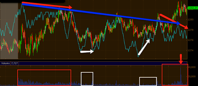
Here's today's ES (E-Mini) contracts. The average volume today was about 4700 contracts per minute and this is a 1 min timescale.  There was a negative divergence in the morning that sent ES lower. Note the higher volume during the negative divergence which signifies distribution (3C can not tell the difference between selling distribution and short selling distribution as they both come across the tape as a sale-so it could have been either, but I would lean toward short selling in to strength). After that negative divergence sent pries lower, there was a positive divergence (accumulation/buying), however it was on a much smaller scale as volume reflects in the white box. This is an old market maker strategy but I assume bigger players use it as well, they buy the ask until they push price up, but on as little volume as possible and then sell on heavier volume in to the advance. There was a second accumulation period (white) again on lower volume followed by another intraday bounce, this time on heavier volume. This rally was in to 2 negative divergences, a long term one (blue arrow) and a local one (red arrow) and during this time period, we actually saw the heaviest volume of the day at 39,229 contracts in a single 1 min period (about 8x the average). The overall volume was rising as well.


I verified this daily chart as many platforms are still showing incorrect daily information. There are two things that stick out here. The first is a "No follow through day". After a breakout above an important resistance level as shown yesterday, the next day sees what is called "Follow Through buying" and volume and price usually are greater then the first day, there's an example below. The second issue is a Harami Cross which is a candlestick reversal pattern. It looks very close, but again I verified the price levels and today's doji does fall within yesterday's body, this is a common reversal set up with the 3rd day being confirmation.

Here is an example of follow through buying this week in URRE. The first day is the breakout (and this isn't even really important resistance), the second day sees follow through buying in which price and volume shoot up as investors judge this to be the start of a new leg or trend up.

Here's an example of a Harami Cross in Goldman Sachs, it's not exactly the same, but these are rare candle formations and difficult to find.

 Here's the GS Harami Cross reversal, it is similar in a couple of ways, the two candles are very similar and GS broke an important resistance level. Here's what happened next...

The Cross is in the white box, GS fell about 45%. However, a Harami Cross reversal does not carry a downside target, it simply is a high probability reversal pattern.

Second Verse Same as the first

Yesterday in what I've mentioned as a "set-up" the market rallied on no news and no correlation with the Euro which was moving down, which seemed like a bearish set up.

Today wasn't much different.

 DIA's "set up" yesterday in the white box as the Euro moved down, this also broke an already parabolic linear regression channel (for the importance of this I would strongly advise reading Don Worden's "Street Smart Charting" in which a break of a channel-especially a parabolic channel seems like a bullish event when in fact it is typically one of the last moves before a market reverses direction, kind of like the "head fake" event).

 The same in the QQQ , I use the red trendline of the Euro to establish the trend of the Euro and the green line to establish the relative trend vs. the Euro in each market-this being the Q's. Also note the decent volume spike on the last candle, which is a bearish candle-all of the charts show the same.

 The SPY...

The IWM is a bit harder to establish a baseline on, but nonetheless, there's an effort and an ugly closing candle/volume.

A lot more coming...

Fair is Fair right?

Lehman probably didn't think so after Bear Sterns, but this next bit was predictable as soon as the first mention of 50% haircuts on Greek Debt were uttered, even if the real number is only 28% or so.

From Reuters:

Merkel: Must prevent others from seeking hair cuts

"In Europe it must be prevented that others come seeking a haircut," she said.
Surely this isn't the very first time she thought of this?

Sure enough...

"Oct. 28 (Bloomberg) -- Ireland's government may cut at least 1 percentage point off its 2012 economic forecast, as a global slowdown curbs the country's export-led recovery, according to two people familiar with the matter."

This would mean Ireland will likely cut their GDP for 2012 from 2.5% to 1.5%.

France already cut their's from 1.75% to 1% yesterday.
"In Ireland, Noonan has said the government may need more than the planned 3.6 billion euros ($5.1 billion) of budget savings"

The EFSF was largely built and is hoping to be leveraged to deal with the Greek Crisis, Once Ireland, Portugal, Spain and Italy start seeking the same "fair is fair" treatment, it is highly unlikely that there will be an EFSF and at that point, the Germans may be printing a new or rather old currency (Newspapers in Germany are already quoting their prices in Deutsche Marks)

Bollinger Bands

Most of us know that when Bollinger Bands see a very tight squeeze a highly directional move is about to take place.

Here are the ETF averages on a 30 min chart with the tightest squeeze since the rally started.

 DIA

 FXE

 IWM


 QQQ

SPY

Treasuries

Yesterday I noted the start of a turn around in treasuries. I just ran in to this post, I'm not a treasury expert by far, but if my take is correct, then there's some correlation with what is being said and what I'm seeing. First I'll post the article and then the charts (although it's difficult to find the exact correct treasury harts due to them not being available or having such low volume that any analysis is useless, but the charts used do cover the timeframes noted in the article.

Here's the article and link


Did Primary Dealer MF Global Dump Its TSY Inventory And Exaggerate Thursday's Equity Rally?


We have often discussed the use of the Treasury 2s10s30s butterfly as a carry tool and it makes sense that primary dealers would proxy this in their inventories to earn a much more risk-managed carry than a simple curve trade from a net interest margin perspective. With MF Global drawing down its credit lines and facing immediate stress, it also makes sense that they would look to sell down any and every holding they had in order to show liquidity. In the 24 hours from mid-day Wednesday to mid-day Thursday the 2s10s30s butterfly experienced one of its largest ever shifts higher (unwinding the carry trade) at over 4 standard deviations and only matched by moves in Q4 2008 (LEH?). Equity markets tracked this massive and unending rise in 2s10s30s almost tick-for-tick which we think explains how such a no-news summit in EU can create such a massive move in US equities. Moreover, the attractiveness of the 2s10s30s butterfly is reappearing up here and it is compressing suggesting stocks have room to fall here.
This shows the 1-day moves in 2s10s30s with the red dot indicating the 24hr period move from Weds to Thurs this week - over 4 standard deviations.

The shift up in 2s10s30s from Weds to Thurs was incredible in size and very notable for the hyper-correlation with ES. Today sees the low volume equity range holding up as 2s10s30s starts to get bought again (for carry) suggesting equities have some downside risk here.
Charts: Bloomberg

As for the charts, which should show a sell-off Wed-Thursday midday and accumulation since.

 2 year the dates are in white at the bottom, Wed /Thursday and mid day being key.

 10 year

20 year

Whatever you make of the article, 3C seems to agree on all 3 charts there was selling when they saw selling and accumulation since Thursday around mid day.

IWM-Russell 2000

The IWM which has put in the largest percentage gain on this rally (IWM 25.3% / SPY 16.4% / QQQ 15% / DIA 14.65%) is also one of the first today to show lower lows and lower highs

The white is lower highs, the red is lower lows. There was an uptick in volume as the intraday lows were taken out. Now to see where this next bounce goes (if it continues the pattern). It appears to be turning down now, but it's too early to say conclusively.

UNG Follow Up

Yesterday I put out an update on UNG which is trading in a base/range, but looking very bullish. Some events have transpired today that warrant a follow up.

 First recall that UNG looks similar to URRE in the price pattern, a bullish descending wedge. Except URRE did not build a base after exiting the wedge, it did start a move and is consolidating now (you may want to take a look at it on the pullback). Today we see a nice move in UNG off yesterday's pullback to the lower end of the base, I would normally consider this just part of the hop in building a base, but UNG warrants closer attention because of the very large volume today. Technically it has NOT broken out of the base yet, but may do so shortly.

 The 1 min chart does show accumulation on yesterday's lows as you would expect for a base.

 The 2 min chart looks even more bullish in a strong leading positive divergence.

 The 5 min chart, may not have caught up yet, but is some cause for patience as accumulation is evident , but the in line status is fading a bit on the recent high.

 A longer view of the 5 min chart shows that it is in fact not in line with price yet, this is what causes some caution in my view.

 The 15 min hart shows the same problem. Remember, in this case we are looking at local strength, it will start on the shorter charts and bleed to the longer charts so improvement in the 5 min should lead to improvement in the 15 min. The longer term charts like 30/60 represent the entire base, rather then local strength.

 And as you can see both the 30 above and 60 below are very strong on this base with leading positive divergences. Yesterday we saw the same in the 1 day chart, but I have not posted that today as the 1 day charts are being effected and showing the wrong price from the exchange data feed, however, yesterday's post shows the strength.


Ultimately this is the base more or less with a few upside and downside head fake moves. It depends on your risk tolerance as to whether you want to buy in the base. I would say a strong breakout above $9.20 on volume like today's would be a high probability trade.

USO Update

My apologies on emails and chart requests, the data problem that is ongoing and across many platforms and websites (obviously and exchange related bad feed somewhere) has caused a delay as I have had to back check charts and make sure it's not effecting any indicators, it just seems to be effecting the % change on charts and the position of daily charts on some symbols. I'm trying my best to catch up on a 2 hour or so delay as I spoke with tech support and conducted tests.

This is a range of short, medium and long term USO charts.

 First USO (green) vs the FXE/Euro. I've been noting these discrepancies between USO and the Euro which should largely trade together as the dollar is effected so is oil price. In the first box the dip in the Euro and continued strength in USO almost seems like a leading indication of USO's trajectory. We see it again today with USO a bit stronger then the Euro.

 USO 1 min shows yesterday as a distribution event , the same has been seen in many charts. There was a test of the morning highs (red trendline) and a negative divergence there that is turning into a leading negative and ended up as a failed test of intraday resistance thus far.

 The 5 min chart shows more history and went negative on the 25th sending USO lower. There is an unmarked positive divergence at the lows of the 26th in to the EOD you may be able to see as 3C rises and USO declines, sending USO higher the 27th. I have marked with a white trendline the relative price level of USO  and as you can see it is now leading negative.

 The 15 min chart shows the start of this advance with some accumulation, at consecutively higher prices 3C makes new lows, this too is also a leading negative divergence.

Perhaps the worst is the 60 min chart, again marked in white, relative price levels with 3 in a very steep leading negative divergence, much worse then the negative divergence of October 6th that sent prices much lower.

Market Update continued


DIA
 This is yesterday's Linear Regression Channel continued. In red is FXE/Euro. I mentioned the Euro moving down as the market broke to new highs and said it looked like a set up, also breaks above channels like this are usually short lived and reverse quickly. The channel is now decisively broken.

 The short term DIA 1 min chart shows what I expected yesterday at what I called the set up in the small red box, 3C made new lows as price moved up against the Euro- it looks to have been a major distribution event. 3C is now leading negative.

 The same is confirmed on a 2 min chart.

 As well as a 10 min intermediate chart with Stochastics (longer settings then normal) rolling over.

QQQ
 Here's the same "set-up" in the QQQ yesterday, note the break of the channel today on a large volume spike.

 The short term chart agrees with the DIA above that the "set-up" was a major distribution event and 3C is deeply leading negative.

 The same is confirmed on an intermediate chart and 3C is leading negative currently.
This is pretty good confirmation across various ETFs and timeframes.

SPY
 Again the upside break of the channel, running opposite of the Euro which was strange on its own, as is the upside break of a parabolic channel. Again volume increased today on the decisive break of the channel.

 Short term 3C confirms the DIA/QQQ as well at the "set-up" with the worst divergence of the entire day at that point. 3C is pretty close to leading negative when price levels are considered.

 The 5 min chart which never even confirmed yesterday's rally (calling it a distribution event) also shows the same negative divergence at the "set-up" area. 3C is leading negative in a longer and shorter sense.

 The 15 min chart remains negative.

 As does the 30 min chart.

And a major negative divergence/leading negative divergence on the 60 min chart.