Tuesday, July 12, 2011

The Miners Trading System

Today DUST was left n the dust with a 6+% loss. The signal for tonight remains long DUST, how ever the 3% stop-loss should be considered as t is part of the system.

For system 1 entries, the stop-loss which would be executed at the open, is $40.62.

System 2 entreis have a stop loss of $40.87, the close was $40.65 so System 2 entries would (by the system rules) stop out on the open tomorrow and the trade would reman neutral or in cash. You may want to consider looking at what the open looks like it will be, if there's improvement and DUST will open higher, you might consider not stopping out on the open, but rather leaving to stop as an intraday stop.

I know from emails, many of you want to know what DUST looks like on the 3C charts. I'll compare GDX which is the equivalent of being long NUGT, to NUGT, to DUST for confirmation. For confirmation GDX and NUGT should give the same signals and DUST should give the exact opposite signal.


Hourly charts
 DUST positive

 GDX Negative

 NUGT Negative

15 min charts


 DUST positive

 GDX negative

 NUGT negative

1 Min Charts
 DUST positive

 GDX negative

NUGT negative

Financials Can't Catch a Break

Just when BA thought they had reached a deal to settle RMBS, the New York AG isn't letting this one go, see the story here at Business Week.


It's not just financials, but the market took a beating in closing trade as Moody's downgraded Ireland to Junk status. From my search on the news sites and looking at volume in both the Euro and the S&P, it seemed to happen around 3:24 today at the red arrow below.


Considering the bombshell which was the hint of QE3 in the Fed's thinking, today really ended badly. It seems 1 or more of these events was known in advance when looking at the 3C divergences and the market's reaction. There were a lot of events unwinding today that made little sense and still would make little sense if you don't consider the information curve and how far we are behind it.

And Mickey D's Gives It Up

Technically today wasn't significant as far as MCD's closing action, but the strength seen earlier today that was running into negative divergences as per this earlier post have resolved to the downside, the 10 min 3C chart being key.

Note today's 3C divergence on the 10 min chart, it was one of the worst thus far in the series of noise candles over the last several days and now it has moved in to a leading negative position.

Here's today's price action, the red square on price was the 10-min 3C negative divergence. Look what happened after the negative divergence which implies either distribution or short selling.

Leaked minutes?

Conspiracy theories don't make for good analysis in general, but we should examine some events today. The 1 p.m. auction of 3 year treasuries priced at new low yield for 2011, that's a bit odd. At 2 p.m. the minute were released. If the minutes had been released at 1 p.m. and the auction was at 2 p.m., it would have made perfect sense.

Looking at the market... Each of the averages below posted positive divergence right before the minutes were released. Take a look.

 IWM

 QQQ

one of the few positive divergences the SPY has seen.

Remember my post with the Tick chart on the 2 p.m. run up? I found it strange.

And the market now....

The market has given back all of the FED minutes 2 p.m. bounce.

You have to ask could there have been a leak? It sure would have benefitted the Treasury in today's auction and the mechanism for a leak s there, embargoed press stories such as the Fed minutes. How else do you think the CNBC commentators can immediately form an opinion upon the release of the minutes? They've seen the report, it's just embargoed, meaning not for public release until 2 p.m.

Nice move in Gold

But can it be trusted?

I wouldn't be chasing it here.

 The daily chart looks solid, a breakout above the consolidation, a strong move, heavy volume, it looks really good.

 The 60 min chart had some accumulation after the break below the consolidation, but negative divergences already started peeking out.

 The 15 min chart is negative as of now, it could climb in to confirmation as it is yet to turn down.

 The 5 min is showing a negative divergence on the new high

 As is the 1 min.

The green volume spike makes sense as it's breaking above yesterday's close, the two red volume spikes don't seem to fit in the picture. I'm not going to jump to conclusions, but I will throw a possibility out,
a lot of traders chase momentum by running volume surge scans all day long. I've often said that to go from a base to stage 2 "mark-up", you need volume to advertise the stock s entering mark up. It is possible this is a bait and switch or head fake. I'm not aware of anything that would send gold higher today, except it was making highs relative to the euro in the European session, but that has to do with the value of the Euro vs. the dollar as gold is priced in dollars.

The Transports showing unusual strength

Last Thursday as the market topped, we discussed the importance of the transports to the overall market, the post can be found here. So seeing strength in the transports now is another piece of the puzzle that should be considered. I will point out that strength was apparent in the transports before the Fed minutes were released, but to be honest with you, I never trust that things like the minutes aren't leaked before hand.

Here I compare the DJ-20 (transports) to IYT (ETF representing the transports) for purposes of confrmaton.
 DJ-20 15 min 3C

 IYT 15 mn 3C

 DJ-20 10 min 3C

 IYT 5 min 3C

DJ-20 5 mn 3C

The strength in the transports is unusual versus what has been seen in the broader market averages.

The internals of the 2 p.m. move are interesting

 DIA (green) vs the TICK chart (red). The TICK hart, as often is the case, actually was a leading indicator in calling the reversal from the initial pop up.

While the TICK chart readings at 1250 aren't surprising, the ones at -1000 during the move are. I just mention it as a piece of the puzzle.

Market Movement

And all of the sudden the grass really started to grow.

And why?

From the Fed minutes released at, well you can tell by the price chart-2 p.m.

"Some participants noted that if economic growth remained too slow to make satisfactory progress toward reducing the unemployment rate and if inflation returned to relatively low levels after the effects of recent transitory shocks dissipated, it would be appropriate to provide additional monetary policy accommodation....A few members noted that, depending on how economic conditions evolve, the Committee might have to consider providing additional monetary policy stimulus, especially if economic growth remained too slow to meaningfully reduce the unemployment rate in the medium run." 


More monetary Crack for the Bulls? Just the mention of it gets their blood flowing as you can see.

BRKL Follow UP

BRKL was a long trade idea from June 29th

 This was the original consolidation pattern, you can see the noise candles that kept the trend intact and the white candle when the idea was posted.

 It seems the consolidation in retrospect is better drawn as a bullish ascending triangle, the price action prior to the formation was correct. The chart shows the price pattern implied target.

 The daily 3C chart is what was interesting about this trade.

 The hourly chart confirms both the daily accumulation as well as the current trend.

 The 10 min is in line with price as well.

The trade is at a little better then a 4% profit, I'd like to see at least a 10% swing out of the trade. For me personally, since the 10-day moving average has  not seen a single day close below it since the move up started, I would use this average as my trailing stop.

Market Update

It's one of those "Watching grass grow" days again, which as I always say, are the days that make me nervous as it is easy to let your guard down.

As for the 5 min positive divergences on the DIA, QQQ and IWM yesterday, they remain today, the SPY isn't showing much and the divergences are stuck on the 5 min chart, they haven't migrated to the 10 or 15 min charts, suggesting to me that the market is just kind of being held in limbo right now. With OP-EX on Friday, perhaps that's part of the plan for now.

 DIA 5 min over the last 2 days has been positive, but hasn't made any progress toward the 10 or 15 min charts, which is a little strange. The strength isn't overly impressive either though, it's not in a big leading positive divergence, just seemingly enough to support the market and perhaps putting some shares into inventory.

 The IWM looks decent, but no hints on the 10 min chart either.

And here are the Q's 5 min. OP-EX s still 3 days off and who knows what the plan may be. Perhaps keeping the market at these levels will encourage more puts to be bought and perhaps those puts are pinned Thursday or Friday? I just am not sure what to make of this, except it seems to enough for the time to keep the market from diving off a cliff.

MCD Chart Request

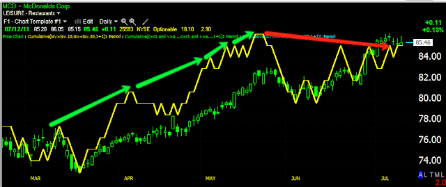
 MCD just completed a parabolic move up, there haven't been too many and they typically end with a pullback. Whether this will end up in a pullback or something worse is too early to know.

 Looking at the recent parabolic move, there are several noise candles in orange recently, this helps us define a trend, but nose candles also almost always show up before a trend reversal which could include a pullback or again, something worse.

 Daily 3C from confirmation to negative divergence

 Hourly 3C

 The uptrend cycle with accumulation and distribution visible on  a 30 min chart.

 Recent highs went negative on the 10 min chart.

 Today's highs went negative on a 1 min chart-note the highs of the day were tested and that's where the divergence occurred.

The Trend Channel. A move below the $84 area should be taken seriously. A break of the TC could simply lead to a pullback, but the market is a lot different now then t has been the last 2 years, so we must be cautious if we try to buy a pullback in MCD.

USO Update

USO just scored a small victory

 On the daily chart, you can see USO crossed above resistance, which is obviously an important level as it has acted as either support or resistance 11 of the last 19 days.

This is what the 5 min 3C chart looks like, confirmation and also a leading positive position. The charts from 1-15 min all look strong like this.

FSIN May Have Stuck Its Neck Out Too Far

 Today's daily range has been pretty wide.

 Here's what caused the wide downside part, it appears to be an early morning attempt to wash out stops.
The recent move is a bit more parabolic then it appears on the 1 min chart. Trading is certainly out of recent character.

 3C 1 min is not following FSIN higher.

 Nor is the 5 min chart.

 I would keep an eye on the 50-bar m.a. on a 60 min chart, it may be the key to a reversal here.

The 15 min hart hasn't gone south yet and I'd like to see that happen before jumping in the trade with both feet. By the looks of the 1/5 min 3C charts, it may happen quickly.