Wednesday, September 26, 2012

Market / NASDAQ Breadth

I started out just trying to get a feel for today's breadth in the market and dug a little deeper from there. Market Breadth is like taking the temperature of the market, there's no interpretation, these are hard factual numbers so I find it helpful to keep an eye on breadth at least a few times a month and especially at important areas.

You may find some of the charts surprising or you may not, but thus far there aren't many indication if any of building strength in to falling prices which is what we'd call a positive divergence. Lets just jump in from the market trend to today specifically.

Actually, since I have some credit charts too, we'll start there. You may recall yesterday the chart posted showing European Credit really worried about something while European stocks went on their merry way higher; you may recall the maxim, "Credit leads, equities follow". That market maxim proved correct as Spanish/Italian markets were down horribly today, at the same time sovereign yields (the real symptom of the EU problem) today were wider across the board with Spain back above 6% and most other sovereigns at their highest levels since QE3 was announced; it looked like this today.
Note how much higher sovereign debt jumped today.

While Equity Averages did this...


And all of this was signaled in the European credit markets yesterday... (from yesterday's post)

European stocks in dark blue vs credit from yesterday.

As for High Yield Corporate Credit, it seems that since Thursday's CDS roll, quite a few longs took their profits and called it a day as the highly liquid HYG (High Yield Corporate Credit ETF) has been on the decline since last week's roll. As pointed out yesterday, HY Corp. Credit is significantly below where it was on September 13th  while the SPX (green) just broke below that level today.


High Yield Junk Credit is also significantly below the levels from Sept 13th (When QE3 was announced).


In the same way Credit can give us a leading indication, breadth can tell us about sustainability and emerging trends that are not yet otherwise visible in price.


The breadth indicator will always be green while the comparison symbol (the S&P-500 unless otherwise noted) will be red.
 This looks chaotic, but it's not too hard, it's the Absolute Breadth Index and when the readings are high, it's consistent with conditions for a market bottom, conversely when readings are low it is consistent with topping conditions in the market. I've highlighted several areas of lows and highs and their corresponding tops/bottoms. Recent readings are near multi-year lows, consistent with topping activity.

 The McClellan Oscillator (MCO)... While there are several ways to use the MCO, I have found it to be most consistent as a divergence indicator, crosses above and below the zero line are also used for short term trend changes. The MCO gives a positive divergence at the October 2011 bottom and a negative at the March-May 2012 top and another positive divergence at the June 4th 2012 lows, it is now giving a negative divergence that is leading to new lows for the entire uptrend since June 4th.

 Daily NASDAQ 100 Advance/Decline line, obviously this is a cumulative indicator that subtracts declining issues in the NASDAQ 100 from advancing issues, the idea is that it should look like price or it can have a positive divergence that signals the probability of a bottom, right now it is in a negative divergence from the June 4 low rally, this is what I mean when I say many indicators make this rally off the June lows look like a counter trend bear market rally, obviously price doesn't allow for that classification, but numerous indicators do look that way.

 This is the same Advance/Decline line except for the entire NASDAQ composite-every stock trading on the NASDAQ network; it gave a negative divergence at the March-May 1 2012 downside reversal and has been in very negative territory ever since, failing to equal the February highs while price moved above them.

 The Advance/Decline line for the Russell 2000, note how it is in line with the index in the green area and falls out at the 2011 top, again at the May 1,  2012 reversal down and has moved even lower ever since as price has moved to a new high. Essentially far fewer stocks are participating in the advance which gives us a thin market, these can be dangerous markets as they don't have the breadth to support them and we often see volatile moves from thin markets.

 The Zweig Breadth Thrust has some complicated uses, but again, it has always worked well as a divergence indicator, calling out the 2012 reversal to the downside and confirming in yellow, a positive divergence at the June lows and confirming in yellow and now in leading negative position.

NASDAQ 100 Intraday Breadth Charts...

 This is a 60 min chart of the percentage of NASDAQ 100 component stocks above (green) or below (red) their 60 min 50 bar moving average since Sept. 13th. The 24th and 25th were key days for all kinds of underlying weakness including this indicator.

 The same indicator on a 15 min basis, again the same area really saw trouble brewing which may not have been evident by price alone.

 This is the 1 min version, just looking at today. As you can see, breadth declined as the NASDAQ hit intraday highs today. This wasn't what I was expecting, I was expecting something a little stronger today.

 The Advance/Decline line for the NADAQ 100, but on a 60 min basis. I think the finding here is clear as fewer NASDAQ stocks held their ground.

 This is the same chart on a 1 min basis looking at today, we see the same breadth deterioration at the intraday highs in the NDX. What was most surprising was the end of day reading.


  The MCO for the NASDAQ 100 on a 60 min chart, again the area of the 24/25 really showed breadth fall apart badly.

 The MCO on a 5 min chart also saw breadth today deteriorate in to the intraday highs, there was a slight uptick near the close.

 This is the percentage count of NASDAQ 100 stocks making 15 min, 250 bar new highs/lows.

That same area of trouble seen in all of the above charts saw a 60 min 3C negative divergence as well as TSV 18/38 negative divergences which I included simply for confirmation.

In other news, Germany had a technical failure today on a 10-year bund auction of $5 bn euros, receiving only 3.95 bn in bids. This is a safe haven asset, but it seems that bond traders may even be concerned about Germany going out 10 years.

In a further sign of manufacturing contraction, Yesterday we saw a statement from Maersk,
the world’s largest shipping company, who announced capacity cuts on Europe-Asia routes. So much for China bailing out Europe, although that's been a dead horse for a long time. You've seen transports lately, tomorrow I'll take a look at the Baltic Dry Index.

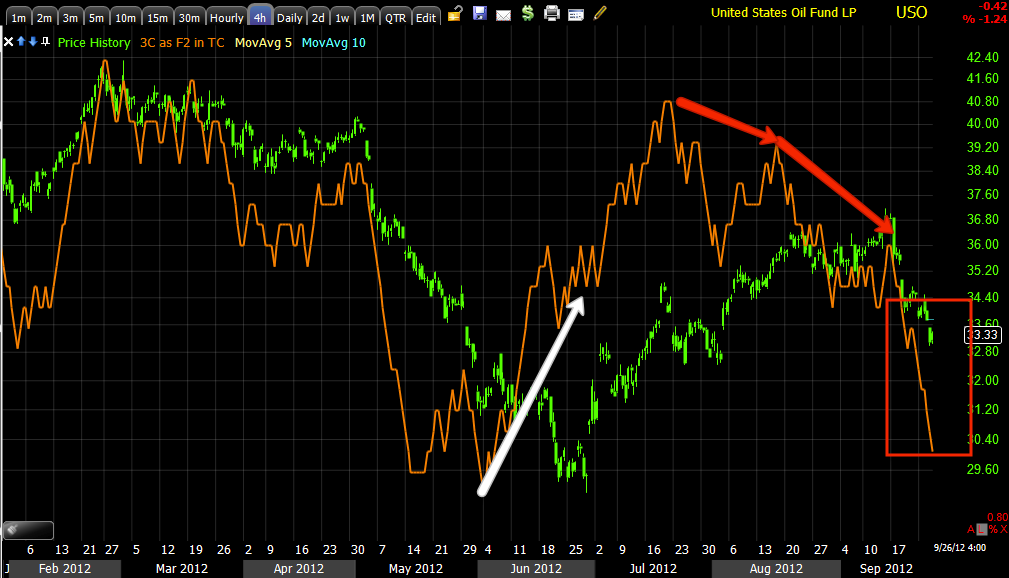
In futures tonight, ES is up about 5 points to $1432.75 so far and NQ is up 10 points to 2785; 3C is in line/slightly positive. Gold mini futures are up a few points, but 3C is showing a deepening negative divergence. Crude is up marginally, also showing a negative divergence, but not a bad as gold's.

The dominant Price/Volume relationship was price down/volume down. There's really not much to stop the market from a correction to the upside, oil looked like it was set for such a move, the averages didn't have strong divergences, but there were a few smaller ones and I'd expect the averages to draft off energy broadly.

I'll bring you any developments that may arise.


Futures

Both the ES and NQ (mini size S&P and NASDAQ Futures) saw a stronger 1 min positive divergence as we move toward the close, perhaps some overnight action? I'll take a look later tonight and see if there's anything that maybe leads to a gap up.

Crude Futures have seen a slight improvement in the short term chart going into the close, gold futures have actually seen deterioration on the 1 min chart going in to the close, their 5 min future chart is exactly in line with price today. I still have the GLL (leveraged gold short ETF) position open and expected some GLD upside, we did see some intraday, it wasn't exactly what I had in mind, but with the market so dull today I'm not all that surprised.

Just consider one thing when you consider how dull the market is today, consider how negative it was yesterday. In that respect that's a major change in sentiment or at least price action, it does fit well with an oversold bounce and as I mentioned shortly ago, Wall Street doesn't do much without a reason so you have to expect volatility.

Quick Look at Volatility Assets - VXX / UVXY

Today as everything seems to just be content to drift (remember quiet markets are dangerous markets-don't be lulled in to the sense of calm and quiet, prepare your plans and contingency plans), VXX and UVXY, the short term VIX futures have held up well today. Between the two, I don't see any negative divergences standing out, for the most part they have been in line with some charts on the longer end even seeing positive momentum.


Market Update

So far today it is the second option, rather than a quick upside bounce, it looks like the lateral action today has helped build a larger positive divergence, although there's nothing that looks spectacular. More than anything, I'd think a risk on move in Energy would see the rest of the market draft that move.

Here are the charts for the averages and Futures...

 The DIA was pretty difficult to find much of a positive signal in, taken alone I would call this divergence support, simply enough to keep the DIA from falling further as there are two ways to consolidate, through price corrections and through time (lateral price patterns like triangle, rectangles, etc.

 As far as capping any positive momentum, the 60 min chart's very fast leading negative divergence puts a large road block up.

 The IWM too was difficult to find the kind of positive divergences I would expect to see after today's price action, there's this 3 min leading positive, but again - taken alone and after yesterday's momentum down, a divergence like this could be used just to provide some support and halt the slide.

 The IWM 10 min shows a little better positive divergence more along the lines as far as timeframe.

 The IWM 60 min's deeply negative posture seems to cap any extremely bullish hopes for now.

 QQQ, again not a strong signal as a 3 min leading positive, however I would say we have simply been building today so the upside response to the divergence hasn't started so I'd expect that either to start near the close or perhaps tomorrow unless an even larger divergence is built which I tend to think is nor as likely.

 QQQ 5 min leading positive is reasonable, but still not overly impressive.

 SPY 5 min is probably one of the better looking positives today.

 Even the 15 min chart though caps any positive developments, but I will note the momentum accelerating to the downside yesterday along with the dominant theme of the Price/Volume relationship from yesterday both suggest a short term oversold condition exists.

 ES 1 min looks pretty good.

 ES 5 min look ok, I'd think the market could get a decent bounce from here.

 NQ 1 min is about as impressive as the QQQ divergences, not very.

However the 5 min chart has been building since last night and this looks more along the lines of a volatile move.

There's little reason to lift the market if it doesn't move traders emotionally, meaning get those who were long and stopped out back in the market or those who went short to cover, there's almost always a reason to what Wall Street does and why. So although I don't see strong evidence of a strong bounce, I would expect one just from a behavioral point of view.

This does open up some possibilities and opportunities to enter some positions as the trades come to us, however at the same time I want to monitor the QE3 aspect of all of this. I need to see 2 things, a downside move and an upside move to gather the information that gives us the probabilities. Thus far on the downside move, we aren't seeing large accumulation of lower prices so the data so far suggests QE3 was already priced in and the market is more worried about the real economy and events.

A move up will tell us whether the higher prices are confirmed or under distribution as they move up, if they are under distribution, then that matches with what we have seen thus far and suggests QE3 was priced in and it i likely the long term charts from last night are still reliable and most likely the underperformance in hedge funds comes as they have been building short positions in to higher prices in expectation of a nasty move down, which also seems to fit with the opinion that unless Bernie knows something we don't, then he seems to have panicked. I would guess 11 members did not make this choice lightly and it would be likely there's something we are not aware of that the F_E_D is trying to get in front of, something not so good.

USO / ERX Long

You may recall I closed a USO short I believe it was the 19th of September and entered an ERX long position (Energy 3x Bull), which is not the same as specifically being long oil as Energy is much broader including other forms of Energy and multiple services.

USO has been given some signals that it's looking for some upside, the question is how much? This is one of the best examples of the conundrum of QE3, oil should have rallied, but we have a macro-fundamental environment in which demand should be stifled as manufacturers are in contraction, transports are as well and the average consumer is seeing high inflation in gas and food. The other situation, just to make this as complicated as possible is the geo-political environment from Al Qaeda attacks on US diplomatic missions, to China/Japan/Taiwan all fighting over 2 barren rocks in the middle of the ocean, there's also the Syrian and Iranian problem with an armada of 25 nations amassing in the Straits of Hormuz and there are violent protests that are springing up around Europe and not to engage in hyperbole, but the last 2 World Wars and particularly the second, were not only on the very same continent, but also after a period of social/financial unrest that was used to turn citizens in to national zealots to take the focus off the failing of the domestic government in dealing with structural issues such as 50% youth unemployment in Spain; it's a wonder they haven't already burnt half of the country to the ground.

As for USO/ERX, I feel good about the long ERX position and am interested in what effect, if any QE3 has on the underlying trade of oil, thus far it hasn't been good.

 I originally went short and kept USO short as it failed to hit the upper channel and subsequently broke down, however while this looks like a textbook short set up, these textbook set ups almost always see volatility shakeouts which is why I prefer to either short at the top or wait for the volatility shakeout than short in an area like this.

 The odd behavior in all assets, but oil since QE3.

 The 60 min USO chart shows several distribution areas, the last at the QE3 announcement.

 USO 2 min shows some intraday momentum in 3C picking up.

 The real positive divergence though has been on this 5 min chart.

 The 4 hour chart or the big picture would seem to cap off USO's probabilities of a large run to the upside along the lines of normal QE price inflation, but I'm open to any data that suggests probabilities are otherwise.

 In ERX, 3x long Energy, the 4 hour chart is similar to USO's, deeply leading negative and especially so at the QE3 announcement. Compared to the last negative divergence in March-May 1, this one (currently) is far, far worse which would imply a spectacular move lower in ERX/Energy. We'll see how they react on any upside, if there's strong distribution in to higher prices, this may be one of the best opportunities we have seen since March of 2009.

 ERX 60 min also looks like USO in not only the positive sending it higher, but the recent negative leading divergence.

ERX near term 3 min chart is leading positive so I suspect both USO/ERX and Energy more broadly are about to see a decent upside bounce, which brings us to other risk assets which I will cover next.

USO looking pretty good

I'll post some charts, but USO looks ready to bounce, how high is the question. I have a long in ERX that is speculative size, or about 7% of portfolio, I may increase it if I have the time.

Charts coming.

UNG

Remember that tomorrow is the EIA Natural Gas report, while it's not usually much more than a creator of intraday volatility, it wasn't that long ago (June) that we saw a 15% move in UNG in a day on the report. UNG is also one of the few core short positions as an equity long.

UNG is up nearly 3% today, it's been up higher this morning, but is seeing some resistance from the 9/12 area.

I personally don't pay much attention to UNG, I have faith in the position and am content to let it take its time and do what I feel confident it will eventually do, that is head toward at least $30-$40 and likely it will exceed that by quite a bit a there has been a major change in UNG, someone is suddenly very interested (as in this year). Still what UNG needs is to move from a stage 1 base to stage 2 mark up and the only way to really do that is to have a nice move up on heavy volume, retail traders see this as smart money buying and will chase it sending UNG in to stage 2 mark up, in reality smart money was in place long ago.

 The life-cycle of assets, UNG from stage 4 decline to stage 1 base as the life-cycle starts over. Stage 2 mark up would be next and where UNG would trend higher.

 We expected a pullback at this white arrow and some accumulation in to the pullback. The long upper wick on today's daily candle shows higher prices being rejected as UNG makes it's first contact with resistance from early September. UNG needs to be above the base area before stage 2 volume/price spike is likely.

 The 60 min chart showing the downtrend that 3C is confirming and the transition to a leading positive divergence at the base area.

 On the 15 min chart 3C is stronger here than it was at the last base highs in July, so that's a positive development.

 Since the early September pullback where 3C went leading negative and then positive and now is in line or confirming the move up.

 On a 5 min chart the profit taking and disappointment with early resistance today has formed a bit of a leading negative divergence on the 5 min, but that may change.

Divergences start on the shortest timeframes and the 1 min is now turning more positive than it was earlier, if this keeps up the positive posture will migrate through the 2, 3 and eventually 5 min chart.

However for now these are just small moves, the real move of interest is the volume/price spike signaling the start of stage 2.

AMD Head Fake Move?

That was my initial impression yesterday, that opinion has solidified a bit more today as 3C has caught up to yesterday's fast trade. Head fake moves are common just before a reversal, they are helpful in adding momentum to a reversal in a number of ways and as such, it tends to be the reason we see some sort of head fake move about 80% of the time before a significant reversal, in fact it' usually the last event to occur before the reversal.

 If AMD is going to form a larger base (which I don't have any significant proof of right now), then I'd suspect this portion would only be about one quarter to one third of the overall size, assuming it is similar to the bases AMD forms about once a year. If this i a larger primary trend base, then it could take nearly 2 years as we have seen in the past. In any case, there still looks to be a tradeable move here to the upside in the meantime.

 I mark suspected or confirmed had fake areas with a yellow box or sometimes arrow, these have provided us some of the best entries in stocks we shorted like BIDU and PCLN as well as having given us tactical action areas that match our strategic analysis.

The point of a head fake move below resistance is to shakeout any longs and absorb their shares as well as draw in shorts, when price rises above the newly formed resistance level, short covering helps propel the stock higher.

 Here's the 4 hour 3C chart, as mentioned, we can see the negative divergence that turned the trend from up to down, but there's no evidence yet of a long term base forming.

 The 15 min chart locally shows us the reversal to the downside on a negative divergence around the highs of and just before the 17th, we also see the break below support (red trendline) and a positive divergence on a 15 min chart in to that break, that makes it more likely it is a head fake move.

The 5 min chart also is leading positive at the break below support and the intraday timeframes below 5 min. support this finding. Personally I would hold AMD here for the time.