Tuesday, January 24, 2012

VIX Sell Signal

I've been going back and forth over whether to post this as the big event tomorrow if the F_O_M_C meeting, but after talking to a few members, I think it's worth posting if for no other reason then educational purposes.

There's a VIX signal right now which suggests the market is a sell, here it is and how it works...
First you have the VIX with Bollinger Bands set to 20/20. There are 3 components, the first is the VIX closing outside of the BB's which happened Friday, the first day in the red square, the second day the VIX needs to close back inside the Bollinger Bands which happened yesterday and the third day (today), the VX has to post a higher close then yesterday, all 3 components have occurred an it rarely happens. Furthermore my custom DeMark influenced indicator is giving a VIX buy signal as of Friday, the start of the VIX signal. Additionally, the VIX is now around the same level as the late July decline that saw the market plunge by 17% and even more on an intraday basis, that was the last big decline we have seen in the market.

We did have another buy signal in the VIX earlier which would mean a sell signal in the market, but we didn't have the VIX signal then.

We also have a sell signal in the SPX on the same Demark indicator on a 2 day chart, that's a strong signal.

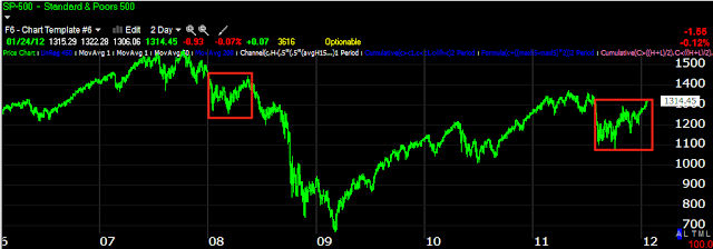
There have only been 2 signals in this timeframe, the first was the buy signal that ended the July decline mentioned above you can see to the left in green, now we have an even larger sell signal in a very thin market ramp.  These two taken together offer a pretty solid sell signal, however tomorrow will be focussed on the F_O_M_C announcement which certainly could disappoint the market.

Furthermore, these two areas in the SP-500 have striking similarities.
Both came off a nasty decline from a market top, both posted a low and then a new lower low that started a strong rally...

Both ran into the top's neckline as resistance and both were in leading negative daily divergences.

Thus far overnight the Euro is rounding over just as 3C had predicted before the close. Three and a half more hours before Europe opens...

AAPL Stops Just Busted Up

While I appreciate the move in AAPL, that just keeps adding profit to the PUT position there, I would caution as always placing stops at obvious levels. We see this every week, probably nearly every day.

Look at all the stops hit when price dropped below intraday support where a bunch of stops were placed. Wall Street sees these when you place your order with your broker, that s why I keep my stops mental and why I never place them at obvious support levels.

New Trade in the Options MP

I just placed an order to buy BAC March $8 Puts.

BAC Short

BAC's run looks like it is ending, it's followed the market as 90% of stocks will do, but seems to have been under distribution while doing so. This looks like an area that may be worthwhile to start building a short position, phasing in using maybe 1/3 increments, just make sure you figure out your full position risk management first.

 BAC has moved with the market, but 3C has shown it to be under distribution on today's move.

 The intermediate trend at 15 min is also negative

And the long term 60 min trend looks like BAC's run is just about done. I prefer using Puts with BAC and holding them for a couple of days until I get a 30% profit or so.

CLFD Long Looks like it has more gas in the tank

 First we have a decent rounding base which should show accumulation and good volume today, a close near the high end of today's range will increase the chances of follow through buying tomorrow.

 The 15 min 3C chart shows the accumulation I expected to find, I doubt it has all been distributed in a single day, so I would say the probabilities for more upside here are pretty good, maybe 10-15%

Using a 22 bar moving average on a 60 min chart makes for a nice trailing stop with your initial stop around $6.60-$6.70

Market Just following the Euro

It's a pretty slow day so the machines are just running legacy arbitrage algos.

 SPY in green vs the Euro in red, an obvious correlation.

 However I don't think the Euro is going to hold too much longer here, probably through the NY close, but I suspect it dips with ES in after hours.

Longer term, the Euro looks to be topping out after it has made its run to $1.30+

Pretty much a boring day.

PEIX Long

You might want to set a price alert and keep an eye on this one. We had a nice trade in PEIX before and it may be setting up for another run. For risk management and position sizing, this should be considered a speculative trade and risk management should reflect that, if it takes off the gains will take care of themselves, I believe the last run was about 500%!

 This has been the new trend is wedges, they use to breakout at the green arrow, but that very rarely happens any more, instead they go on to form a base and then take off. The same is true of bearish ascending wedges, except they form a top and it usually doesn't last as long.

 Here's the base maturing and this was about a 500% run in 6 weeks. Note that volume is correct for the triangle consolidation.

A closer look at the last 2 days shows another triangle consolidation, a breakout above the $1.24-$1.25 area may very well be worth buying with a stop around $1.16, however, I would either phase in to the position if you have to have some now fearing you may miss a gap move up and then add to it once it is moving in your favor or my personal preference, set a price alert for $1.24-ish and buy on the breakout, let the stock prove itself.


AAPL Update

My AAPL Puts in the option model portfolio are at a slight profit, last night I also covered AAPL in my wrap on Monday's trading action.

 Strangely, the NASDAQ 100's biggest component by weighting is not trying to fill the gap today and is heading down with 3C confirmation.

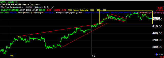
 This is what I view as a head fake move in AAPL, there are two that are part of one larger move, first the breakout from a bearish ascending wedge and then a breakout from a bull flag, I entered my puts the next day.

 Here's a closer view, the yellow box is where I initiated the PUTS, a break below the yellow trendline should be a high probability lower risk trade as it will confirm the head fake move in AAPL and trap a lot of very loyal longs.

On a long term 60 min trend, you can see 3C went negatively divergence right at the breakout of the ascending wedge and the bull flag which is in the yellow box. The long term trend seems to be indicating the move above both patterns has been used to sell/sell short by smart money. For newer members we have been tracking AAPL for some time, there have been many negative occurrences such as an all time new intraday high put in and AAPL couldn't hold it, it couldn't add to it. There have been many other events as well, and in general AAPL longs are in love with the stock, which makes for a great bull trap.

I would put AAPL on your watchlist and watch for a break below the $415 level.

XLF vs FAS vs FAZ

I like to compare different ETFs that are in the same industry group, for example XLF is financials, FAS is Bull 3x financials and FAZ is Bear 3x financials. Because they all have different trading volume, they shouldn't confirm unless there's something really behind it. Looking at these charts, I'm tempted to add to a financial short, but until the market finishes it's gap filling, it's dead money, plus the F_O_M_C may provide a better entry so I'll use my better judgement and just be patient, but the confirmation is striking.

These are all 15 min charts...

 FAZ-Short Financials (inverse ETF) is leading positive, a very strong bullish signal. For confirmation, FAS should be leading negative..

 And FAS is leading negative. Because FAS s simply a 3x leveraged version of XLF, XLF should look similar...

And XLF looks horrible, a very strong leading negative divergence.

Patience...

DIA, IWM and QQQ

These charts all suggest it's all about the gap as well.

 DIA with a slight leading positive divergence on a 2 min chart, it still hasn't filled the gap from today.

 The long term 30 min chart though is breaking down bad.

 The Russell filled the gap, went negative after that and has just held in a range, apparently waiting for the other averages to fill the gap.

 The 30 min chart is making multi-month new lows and this is in the red zone I have mentioned.

 The Q's filled the gap and then went negative and backed off today, right now there's a relative positive divergence, I assume the NASDAQ is just moving with the other averages still trying to fill the gap.

The 15 min chart though looks considerably worse making new lows here.

The Market Really Want s to Fill That Gap

 As the short term 3C SPY chart shows, it really seems to want to fill that gap.

However what comes next looks more uncertain as the 15 min chart has made a new leading low negative divergence today alone.

The last of the 3 pillars, Technology

 XLK made a new intraday high yesterday, it should have held it and should have seen follow through buying today, neither happened.

 My Custom Demark inspired indicator is showing a 2 day sell signal! This is a strong signal.

 On an intraday 3C chart, here's yesterday new intraday high, again a parabolic move into a 3C negative divergence.

 The 2 min chart finds the same negative divergence at the new high.

 The longer trend 5 min chart also shows the same failure of the breakout and the trend in 3C has been down, remember this is in the area I consider to be the danger zone for the market and we see these negative divergences in the major industry groups consistently.

 Here we see some accumulation and then distribution, this is specifically the danger zone in the market in the red box and the 15 min chart is a serious timeframe. This looks like massive distribution has been taking place for sometime and taken with the VIX readings as well as the SKEW readings, I think they should be given some serious consideration.

 The longer term 30 min chart has shown a few cycles, but now we are seeing the first really serous leading negative divergence, once again in the thin trade of the danger zone.

 The 60 min chart confirms the recent findings of the 30 min chart, also in a leading negative divergence.

For the first time on this daily chart stretching back to early 2010, we have a leading negative divergence in tech and we also have a recent, probable head fake as of yesterday. For newer members, a head fake is one of the last things we see before a trend reversal.

Energy Update

 Fr the time being XLE (Energy) is simply following the FX correlation (Euro in red), while trying to fill today's gap.


 Here is the danger zone in XLE in yellow, the breakout from a symmetrical triangle, the problem is a breakout from the 2 month consolidation "Should" have produced follow through buying sending XLE quite a bit higher, instead it has been content to trade laterally in the area I consider it be a red line zone and thus most likely, probably a head fake breakout which will eventually trap longs. Also note the declining volume, even after the breakout.

 XLE Hourly sell signal from yesterday.

 3C 1 min showing yesterday's end f day negative divergence sending XLE lower, so far the 1 min is in line with today's price trend, this is largely a function of the FX correlation as there was NO positive divergence to kick off the intraday bounce.

 A 2 min 3C chart shows the more recent trend, very negative at yesterday's highs and leading negative today.

 The 5 min chart shows the exact same thing, so there's good confirmation between the 2 timeframes as each has a different look back period and does not need to produce the same signal unless that signal is valid.

 Longer term on the 15 min chart we see positive divergences marked by white arrows and the area of price accumulation marked with a white box, distribution marked by red arrows and price area marked by a red box. In general, the highs have been distributed and the lows bought as XLE remains in a wide trading range.

 The longer term trend on the 30 min shows that accumulation areas seen on the 15 min chart were actually quite small and didn't even appear on the 30 min hart, suggesting that overall, the balance of money flow throughout this wide range has been heavily skewed toward dumping shares or even selling them short.

On a daily timeframe, the last good bout of accumulation was back in the summer of 2010, since then we have seen some heavy distribution in XLE.