Tuesday, September 10, 2013

Gold Futures Look Interesting

Thus far Gold has been the flight to safety trade or you could say it has been trading opposite the market, for a while we were looking at gold rallies (recently) as sentiment that the F_E_D taper was to be pushed back and declines that the market feared the taper sooner than later, but now even with the new F_E_D nominee up in the air and Bennie likely staying on longer than thought, there's some uncertainty about a taper date that has been widely held to start September, but in my view, I believe the F_E_D and Bennie want a new chairman-woman (Janet Yellen perhaps) to lead the effort to unwind the F_E_D's unprecedented level of policy accommodation since late 2008.

Entering F)E)D policy is the easy part, unwinding policy, normalizing the balance sheet and raising rates is the hard part, it looks like new leadership will lead that charge, that's the VERY distinct feeling I get, especially when looking at the timeline of how the events (what I called "Slow boiling the frog") came together to lead the F_E_D to the point in which they could go from introducing QE3 to letting the market know that policy accommodation is about to end and all of this in under a year.

In any case, gold in my view already had a cycle started, phase 1 accumulation, however the events of the last 24-48 hours seems to have changed fundamentals and the war premium in the market has been discounted again. Still, once Wall St. invests in a cycle, they rarely let it fail. In this manner I think Gold will go higher and that's probably why GDX looks so good. I would not make any assumptions about silver beyond the last major update last week, I would not expect arbitrarily that it will mirror gold, I put out pretty extensive analysis of silver, I'd check that out. I will update Silver to reflect short term changes, but I think the thrust of the longer term remains intact.

Gold
 1 min gold futures with a large intraday positive divergence.

 In the middle of the chart is the accumulation zone I mentioned, there's no distribution, so the move was largely a reaction to fundamental events, not a closing out of the new cycle as far as I can tell, I mentioned this in earlier updates during market hours today, I believe to the right we are seeing a new divergence, since the stage 1 accumulation is largely complete, I think this would simply be tactical tweaking.


The 30 min chart shows the accumulation of the head fake move as well to the right of the middle of the chart, again no distribution of any kind leading us lower so I think the accumulated positions are still in place, they may be averaging down at a better price point which is fine when you are controlling the cycle, note the leading positive today or tonight.

I haven't been impressed by short term GLD signals this week yet, but I have a feeling that's all about to change so we may very well look at some GLD long positions and maybe SLV, I would just warn that if we do, be careful not to over-correlate your portfolio with GLD, SLV and GDX or NUGT, you have 3 positions all highly correlated, my way of dealing with that was to look at GDX and GLD as one trade for risk management purposes, I think if we get confirmation signals, that might be the best approach to spread out relative performance, but to keep your portfolio from having too much PM related exposure.

What we need now is strong GLD confirmation, as soon as we get that, we'll look for a tactical entry with low risk. I have been patient with GLD, last week (Friday) I declared, "No GLD/SLV trades for me", not because I didn't believe in the cycle, but the charts didn't look right and this week we found out why.

As always, a sharp edge in the market and patience is a deadly combination for a wolf stalking its prey.

Daily Wrap

While I've still got currencies on the brain, in tonight's post, Currency Update: EUR/JPY in which I showed how the EUR/JPY not only lifted the market overnight from Sunday night or actually early Monday morning through the close, but it just needed to get the market to some obvious technical levels that would cause a short squeeze. Interestingly the market followed the pair again today. More importantly I showed how this former Carry pair was not looking good at all and the chances that the pair would be taking the market much higher were fading rapidly with building negative divgerences in the pair and positive in the JPY which all carry trades use as the second currency in the cross.

I made mention that the market wouldn't get support for much longer (if at all) from the pair "unless another pair stepped in to take its place". These carry pairs use to hold a solid uptrend for 4-5 months, now maybe a day or two. I looked over the other contenders, the $AUD and $USD and besides the Yen getting stronger making any carry pair difficult, noether the AUD or the $USD have any underlying strength at all so I think it's pretty doubtful the market gets any support from that old standbye market manipulation trick.

Even though I think a lot of the upside (by the way the NDX made the highest close since Nov. 2000 today) is the unraveling of war premia, this is also the same "Very strong move to the upside" that we had expected, the pullback to the lower end of the range was only to make the range stronger for a stronger upside move.

I think there's very little doubt that this is directly attributed to Syria and the change in tone from war-footing to a diplomatic face-saving way out as Obama doesn't have the support in Congress (it is unclear whether he would have went ahead or still will without their approval as he said he feels he has the power to do this without Congress when he said he'd ask for a vote there).

Syria is a catalyst at least or an excuse, maybe not the reason as the cycle was set up before Syria became the issue it is.

The wholesale dumping of oil (USO - WTI) in green shouldn't behave that way considering what the $USD did since Friday's close, note the $USD (orange) lost a lot of ground since Friday's close, since oil is dollar denominated, a lower dollar means oil prices have to rise just to make the same money on a barrel, the only way it falls like this at this particular time is a discounting of war premium, but still I don't think that's all because the market needed a sponsor, the EUR/JPY.

Now that the market can't get the help it needs to maintain the "Strong move up" and the additional time to distribute up here, the market needs something else, what is there?

Well as I was looking at closing charts I came across this, you'll probably recall it...
 TLT-20+ year Treasuries vs the SPX, note the close though, TLT saw a sharp move down and the SPX a small move up. This isn't exactly banging the close and there may be a hint in the inability to "bang the close.

 Here we have short term VIX Futures (VXX), notice anything unusual here near the close?

VXX was also pushed lower in to the close obviously in hopes of banging the close, the move in the market at the close wasn't organic, the Q's were starting to struggle because of AAPL, and every other index, no matter how broken their correlation has been (today not as bad as other days, but the NDX at a new high closing about half of the IWM and the NDX closed with a nice downside reversal candle.) all looked almost exactly the same the last few minutes, considering they were trying to bang the close, it was a pretty half hearted attempt by the market itself.

What other evidence is there that they were trying to bang the close?

Take a look at HYG during the close.

So we have TLT and VXX down right in to the closing 30 mins or so and HYG up, anyone remember what that correlation creates?

THAT'S RIGHT, THE SPY ARBITRAGE

And in case my charts above weren't enough, here's the Capital Context SPY Arb. model which is based on only 3 assets, the flight to safety TLT, the flight to protection VXX and the Risk on HYG, the first two have to be down and the last has to be up to create the arbitrage and there it is spiked at the close, BUT THE MARKET COULDN'T DO MUCH WITH IT.

BEING THE EUR/JPY CHARTS (AS WELL AS THE OTHER POSSIBLE CARRY CROSSES) LOOK THE WAY IT /THEY DO, THE ONLY OTHER SHORT TERM MANIPULATION IS THE SPPY ARB.

Don't get me wrong, I'd like the market to stay up here and move laterally or slightly up for a good week or so, this was the main trade, the main point in all of the cycles, to sell short in to a strong market rally, that was the gift, that was and is the set up for the primary downtrend.

However, I'm not sure how long it can or will hold and obviously the unknown of Syria plays a big role.

As far as some other assets and indications...
You saw GDX, I love it and I think it moves, I'll show you some interesting GLD/Silver charts developing tonight in another post, but GDX has a tight correlation with gold so if gold moves up with GDX, it would almost certainly be out of a "Flight to Safety" trade.

How about some market breadth/internals? 

These are breadth indicators, the indicator is in green and the comparison symbol in red (usually the SPX unless otherwise noted).
 The % of all NYSE stocks trading above their 40-day moving average, as you can see this has gone from 85% to 46%, that means the majority of all stocks in the NYSE are below their 40-day moving average despite the NASDAQ at new highs and the other averages close!

 This is the same indicator, just 1 standard deviation above their 40-day moving average, these are momentum stocks typically. We have a move in breadth down from 70% of all NYSE stocks to a current 30%, note the sharp uptick recently, that to me says, "Short Squeeze", especially in a 1 SD > 40 ma indicator, but the 30% level even on a short squeeze is an extremely thin, hollow market.

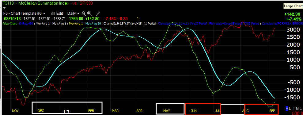
 This is the McClellan Summation Index, a cumulative indicator of the MCO, it should move with the market making higher highs and higher lows in an uptrend, but look at the decline from May. Crossovers or cross-unders at the zero line are also signals trend traders use, right now it would be signaling a short trend or bear trend, the breadth of the market is horrible, as I say, "Price is above all, deceptive"

 Trend Traders use the same indicator with a 20 day moving average to signal long/short entries/exits, but the breadth has been so bad that many signals were short as the market was rising, this isn't a faulty indicator, breadth indicators are based on real, hard , objective evidence, not interpretation, the new lows just shows how bad this market is as many averages are so close to new highs.

 This is the R2K's Advance/Decline line, there's only been 1 other time on the chart that the line fell behind and not for long, right now the R2K may be performing, but the majority of stocks are much weaker than price lets on, this is what leads to 2 or 3 months of gains being wiped out in one opening gap down, you must pay attention to these warning signals.

 Street sentiment via HIO shows positive sentiment as the base was being accumulated, it wanted or did pullback where the market should have, since then sentiment has been down.

Here's the intraday sentiment, they weren't buying the EOD attempt to ramp the close.

Junk Credit wasn't buying it either, even though it trades just like HYG, the only reason HYG bought it was because the SPY arbitrage wouldn't have worked without HYG.

And yields that act as a magnet for the market giving leading signals here are now giving a leading negative signal.

I have a lot of other interesting charts, but the real question is, does the market make a shallow pullback before large scale distribution or does it go ahead and start now or do we get something else entirely with Syria causing uncertainty? 

I'm initially thinking, "Sell the news", kind of like AAPL today.

More to come after dinner.


Trade P/L: IWM Oct. 100 calls; FSLR Oct. $35 Calls; XLF Sept. $20 Calls

Here are the P/L figures for the few positions closed today that I didn't have time to post.

As I said earlier in the day,

"Until we figure out what the highest probabilities are (which tools are best suited to the developing market environment) for now I'm going to take care of position management or spring cleaning and essentially balance out the short term trade bias or go toward cash completely,  to take gains while they are still available and to raise resources (Dry Powder) to enter new positions".

Many of you have traded options and know this, but trading options is not at all like trading a stock. If we assume we are long MCP and long MCP using the leverage provided by options (long MCP calls), MCP may make a gain of +.50% tomorrow and while the long position in the stock will gain the exact same .50%, due to a variety of options model pricing influences we can actually go from a gain today to a loss tomorrow even though MCP moved up the next day by +.50%  because options are priced using a variety of factors, you can read more about options pricing at this link for the two Nobel prize winners who created it and also almost sunk the US Financial system when their firm, Long Term Capital Management nearly went belly up-another interesting story...the Black-Scholes model which among other things, incorporates volatility, the time left before the option expires (theta or time decay) as well as other forces that are market related.

So here's the P/L for positions closed today not already covered:

IWM


At a cost basis of $3.96 and a fill of $5.36, the P/L for the IWM Oct. $100 Calls came out to a gain of +35%

FSLR


At a cost basis of $4.10 and a fill of $5.35 the gain came out to +30.5%

 XLF


At a cost basis of $.32 and a fill of $.35, XLF was a gain of +9.37%


Currencies Update: EUR/JPY

Most of us don't trade currencies and they may seem boring, most traders have no idea how much if at all, the currency market influences the stock market and how much the currency market can tell us about the stock market.

Sunday night I said the opening action in most everything including currencies was pretty flat and as a result, I didn't expect any of the carry pairs which include AUD/JPY, USD. JPY and EUR/JPY, to influence the market. Yes, currencies, especially carry pairs like the 3 above can and do influence the market. 

Yesterday I made it 100% clear that it was my opinion that the EUR/JPY was used as an engine to power the market up to the point in which it hit significant technical levels setting off a short squeeze and letting retail do the rest of the work.

*For those not use to currency pairs or "currency crosses", which are not "carry trades, but can be carry trades", the first currency in the pair (in this instance EUR for the Euro) is the long, the second currency in the cross (in this case JPY, the Japanese Yen) is the short. So if I'm long the EUR/JPY, I expect the EURO to move higher and the Yen to move lower either on an absolute basis or a relative basis (meaning the EUR/JPY could advance even if both the Euro and Yen were advancing, so long as the Euro was seeing a stronger upside move-however this is very rare).  If the EUR/JPY moves down, this means that the Euro is underperforming the Yen, the Yen may be rallying while the Euro is declining, if I was long the EUR/JPY I would lose money if the pair declined.

I showed you this chart last night with the commentary below, but had talked about it long before during normal market hours.

"The EUR/JPY cross compared to ES would look like this..."
"This is a 1 min chart of the EUR/JPY in the candlesticks and ES (SPX futures) in purple, since 2 a.m. to 1 p.m. today they are nearly in lock-step, the pair was as I said earlier, essentially the market's sponsor or as I'd usually call it and called it last night, the market's engine. There were other influences though that were important and we touched on them early, HOWEVER, TO ENGAGE THOSE OTHER INFLUENCES, SOMETHING NEEDED TO SEND THE MARKET HIGHER AND THAT WAS THE EUR/JPY."

That's why this post is important, let me just show you a few more correlations starting with the EUR/JPY vs. ES (S&P-500 Futures) for today...
 This is the exact same chart as above, the EUR/JPY in the red and green candlesticks and the SPX futures (ES) in purple. This chart shows the 1 min action from 5 a.m. EDT to present, do you notice anything?

If you said that ES is still following the EUR/JPY nearly tick for tick, you'd be 100% correct.

So, while it is possible for another currency cross to sponsor the market's risk on (because the market itself doesn't have what it takes to move higher without help), we can get a lot of very useful information about what is likely to happen to the market if we know what is likely to happen to the currency cross that is moving the market.


To give you a broader perspective, this is the EUR/JPY in the candlesticks and ES in purple just like the 1 min chart from yesterday and the chart from today above, except this is a 5 min chart. 

Notice how the market follows the currency pair nearly perfectly?

Now lets look at the individual currency futures and how they relate to the market.
 Again, the currency is the candlesticks and Es (S&P Futures) are purple. 

This is a 5 min chart of the Japanese Yen (JPY) vs ES, note that they trade nearly the mirror opposite, that's because the JPY is the second symbol of the currency cross, the short.

This is the same 5 min chart, but this is the Euro (EUR) vs ES and notice how the market follows the Euro nearly tick for tick, just like the EUR/JPY pair because that's what we are looking at, the pair broken down in to individual currencies and showing how they relate to the market. 

So what do you think would happen if the Euro moved down on the chart above? Or what would happen if the Yen moved up on the above this one? If you said the market (assuming the correlation is still linked) would fall, THIS IS WHY THE SIGNALS IN THE CURRENCY (or FX) PAIR are important and VERY few traders know this or know how to get the underlying probabilities from the currencies.

Now lets look at the 3C chart of the EUR/JPY.

 It's difficult to get detailed signals from currency pairs, but I can often get an idea in the 1-5 min chart range, this 5 min chart of EUR/JPY shows a negative divergence that has gone to a new leading low for the week late this afternoon, I thought this was important enough to mention in this post today.

To go further in my analysis of the currency pair, I can look at the individual currency futures that make up the pair such as the Euro's 3C charts and the Yen's 3C charts, here's what I found...

Single Currency 3C Euro charts 
 This is the 5 min Euro and the 3C divergence is clearly negative, this does not bode well for stock market upside, it's not damning in and of itself, but it is a piece of the puzzle.

 The Euro 15 min chart is much more serious, if not for the market, then at least for the currency cross, this too is a new leading negative divergence hitting new 3C lows for the new week and even further back. *Almost all of this damage, which is on a very strong and important 15 min chart, was done TODAY ALONE!

 Euro 30 min shows a positive divergence forming last week, then late last week we saw none other than a .....

HEAD-FAKE! Remember how I'm always writing that we see a head fake move 80% of the time before a reversal and even more specifically, HOW THIS CONCEPT HOLDS TRUE IN ANY TIMEFRAME, ANY TYPE OF TRADING AND IN ANY MARKET? There's proof for you.

One way we know it's a head fake move beyond the strong positive divergence in 3C as the move is made to new lows, but also note the increased volume in the two yellow boxes, a head fake move is not effective unless it open up volume, causes traders to stop out or buy, it needs to create movement and volume to be effective. 

Beyond that, we have a very strong 30 min negative and once again, almost all of the damage was done today alone, this is rare to see on chart's as long as the 15 or 30 min, but just goes to show how much distribution is taking place.


The 60 min chart shows divergences as well as a lot of accumulation at the head fake move, however the negative is starting to show signs of making it to this timeframe. Honestly this is excessively long and we could get a reversal in the Euro and the FX pair based on the 5 min chart alone, but to make the case stronger, a rising Yen would confirm and make a stronger case for the FX pair to lose ground and likely take the market lower with it.


Single Currency 3C Yen charts 
 This intraday chart of the Ye shows what we want to see, a positive divegrence, but not only that, the divergence is found within a price formation that is base-like, sort of like an inverted H&S base, this makes the case stronger.

 The Yen 15 min charts show 2 positive divergences, the first sent the Yen up fairly substantially, the second is in place now (it could add to the divergence making it stronger), however for a 15 min chart, this is strong.

 We have a Yen 60 min chart showing a positive divergence as well. As the Yen makes new lows it is clearly being accumulated.

This daily chart of Yen accumulation is very strong and a long term view of the Yen, this is almost all of 2013. 

In fact I think the Yen is so important and its eventual rally to the upside as I believe the Bank of Japan created a QE monster that is too large and they have lost control of it, is such an important event, I wrote these two articles called Currency crisis.

I find them interesting because I make the case in these articles which were written around April 2013, that the Yen rallying will be seen at the same time the stock market take its hardest hit yet, so to see daily accumulation on the Yen chart is encouraging for our Primary Bearish trend.

Here are the two articles, you can always find them linked on the right side of the member's site.

Currency Crisis Part 1

Currency Crisis Part 2

In essence we have a shorter term indication via the weak Euro right now and strengthening Yen and the fact that it was the EU?R/JPY pair that acted as a short term engine for the market to lift it higher until it broke technical levels that caused a short squeeze. On a longer term or rather a big picture basis (as I have said many times recently, "I don't think we are close to the big picture, I think we are already in it"), the indications above are in line with what I expected and wrote months ago in April so I would expect to see Japan in huge trouble, the Yen soaring while the US stock markets and global markets see one of the worst bear markets anyone alive has ever seen.

Syrian / Market Sensitive Assets

Just from a quick look (mostly at futures), there are a few things of note today. VIX futures are intraday a little weak in to the close, I believe though this is more about keeping them flat and not rallying as the longer 5 min chart is solidly positive, this suggests traders are accumulating VIX futures which indicates fear in the market, fear = market decline.

Gold itself is not really impressing me that much, there's no doubt in my mind whatsoever that gold went through an accumulation phase and was ready to rock higher, the start of the new week with the new Syrian diplomacy vs war footing took away the bid for a flight to safety asset, gold. The 1 min chart intraday is positive at today's lows, but that's not enough to do anything with beyond a day trade. The longer term GLD charts are much more positive, the question is whether they too will shift due to a potential new and unexpected Syrian outcome.

Interestingly Crude futures (Brent) which saw a sudden and sharp decline as the Syrian situation deescalated (at least that's the market's interpretation for now, is suddenly showing positive1, 5 and 15 min futures charts. I wouldn't say USO (WTI crude) is seeing the same kind of activity, but they are from two different parts of the world.

Silver/SLV has some sudden, unexpected strength brewing, for the most part it is in SLV, I would be VERY close to taking a long position out there if only the shorter charts linked up with the longer, but it seems something important is happening there.

In currencies I'd say the $AUD and $USD are in line, no interesting surprises, however the EUR/JPY which was behind the market's support yesterday, especially early before short covering kicked in, is showing a significant negative divergence. 


The Yen is also showing a significant divergence, the Euro VERY negative, the Yen very positive, this would send the EUR/JPY which is the carry trade I showed last night that pulled the market up yesterday as they moved tick for tick.

If I could, I'd be short the EUr/JPY or you could play it short the Euro (FXE) and long the Yen (FXY). This is perhaps one of the most significant developments.

Leading Indicators

There are no surprises among Leading Indicators, they are not providing a smoking gun with regard to what the best strategy in this area is (short term or longer term positions), I have a feeling that is because the market doesn't know, it's apparently not that afraid of "the worst" as things have calmed down substantially, but it still seems like it's closer to a holding pattern awaiting developments.

That's my take as of now.

My plan is to take any trades that have the signals in place to support them, but in lieu of that, I'm mainly looking to clean up short term trades (especially longs) and balance out the options or short term trades to a more neutral or cash stance.

Spring cleaning essentially getting ready for the big party.

***Market Update

This is an important time because the signals of a market move to the downside are in numerous places, it is very difficult to determine whether the initial cycle that was set up had been altered, whether the cycle is still going to move toward initial expectations or whether some of the smaller details have been wiped clean from the cycle, it has been accelerated and we do not get the pullback to the lower end of the range followed by the strong upside move, but rather we have some amalgamation of these events and what we have already seen this week is essentially the upside move.

The reason this is important is because any positions taken on a head fake move (yesterday's move) in this area were initially considered to be of lower value and profitability. The head fake changed that and made it a better looking trade, still the better looking trade was accumulation at or on a head fake below the bottom of the range which we are far from. 

I don't want to enter shorts expecting the lower range move to occur when in fact we are past that and in to the expected upside move which we wanted to short in to form the primary trend down, these are two totally different trades, 1 needs leverage and is likely good for several days on the downside and the other is the setting up of core short positions meant to be position or trend trades. 3C should clear this all up by showing us whether the distribution is along the lines of a shorter term move down or whether there's heavy distribution that looks like a primary trend lower which would make a new lower low in the market, RIGHT NOW I'M LEANING TOWARD THE SECOND OPTION, that should explain to you why I've been more interested in cashing in longs than starting new shorts. If the market is going to put in a larger distribution event for scenario #2, then it will take more time, however any of the long options positions would lose value even if there were minimal upside gains in their underlying assets because of Theta (time decay). On the other hand, shorts would have more time to develop, this is why it's important to try to determine which scenario we are looking at and a lot of this is on the fly as fundamental Syrian events change.

So I'm going to look in to some other indications, but first I wanted to give you a market update before switching my layout.

It seems clear that Syria and the changing scenario there is largely behind all of this, yesterday the Naval map had more Russian Warships in the Mediterranean than US warships, today it's all about diplomacy which I'll have some thoughts on later, this is truly a case of, what a difference a day makes.

I'll try to give a broader example with the SPX and then highlight charts in the other averages.

SPY
 The 3 min chart shows the range and the top of the range, a head fake move above is not surprising if price was to return to the bottom of the range rather than make a new low. The head fake move above the top of the range would be even less surprising and more expected if this were the real top and heavy distribution was to take place here.

Point A shows where there was distribution to send prices lower near the top of the range, I HAVE VERY LITTLE DOUBT THIS WAS THE PLAN AND FUNDAMENTAL EVENTS OVER THE LAST 2 DAYS IN SYRIA RE: DIPLOMACY HAVE CHANGED THE ENTIRE LANDSCAPE. 

Point "B" shows the strong distribution that has been ion place as mentioned last night and continues in a deep leading negative divergence at a new low even below the area when price was low in the range.

 5 min, the yellow line represents the top of the range, the red represents the probability price was going to do as expected from Friday's EOD update until the market had to discount new information on Syria, serious information that took us from war-footing to diplomacy.

The 10 min chart also shows heavy distribution, here a lot of it is above the range so it appears clear that the targeted areas like Dow $15k, SPX 50-day ma.a, and the others mentioned last night, were targeted to create demand via a short squeeze or long sentiment, this creates the ability for Wall St. to sell or short in to that demand which is a large reason why head fake moves exist as Wall St. knows (as do we) just how technical retail traders will react and that allows them to use those reactions to their benefit (as it does for us as well).


 The 15 min chart is positive at the lower range and in line since, it had no reason not to be as the idea was the pullback to the lower end of the range would create a stronger divergence for a stronger upside move to short in to, so this chart makes perfect sense.

This is the 4 hour chart, deeply leading negative, this is exactly why we wanted to use a strong move up in prices to sell short in to, this represents the market's primary trend and that is full-out bearish so any upside is a gift to short in to considering this is telegraphing where the market is going on a primary trend basis.

Custom TICK Indicator -2 min vs SPy
 This is today's TICK, there are a number of market breadth indications as well, like the number of new highs yesterday.

DIA
 1 min intraday is quite clear.

As is the 3 min

And the 5 min, the message here is the move above the range yesterday has been sold in to / distributed.

IWM
 3 min with the lower accumulation end of the range and higher end of the range, the sharp leading negative on the break above the range, suggesting pretty clearly this was and is indeed a head fake move/false breakout as expected from yesterday's analysis.

The 15 min chart is positive at the lower end of the range and looks as it should considering the ORIGINAL CYCLE SET UP. If there are new plans, they'll take a little longer to filter to the 15 min chart.

This looks exactly as I'd expect considering this range was an accumulation range for a strong upside rally to short in to.

QQQ
 2 min leading neg. as prices move above the range, spells "Head-fake"

QQQ 10 min, if indeed the 15 min chart's original cycle that was set up has now changed because of new fundamental information re: Syria, then this 10 min should migrate to the 15 min chart soon, then we'll have an answer as to the highest probabilities and if there's a revised market plan