Friday, January 13, 2012

Full S&P Downgrade

As you know France was stripped of their AAa status and downgraded 1 notch. This has obvious implications for the credit status of the EFSF bailout mechanism with the burden put squarely on Germany.


As somewhat expected, Cyprus, Italy, Portugal and Spain were cut by two notches.


Austria, Slovakia, Slovenia and Malta all received 1 notch downgrades (along with France).


The S&P said their actions were "primarily driven by insufficient policy measures by EU leaders to fully address systemic stresses".


All in all 9 of the 15 countries under review were cut. There has been a little political mud-slinging since the action. While some have expressed anger at the S&P accusing them of playing politics, others such as Germany' s Michael Fuchs, deputy leader of Merkel's CDU party said, 


"This step is out of order. Standard and Poor's must stop playing politics. Why doesn't it act on the highly indebted United States or highly indebted Britain?"


"If the agency downgrades France, it should also downgrade Britain in order to be consistent."


I would just point out to Mr. Fuchs, the S&P cut the US AAa rating a while ago.


SPY After Hours

3C which is used on ES harts, was originally developed to look at after hours trade in the SPY. So here's  look at what happened in to the close and in AH.

The negative divergence to the left was after hours Thursday night, the fall that came right after that was pre-market Friday morning. There was one positive divergence in regular hours today in white, since then the late afternoon bounce and after hours action have been in a leading negative divergence. Considering the S&P AH release, the divergence in to higher prices makes perfect sense to me.

US Treasuries, China and Europe.

Bloomberg's BusinessWeek says:

China’s Forex Reserves Drop for First Quarter Since 1998


I and others have been talking about the European (more specifically the Euro-zone) banks selling everything not nailed down to raise their capital levels. This has been very obvious since at least October when we saw for the first time ever Markit's PrimeX 4 major averages (these are prime mortgages, not subprime and consider to be of some quality) all trade below par. The take away? EU banks were selling everything and that included $US dollar denominated assets which they then sold (the $US dollars) and bought Euros so they could repatriate the capital. In October this caused an algo legacy arbitrage rally as the Euro gained because of demand and the dollar fell because of supply, which sent the market up as the algos misinterpreted what was happening as bullish, as the $US was down, stocks looked cheap and the computers were buying. 

We then saw other markets hit, specifically the F_E_D's custody account saw US Treasuries being sold en masse. The latest disclosure from the F_E_D this week shows a new all time record outflow of treasuries, $85 billion and counting as this is now 6 consecutive weeks of sales. 

I have speculated that this has not only been in assets that are easy to track such as the F_E_D's foreign custody account, but probably US equities as well including hedge fund redemptions.

Where is the money going? Just look at the ECB deposit facility which has seen all time new highs this week in deposits that yield .75%. At this point, since the December 23rd ECB Long Term Repo Operation in which they offered 1% 3 year loans, there have been more deposits in to the ECB's deposit facility then capital taken by banks at the LTRO, meaning all of the LTRO cash and then some has been placed in the custody account for a loss of .25%. 

In other words, the only lending going on between banks is facilitated by the ECB as no one trusts the counter-party banks. This is the same liquidity freeze seen during the 2008 sub-prime mortgage crisis. At this point, the only thing I can see that would get money out of the ECB and back in to the financial system would be the ECB cutting the deposit interest rate from the current .75%, but as Draghi stated this week, there has been no discussion of lowering the deposit interest.

My gut feeling is that the sovereigns, such as France/Sarkozy in particular who predicted the LTRO cash would be used in a carry trade in which the LTRO money is used to buy high yielding sovereign debt , is the goal of the sovereigns. As a banker, I think the ECB's Draghi understands that the banks primary goal is to raise cash and my gut feeling is that he agrees with that position and will likely not do anything to stop the current trend because when the financial system implodes (Greece's breakdown in talks re: debt restructuring could easily be the catalyst as they have a massive turnover of debt in March and may not get the next tranche of aid from the Troika in time, producing a disorderly default) the banks will be best served holding cash, not toxic bonds.

What all of this means for the US and debt issuance in the near future is another story and one that could be the least under appreciated ticking time bomb in the US markets.

Widely anticipated, but now official, France cut to AA+

As Per Forbes

S&P Downgrades France To AA+, Maintains Negative Outlook


The negative outlook means that the S&P may cut France again

Why The Greeks May Be Spending Bailout Cash on Weapons

You may remember my post this week about the Greek government entering in to contracts to buy everything from tank ammunition, to submarines, frigates, patrol boats and Apache helicopters.

From Reuters:

Greece euro exit worse than catastrophic -Toscafund

A Greek exit from the euro zone would be worse than catastrophic and could provoke greater social unrest, Zimbabwe-style inflation and a military coup, said London-based hedge fund firm Toscafund.

In a stark note to clients, chief economist Savvas Savouri said introducing a new currency instantaneously in the wake of a euro exit would be impossible and the delay would lead to "a run on banks and evacuation of capital that would make what has already been seen as nothing by comparison".
"The word catastrophic would not do it justice enough," said Savouri, who comes from a Greek Cypriot background.
"Those who imagine some post-euro-exit stability would be restored ... quite simply fail to understand the magnitude -- social, economic and political -- of such an eventuality."
He predicted a range of problems for the country, from hyperinflation, extreme difficulty for the government in raising money on bond markets and an evacuation of people able to leave the country, taking as much wealth as they can with them.
"Inflation in Greece would quite frankly spiral in a way resembling Zimbabwe's experience," said Savouri, who also predicted severe poverty amongst the elderly.
"The social unrest seen up until now in Greece would be nothing compared with what would be seen in the dawn of a new drachma."
"It would not be hyperbole to argue that the denouement of a Greek exit from the euro would be at worst the rise of poisonous political extremists and at best a military coup."

As a teaser, in 2008 the inflation rate hit 231,150,888.87% 

Now that ES is closed, watch for the S&P announement

XLK/Technology

These charts probably should have been included in the AAPL post.

 This is the 15 min XLK chart, followed by the 30 and 60 min. Not only are they all in a deep leading negative divergence, there's good confirmation as to when the divergences really started, pretty much at the end of December/ early January.

 XLK 30 min

XLK 60 min

Interestingly, because MoneyStream rarely gives strong intraday signals. Also note the timing.
 XLK MS 15 min

 XLK MS 30 min

XLK MS 60 min

AAPL follow up

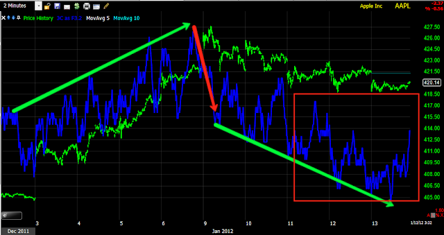
Here we have a VERY wedgie (bearish) price pattern, there was a breakout from the wedge which would appear to be a headfake move. The day in yellow set a all time new intraday high on about 45% more volume then the 22 day average (I used a shorter average volume because volume has been falling and it is more in tune with recent volume action). AAPL could not hold that new high and closed below the all time closing high as of that day; that would indicate some churning was going on that day. Of course there was no follow through and as I have stated several times, AAPL looks like it's been pushed up on a short squeeze, which means there wouldn't be any underlying institutional support for prices at this level.

 The 1 min hart has generally shown confirmation up and down, it's actually a bit leading negative when comparing relative price levels.

 The same is true of the 2 min chart, I've marked the leading component in red here.

 15 min goes from upside confirmation to a sharp negative divergence at the new high attempt, even with the recent 3C bump, it's still in a leading negative position.

The hourly chart is quite clear.

The daily 3C chart above and the daily MoneyStream chart below need no explanation.

Possible SPY Trade

 If we can get a gap fill soon, I may consider some SPY Puts.

The longer term price action (bearish wedge) with a probable false breakout (white box) with a leading negative divergence in place, looks like this may be a major turning point.

USO/XLE Trends

 This chart of USO above is the same as the chart of USO below, the only difference is that on the above chart I have marked the divergences that have preceded counter trend moves. The chart below I think better illustrates the long term trend. The divergence above running from mid-November through the present, is really the most important one on the chart and really is the only strong divergence as you will see what I mean with the chart below. This is why I have kept oil shorts open, because I'm looking at the longer trend and not the day to day chop, I see this as a good opportunity on a strong signal.


 More generally, there haven't been any really strong divergences in USO until recently, while there have been some as marked above, the general trend has been USO down, 3C down which is confirmation. Only recently over the last several months have we seen a strong divergence develop.

As for XLE or Energy which is an Industry group that is much more diverse then oil (includes, explorers, drillers, pipelines, logistics, etc) this is the long term trend. Through mid to late 2009 we saw confirmation of the move up, at the start of 2010 we saw the first negative divergence, a relative negative divergence which sent XLE lower, but relative divergences aren't as strong as leading divergences such as the one seen in USO currently. 2010 seemed to mark a top in Energy and the divergences got worse, they started leading and we saw much worse price reactions to the downside. Through the later part of 2011, those same divergences have appeared. Note both in 2010/2011 in the white boxes, the relative flatness of price, it certainly wouldn't feel like that on a day to day/ week to week basis, but the trend is clearly more lateral and this is where we most often see institutional action whether it be accumulation of a bottom or distribution of a top. The current negative divergence in to a relatively flat area looks pretty bad for XLE and looks as if it is setting up the next leg down. As we have seen in averages and individual stocks, the initial break down of a top is almost always followed by a volatile period, it's only after this volatile period ends that we start to see a cleaner trend emerge. From what I see on this chart, it looks like XLE will be entering a cleaner downtrend shortly.

S&P Downgrades

As I understand it, the S&P will announce their downgrades of European sovereigns after the market closes.

Earlier we heard chatter from French officials that France will be downgraded. The latest "source" rumors are that Italy, Spain and Portugal will be downgraded 2 notches, France likely  1 notch, however this will put credit strain on the EFSF which has been trading as if it were already downgraded from AAa and will put more pressure on Germany to back/guarantee the bailout mechanism. So far, there doesn't seem to be any hint that Germany, Finland,  Luxembourg and the Netherlands will be downgraded.

Italy, Spain and Portugal are said to most likely be cut by two notches, giving  Italy a BBB rating. Austria is also expected to be downgraded, how far though is not known, I would suspect 1 notch. There are rumors that Slovakia will also lose their A+ rating. S&P has refused to comment thus far.

Any downgrade of France would effect the currently AAA rated EFSF bailout fund which has been a total disaster since the Euro-zone members decided they would leverage the fund, it has had massive problems attracting even a fraction of the capital the leveraged fund envisioned. With France being the second largest contributor/guarantee behind the EFSF, to maintain it's AAA rating, more AAA countries would have to step up which would be politically difficult, as many have already backed away from any further support.

The downgrade supposedly coming after the market close could cause a bout of selling in to the close as we have a 3 day weekend with US markets closed on Monday in recognition of Martin Luther King day; both bond and equity markets will be closed.

The ONLY silver lining I see is that France may only be downgraded 1 notch instead of 2 as some have speculated. We'll have to see how far S&P goes. It could be a long weekend.

Market Update

It looks like an intraday leg up is set up.

 Since the last update that showed this red negative divergence, the market has dropped, but now we have a 1 min positive divergence suggesting at least a consolidation if not an intraday leg higher.

 The same is seen in the QQQ

As well as the SPY.

The R2k is giving no such signal as of now.

RIMM TRADE MANAGEMENT

You may remember the RIMM Earnings Call, I went long RIMM in the WOWS Options Model Portfolio using March 2012 $14 Calls which were in the money at the time. 3C had looked very positive on the 15 minute chart, but the earnings (which I believe beat, but maybe had some bad guidance or something like that) failed to impress and RIMM dropped -11% overnight. The 3C signal was still positive so I held the calls, since RIMM has moved up as high as $16.57 yesterday (above the $15.00 area where I put the trade on. Right now I have nearly a 21% profit in the calls and I intend on closing them. I still like RIMM, I just feel that a pullback is probable, which would kill my profit. f everything goes to plan,  will re-open the position. If you have a longer term perspective and perhaps are not dealing with time decay in options, you may want to just ride out a pullback.

Here's the Calls bought at $2.70 and currently worth $3.25 now.


Here are the RIMM charts...
 RIMM seems to have broken above a resistance level, you can see support at the level at the white arrows, resistance at the red arrows. If RIMM were to produce a good follow through day today, I may regret closing the position, but it would have to put in a price gain, close near the top of the range and see volume pick up. The 50-day moving average is also providing some overhead resistance the last 2 days.

 Here's the 60-min chart with a 50-bar moving average, I'm thinking we may see a pullback to the m.a. around $15.50.

 The daily crossover screen I use is getting more bullish, only the middle window custom indicator has to crossover for a confirmed long signal. I think it is possible and maybe probable that we get a pullback  to the 10-day moving average which is also at $15.50, this s usually the area the first pullback moves toward. It may give RIMM some strength on the pullback to go ahead and make the next leg higher.

 Here's the 1 min chart which went negative at yesterday's somewhat parabolic move.

 The 5 min chart shows accumulation after the earnings gap down, but currently 3C should be a bit higher then it is.

 The 15 min chart is why I entered the trade, even after the 11% gap down, it's continued strength is why I held the position and I'm glad I followed 3C rather then price acton. However, the 15 min chart should also be higher then it is right now. It's not looking negative, just not confirming like it was, it may need the pullback.


 Longer term the 30 min chart was not positive when I first entered the trade, it is very positive now and it makes me think there will be more upside in RIMM to come.

The 60 min chart was not positive either, it is now as 3C is higher then it was a the same relative price level represented by the green trendline.

I'm still bullish on RIMM, I just think a pullback is looking more likely and with the options, I'd rather cash in the profit and wait for the trade to set up as a high probability/low risk scenario before re-entering.

Market Update

We seem to be going negative here a bit, we'll see if it builds in to the longer timeframes, but for now it has caused at least a minor intraday reversal.
 DIA

 ES-E minis

 IWM

 IWM

 QQQ

SPY

Market Update

You may recall this update on the market, there was an earlier one too showing the same, just a lot more charts. In any case, I didn't put any arrows on it because of time, I was rushing back from my blood draw and wanted to get it out as soon as possible and the divergences were more then clear and didn't need my annotations.

The divergences are much easier to see yesterday (see link to yesterday's post above) as 3C has moved down today in confirmation. The large 3C update, the one in which I asked you to just try to visualize the price/3C trend, was very clear about the action and underlying action throughout this wedge.

 DIA, yesterday this divergence in the red box was so clear I didn't have to put any chart annotations. We've seen a slight relative positive divergence off the DIA lows this a.m., relative divergences are not as powerful as the leading divergence in the red box.

 Here's a representation of the price wedge which is always suspicious, it is a bearish pattern, but because it is so obvious on the chart, Wall Street knows what traders will do and usually head fakes the pattern, that happened as 3C showed continued heavy distribution. Price is now in the area in which it would confirm the head fake breakout which is the red box on price (the smaller one).

 The IWM should perform the best on a rally, it had some of the worst negative divergences like this leading divergence from yesterday. Currently 3C is in line with price action.

 The bigger 3C post with something like 30 charts from yesterday showed some of the longer trends like this 2 min. Currently 3C is lagging price and is bearish on the move off the a.m. lows.

 The 5 min trend was pretty clear as well, especially given the IWM had made a higher high while 3C trended lower. This chart is in line currently.

 The 30 min chart allows us to see the bearish wedge in the market as well as 3C's trend.  You can see what s almost certainly the head fake breakout in red around price and the start of confirmation. The lower price moves, the more momentum this false breakout will cause to the downside, this is the point of these head fake moves.

 QQQ showed the negative divergence very clearly yesterday, we have a relative positive divergence, but it's not that big of a deal, just intraday jiggles.

 Here's the QQQ wedge, this is more extreme and probably had more to do with short covering as the main component, AAPL's trend (price) looked like pure short covering. Again, the head fake breakout combined with the divergence in 3C is a clear bearish signal.

 The SPY negative divergence posted yesterday, this is quite clear, especially because the SPY moved to relatively the same price level as the head fake move in the SPY on the 11th, 3C if it confirmed the trend, would be at the same level as it was on the 11th, not moving down. Currently 3C is in line with the price drop, or confirming.

 I also posted this 5 min negative divergence

 If you looked at the "Broad Market Update" then you would have seen the trend in 3C vs price, and how negative it has been, especially in to the false break out area.

The main reason I've kept my short side conviction can easily be seen in this 30 min chart f the SPY.

Credit/Risk Assets Update

Remember the entire point of tracking these assets is the 1 thing they have in common, they are highly correlated, meaning in a real, healthy risk on mode in the market, they should track or lead equities, not lag them or dixlocate from them.

 Commodities for instance (the S&P is always in green) showed some correlation in the green boxes, but become dislocated in the red boxes, this puts the risk on rally in question.

 Long term commodities have been underperforming equities since October.

 Yields are like a magnet for equities, here we see a major dislocation.

 In Green they are acting like they should, in red, the stock market's strength vs this metric is cast in to doubt.

 Who says the S&P and Euro have lost their correlation? I'll tell you who, those who argue that the US can decouple from the world, rather then simply be lagging it. The last several days of US economic data have shot a lot of holes in the decoupling theory.

 That would mean the S&P has some catching up to do to the downside.

 Actually, a lot of catching up to do.

Credit leads equities, Here's a pretty darn good example.

And in case you haven't heard, the recent wedge behavior in the market...

As well as the recent breakout above the 2011 top's neckline, which to me (as I have said at least a half dozen times, looks like another head fake breakout like the last one)...


seems as if it is not been propelled by any market strength (see my post yesterday on the long term 3C trends), but instead a short squeeze as I have noted many times in different assets, for example AAPL and others, I have said, "This looks like a short squeeze".

Here's the NYSE data...
The black bars are the level of short interest, note as the market has risen in to the bearish wedge, the shorts have sequentially declined to lows not seen since April of 2011.

Furthermore the NASDAQ short interest has dropped to January 2001 levels, not 2011, 2001!