Friday, May 4, 2012

Post Coming Up

I just wanted to let you know so you don't miss it, I'm working on it now.

Through much of 2011 I spent a lot of time showing you why the market was broken and that something bad was coming.

There were some long trades to be had, but for the most part the market went nowhere and the underlying leading indicators that are not visible on a price chart and aren't visible using many conventional technical indicators couldn't tell you this. Sentiment back then was the same as now, "The F_E_D will rescue the market!" and just like the 2010 choppy consolidation market that lasted from January through August, the 2011 choppy market was expected to move higher. I spent a lot of time showing you breadth charts, 3C charts, etc that argued against that and a day in late July the market started down on what was to become a -20% move.

Starting in Early August, while this move down seemed like it would never end (at the time), I spent some time showing you it would end and soon and we called the bottom of that move within a few days. We successfully traded a VERY choppy market from August of of 2011 and predicted that we'd see a new low and that the choppy market we had been trading was accumulating a lot more than distributing, therefore the analysis was for a new low to be made and then a strong rally from there that would eventually turn the market. The rally was a lot stronger than I had expected and I expected a very strong move.
Through this period of portfolio grinding chop, we actually called every move up and down and one equity only model portfolio that I had been keeping up with (as the signals were very clear-there wasn't much work to do) made over 80% during this 2 month period. We saw our new low in October (by the way, the new low was intended to be a head fake move that traders would expect to be the next leg down, we expected a strong rally).

Through 2012, I spent a lot of time showing you the proof (not subjective data) like market wide breadth charts, outflows from domestic equity funds, hedge fund redemptions, a huge trend of insider selling, and many other indications that this 2012 rally was a dangerous house of cards that was being pumped up by bogus economic reports that used seasonal adjustments to create a stronger looking economy then what was really there, the sub-indicies of the economic reports were the "Devil in the details".

By the time the seasonal adjustments stopped , this is what the market morphed in to.

A steady, but very small ATR rally, then a choppy, much larger ATR top.

If you don't believe the economic reports moving out of the seasonal adjustment period had a lot to do with this, just take a look at Citigroup's Economic Surprise Index.
From September to February the economic reports surprised to the upside, late February we as we moved out of the seasonal adjustment period, economic reports have trended, surprising to the downside, that pretty much coincides with the change in the market trend as you can see on the 2 charts above.

I firmly believe 100% that the 2012 rally was set up specifically so smart money would be able to make a quick profit on the move up, but more importantly be able to use that strength to sell their positions and sell short the market. So to be clear, I do not believe for a minute that the market went up and Wall Street followed it, I believe this was an engineered rally and I think it goes much deeper than just Wall Street.

It was not just the "Devil in the details" of the positive economic reports that showed this rally to be hollow and dangerous, I spent a lot of time showing you the data that proved it. Take for example the trends in insider transactions, people who own the companies we trade. If you recall some of the key dates in trends mentioned above, then you may find this next chart to be a little sinister as to a level playing field and as to just how badly this market is manipulated.

Just based on our own analysis of what we expected in the market, take for example the new low in the market before a strong rally higher. That new low came less than a month after I said that was what I was looking for to trigger a strong rally (this was simply the head fake concept before a reversal that occurs on every time frame). According to the data above for insider transactions, August of 2011 (the same time we called the end of the drop in the market by a few days) saw the greatest amount of insider purchases over the last year at $716,445,197.00.  Now consider the analysis of 2012 and the hollow rally, according to the data February of 2012 had the greatest number of insider sales at $3,709,013,802.00!

If you caught the extra digit in sales, you'd see that the insider sales, which happened to be right before the market turned sideways (remember they need market strength to sell in to with the size of their orders) was over 500% more in insider sales than what they purchased for the run up. In other words, they did buy shares for an anticipated move up, they sold them at a healthy profit and then continued dumping another $2.9 BILLION in company shares, very roughly off the top of my head, about 400% more than they accumulated for the rally and we are to believe this is coincidental? This is just insider transactions, imagine institutional transactions! This is why 3C has ben showing an almost (and for some people truly) unbelievable amount of distribution.

Or how about some more hard numbers in market breadth?
The green line represents the number of NYSE stocks trading 1 standard deviation above their 40-day moving average, it's not much above the average. At February 2012 the percentage was 78.5%, at early April, even though the market was higher, there were only 7.5% of stocks 1 standard deviation above their 40 day moving average, even when the market was nearly 6% higher from the 78.5% reading, the number of stocks was trending down and only at 40%, a decrease of nearly half. For that to happen, it means a lot of stocks were trading much lower and losing a lot of momentum as they were sold, but people only watch the averages. This chart proved the market was rotting from the inside out.

This wasn't all, there were numerous indicators that only we use that showed this trend of rotting in the market. Hedge Funds were losing clients left and right, Domestic Equity funds were seeing one of the largest consecutive weekly streaks of funds pouring out or their AUM.

The point is, I spent a lot of time making the case that this market was not what it appeared to be. When looking at the market moving higher every day for months, it was very hard for some people to accept 3C charts that looked like this...

This chart shows 3C leading negative worse than anywhere else in the last 6 years while we had what appeared to be a strong market rally underway. Even though this very chart did a great job in calling major reversals like the 2007 top, the 2009 bottom, the 2011 dump of 20%, it seemed like something must be wrong with the chart as it shows the worst leading negative divergence in years.

As you can see from just a few bits of hard data above, the selling was way more intense than the buying; insider transactions alone show this, now throw in the real money from huge Wall Street funds, of course this rally was engineered to allow them to sell massive amounts of stock without the price dropping like a rock and what we are now left with is a cliff that is about to break or has broken already with a completely hollow shell of a market at prices that are way higher than at any point in the past in which they had some market support.

The point is, I think I made that case, but for newer members you haven't seen it as once the case was made and our strategic view complete, we have been focussed on the tactical view and using any market strength to get in to position for what is coming. I think lately I've done what I warn you not to do, "get lost in the lines" which means to micro-manage and lose sight of the big picture. Of course I want you to have the best entry with the least risk and highest probability trades, but I think it's time to show a little of why we have been building our position.

The next post will cover a few stocks and some various other items, if for nothing else, just to give newer members a sense of the bigger picture.

I will also cover the market this weekend as to the near term, what I call the tactical timeframes because it is market bounces and market strength that allow us to enter positions at lower risk, better prices and higher probabilities. I have 6 positions (all short) in the equities model portfolio (this is what I use for the longer term trades). Not one position is red, every short position is in the green and the market hasn't even really broken down yet. These positions include: 1) BIDU (the biggest winner at a 10.5% gain with no leverage)- I have room to add to BIDU and look forward to doing so on some price strength. 2) CAT is at about 1/2 full position size and the second biggest winner at a 9% gain. 3) AAPL which is nearly an 8% gain and is about 80% of a full position. 4) PCLN which believe it or not, is in the green and about 80% of intended size. 5) XOM which is at about 75% of intended position  and 6) BEAV which is at a full position size.

I only have one long term option position, XOM July $85 puts which I took on because of XOM's low BETA of .61, this position is just meant to add some kick to XOM.

In any case, you can see I'm heavy Tech, more so than I'd like to be (at least compared to the other positions). I want some exposure to energy, but not a lot as there are too many wild cards that could effect energy, such as the Middle East, currency wars as manufacturing world wide declines, everyone will seek to debase their currency to make exports look more attractive. I have no exposure to Financial which was a big mistake, there were several positions I wanted to add, but simply didn't have the time. I also want some exposure to volatility (VXX/VIX), but these need to be timed just right.

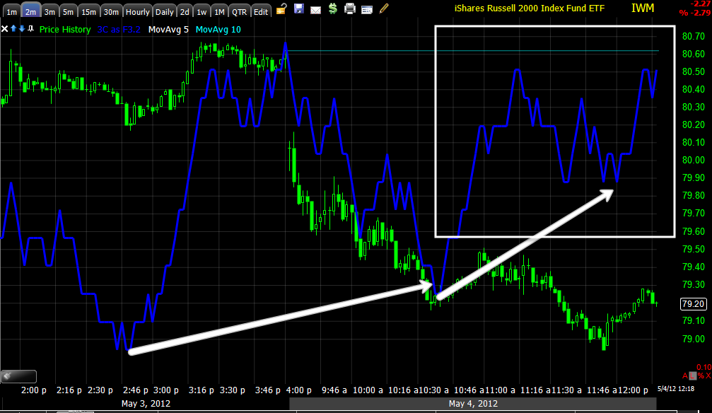
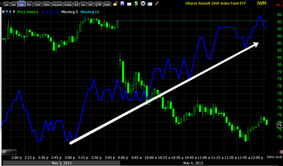
In any case, I've been showing a lot of near term charts in looking for that one last blow-off move that I'd love to see and sell short in to to add the Financial positions and some others and fill out the rest of the technology positions. I'll cover the near term this weekend, but I'll just remind you for now that volatility was expected to increase, it has increased; what may seem unlikely or not possible is very possible with volatility the way it is. For instance...

The size of the daily candlestick's range alone as you look at the chart fro left to right shows volatility has increased. The move in white was from a lower position than we are currently, so a move to the yellow trendline is certainly possible. While we know that one of these breaks of support is going to be the end of this market's sideways chop and start a new trend, this also has been one of the key elements in the timing of reversals, a break below major support has shown us on many timeframes to be an effective timing signal for a reversal. I'll cover that in more detail in another post this weekend. Hopefully you've been able to use the analysis and information to position yourself in the way you see fit.

The next post will cover some of the longer term charts that I haven't posted for a while.


Bottom Line on AAPL Calls

These are the May $575 from yesterday, for me it' not too hard of a decision because my exposure there is not very big as a speculative position and my long term shorts I have been putting together for the last month or so are all working well, the AAPL position is like a drop in the bucket compared to those so I don't have any strong emotional burden.

Here are the charts, I will continue to hold the calls, I'm most interested in the 15 min chart for near term.

 Since our first hint something was going on in Tech and AAPL on the 23rd/24th, the divergence there was strong, there was some distribution on the 25th gap up after earnings, but since the 15 min chart has moved higher in to AAPL moving lower.

 On the 15 min, today specifically, there's a strong relative positive divergence and the 15 min intraday although not a huge move, has moved positively today.

I believe I mentioned in the post (I know in many emails) that there's a chance of an AAPL shakeout below major support although I didn't think it was likely with yesterday's charts, the NFP changed that. In any case, this isn't the first time we have seen obvious support in white broken to the downside and then a monster move up.

So I'm going to hold these calls in to next week.

SPY vs ES

The SPY is the closest related average to ES, here's what the SPY charts have looked like during this ES afternoon wackiness

 SPY 2 min shows the same move down as ES, but has continued and recovered.

 The 3 min trend is virtually unaffected.

The 5 min trend is as if nothing happened, yet ES is noisy.

I still suspect ES is seeing traders move out before the close as it is highly leveraged and traders don't like holding through the weekend.

3rd ES Update

There's the dip I mentioned several updates ago, 3C stayed in a relative positive divergence and ES moved back up, right now ES is about 1 point from challenging the afternoon resistance level where this range has been all day. The last hour of trade could get interesting.

ES Follow Up

The move in the 3C Es chart is definitely not effecting the other averages like ES, the only one that is close is the SPY which is tied directly to ES as ES is the SPX Futures.

For example the IWM isn't moving down at all, still trending up, the Q's chart is moving down a little but nothing like the ES chart. The DIA 1 min seems to be unaffected as well.


ES Update

I bring it to you as it is...
ES which has been moving up all day put in the start of a negative divergence intraday after 2 p.m., it wasn't much at that point, after 2:30 it started leading move and price has reacted to that. I'm not sure what it is up to, it could be ES traders closing out positions before the ES market closes today (no overnight over the weekend) or it could be ES prices are a little too high in the range for where positive divergences have been occurring-generally they don't want to accumulate in to higher prices but lower, although I'm leaning more toward the first option.

As I write, it looks like it just turned up, still in relative positive territory.

I'll check the averages.


Market Update-Still chugging away

The earlier Linear Regression Channel update was correct, there was a change in character in the market from a decline to what is shaping up to be a "U" looking type of formation. 3C is pretty much still making progress in all of the averages.


 ES intraday and the trend (relative positive) are both increasing to the upside. Signals have been murky this week, some starting at the end of day, some just not that strong, but I don't see a reason for there to be continued positive divergences in to lower prices if they didn't plan on a move higher. A gap fill would almost be a given, but this seems to be more than a gap fill.

 DIA 3 min

 DIA 5 min trend, strengthening in the trend and intraday

 ES continues moving higher.

 The IWM 1 min is making a new high over all of yesterday

 The 2 min continues with a strong leading positive

 The 3 min is doing the same, now above all of yesterday's action while prices are obviously lower.

 QQQ 1 min trend  today

 QQQ 2 min leading very positive, above everything from yesterday

 QQQ 3 min still developing with higher highs.

 QQQ 5 min with a decent relative positive and starting to lead.

 SPY 1 min trend, no down side confirmation today and a continued relative divergence

 2 min is leading making new highs for the day

 Same for the 3 min

And now the 5 min, the SPY was the laggard earlier, it's starting to see some life in 3C.

ES Update

 Longer term view of ES, a negative divergence just before the NFP release, 3C was in line (confirming the move down) at the green arrow in to the market open and early morning. There have been 2 positive divergences, when 3C/ES is in this mode, it usually tracks intraday moves pretty well, the leading positive divergence is stronger than the previous and near where 3C was at the NFP announcement when price was quite a bit higher.

 A closer look at ES during regular hours.

 GLD as a sentiment indicator for the QE-crowd. The drop in GLD had me a little puzzled at first until I looked at the next chart.

The white line is the Euro, traditionally GLD and risk assets move pretty closely to the Euro, that's because the $USD is doing the opposite as the EUR/USD make up 50% of the Dollar Index, so the Euro topped before GLD and started trending down as GLD was still up this morning, I think that FX arbitrage relationship caused GLD to dip, but sentiment seems to be strong as GLD has broken free from the correlation as the Euro is flat and GLD trades up.

Market Update

 DIA 1 min

 DIA 3 min

 DIA 5 min, the 3 and 5 min charts include positive divergences from yesterday that are out of scale so we can look at today's intraday action.

 ES 1 min

 IWM 1 min

 IWM 2 min

 IWM 3 min

 IWM 5 min The IWM 5 min chart still has a pretty strong relative positive divergence from the lows of May 2nd. While leading divergences are more intense and generally stronger than relative divergences, you must account for the depth and duration of the relative divergence.


 QQQ 1 min, this is an example, the QQQ 1 min is leading positive today, but the IWM 5 min relative divergence over several days is a more important divergence. On this chart specifically, the arrows represent relative 1 min intraday positive divergences, the leading positive on this chart would be more important, more intense.

 QQQ 2 min this is a pretty good looking leading divergence

 QQQ 3 min is also putting together an impressive leading positive divergence, above the late day positive divergence seen yesterday.

 The SPY is ok, although it seems to be the least responsive, the Q's the most responsive. SPY 1 min

 SPY 2 min

I wish I could stretch this 15 min chart to leave some empty space to the right, I would draw a "U" shape as a potential move up, on the 15 min chart you can see today's move is rather parabolic, it's not very often we see a parabolic recovery that is sustainable. However the large volume on the break of a recent support area "if accumulated" would make a more "V" shaped move more likely as the need for a "U" shape is primarily time to accumulate, again if that is the intention which I believe it has been. In this specific case, someone needs to take the other side of the trade in all of that heavy volume selling, if smart money was on the other side, the need for time and a "U" shape is less relevant.

AAPL Update

I'm getting a lot of email questions about what I'm doing with AAPL, first understand that the bulk of my positioning is all short in equities, these are the shorts I've been building in to strength using straight short positions. Every trade in the equities model portfolio is in the green. AAPL represents a small speculative trade because it is counter to my major market view, however as mentioned last night, I never pass up on the kind of divergences in AAPL yesterday.

As for today, Yes, I'm still holding AAPL Calls purchased yesterday. Here are the charts for AAPL this morning.

 AAPL has held a support range the last 4 prior days-not exact support, but a range, today's move is a break below that range, this in itself is not worrisome to me as this is something that is seen more than 80% of the time before a reversal (in this case to the upside), the size and duration of such a move varies, but with AAPL, it's not surprising to see a decent size break of that support area. The intraday price action in AAPL has gone from one of decline to a lateral trend for the last hour or so starting around 10:30 this morning (this is part of the reason I use to usually sit out the first hour to 1.5 hours of the market for the most part -it's noisy and most of the time has little to do with what is really going on, it's a time for the middle men and now HFTs to take advantage of orders, stops, etc.). Volume is also making a rounding formation, associated with a rounding bottom. This alone isn't enough to stay in the trade.
 As the market has gone lateral in AAPL, the 2 min is responding favorbly.

 The 3 min is as well

 The 5 min lost some ground, but still remains in a fairly good size relative positive divergence.

The 15 min chart of AAPL is where I'm most interested in the short term trade. If this chart didn't look the way it did, I probably wouldn't have taken the chance with AAPL. There's an intraday move up in this chart which is longer and takes longer to respond.

So for now I'm sticking AAPL out. If certain conditions were to develop which would include very strong signals in AAPL, Tech and the market itself, I "may" consider adding to AAPL, THIS IS NOT to average down my position size, I can easily cut the position here and not have to worry too much about the loss. The only way I would add to AAPL is if it looked like a stronger trade today than it did yesterday.