Tuesday, July 5, 2011

Closing Stats

We had another out of character development today when I looked at the Price/Volume relationships after the close. We have been seeing Close Up and mostly Volume down. Today differed in that Close Down entered the picture, it wasn't dominant, but shared a co-dominance, the two for the NYSE were Close Down / Volume Down and the second place, Close Up and Volume Down.

Only the Dow-30 and S&P-500 had actual dominant P/V relations and both were Close Down and Volume Down. This is reflected in the daily closing charts...
 The Dow's price candle today could be called a Doji or at least a star, both candles represent indecision, especially n a trend that has been as strong as this one has been the last 5 days; this is another change in the character of the trend. Note volume for the Dow was significantly off today.

Technically speaking, the S&P-500 formed a Harami reversal pattern today, but only by pennies. A nice looking Harami reversal would have seen today's narrow bodied range fall about in the middle of Friday's wide body range so I don't consider the particular signal to be significant.

My interpretation of today's price/volume action is exactly that of what the charts suggest, indecision. When a trend goes from very strong to indecision over the course of a trading day, something significant has changed. Some might attribute it to window dressing, but Friday was July 1st and the quarter was over, we still had a strong price day.

The other option to consider is resistance in the area as you can see by my trendline. I think today showed several issues that have the trend in doubt, but even if this is a 100% guaranteed change in trend, Wall Street still plays the game and the game is to make as many people wrong as possible at any one time.

From this point I would not be surprised in the least to see a false breakout above the respective resistance level now that the shorts have apparently capitulated and covered their positions, it's time to sucker in the longs and set a bull trap, a breakout above the resistance area I drew in would do the trick. In fact many of the shorts who just covered at most likely a significant loss, would probably switch sides and go long on a breakout making them potential two time losers. We know from experience that very rarely does a trend change without some gaming first and a head-fake / false breakout would be and has been what we have come to expect as watchers of the market. It seems to work every time as those in the retail technical analysis market still have not adjusted to Wall Street's gimmicks.

If indeed we do get a false upside breakout (which can be confirmed with the help of 3C), it would be an excellent place for those who like to get in very early on a short position. Others may want to wait until a false breakout is confirmed by price falling back below the trendline, it's just a matter of preference.

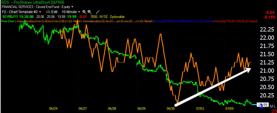
The real strength of this move and what has had me convinced that we would see a move higher over the last month (and there were some very precarious days in which the market could have dropped to new lows and a new downtrend any day) has been the strength in the 30-60 min 3 charts. Today we saw the first sign of change n the 30 min chart.

(at the red arrow)

So that which has held my faith in this bounce occurring over the last month is now starting to slip, which is also what was expected, "a bounce to a significant area where shorts could be well positioned".

I think you probably get the gist of my opinion as the uptrend starts to show signs of unravelling.

The Miner Trading System Update

I just ran the scan and there are no changes to either system, both remain long NUGT for a 6.41% gain today and around an 8% gain since the positions were opened which is about in line with the average gain 7.81% for winning trades with an average duration of 6.1 days.

The red line is the signal line, the green is system 1 and the blue is system 2.

Some more interesting SPY charts

When dealing with a trend, we are always on the lookout for changes in the character of the trend, I pointed out a few Friday.

 Here's the SPY and Bollinger bands (10 min), notice the period of diminished volatility (band squeeze) is now longer then at any point since the trend started on the 27th.

 The 50-bar 10 min average which has held as support, as I pointed out n the last post, has been broken, it's also starting to turn flat. RSI is negative here toward the top of the trend.

 Whenever a major support level breaks, rarely is it a clean break. We should always expect volatility, even a new high. New false/head fake highs are often the key to a reversal. Note the volume around the break of the m.a.

 Looking at the inverse UltraPro Short S&P-500, we have a 10 min positive divergence similar to the 10-min negative divergence in the SPY.

 UPRO, the Ultralong S&P-500 has a 10 min negative dvergene

 SDS the Ultrashort ETF for the S&P-500 has a 10-min positive divergence (the point in looking at these ETFs which are leveraged long and inverse or leveraged short is to show correlation).

 The TCK Index has been the most negative today since the trend started on 6/27 and we now have a sub -1300 reading (readings below -1000 are rare).

 I pointed out late last week how the Australian dollar has some predictive value in which direction the market will be heading as a leading indicator. Note that on Thursday while the market put n a strong performance, the FXA put in an indecision candle, followed by a strong candle which could not break to a new high (the market did break to a new high that day) and today there's significant relative weakness in the FXA vs. the market.

 This is the FXE Euro Trust ETF vs the SPY in red, note the correlation between the two as a strong Euro means a weak dollar which is typically good for equities. The last few days the Euro has diverged noticeably from the SPY.

And the 10-min FXE Euro ETF's 3C hart is in a deep 10-min negative divergence. Price is always the final judge, but we need to look at the evidence in front of us and start thinking about our long side risk, entries n short positions, etc. This doesn't mean today will definitely be a reversal day, but it does show us a trend that has been consistent in which we are now seeing significant inconsistencies.

More on the SPY

This looks like a significant potential turning point. Here are some more charts:

 Earlier I warned a break on the 50-bar 10-min chart would be significant as it has defined support for the recent uptrend, it just broke.

 The 10 min negative divergence shown earlier today has worsened.

The 10 min negative divergence has creeped in to the 15 min hart, which is now looking worse and a more significant negative divergence then the last 15 min negative divergence mentioned in an earlier market update.

It's all about Greece

Moody's just downgraded Portugal with a negative outlook. Take a look at the SPY...

What if you threw a party and no one came?

Well that might hurt some feelings, but when we re talking about the market, this has significant consequences. The Chicago Board of Trade issued June volume today across the 4 major trading vehicles: Equity Index, Interest Rates, Commodities and Energy, for the month of June on a year on year basis. Volume has dropped an astounding 92.9% !!!

What this means to the market, too many things for me to consider at the moment, but when volume dries up, volatility increases. If we experience a downside move, this means those who are on the short side who actually provide liquidity in a falling market, will not be there. This will exacerbate the downside move as there is no short covering volume to offer a bid in the market. Low volume creates exceptional volatility. The fact y.o.y volume has dropped so dramatically sets up a very dangerous market environment, especially for those on the long side.

This should also be considered within the framework on what I've been saying for a month or so now, large players that are highly leveraged are seeking to rapidly reduce their leveraged exposure to the market with the uncertainty that comes with QE 2 ending. This report can be taken as a sign of the market's perception and how over leveraged many of these institutions are.


This is something to consider and ponder, but the actual figures are astounding, I cannot emphasize this enough with caps, bold or underline. Just think of the % drop, nearly 93% less volume since June 2010!

EEE Follow Up 2

As suspected in my earlier EEE update today, EEE formed a triangle consolidation pattern and has since broken out of it.

 At the last update, early hints were apparent that a consolidation of a triangular nature would take place, as we can now see that is exactly what happened and we have a breakout of the consolidation pattern. Typically this type of consolidation would be considered a continuation pattern (continuing the preceding trend before the triangle). A symmetrical triangle carries NO inherent bullish of bearish bias like some of the other right angle triangle patterns, it depends on the preceding trend. The one thing I'm not very impressed with is volume coming out of the triangle and I view this as an opportunity to take partial profits if you missed the earlier chance. If volume picks up and we make a new intraday high, then the outlook will be more bullish.

 3C is in line with price and is of no predictive value at this point.

While volume is up, considering this to be the first substantial breakout since the downtrend/larger consolidation, volume should (in a healthy move) eclipse the past green volume spikes by the close. The 50-day moving average has no real significance as a resistance level except for the self-fulfilling value placed on it by traders as one of the most popular moving average periods so there could also be some resistance coming from the moving average.

Again, as I said earlier, a move, especially above the 50 day sma, which closes toward the top of the range leaving a small or no upper candle wick on increasing/heavy volume, is often a sign of follow through buying to come over the next few days so keep an eye on the close.

I would still be using a trailing stop. For those who want a tighter stop, the 50-bar moving average on a 5 min chart DID allow enough room for the consolidation. You may consider that as a intraday stop if you are considering taking profits today. Otherwise, if you have a longer term perspective and things seem to be going in EEE's favor, I would look at the 50-bar sma on a 10 min chart for the possibility of a multi-day trend.

SLV/GLD Update

My last update on Thursday of last week I started the post saying that some economic data regarding initial claims was being blamed for the drop in SLV/GLD and in my opinion that the theory didn't hold much water. There is always an attempt by the financial media to explain "why" something happened and it's usually very short sighted. I also said that I had expected more upside from SLV/GLD, but there were some warning flags starting to flash. Friday we had a steep drop that actually set up a nice positive divergence leading to today as I'll show you, but both metals are still in a precarious and very transitional area.

SLV
 The drop on Friday actually was a good thing as there was a strong 30-min positive divergence that day. The red trendlne marks resistance and this is perhaps the area that is causing some of the warning flags that were visible last week.

 The 15 min chart also looked very strong on Friday's drop and prices are right around the area of resistance in which they started seeing 3C deterioration. This is sort of reminiscent of the SPY pullback that 3C picked up on 6/21-6/22 from resistance, the move from tat pullback led to the current short covering rally.

 The 1 min chart is struggling a bit in this area with the test of early morning resistance being broken, but 3C is slightly lower. This in itself is not a strong enough divergence to cause immediate concerns, but more likely to cause a consolidation in the area which would be expected without 3C's insight.

 What is more pressing at the moment are the 10-min Bollinger Bands. When the bands narrow, volatility is low and more often then not leads to a highly directional move. Last week that directional move was down, then a second squeeze of the bands sent SLV higher today.

SLV is not as clear cut as the SPY was with an obvious zone of resistance, which once broken would likely lead to a move higher and as I pointed out, a short squeeze as traders would and did take that resistance level very seriously as a line in the sand. SLV is more ambiguous as there is a zone of potential resistance from the local resistance it just barely cleared today to the larger triangle resistance from which SLV broke down from. The red arrow is an excellent example of a resistance zone rather then the more often quoted "exact" resistance levels. A move through the resistance zone could very well set up a short squeeze in SLV. A failure would likely send SLV to new trend lows.

GLD
 GLD as I pointed out Thursday is in a similar situation. The drop on Friday set up a nice 30 min positive divergence sending GLD higher today. However, GLD has not cleared local resistance at the lateral red trendline.

 Here's a closer look at the warning flags from last week, mostly centered on a resistance zone (red trendline) in which 3C was showing negative divergences, setting up a move lower. Since these were in place before Initial Claims came out, I don't believe IC had anything to do with the price action to follow.

 GLD reacts very well with a daily 50-day moving average (exponential) as you can see numerous levels of pullback support and the occasional break of support on volume.

 GLD has not cleared local resistance at the trendline, but has cleared the 50 ema. Unfortunately volume hasn't picked up much making the move suspect.

Lets not forget the bigger picture of the daily chart when a false breakout of the triangle sent the GLD downtrend in to motion. As I pointed out at the time, I DO NOT view this daily divergence to be substantial enough to cause a primary trend reversal, I look at this divergence as more of a pullback that may offer a good buying opportunity at the 150 day sma.

The 150 day sma has defined several 1-2x a year pullbacks that have been excellent buying spots for gold. If GLD does pullback, it will depend on how long the pullback takes, but the 150 sma should be in the area depicted.

EEE Follow Up

EEE is a speculative long that I brought up on June 17th and 2 more follow ups since then. I know a few of you are trading it as we have looked at it in email requests lately.

Today EEE has made a strong move that would have made the original June 17th purchase a nearly 12% gain today. However, EEE is one of the few C&D trades that looks as if it might have more in the tank. Usually any 1 or 2-day double digit gains I view as a market gift and take them or at least portions of the profits quickly, as they can disappear just as quickly. EEE is one I would consider having taken partial gains and trailing a stop behind the trade. It still may be a trade worth initiating a position in so long as you understand risk management on highly speculative positions and are comfortable with it.

 EEE's relatively flat trade lately and this morning's spike on excellent volume.

 Here's the initial trade idea on the 17th @ $1.81-also note today's daily volume is excellent. We look for a strong close near the top of the daily range and increasing volume as an indication of the probability of a follow through move over the coming days.

 This daily 3C chart is why I think EEE may be more then a 1 day pop, usually C&D trades that make 1-day or two day moves don't show positive divergences as far out as a daily chart.

 For this reason, a trailing stop makes sense. At this stop, a 50-bar average on a 5 min chart, you can still lock in a decent profit.

EEE does look like it is going in to a triangle consolidation right now, for that reason a slightly wider stop on a 10 min chart (50-bar average) also makes some sense as it should give you at least a break even trade and the chance to let EEE consolidate for possible further gains.

Market Update

You may recall toward the end of trade on Friday, I pointed out some profit taking and ended the post with the question of whether or not institutional money was also engaged at this point.

It's important to remember that distribution takes place in to higher prices, conversely accumulation takes place in to lower prices or a trading range. The idea is to pick up a large position on the cheap and then after the mark up process has started and Wall Street is above the average price paid on the position, they start to feed shares out through distribution. If they were to try to dump such a large position at once or in bulk, they'd drive prices down by overwhelming the market with supply, so they average out of the position making sure not to let out too much supply at any one time to adversely effect the supply / demand balance which in a rising market under distribution, they'd prefer supply be on the scarce side and demand higher, especially when the market is under a short squeeze, something I said I thought would happen one the market broke out of its range (around $129.95 for the SPY). Indeed, I pointed out that price action looked very much like short covering ( a lack of normal pullbacks), a day or two later we got confirmation that a huge number of shorts were being squeezed.

Basically the theory that started a month or so ago, has played out just about as imagined.

Here's the NYSE components $TICK chart which shows the uptrend line (advancing issues minus declining issues), per tick broke down late Friday under the trendline. This morning the behavior has continued and we have seen some of the worst readings since the squeeze began. Note the TICK chart is making several -1000 spikes today, pretty extreme.

 In fact the TICK this morning hasn't looked this bad since June 24th above.

 Usually the SPY holds a 5 min 50-bar average, the momentum last week was so strong though, it was holding a 1 min version of the 50-bar average, it may not sound like a big difference, but it is. Typically the market may have a few run ups during a rally that hold the 1 min 50 bar average, but it typically can't sustain that for a day-more evidence of short covering. RSI has also gone a bit negative on this chart.

 Here's the longer term trend showing the entire run up on a 10 min chart, notice there's only been 1 pullback to the 50-bar average until this morning and thus far the SPY has found a little support in the area as can be expected. A break below and the average turning down would hint at a substantial change in character from last week's short covering rally.

 The 15 min 3C chart is putting in the first credible negative divergence since we saw the pullback from resistance on 6/22. The green arrow shows the lack of substantial or normal pullbacks usually seen in a trend, another hint of short covering.

 The 10 min hart has been showing distribution for the last couple of days and is now pretty substantial. When the 15 min chart starts to look more like this, we are probably pretty lose to a reversal or at least the end of the short covering rally. Remember, prices can do 3 things, go up, go down or go sideways.

A sideways environment would most likely show us short selling by institutional investors. At this point, most retail investors are not going to be to brave about shorting the recent market strength.

 This is a 3C divergence scan indator on StockFinder that I've spent a good portion of the 3-day weekend working on. A divergence is one of the hardest things to define in software because they can occur over different timeframes or different lengths of time, yet the indicators we have available to help define the divergence are set at one particular timeframe, making this task very hard. So far I'm getting pretty close and the pink you see on the charts is a sign of a negative divergence, interestingly starting late Friday and early today.
Past Bollinger Band volatility squeezes have led to upside breakouts, when the bands tighten a directional move is close at hand, we want to keep an eye on this, there could always be an initial shot up followed by a reversal, either way we are in an area in which the trend is becoming over extended and should be vigilant about our positions.

This is the longest Heiken-Ashi Candle formation of 3 dojis (indecision) we've seen since the uptrend started. Also note Volume at price in the area (to the left, at the top).

VRML Follow Up

VRML was a long trade idea from Tuesday June 28 at $3.88 I subsequently followed up on the trade the next day and again on 6/29.


This morning VRML continues to move higher and is currently at a gain of nearly 9%.
 Original trade idea

 The idea was based on a very strong 60 min leading positive divergence.

 This chart shows a trailing stop using a 50-bar average on a 30 min chart.

For those who entered around the $3.88-$3.90 level this is a wider stop still using a 50-bar average, just on an hourly chart and virtually guarantees at least a break even trade, while allowing plenty of room for a consolidation.

For those who may want to add to the trade or initiate a new position, I would look to the 22-bar moving average on a 60 min chart.
The 22-bar is in blue. I would just double check the the 14 bar 60 min RSI to make sure t's still above 50 before buying on a pullback to the 22-bar average.

If you are running TC-2000 you should be able to set a moving average alert letting you know when such a pullback occurs, so far the only one was pretty short lived. Usually subsequent pullbacks in maturing trends are deeper with each pullback and thus may last a little longer.