I'll touch on currencies, but I think they deserve a separate post, I'm going to post some charts that I recently posted as red-flag warnings and I'm not trying to rub anything in to anyone's face at all, this is about learning and beating the street thieves, however when you see this, you simply CANNOT IGNORE IT and just assume the high volume melt up will continue. I encourage all of you to go back and
read the post the night before the F_E_D minutes or
This one with the VIX running stops the day before in the last 1/10th of a second before the close, the one on
President's Day about Bubbles and
the "It's different this time" mentality because of the F_E_D, here's the post.
These are but a few charts, but breadth charts to me are extra special because they are hard numbers, hard facts and it's very simple to figure out what looks right and what looks wrong.
This is the Percentage of all NYSE stocks (green) above their 40 day moving average vs the SPX (red), in a rally they shouldn't drop from 85% to 69%.
Here's where we really get a feel though...
Momentum stocks, these are 1 Standard deviation above the 40 day moving average, from 70% to 50% to 25%, which is another warning in my view of being too aggressively bearish here without some relief in the market,
we don't chase!
The real high flyers, 2 Standard deviations above their 40 day moving average, and this is one I really made a big deal about, 44% to 38% to 25%!!!! Nearly cut in half while the market is rising?!?!?
At the high, the reading was 12%.
Don't forget the sentiment indicators, the appearance of the Cats and Dogs, which I really am upset about missing that trade, Mass Psychology, reading the economic indicators closely instead of headline prints, Dominant Price/Volume relationships within the averages' component stocks, looking at the full cycle of F_E_D policy, not just accommodation, but the dangerous exit as well; there have been so many topics we've covered I can't nearly remember them all, but I hope you put some of them in your tool box.
OK, now that we can come back after and see that these charts are helpful and I'm sure we'll come back again when it's even more meaningful, lets move on to leading indicators.
First the quick and dirty CONTEXT Model of risk assets vs the S&P (ES) Futures.
Overnight they were largely in line, but many key markets are closed during this time, by the open the model was negatively dislocated with ES, this has been the story in our Leading Indicators for a while, certainly since Feb. 1. As of this capture, the differential was -9 points, so ES is rich here, but this is where and when we can find opportunities.
Commodities in my view have been a leading sentiment indicator about how smart money has really felt about F_E_D policy moving forward, since the November 19th cycle lows, commodities have really not kept pace with the SPX (always green unless otherwise noted). Check out commodities around Feb 1 when there were many changes in character if you paid attention to them.
Commods today intraday vs the SPX, but this has more to do with the $USD which I think will let up a bit so commodities may very well rise in to the afternoon.
Yields intraday are not keeping pace, nothing huge or surprising.
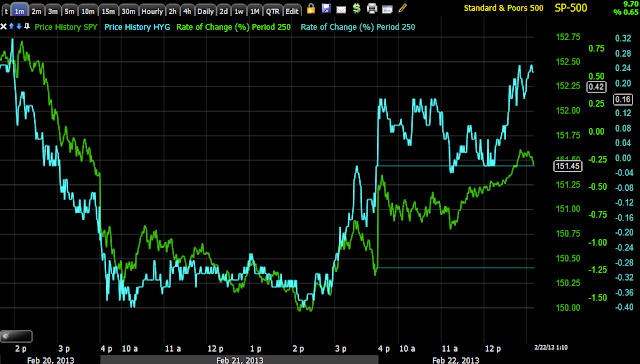
A longer view 15 min chart of High Yield Corp. Credit
Intraday it is not looking too bad here vs the SPX, this may be part of what helps the market carry some strength in to next week as we have so far been planning for with the weekly calls opened yesterday.
Long term when Credit dislocates like this it's not good, the bounce in yellow I believe is a short squeeze considering.

This is the 3C 15 min chart of HYG (High Yield Corp. Credit), check out the negative leading divergence at the top,
it was clear they were clearing out of credit and that's where the real smart money is.
The bounce seen above is shown with a small positive divergence (white arrow to the tight), note though the recent distribution.
Here's a closer look at that distribution.
Touching on currencies-the $USD intraday vs the SPX
The correlation in white is as it should be, the market moving up to the right of the box is not the normal correlation, but 3C did indicate it yesterday, thus our trade long calls yesterday.
The Euro is a bit low and out of sync, this weekend may see some movement in the Euro with the Italian elections,
"WILL GOLDMAN SACHS LOSE THEIR GRIP OVER ITALY?"

THE AUSTRALIAN DOLLAR is one of my favorite leading indicators among currencies, it's doing well intraday vs the SPX here.
Long term, there's a huge red flag as the $AUD falls away from the SPX.
The more important currency recently has been the Japanese Yen and here intraday over the last 2 days we have a picture perfect correlation between the JPY and SPX.
In Red, note the break of the correlation as the JPY and SPX trend down, note the date, this is clearly because of the F_O_M_C minutes.
IT'S NEVER "DIFFERENT" THIS TIME


