Wednesday, February 22, 2012

Treasury Flight To Safety

It was just yesterday in this post I pointed out the late day grab for protection that has been going on the last several days, being that smart money most often trades the close, it was a little change in character that was worth noting and keeping an eye on, today that led to a green day in treasuries...

Flight to safety in the last half of the day the last 3 days and a gap and trend higher today.

 Treasuries or TLT have been choppy lately, however if the start of accumulation here is an indication, it would suggest a move quite a bit higher (Relative to the Beta of TLT)-I think I posted this chart yesterday.

Here's the 15 min chart, I didn't mark it at all. I wanted you to see how 3C has been responding in line with price and how over the last few days that changed and ultimately led to today's reversal.

I'm not sure what the end game is here, I had a meeting last night with a financial firm and we were discussing long only options and where money would likely go in a post Greek default, treasuries came up in the discussion, however I'm not convinced that they would be an asset class in which investors sought out big gains, I'm more of the opinion that they would be a hiding place yo get capital out of the financial system.

USO Update

Crude has had a good last 2 weeks with USO up 8.6%, but is this a reversal in trend or a shakeout as USO had been lateral for over 2 months and trending down for a month. The media says this is on Iranian escalations, however over the last 3-4 months we have seen very provocative actions, war games, launches of long range missiles that can easily hit Israel, Nuclear events, war games in close proximity to US Aircraft Carriers, Russian threats, Chinese threats, and on and on.

This is the same media that say "The Greeks Have Won Their Bailout", when we know they are a long way from that reality and maybe further then ever. Why would USO suddenly be reacting? Sure we can come up with events such as shutting down flow to Europe, but this move started before then.

Lets take a look at the charts and see what's going on....

 Here we see the lateral trend and the down trend that started and a break above the range, although we have to see how the GLD situation plays out, the concept of a convincing move is the same and ironically USO just broke above the range yesterday on good volume, yet today there was no follow through.

 Here's yesterday's and today's daily candle, today's candle is a doji which is a loss of momentum and often a reversal candle. Volume today is higher then on any other previous small bodied candle within the trend, which also is a bit suspicious, there were only 3 days of strong daily candles, the first day of the move, the 4th day which closed at a loss and yesterday, with yesterday being the weakest of the 3 with a longer upper wick.

 Intraday, we saw a parabolic move up to a new high (you know how I feel about parabolic moves, they usually don't end well), and then nearly as fast a move down and this move was the heaviest intraday volume seen in 7 days, it does have the characteristics of a churning move.

 Here's the 30 min chart, you can see the negative divergence over the last 2 days and it wasn't so strong as to move much above 3C's highs, the red box is where the downtrend was.

 The 15 min chart that showed the October accumulation and has been heading down since the range started, which was a warning that led to a downtrend, hasn't broken the 3C downtrend at all in this recent move up.

As far as today possibly being a churning day, that's exactly what the intraday 3C chart shows as well as price/volume action.

A new high on a strong candle and volume (follow through) may swing my opinion here, but as of now, this looks a lot like a shakeout move.


Quick Market Update

I suspected the earlier losses wouldn't hold all day, the market needs to create movement to make money and the fact the Q's didn't confirm (Dow Theory) strengthened the case for a move off the intraday lows.

There are a ton of indications I still want to look at, volatility, risk assets, treasuries, etc because until they are ready to really let this crack, they don't want to lose the "buy the dip" crowd, which I wouldn't be surprised if the term was created in Goldman Sach's propaganda unit, it is certainly useful in conditioning traders.

 DIA 1 min went negative around the 2 pm reaction highs and is leading negative.

 The same is true of the 2 min chart...

 The IWM has pretty much been in line except for a small positive divergence earlier at the lows.

 The 5 min chart though is still exhibiting some relative strength, it may not have caught up yet or as I said, until they are ready to let this really crack, they'll want to keep the buy the dip crowd and sentiment bullish.

 The QQQ 1 min has been pretty much in line with trade. Note what looks like a possible small positive divergence forming.

 The 2 min chart, as I suspected bounced off the larger relative positive divergence mentioned in an early update.

 Again the 5 min chart is not negative and still holding up.

 The SPY 1 min

 SPY 2 min and leading negative

The 5 min is in line.

It is because of these 5 min charts I want to look in to this further.

A Little Break...

When asked how my Vizsla, Emma,  feels about the Wolf Pack....

Interesting Move in GLD

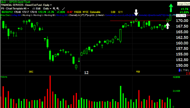
Yesterday I put out a pretty comprehensive update on GLD and followed up today. As has been noted by an influential website, gold moved up today, " With no news at all, in a span of minutes, both gold and silver have soared"


If you read my analysis yesterday, then you may remember this point I made,


"Now we have another possible breakout of the range and again volume is low. To entice longs to buy this breakout, it will have to make a new high and surpass the former breakout to remove any lingering doubts."


Today's move...


And with that move, yesterday's condition is fulfilled and it looks like buyers stepped in as I envisioned.


Now's the time to start paying attention...


GLD got a little boost from none other then, the Australian Dollar...
 GLD in green, the AUD in red on a 1 min chart.

The longer divergence though remains intact...


So now is the time to pay attention for signs of a possible head fake now that the conditions have been fulfilled. 

RCII Trade Idea

This isn't a very exciting stock, Rent-A-Center, but it looks like a good set up right in this area and the fact that it is not a momentum stock and the momentum crowd isn't in a trade like this, may just have some advantages.

Unfortunately the all of the charts didn't load in the order I wanted, but it's not a big problem.

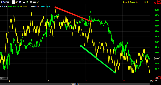
 First RCII has made a break away gap, these are rare in this market, I really don't think it will be filled, which makes this a more bearish trade based on that alone. Next it has formed a bear flag that volume is confirming and that flag is starting to break down.

 Here's where RCII being a boring stock has some advantages, as you can see on the last bear flag in 2011, there was no head fake move, it's an obvious pattern that would usually be head faked, but if the momentum traders, which are the primary targets of head fake moves, aren't interested in the stock, the chances and the benefit of a head fake move is severely diminished.

 I rarely show Balance of Power because I feel it has little predictive ability, but I decided to show it this time because it confirms the 3C chart and what was going on at various stages.

 Money Stream shows a long term negative relative divergence and at the bear flag, a leading negative divergence. Note that BOP, MS and as you'll see, 3C don't show any positive divergence of any consequence at the bottom when the uptrend started.

 Here's the bear flag, there was a new high posted just before the stock broke down completely (this may have been coincidental as the market was showing similar behavior on the 26th). It is also showing appropriate volume and a negative candle indicating a reversal of the bear flag is likely near.

 Here's my X-over custom screen for crossover signals, there was a long signal when all 3 indicators were green, the yellow areas show price moving averages showing whipsaw or false crossovers as the other 2 indicators didn't confirm, so as you can see, this is a very useful screen if you use any crossover system. The last yellow false crossover though was showing problems emerging in RSI. The sell/sell short signal was clean and confirmed.

 For long term trends RCI needs a 5 day trend channel as it tends to get choppy and then post big moves like the gaps down. This channel holds the long term trends well and just broke the long trend at the white arrow.

 On a shorter basis of 3-4 month trends, the 2 day Trend Channel works well and this is what I would use as a stop, the uptrend has already been broken here as well.

 The long term 3C chart looks very similar to the BOP chart posted above, except 3C quantifies the depth of the negative divergence in a way that BOP cannot. This is extreme distribution.

This is the tail end of the bear flag, you can see where 3C went negative on a little price spike and since then price has been moving down, threatening to break the bear flag in the next leg lower, 3C is confirming the downside move.

This is a trade I would consider in this area, it is not a "show me" trade because the majority of the gains come on opening gaps down. I also think the Risk:Reward and probabilities are favorable in this area.

LULU chart request/ Trade Idea-Earnings Trade Ideas

One of our members is pretty familiar with LULU, being a customer and living in the same area where LULU was founded and originally produced their line. I particularly like ideas when you have direct experience with the company or the field they are in. I remember as a Dell customer, I had to return a couple of their computers, around the same time the local outlet they had opened closed and I remember thinking this is a company that I'd like to short if for no other reason then all the time and energy they cost me. A few months later in 2005, Dell fell hard losing nearly 50% over the next year.

When our member was talking about LULU and the fact the stores were empty and the quality of their product (which is high-end sports wear) had deteriorated badly, I kept thinking about the 2011 margin squeeze that continues today, but for a time it was very bad for manufacturers as commodities had run up, so the lower quality makes sense. In any case, they report March 8th so this could be in addition to a regular trade idea, a specific earnings play, but we'll have to check back in on the charts just before earnings. Here's what it looks like as of now.

 This is LLU's relative strength vs their Sub-Industry group, this is not at all the same as Wilder's Relative Strength which compares the stock to itself, this is regular relative strength comparing the performance of LULU vs the sum of their competitors in the same group, clearly it is poor.

 LULU is volatile as you can see by it tracking a 10-dy moving average, it also has a Beta of 2.5 which means on average it will move 2.5x the S&P-500.  There's also a Wilder's Relative Strength divergence at the bottom.


 Here are the local daily sell signals, we have a large one now, also I tried to highlight in yellow the Bollinger Bands narrowing, this is the most extreme pinching of volatility on this chart, which indicates there's a high likelihood for a strong directional move.

 The Trend Channel, which self-adjusts to each stocks volatility and then adds a formula for the channel which is based on 2 standard deviations from the average volatility, so when the channel is broken (at the red trend line), it tells you something significant has changed. The ATR has decreased which is a direct result of the very small candles representing a loss of momentum (the red rectangle shows the area in which the price candle's daily range has become much smaller) and at the bottom, my custom indicator, "Close within the range" has made a new low after trending up, so the daily closes when smart money trades have been weak.

 The hourly 3C chart shows strength in white and distribution at the red arrow, we've seen stocks reverse on a 15 min divergence so a 60 minute divergence is pretty serious.

 There is usually a defining moment that most traders fail to recognize in which the stock's back (trend) is broken, it doesn't mean there will be an immediate decline as Wall Street is still setting up positions, but this area where LULU made a strong move to a new local high and then gave it all back on the same day on a 3C negative divergence looks to be that area in which its back was broken.

 This is that day in yellow...A strong opening and very weak close and on volume, I wouldn't be surprised if longs from that day are still hanging in there trapped.

 Here's the same day on a 15 min chart

 And a 5 min chart, so there's good confirmation.

The two minute chart shows a recent head fake move.

I would prefer to see the trend channel broken before entering a short trade and use the channel as a stop. The other trade that may be worthwhile is the earnings trade, in that case we'll simply need to look at the charts just before earnings and if they are like they are now or worse, it's likely there's been a leak and LULU is being set up now for the move to come after earnings.

Context

For the second day, the market has under performed the implied FX correlation...
 However, we saw the same thing on the way up, except the market ignored the correlation, I am not in the crowd that thinks the correlation is broken, I believe it will revert to the mean. That means the longer term implications have to be considered, the market intraday is below the Euro, but way overvalued vs the FX arbitrage and therefore is actually still outperforming the Euro even as it falls.

Take a look at the long term chart below and how far the market has on the downside before reverting to the mean... We also have to consider, just as it overshot on the way up, it is equally or even more likely it will overshoot on the way down.


Below, it's the exact same situation with commodities, the market is underperforming them for a second day.


However, longer term, the market has a lot of downside before reverting to the mean of these two risk assets that typically move together.

Here I compare commodities with the Euro/USD and you can see they are following the pair's cue.

Sector rotation...
Financials, Energy, Discretionary and Basic Materials are rotating out, Technology (the strength in the Q's) is still maintaining, but not in strong rotation. The defensive groups are rotating in (we saw these groups cresting yesterday so it's no surprise they look as they do today-once again it is the small things that matter); Utilities, Healthcare, Staples and Industrials (most likely a flight to quality) are rotating in, although Industrials could crack.

Update

 The DIA 5 min chart, right now we can't call this much more then a technical shakeout looking at this objectively, but as I have used the phrase "Picking up lose change in front of a steam roller", it will be very difficult to differentiate moves that look like a simple shakeout like this and the big one that just doesn't comeback. The underlying action has made the market like an ever thinning ledge, in other words, the environment for that day that just doesn't come back is there so it's not like we can look to that for a clue, it's been bad for a while.

 DIA 1 min is in line with price

 As is the 2 min

 The 5 min will take a little longer to catch up to a move that was that fast.

 The IWM 5 min chart has also broken below support

 The 1 min 3C chart is in perfect confirmation

 As is the 2 min, but there's still potential for a relative positive divergence to form at this exact stage.

 The Q's holding above support is really the market's saving grace at this moment. Dow Theory does matter, whether it's long term like I illustrated earlier or short term.

 QQQ 1 min is in line, confirming the price trend.

 So is the 2 min.

 SPY 5 min

 Surprisingly the SPY 1 min chart is a bit stronger then the price action, but...

The longer 5 min chart is more negative.

The IWM is at a loss of .84%, in the last several months, the market has not been able to hold losses this big (as moves have been relatively small) this early in the day. If the market can hold this loss and add to it, we have a definitive change in character and the downside risk becomes much more grave, but you know what I've been expecting, all the pieces are in place, it's just a matter of time. However until then, we have to assume that the market will continue the trend of not letting big early losses stand until the trend ends and we will have a key piece of the timing puzzle when that happens.