Friday, May 13, 2011

Dust Settles

Today was a pretty busy day fro me with the site problems, the crazy intraday volatility, etc. However, the idea that  had in mind yesterday was that we would see a false breakout of the SPY triangle which would also correlate with some other resistance breakout zones in the other averages.

I've been looking at the charts after market and it seems like this is still very much a possibility. The issue I have is that the triangle is too obvious. Longer term the market averages don't look good, but it's just not very common to see a market break down or make any kind of move without some head fake preceding that move. Those of you who have been here awhle have seen it time and time again whether it's an intraday head fake or a longer term head fake, Wall Street makes their money by making as many people wrong as possible at any particular moment.

So here's what the DIA, SPY and IWM all have in common.

 DIA sees accumulation at the lows of Wed/Thursday, then distribution sending the DIA back down, today it posts another positive divergence at the sell-off lows today and forms a little intraday bear flag. These bear flags intraday fail all of the time so a move up just based on the bear flag makes sense. However, this all coordinates with the SPY.

 The IWM sees the exact sam behavior as described above.

And the SPY (this is a 5 min chart, but you can see the triangle trendlines), accumulation occurs at the bottom trendline of the triangle, as it approaches the top trendline, distribution (at this point the triangle is not that well developed and I wouldn't expect to see a breakout move yet). Today, just like the DIA/IWM there's a positive divergence at the lows of the day which also happens to be right at the bottom trendline of the triangle. Also another bear flag is formed. At this point, if there's going to be a false breakout (and I believe it will show itself to be false because of the very negative posture of this formation in the longer charts), then they have accumulated enough to make the trip up worthwhile. The bear flag would fail and we'd see the breakout. As I've explained before with the ADM example, there's a reason to create a false breakout, it creates the demand they need to sell short into.

So looking at these charts, I think the probability is still very much on the table. Considering the triangle is now very close to being complete, the timing is also right.

I didn't include the QQQ because as I mentioned earlier, it's off doing it's own thing, but I would think if these 3 majors moved, the Q's would probably follow.

As far as what this would mean for us, if we get the breakout and can confirm it to be a false breakout, we'd have very good positioning on a number of trades. We'd also be that much closer to getting out of this daily volatile chop that pretty much goes nowhere worthwhile and move closer to a trending position that would be worthwhile. That's my take.

SOME OF MY FAVORITE ETF TRADES AND WHY

First off let me say that the May 3rd ETfs featured as longs have done very well and I'm happy with the timing on those trades.

It's important to understand ETFs and that many of them have a 1-day performance period, meaning the ETF managers are trying to replicate 1 day's worth of market action, they are not trying to make their ETF track like the underlying issue over a 30 day period. I'm a firm believer in outperforming the market. Some people don't want to buy "risky assets" like leveraged ETFs, but I'd say to them that those who bought mortgage backed securities thought they were buying an extremely conservative and safe asset. The fact is, whenever you have money in the market, it is at risk. Silver longs recently saw short covering and an asset that was historically undervalued, it seemed like a pretty safe and obvious trade. They couldn't account for the margin hikes the same way buyers of MBS couldn't account for a housing market melt down and all of the fraud that was a part of that. So in my view, if your money is in the market, it is at risk no matter what you are invested in. There's even the risk of investing in something so conservative that you take an inflation related loss. The only way to make money consistently is to mitigate risk through risk management (see the link at the top right of this site for some ideas on the subject).

When investing in ETFs, especially leveraged ETFs, the risk comes from the minute differences in the ETFs performance (they try to match the underlying asset, but often are off in either direction), especially in a choppy environment using leverage. The best time to use a leveraged ETF is when it is trending (in your direction).  Right now, a number of ETFs are very close to or entering the profitable stage of investing, which is after the choppy base, stage 2 or mark up. This is when we have our best opportunity to get a decent trend.

So here are my favorite ETFs, I'll add more over the weekend, but for now, these are the faves and why.

 EDZ- an inverse ETF which is a short play on Emerging Markets. Inflation is the keyword in Emerging Markets and even some of the bigger more developed like the BRIC countries (Brazil, Russia, India and China). The Fed through Quantitative easing has been exporting inflation to these markets and their overheating. EDZ's chart shows a nice, simple rectangle base and this 30 min chart shows multiple points of accumulation at the base's lows. The white box shows 3C in a leading positive divergence which is different then the white arrows which are relative positive divergences. A leading divergence is a sign of heavy accumulation and this is what we want to see when it's taking place right before a breakout. EDZ technically is in a breakout, it may pullback a bit, but it's very close to emerging from the chop and moving toward mark up. There's a lot of potential upside here so if you haven't bought in, there's still plenty of time, this is very early in  the stage in which you want to look at these trades.

 EWV didn't take off right when the Japanese crisis started and we didn't expect it to. Why? Because this as a fundamental development that the market ha no way of discounting, thus they needed to accumulate a position and that takes a bit of time, they also want to do it at the best price levels possible. EWV looks like it's now turned the corner and ready to move toward mark up.

 FAZ has been a long time favorite, it's just been a matter of timing. The fundamental situation with the major banks is horrible for a number of reasons, not the least of which is the fact they'll be spinning off their profitable trading desks. FAZ based out in a nice triangle and 3C on this daily chart has been moving up the entire time. Again, the white box denotes a positive leading divergence as 3C makes new highs while FAZ is relatively low in price.

 FXP is a short on the China 25. China is entering an overheating stage, inflation is high, and  they're facing a massive real estate problem like we did several years ago. Wages are rising and they may start losing some of the production that has driven growth.

 OIH I featured yesterday and showed you the H&S top in place with all of the right ingredients. 3C daily has acted exactly as it should in such a top and while there may be a little volatility around the neckline/support, the bigger view is that of a decent opportunity for a move down.

 TWM is one option for shorting the Russell 2000. It seems that during QE1/2 and the POMO regime, the target of POMO fund flows was the Russell 2000 and for a pretty good reason. The R2k is considered to be one of the broadest averages with all sorts of different businesses. The Fed wanted to portray a picture of the economy getting better and the stock market has long been used as a leading indicator for the broader economy, the problem here is that the R2k was MANIPULATED higher through POMO profits, not from market participant sentiment. Thus the R2k may be the average with the most to lose once QE/POMO ends. It's very close to breaking out above it's downtrend line and if you look carefully, there's an inverse H&S bottom in place. I used Money Stream to show the positive divergences because of scaling on the 3C daily chart.

 TZA

 UNG is a shorter term long trade, there's a good positive divergence in place and a nice flat base, it's also close to a breakout.

 XLK-  Technology Thus far on the daily chart, there's an unfilled gap. There's also a double top. That unfilled gap back in February would be considered a breakaway gap. It will be very bearish if that gap remains unfilled. This would be a position you'd short or buy a similar inverse ETF.

Here's the hourly 3C chart showing a cycle of accumulation and a very negative divergence into flat trade. Divergences occur most frequently into flat trade.

While these are some of my favorite ETFs, and I will add more this weekend, I DO NOT advocate trading in ETFs alone. They are useful in diversifying your portfolio and gaining broad coverage to a weak or strong sector without trying to pick the perfect stock in that sector. However, by no means should ETFs be the bulk of your holdings. There are advantages to being short a stock/equity that you can't get in buying an inverse ETF, more on that here. 

Most of all, I like these ETFs because they are entering the stage in which they are the most useful, in a trending environment.

EDZ

Just a quick look at the longer term outlook at EDZ.

Very Bullish looking ETF. I'd probably fill out the rest of the position on any pullback, you may get your chance early next week.

XLF

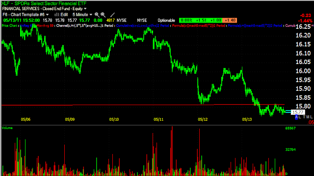
EDZ is one of my favorite inverse ETFs, it's a short on financials and I believe financials are going to be among the first to blow up. However we have a break down in XLF below support, on a short term basis, I don't trust this move and think XLF will be back inside the descending triangle next week. I'd still keep my position in EDZ as I mentioned in the second to last post.


 Here's the daily chart

 Here's the 1 min chart showing the break

 a 5 min 3C chart

and a 15 min 3C chart.

I'm not making a bullish case for financials whatsoever, I'm just saying this particular break, I don't trust.

ADM May 3rd Short Trade

ADM still looks very much like it's prepping for a dead cat bounce.

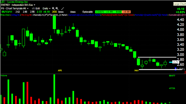
LEI Chart Request

 60 min 3C

 30 min 3C

 1 min 3C

Daily chart.

All in all, it looks pretty good. Price makes this trade a speculative trade, but spec. trades are also the ones that can move a lot very fast. The last run was 136% in 4 days

Market Update

I want to get this out quick and it'll take too long to get all the charts here.

Basically the IWM, SPY and DIA are all in line on the 1 min chart, there's not a positive bias going into te close, just in line with price. On the 5 min charts, all 3 show positive divergences.

The QQQ is the exception, the 1 min and 5 min charts are exactly in line with price, they're not showing the 5 min positives the other 3 are showing.

From a market action standpoint, a lot of stops were hit today and that's where the 5 min positive divergences start, right where the stops were hit and at the lows of the day. The 1 thing that makes me still think there's a decent possibility of an upside move and the false breakout that I've been looking for is that the SPY DID NOT violate the lower trendline of the Triangle it's been trading in. There was a strong bout of selling when those stops were hit, but the SPY managed to stay within the triangle or held support. I use the SPY as an example because it has the clearest price pattern.

I personally would reduce my risk exposure a little going into the weekend. We want to increase our risk exposure when we have a strong, high probability trade. A false breakout with a negative divergence like we saw intraday at the close in the SPY on Tuesday was such a scenario. Or if we get a solid breakdown below that triangle and good confirmation. Those would be the strong probabilities. Inside this triangle we are just seeing a bunch of up and down volatility. I don't think it makes sense to have a lot of open risk. I'm not saying I would shut down all of my positions, certainly I wouldn't shut down the May 3rd trades in the inverse ETFs like FAZ, EDZ, etc. I would not have a full position size until they breakout, but I would continue to cary those trades so long as I wasn't over-leveraged on them.

PSLV/USO

Yesterday and today I mentioned I thought both of these would see further upside today, if you managed to hang in there and I know from emails that some of you did, you have a further gain today. However, I would not take these for granted. I would definitely have a trailing stop and probably take some profits off the table going into the weekend. The CME always runs their margin hikes after hours.

From a short term perspective, which is about as far as I think it's prudent to go with either of these, the 3C charts look a bit stronger in USO then PSLV. Of course, PSLV moves a lot more in terms of % moves. If you want to take your chances with the margin hikes, on a longer term 3C perspective, PSLV actually looks quite strong.

Same...

FLASH CRASH in ESRG

I’ve been documenting these flash crash whenever I hear about or see one. The reason? Because they are becoming more and more common and hitting big names that you are likely to trade. Today’s is the worst I’ve seen, from $102 to $.01 in 1 minute.
While ultimately the exchange will probably deal wit this and break up the trades, some of the not so extreme crashes may catch you at a loss. The first thing you need to know about them is in all cases I’ve documented, they first will see a negative divergence or distribution period before they occur which means I’m 99% sure they are pr-planned. The second thing you need to know is if you have stops placed with your broker, you will be stopped out and this is yet another reason I prefer to keep stops mental. And lastly, it’s best not to panic, nearly everyone I’ve seen recovers within a minute or so, although they usually fall a bit short of where they started the crash, as in the case here, from $102 and recovered back to $99.98
 Every one of these I’ve covered has shown selling/short selling before they happen
Here’s the daily chart of the crash from $102 to $.01 and the recovery back up to nearly $99.

More Posts From WordPress

Using the TICK Chart for Early Warning

For those of you who have access to real time data, the TICK chart is a pretty useful tool to get early warning on intraday changes in trend. For TeleChart/Worden users, type in the symbol $TICK. Worden also offers  free real time charting software at www.FreeStockCharts.com, there’s no 20 min exchange imposed delay like most other free charting software. The symbol on their free platform should be the same- $TICK. This shows stocks ticking up less stocks ticking down, use a 1 min chart.
This is an earlier tick chart from today when the market bottomed, the lowest reading was -1866 which is VERY low, recently on down days a low reading has been around -1250 so to see sub -1500 was pretty unusual.
This is the most recent Tick chart  captured, remember that this is all NYSE stocks. Notice how I’ve drawn trendlines around the highs/lows. Once the Tick chart moves above +1000 you usually see a pretty decent move up. If the trend line is broken, then you know the trend is about to be broken. Then you simply can draw the next set of trendlines. It’s not a perfect indicator or one with an especially large lead, but it’s useful.

More WordPress Posts

The Micro and Macro View

In the micro view, this is what the market has been doing with these triangles before reversing, so this is what I’ve been looking for, a run up above the upper trendline at the white arrow, then the drop at the red arrow, it’s all part of the “snowball effect” I’v described.
Here’s the example I mentioned yesterday in ADM, we have the triangle which is very obvious, the 2 day break above the triangle and then the snowball effect as it falls fast and hard.
From this 15 min chart, it appears the SPY wants to do this, looking at the last time the SPY challenged the lower trendline we saw an accumulation period that ran prices up, but our triangle was not as well defined then and it certainly wouldn’t be as easy then as it is now with a much narrower apex of the triangle (less distance to travel to create a false breakout). However, tme is growing short as this triangle will most likely produce a very directional move shortly as the apex is nearly complete (similar to a Bollinger Band Squeeze).
That’s the Micro view of events. Here’s the bigger picture.
This hourly chart is showing a leading negative divergence in the SPY triangle, this is pretty ugly and puts the odds of a sharp breakdown out of the triangle pretty high. As you can see in the past, 3C on this chart has been reliable with accumulation zones sending prices higher and distribution zones sending them lower. There’s another accumulation zone not marked on the chart right before prices moved up into the triangle, you may be able to see the divergence. The leading negative divergence on a 60 min chart is about as negative as you get.
You can also see the apex of the triangle nearly closed so events should unfold pretty quickly.

Posts From Wordpress that some of you are missing

I hope this shows up with the charts....


Financials Update

Since Financials seem to be the key to the S&P moving, here’s an update on what they are looking like right now.
XLF 5 min chart looking pretty strong
Another financial, IYG 5 min looking strong, not quite as strong as XLF, but remember that IYG has been underperforming the XLF the last 2 days.
FAZ, a financial short or inverse is breaking down a bit
SKF is another financial short or inverse ETF and it looks largely the same as FAZ above. So there’s 4 charts that are all more or less pointing in the same direction, Financials to gain ground, which should lift the S&P

TEST

TEST