Wednesday, February 15, 2012

Credit and Risk Assets Warned Short Term, It's The Long Term That Should Be Your Focus

For newer members, yesterday's Credit/Risk Indicators that I introduced a few months ago, have been a huge leap forward in understanding the market. I often say, "What everybody knows is not worth knowing'  and it is in that spirit that I introduced these indicators.

Yesterday's post explains in more detail.

Today every risk asset warned intraday, however what should be your focus is what the long term indications are showing, this is another reason why I believe this rally has been a bear market rally and the next drop will not be a correction, but the next leg down in a primary bear market.

Here are the charts of today's warning signals and the implications of the long term warning signals.

(the SP-500 is always represented in green)

 Intraday Commodities topped before the market, a red flag.

 Long term they were in sync with the market during most of 2010 as there was a true risk on rally, they went divergent at the 2011 top and called the late July 2011 decline in the market of over 16%. Right now they have not participated in this rally at all and are severely dislocated, showing again the high probability that this has been a bear market rally used by smart money to sell/short in to strength.

 High Yield Credit (credit leads equities) warned intraday today

 Credit has sold off over the last 2 weeks while the S&P-500 has lost -.19% as of this capture. Translation, the market is doing nothing while Credit is delveraging fast.

 Yields warned today...

 They also warned right before the July sell-off, they were positive in October right before the market bottomed and put in the October rally. However, Rates which are like a magnet for equities are now at multi-decade lows.

 For those who think the Euro correlation is dead, again, as I have been proving nearly every day, the Euro warned Friday's lows would see a bounce, that the market would decline from its highs on Monday, as well as today.

The long term implications?
 The Euro called the July decline, the October rally top which lost ground and went sideways before taking off and have been severely dislocated since the last rally, which is the one I consider to be the bear market rally. Equities have huge potential downside just to revert to the mean.

 High Yield Corporate Credit warned today

As far as Credit de-leveraging, it hasn't made a single higher high in 3 weeks. These risk assets should move together in a true risk on environment, they are all warning of big trouble ahead.

AAPL "Changes"

AAPL is probably the most important stock in recent market history, both as an innovator, a market bellwether and for its weight and ability to manipulate the market.

While you have to pay $10,000 to get NASDAQ's proprietary weighting schedule for each component on the NASDAQ 100, it was pretty well known before the NASDAQ revised their weighting several months ago that AAPL was not only the 1 component with the heaviest weight of probably any stock in any average, but it was around 20%. I had done a lot of research on this because I knew if you want to move the NASDAQ, you just need to move AAPL. AAPL had about the same weight as the bottom 50 weighted components combined! So theoretically, if we took the bottom 50 weighted stock and added AAPL and called it the NASDAQ 51, all 50 of the 51 stocks less AAPL could post a loss of 2% on the day and if AAPL posted a gain of 3% on the day, out theoretical NASDAQ 51 would close in the green by +1% even though 50 of 51 stocks closed down and only 1 closed up. This example is a bit of hyperbole, but it demonstrates how powerful AAPL is in moving the best performing average of late, the NASDAQ 100.


You may recall yesterday I addressed modern Dow Theory and showed you with a custom indicator I threw together the divergence between the major market averages and the NASDAQ 100, this is a violation of Dow Theory's confirmation and throws the entire market in to a suspicious light. So AAPL is the fulcrum upon not only the NASDAQ lays upon, but through Dow Theory, at this point the entire market!

That's why today action in AAPL is worth taking note of.

First though I wanted to give you the link to my article showing why AAPL is most likely NOT being accumulated by smart money and why their last BLOWOUT quarter may actually be a negative that causes hedge funds to dump AAPL (they certainly have had the chance to do so in to strength recently).

Next, AAPL is under pressure today because of talk that the NASDAQ will be rebalanced, the last time the NASDAQ rebalanced the market saw some heavy volatility and moved down 7%, which in comparison to recent percentage gains, would be huge.

Here's the link to the February 2nd article on AAPL.

Now for the charts...
 AAPL's daily candle alone suggests heavy churning (the dumping of shares from strong hands to weak hands), volume would further confirm churning as this is will likely close at the highest volume in over a year.

 As usual, the retail traders put their stops where they always put them, at the 5 min 50-bar moving average and volume swelled as that was broken today. Also note the RSI negative divergence in to the highs.

 On a swing Trend Channel basis, the channel has held the entire move since late January without a single stop, that is until today.

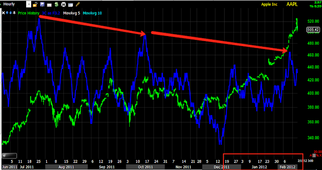
 The daily 3C chart seemed to be showing a top at the end of the October rally, it has been the rally that has taken shape since then that I consider to be the bear market rally, it is the area/dates in red. AAPL is showing significantly less money flow now at these highs then back in July or August and overall is in a large relative negative divergence, which has caused it to be in a leading negative position.

 The hourly chart is negative as well. AAPL never puled back once since earnings and the gap up came on after hours trade post earnings, I can virtually guarantee smart money was not chasing AAPL up 14% (it opened the next day at about half that) in extended trading with poor liquidity. For smart money to accumulate AAPL, they'd realistically have to pull it back and accumulate on weaker prices. Smart money doesn't chase, retail does.

 A zoomed hourly chart shows confirmation, even though the larger picture is that it is still leading negative, today's negative divergence went so far as to hit the hourly chart, something that is hard to do in a single day.

 The 30 min chart was leading negative a week ago, so this rumor of rebalancing was likely already known by Wall Street , the 30 min went negative today as well, that is why it can be seen on the 60 min, it bled through on 30 min 3C weakness.

 Here the 5 min chart has been negative locally as well, giving weight to the leading negative divergence  on the 30 min chart mentioned above.

Intraday, distribution started well before the top-smart money HAS to sell in to demand with the size of their positions.

The bottom line, read the Feb. 2nd article I wrote on AAPL and why their earnings were more likely to produce a "sell the news event" and realize that smart money must sell into strength, just like the earlier example I mentioned when Crude hit it's highs and Cramer was creating demand for GS to sell/short in to.

It is very likely that Wall Street has known about an AAPL/NASDAQ rebalancing a lot longer then we realize.

The effect on the QQQ:

A bearish Engulfing Pattern

VIX Chart Request...

As one of the many pieces of the puzzle we must put together to gain an edge, the VIX has been one I have been highlighting as it has seen accumulation, which would indicate the VIX/VXX moving up and since they have an inverse relationship with the market, the market would obviously move down.

Here's an update of both the VIX and VXX.

 First we have my custom "DeMark" inspired indicator (sell signals in orange/buy signals in green), this is applied to the VIX and remember the inverse correlation, a buy signal on the VIX would correlate to a sell signal on the SPX. In fact, just to demonstrate, here's the same timeframe/indicator for the SPX (below).
Note the buy signal at the start of August after the July decline of 16% and the long sell signal recently in the SPX, they are essentially the opposite of what you see above for the VIX.

 The longer timeframe the signal, the more important it is, right now we have a 3 day buy signal on the VIX, the first in a long time and considering we didn't see one at the July market drop of 16%, this would suggest my theory of the market rally actually being a bear market rally and the next leg down being much worse then a simple correction. Remember the July decline was more then 16% and there's no signal for that decline on a 3 day char, however there was on the above 2 day chart (refer to the above mentioned in bold).

 Intraday we see both the VIX and market green, a bad signal for the market.

 Here's the VIX 1 day 3C positive divergence, it is one of the largest we have seen in a long time.

 In fact, it appears to be worse then the 2008 accumulation/positive divergences, we see 2 here, they correlate to the SPX chart below.

 This is the SPX in 2008 and the red arrows are where the positive divergence occurred in the VIX as the very lows, we are off the lows and therefore a little further in to the signal, which would suggest we are closer to the break in the market as you can see above there was a little lag between the lows in VIX on a positive divergence and the break in the market. The first red arrow is the same area I have illustrated dozens of times as it shares much in common with the current market rally, we can see that period was indeed a bear market rally.


 Here's the daily VXX  in green compared to the SPX in orange, note the change in character of the VXX. The period just before the 16+% decline in the SPX is highlighted in the red box.

 The 60 min VXX 3C chart went from distribution to confirmation to a large leading positive divergnce.

 Here we see the same in the 30 min 3C VXX chart with a large relative divergence and a strong lading positive divergence.

The VXX 5 min chart's move up is showing nearly perfect 3C confirmation.

SPY Update

If you have been following the 3C updates, then today is no surprise, the moves up on news seem to be manipulations of the market causing a lot of overnight volatility. Yesterday's SPY/SPX update showed though how bad the situation is and why I consider the rally since December to be a bear market rally. In fact, during September I posted my expectations for a new low yo be put in (that happened at the start of October), that new low would launch a strong rally and we would make a new low (below the October low) after that.  This rally has done what a bear market rally should do and is designed to do, get investors confident and back in the market before Wall Street dumps the market and leaves them holding the bag. Every thing we have seen has suggested this is what is happening, from my posts on market breadth, ATR, Credit and Risk Assets dislocations with the SPX, Dow Theory divergence between the major averages and the NASDAQ 100, the CATS and DOGS rally which we see at the end of a bull move and many, many more indications.

Here's a SPY update, I'll try to get the other averages out soon as well as the Credit/Risk asset layout.
 The 1 min chart showed us some accumulation late day, I suspect the EU "Samaras rumor" was a plant. Since, today we have seen a negative divergence (distribution) in to the SPY's intraday highs, it is now leading negative which is the strongest divergence type.

 The 2 min chart shows the exact same, again the positive divergence before yesterday's closing run up suggest Wall Street knew about the "Samaras story", remember where Papademos comes from, he is Goldman Sachs Alumni, just like Cramer. Specifically when oil crashed in 2008, I posted that week that oil was set for a crash, the same week Cramer told his audience that if we get a negative EIA petroleum report, they should buy oil as a "CONTRARIAN TRADE!!!" How can millions of viewers all doing the same thing possibly be considered contrarian? Furthermore, after they bought on the EIA report, oil crashed a few days later. Ironic timing huh? Goldman would need a lot of demand to sell/short in to higher prices, Cramer gave it to them as an ex- Goldmanite. You can come to your own opinion as whether it was coincidence.

 Longer term SPY 2 min chart has shown a pattern of distribution and many divergences fall right at intraday or gap up highs. The 2 min is now leading for more then 8 days locally, when put in context of the trend, it has been leading negative  further back then I have chart history available which is to at least January 10 2012.

 The 5 min chart locally shows a strong relative divergence between last Thursday's highs and today's higher highs. We can also see the small positive divergence late Friday afternoon.

 The 15 min chart shows a pattern of not only negative divergences losing momentum in the SPY (+.23% net change over the last 9 days, almost 2 trading weeks!), but an accelerated drop in 3C. Remember yesterday's custom indicator showing the declining rate of change in the major averages. The only thing that gets the market to move are rumors that have a half life of 12 hours at the most and often 1-3 hours.

This is but 1 major reason I have felt we have been witnessing a bear market rally, the 30 min chart (daily as well) are some of the most important timeframes and this trend in 3C suggests not only has Wall Street been selling in to price strength, but setting up large short positions. In the size in which they trade, they cannot set up large short positions in a day, they would crash the market and hurt their own position, they need price stability or strength to sell short in to as their large orders are broken up in to smaller pieces as to not drive price against their position before it is filled.

UNG Update

UNG is another we have been watching and seen a recent change in character. As a matter of fact, when I was checking on the top 25/top 150 percentage gainers (1 day) for the Cats and Dogs trades, UNG had popped up several days in the top performing stocks as well as the top performing ETFs. Even more encouraging, it had done so on days when the market was down, thus showing it was able to trade up and as a best performer without needing market support.

 UNG is now in a triangle pattern, it's not so big that it can be ruled out as a continuation pattern yet, however, volume suggests that there's something more going on here then a consolidation which is typically on lower volume, especially in a bear market trend when low volume is a hallmark of a bear market. The next chart will give you some perspective on volume.

Recent volume is the highest ever, suggesting UNG has seen a capitulation event and thus the triangle is something other then a consolidation/continuation pattern.

 The daily Bollinger Bands, as you would expect with a developed triangle, are starting to narrow, implying a highly directional move. Again, just like with URRE, I would caution against expecting a "V" reversal, as such, any directional move should be put in its proper context, in my opinion that would mean the move has less importance then the triangle and any subsequent directional move would suggest.

 MoneyStream on a daily chart is also showing positive divergences, indicating accumulation. MS is calculated completely differently then 3C, they share almost nothing in common, yet they are both money flow indicators and both giving the same positive signal.

 This Triangle in my opinion is VERY obvious and too small to be a mature base. I would expect any directional move out of it either up or down to be a head fake move, we may be able to take advantage of it on a short term trade basis, which ever way it breaks. In my opinion, the most likely longer term outcome is a reversion to the mean if such directional move occurs and a bias toward further basing.

 The ATR in UNG is exactly the opposite of what I showed you several days back for the market averages which have seen averages such as: Dow-30, the S&P-500, the NASDAQ COMPOSITE, the NASDAQ 100, the Russell 2000 and mid caps, just to name a few, all see their ATR since the late December rally started, fall by 40 to over 50% even as prices are higher. The same thing happened during the Spring 2008 bear market rally. A healthy move should see the ATR at least stay within its normal range if not increase like we see here, it certainly shouldn't drop by more then 50%.

 Here's the daily Trend Channel hold a swing move (a bit longer actually), it stopped out at the red arrow, but again there were earlier warnings such as the Harmi in the yellow box and the fact that it occurred several standard deviations below the average price (oversold and flashing a reversal signal).

The 2-day Trend Channel has held a much longer downtrend and is actually still in effect, so it does not make for a useful stop for a long trade, but may prove useful on any trend up, here we see about 9 months of trend held in the channel.


 Ultimately the 3-day stop is the best, it held the entire downtrend here as well as a 2 year down trend mentioned in the caption of this chart.

 The hourly 3C positive divergence...

A 15 min positive divergence around the area of the triangle, so we may see a directional move up, it can be traded, but remember, a base is more likely before any sustained move.

Right now a stop for UNG is very hard to determine, lets let it play out a bit. If you want to take a long trade on a possible breakout, I would take it as soon as UNG passes $5.46, even intraday, you can set an initial stop at 5.36 or so, but then we'll want a trailing stop and pretty tight. In the case of a downside directional move, the same rules of entry apply, I would watch the $5.08 area. I would probably consider an initial stop around $5.20, although this is open to a lot of interpretation. A tight trailing stop would also be my preference. Either way, I think the most likely outcome is a directional head fake move followed by a return to the area to continue building some sort of base.

URRE Update

URRE is one of those stocks I mentioned yesterday that I only see a handful of each year, the stocks that have long term divergences (in this case a positive divergence) that contradict price and eventually, end up moving well above when the divergence first started and we have been tracking it for a while and as you know, recently noticed a positive change in its trading. I mentioned a few examples yesterday like the 2008 top in oil which was negative for several months on the longer term charts as it headed 20% or so higher, then gave up over 80%. The $US Dollar Index did it twice  in both the 2008/2009 period and 2010 as well as a number of individual stocks and to a lesser degree some of the C&D trades. One of the most notorious was HOV during the 2000 tech bear market which saw a year of accumulation. As Jesse Livermore said, it was his sitting on his hands that made him money, being right and having the courage of your convictions. HOV went on (and after the tech market, who would have guessed housing would lead the next bull market? Smart money knew) to gain over 2500% over the next 5 years.

 Today URRE is doing decent with around a 5% gain, however this isn't what we are looking for with this trade. It does look like URRE has been correcting/consolidating over the last 4-5 days. Remember, stocks don't have to pullback to consolidate, they can do it through price or through time; volume would suggest URRE has been consolidating through time.

 As a general concept that I have been pointing out for more then a year, a bullish descending wedge and to a lesser degree, bearish ascending wedges, no longer act like what you will see in Technical Analysis textbook patterns. This is just another example of Wall Street evolving and using Technical Analysis against technical traders who still haven't adapted (which I have pointed out numerous times, makes technical traders predictable and thus Wall Street's actions/reactions more predictable). TA textbooks will often show a descending wedge reaching its apex and then breaking out and promptly retracing the base (in this case around $3.60). However that is not what we see in the real world anymore, now we see a false breakout setting up longs as you can see in the yellow box, a head fake move, followed by a period of usually lateral trade or some sort of base. URRE has been forming more of a "U" shaped base, the days of "V" shaped reversals are pretty much gone.

 When I first noticed a change in character in URRE I tried to anchor expectations and said, "I would like to see URRE form a rounding base" (this was before the rounding part of the base started to turn upwards so thus far we have seen what I hoped to see). In December URRE started to make a move to the upside, although ultimately as it is a long position, that is what I want to see, I was a bit concerned it was getting ahead of itself so the pullback was not a bad thing in my view and I asked you to keep your eye on the 22 day moving average and look at the bigger picture rather then the day to day trade. So long as the 22-day continues to round, I am fine with URRE's trade. The pullback from the December move up actually gave the 22 day a better looking rounding pattern.

 Looking at a 4-day chart better shows the pattern as well as volume-this is what I was hoping to see.

 Here's my Trend Channel set to 3 days, which is the stop I prefer; it held the last move of 800% and captured the bulk of the trend. Although the stop out came at the first red arrow to the left as URRE closed below the highest point of the lower Channel line, there were warnings before that such as the long upper wicks on the candlesticks in the red box, showing resistance and higher prices being rejected, in the yellow box URRE made a lower high, so there were clues and the exit in URRE could have been before the Trend Channel stop out thus retaining more of the gains. The Trend Channel also held the downtrend perfectly, stopping out at the red arrow, but again we had hints before then such as the descending wedge reaching it's apex, 3C accumulation, etc.

 As you know, I prefer wide initial stops, they can always be tightened later, I would continue to use the 3-day Trend Channel with a current stop ON A CLOSING BASIS of $.81. The trade needs time to work, once a trend is under way, the stop can be adjusted, but I'd rather take on fewer shares for a wider stop then more shares on a tight stop that is likely to get hit. Besides, you can always add to the trade, averaging up on a winning trade is a winner's strategy.

 The daily positive divergence right now is stronger then the last two, the last run produced returns of over 800%.

Here the 60 min chart shows accumulation at the October lows and a current leading positive status.

Although it's nice to see URRE with a decent gain on a day like today, the premise of the trade is much larger. I'm looking for at least a run to $3.60 and given the size of the daily accumulation, I wouldn't be surprised to see much more then that. Just be patient, keep an eye on the rounding base, watch for signs of stage 2 mark up such as a strong breakout from obvious resistance on huge volume to alert the momentum traders who are running volume surge scans all day.