Tuesday, June 3, 2014

NFLX Charts Follow Up

Friday I was close to filling out the NFLX position, but decided to wait until this week, I believe I said I thought we'd need about 2 more days. The reason wasn't so much about price, in fact the NFLX partial position was down less than 1% when I posted Trade-Idea: Bringing NFLX Trading Equity Short to Full Size, at the close it's down less than -0.40%. It was about the timing and not having open risk for a couple extra days when probabilities were high that there would need to be at least a couple of days pass before there was a reasonable looking reversal process in place.

Between the reversal process and how rapidly NFLX charts were deteriorating today, this position became one in which I just couldn't sit on the sidelines anymore. There are certain charts and divergences that I do not ignore when I see them.

As for NFLX's charts, I'm going to try to give you a decent picture from macro to micro.

 This is a primary bull market cycle with a nearly year long base, about a year of mark up and near the same in a H&S top, which has been confirmed. The last stage is 4, Decline. The A and B are the first two places I'll short a H&S top, the top of the head and the top of the right shoulder, the last place and least favorable is after a break below the neckline/support and a shakeout rally that moves above the neckline as this is very common, but depending on where the market is at that time, we may not see that kind of shakeout, it is however a probability.

The downside (eventual) target area based on the H&S top's size is between $150 and $200, although these tops tend to overshoot their target on the downside, the pendulum of over-reaction swings both ways and often a lot harder when it's a fear/decline environment.

 This is a simple custom cumulative volume indicator I constructed to help identify the trends in volume. To confirm a H&S top the rally's that form the left side of the shoulders and head should see diminishing volume and the declines that form the right side of the shoulders and head should see increasing volume as we do above. By the time we are at the right shoulder, volume often falls off very badly on the rally and increases dramatically on the decline.

 On a daily chart (as we are looking for the top of the right shoulder), the last 3-days have been small bodied candles, a star, a hanging man and a shooting star or close to them, all of them show a lack of bullish momentum and open NFLX up to a downside reversal, although I'd like to see a bearish reversal candle on increased volume.

 My X-Over Screen is just showing the signals of a sell/short sell as price moving averages are whipsawing ( we want to see a clean break of the yellow 10-bar below the blue 22-bar), however the custom indicator in the middle is crossing below its moving average which is enough to end the long signal and RSI is not only divergent, but has crossed below 0 or 50 which is 2 of 3 signals going short, that's a pretty good start.

The longer term 4 hour chart shows confirmation of the rally before the H&S top and distribution in to the H&S top on a very large scale as this is a very long timeframe reflecting strong underlying moves.

The Daily 3C chart looks almost identical so that's an even worse development for NFLX.

 The rally to form the right shoulder was in line/confirmed by 3C, but it has not only gone negative, but leading negative at the reversal process area, the "U" shaped rounding top. Remember it's not uncommon to see a top that looks like an igloo with a chimney, a small head fake move on the right side of the rounding top, but I don't have any evidence that this is a probability based on the charts.

 The 30 min chart saw significant damage today alone and is already in a position in which I'd take the trade.

This is how much damage was done on a 30 min chart today alone, it has really picked up, this is why I could no longer afford to wait any longer to fill out the NFLX trading short position, but I may leave it as a longer term position depending on how it reacts at the neckline and what the market looks like at the time.

 The damage in the 15 min chart today shows why the 30 min looks so bad, what I really liked about this today was the migration across such long timeframes in a single day, strong distribution.

 And the 10 min chart is close to hitting a new leading negative low below where the rally first started for the right shoulder, I think it's only a matter of a day or too, with price that elevated and 3C that low, there's a recipe for a very fast decline.

And the 5 min chart is nearly at that level I just mentioned, leading negative to levels not seen since the positive divegrence was put together to start the right shoulder rally.


Scan Candidates

I'm still running scans with my Custom DeMark (influenced) Buy/Sell indicator, I like to run the scan in multiple timeframes, the candidates that have the most signals in multiple timeframes are typically the ones I'll spend more time analyzing with other indicators such as 3C.

In the first round of scans, an interesting trend is emerging, I'll list the Buy and Sell or Short candidates separately.

*These are not official trade ideas, they are assets that I want to look at much more closely, but we have had some really incredible signals using this indicator in the past. I'm putting some in bold as there's a trend among these assets.

Buy candidates: FXP (which is interesting because of our FXI Put); SQQQ (3x leveraged Short QQQ); TECS (Technology Bear 3x); VXX; UVXY; JO; MCP

Sell/Short candidates: FXI (this is the inverse of FXP and we have an open Put position in FXI); COF; HYG; SPY; FDX; XLK; WFC; NFLX; AAPL; QQQ; DIA; IYT; EWG; TQQQ; EWP

The FXP buy and FXI sell/short confirm each other and as mentioned we have a June (monthly) FXI put position.

The SQQQ buy is a 3x short QQQ ETF which fits with the QQQ Sell/Short and the TQQQ (3x long QQQ) Sell/Short signal.

Also all of the averages, but the IWM (which I suspected earlier today would see slightly better relative performance in the very near future) were on the Sell/Short side, DIA, SPY, QQQ along with TQQQ and a buy for SQQQ (the opposite of TQQQ and 3x short QQQ ETF). *It's probable more leveraged ETFs would have confirmed, but they are on different lists that haven't been scanned yet.

The "3 Pillars", Technology, Financials and Energy (the market won't go far without at least 2 of these 3, Energy can often be off on its own) keep popping up. I need to look closer at Energy, specifically oil as numerous signals pointed to Crude being a likely short. However, among our list, in Financials we have COF & WFC as well as the Financial heavy SPY (again, there are only 66 items on this watchlist so it's not a scan of the entire financial sector, but assets I find interesting for one reason or another) and on the Technology side, the Tech heavy QQQ and derivative leveraged ETFs: TQQQ and SQQQ, TECS, XLK (Technology Sector) and AAPL (the most heavily weighted Tech name).

Also while I don't have a lot of transports on this particular list, the fact that the only ones I do have both popped up is interesting given recent IYT/Transports analysis (I believe Monday I covered IYT).  FDX and IYT both popped up on the Sell/Short side.

As for Europe, EWG (MSCI Germany Index Fund) and EWP (MSCI Spain Index Fund) both popped up. The only other on this list, EWI (Italy) gave a recent signal, although not current as of right now, but pretty close.

Here are a few examples...

NFLX since we just covered it...
NFLX

 MCP

These are not large signals, but they triggered every time TLT hit resistance of the channel.

UVXY, again these may not look like large signals, but look at the gains from some of the trades if taken. Furthermore, this is the largest buy signal since the inception of UVXY.

 FXP

SPY on a quarterly basis, only 2 signals and this one is significantly larger, the last was the 2007 top.

DIA

I'll be running more scans as well as additional timeframes, including tactical entries.

I'll be putting out the NFLX Chart update next...

Trade-Idea: Bringing NFLX Trading Equity Short to Full Size

I'm going to go ahead and fill out NFLX, I figured Friday it would be about 2 days before it was ready, there may be a little jiggling and we do have a wildcard Thursday with the ECB, but the charts are falling apart quick and even an ECB knee jerk move isn't going to change the underlying flow and how bad it looks.


MCP Charts

The faster intraday charts are moving so quickly now that it's difficult to keep up with them (capturing). Earlier today I've been corresponding (answering emails) from several members interested in MCP long, my thoughts were to wait for a break of $2.50 (it took surprisingly long today) and to watch for volume to increase as $2.50 would be a very obvious level to place stops/orders. MCP teased around the area at $2.52 for most of the day, but I had set alerts to let me know when $2,50 was broken and as it was, volume picked up and the intraday charts were showing the kind of positive divergence that I want to see at a run of stops/orders like that.

Also on the first watchlist scan I ran using the Custom DeMark inspired Indicator, MCP came up as giving a long signal.

 This 60 min chart shows the bottom area of a larger rectangle base, it's specifically a descending triangle. The yellow box right at the apex of the triangle is where we were long MCP and had a breakout day of 6% and closed the trade that day as the first problem was the support of the triangle is the same support as the larger rectangle that reaches back to April 2013, I had a very hard time believing MCP could make a real breakout to stage 2 without having first run the stops under a year+ base, this is just such a low probability outcome (to breakout to stage 2 without a shakeout first) that I would have exited the long (even though we were at and exited with a nice gain) . Later in the day 3C was showing no confirmation of the breakout, just as it is showing no serious confirmation of the breakdown, which is actually proportionate with the size of the base so we exited the long that day while it was still up well over 5% on the day.

MCP Daily Chart with the multiple 4 stages of a cycle. Each trend / stage is very proportional to the preceding trend, the stage 3 top is the right size for the preceding rally, the stage 4 decline is proportionate to the Stage 3 H&S top, which by the way has a price-pattern measured move (implied target) of approximately $15, these are often overshot, but considering the highs near $80, the neckline near $50, where MCP ended up to form stage 1 is very reasonable. The size of the Stage 1 base of over a year is proportional and the break of support/head fake, while very sharp, is well within proportions for this chart and MCP's character.


 Here's the range that developed after the MCP earnings decline, a very solid 3 trading week base with a very tight trading/basing range and again, the move below which became a higher and higher probability the longer this range persisted and the longer support persisted, is still very proportional to the base above.

Head fake moves are good for several things, one of course is making money on increased volume, bid/ask spreads, volume rebates. Of course for anyone putting together a large position and we know that a $500 million dollar position is a moderate size position for many larger funds with $1 billion dollar positions not uncommon, the supply generated by running stops/short orders and the lower prices are something larger Wall St. firms need.

Lastly, the bear trap that this kind of move can create can cause a significant strong reversal as covering and eventual long buying push momentum (like Channel Busters).

Here are the stops hit the last 2 days, to the right , that's $2.50 exactly and on volume.

 The intraday charts responded almost immediately.

The 2 min chart is fast enough that it could have confirmed any one of the moves lower the same day, it has not, it has stayed in a leading positive position.

Again the longer 3 min intraday responded to the break of $2.50.

 This 10 min positive divergence is not scaled properly, I just don't have enough history on the chart to get it to scale properly, but the 3C divegrence would be sitting higher .

 Interesting 15 min chart

 And this is really what has kept me hanging around in MCP, a very strong 60 min chart that has added significantly to the post-earnings decline/base.

The 60 min in scale after Goldman Sachs downgraded MCP.
 
This is the DeMark inspired indicator, the signals don't have any targets with them, but each has sent MCP higher. The current single signal is larger than the others, that's about the only indication of a stronger move with this indicator.

Trade Idea: MCP Filling out Long Equity & New Calls Position

I've been waiting since early May to fill out the MCP equity Trading position (LONG) which is at half size, with today's move breaking $2.50 which is a level I've been watching and expecting to be broken since this morning (with volume confirmation that orders were hit) as it is a psychological level , this also sets up the kind of entry I like for option positions, to enter on extreme moves such as opening a call position in to this move down.

I haven't taken the time to find the post, but I had recently said that the trading range of the last (approx.) 3 trading weeks in which MCP's charts have held up very well, has support that is too well defined, the range is too large now not to have a stop run, it looks like today's move is exactly that, a stop run / head fake move and this is the kind of move that I like to use to enter options positions as the premiums fall.

I'm going to fill out the trading equity long position in MCP and open a July (standard) $2.50 call position.

I'll post the charts next.

VXX / VIX Update

These are getting very tempting, but they can be very tricky to trade.

In any case, whether worth a trade or just good to understand for basic market analysis, I thought it's time to update them.

We have VIX futures, spot VIX which is what most are probably use to seeing and then we have assets like VXX which are short term VIX futures, this is a 2-month blend of the current and front month, for example while VIX futures (for June) reflect only June, there are other contracts like July, August, etc. VXX would be June and July so there is some difference between VXX (Short term VIX futures) and VIX futures as well as spot VIX.

 This is the CBOE's spot VIX, the one most people are use to. Low levels indicate complacency among traders, a lack of fear and these are most often associated with market tops while high levels reflect fear as traders buy puts to protect themselves and extremes on the high end are most often associated with bottoms.

What's interesting about VIX action is about a week ago or so there was a change in character in the 3C charts of VIX futures, shortly after that ( a day or two), VIX was no longer moving any lower, it was another failed lever for the market. Last week VIX closed green on the week (as you can see support) and had the best week in 5 weeks. The numerous small bodied candles at a support level (Stars, Dojis, etc.) are a sign of a loss of downside momentum and essentially an opening to an upside reversal, the market moves opposite VIX. 

I believe the charts show VIX holding up out of real demand, pros are buying protection and a real supply/demand dynamic is keeping VIX up and in the green when it should be down many days.

This is my Custom DeMark (inspired) Buy/Sell Indicator, it is giving a VIX buy signal right now. I'LL BE RUNNING SCANS OF THE WATCHLISTS WITH THIS SAME INDICATOR IN A FEW MINUTES, unfortunately I can only scan 200 stocks in real time at a time and it's a bit slow, but I think it may bring up some interesting candidates for trades.

 This 5-day chart of VIX shows support broken, but the downside momentum has fallen off as the last 5-day candle is a very narrow bodied Star, a common upside reversal candle (in this position).

As for VXX and UVXY (2x leveraged VXX)...
 Numerous charts are looking very interesting. Last week while there was distribution in the market from Institutional investors and retail was buying, we see a positive divegrence at the EXACT same spot in VXX.

The 3 min chart shows a larger positive divegrence which starts right at the time of the bear flag set up in Mid-May. Plus the leading nature of this chart is right along the lines of the "Flying leading divergences" that we tend to only see in VIX-based assets. The transition from short term confirmation (left) to this leading positive gives this chart a lot of credibility.


 UVXY 15 min, which is interesting as there seems to have already been a trend of positive divergences before VXX was hammered lower, but the chart never confirmed and stayed leading positive.

 The same is true of the 30 min chart, which makes me thing of the SPY and QQQ 30 min which look almost exactly the opposite as the assets trade opposite, it looks like excellent confirmation of the overall situation, distribution in the averages on a massive scale and protection bid on a massive scale.

Finally the same type of trend on an hourly chart, leading positive, no downside confirmation. Even though the past divergences are not relevant because of the rolling contracts (2 months), the trend of how smart money has been responding is worth noting.

Market Update

There's really not too much different than what forward looking expectations were for early this week as of Friday and what we saw yesterday, the intraday 1 min divergences still look like steering divergences, keeping the averages in a pretty tight range, while the longer term, heavier underlying flow timeframes continue to deteriorate. We had distribution in to higher prices last week by institutional money, that was like a mini-cycle from May 15th's bear flag which was short squeeze powered, as I think I said before, I think the move is used up, done and in a reversal process which is the same trend among numerous assets on the watchlists. The price action of trying to maintain stable prices in a reversal process is not unusual, think VWAP as mentioned yesterday. I suspect the longer a range persists (as this is just one of our concepts), the more defined support/resistance are, the more stops/orders will pile up, making a head fake move a higher probability, such a move if it were to occur and I don't have any objective data that it will beyond our concepts and the fact we see it so often, would probably occur as some sort of knee jerk reaction to Thursday's ECB policy announcement. The fact there was distribution in to higher prices rather than just confirmation (holding the positions), tells me that there's a high probability that the lofty expectations of the ECB may turn to disappointment.

 The Most Shorted Index (I use the most shorted 100 stocks of the Russell 3000 to create the index) in red, has fallen off substantially more today, this after having fallen off all of this week and then some (Friday was when it first really became noticeable).

 DIA 1 min, as you can see, these look very much like just small corrections in 3C to keep price in a defined range/area. Since the market has the most directional influence over any given stock (about 2/3rds) and most that I have seen are in some sort of Right shoulder top or other reversal process, holding the market rather steady is what we expected to see early this week or until the process is complete. I'll have a few example stocks up/Trade set ups.

 Meanwhile the larger underlying trend both shorter term and longer keeps deteriorating, in other words it looks like price is being held around a certain level like VWAP where positions can be filled at advantageous levels, but those positions seem to be shorts and or selling of longs, although I suspect most of that was done last week in to price momentum/strength.

The longer term DIA as the range that was so difficult to get off any good trades is showing serious damage, and now with a head fake move in place that we know was distributed, the market looks to be right on a ledge.

IWM 1 min more or less in line, but while most averages the last several days have been pretty much near the unchanged area on the close, the IWM has seen weaker relative performance and is slipping from its range, I suspect there will be some IWM outperformance on a relative basis just to get it back up in to the range area.

Here's an example of one of those divergences in the IWM (3 min) positive, this should get the IWM back in to position.

 QQQ 1 min is one of the better examples of steering divergences.

 While longer term (even short term) charts continue to deteriorate just as you'd expect to see with something like VWAP selling or rather selling at VWAP. It's the market maker and specialists job to get the fill for institutional clients that is most advantageous and that is usually judged by where the fill is in relation to VWAP for the asset.

 QQQ 30 min recently showing a lot of weakness, which is interesting as the same chart/timeframe in the SPY looks the same and I recently noted that Tech (QQQ) and Financials (SPY) are two Industry groups that are looking the worst. Remember last week the only net buys, which were still small (institutional money) was in the defensive Utilities sector.

 SPY also with steering divergences

And that 30 min chart I mentioned, the longer term multi-month range that was a portfolio meat grinder is definitely giving very strong signals that it is likely a top.


Treasuries / TLT Trade

Over the past several weeks it has become a very big issue that treasuries and equities are trading together, this is 180 degree opposite of the normal correlation. Treasuries/Bonds are seen as a "Flight to Safety" trade, a way to preserve capital, not an especially great way to make capital, but when the market is moving down or expected to move down, we often will see a flight to safety trade and vice versa when there's a risk on sentiment in equities (Treasuries are sold and the money goes in to equities). This is especially true for large funds, long only Mutuals are a big buyer of safe haven assets.

It seems strange to a lot of people/pundits and the argument is one is right, one is wrong, they can't both be right as they are two opposing ideas. Without any specific knowledge of a market, if I had to choose which I thought was right, I'd go with Treasuries every time, it's just a bigger market.

However, I don't quite see the disconnect in the same light. We were expecting the SPX to make a head fake move above the range, the bear flag from mid-May wasn't an accident, there was accumulation in that bear flag, it was put there for a reason and as we suspected, a Crazy Ivan shakeout caused traders to believe the bear flag was doing as it was supposed to and make a new leg lower, that was the bear trap which created the short squeeze which lifted the SPX above the range. As you know, I don't see any of this as "accidental" or "random", why else would there be accumulation in a bearish price pattern that technical traders are VERY familiar with? 

If we follow that line of logic and we already know first from 3C that the move up/short squeeze was distributed, we got extra confirmation last night from BAC's report on net sellers (Institutional) and net buyers (Retail) which is the exact reason a head fake move is effected, retail will buy the breakout and that's when distribution in 3C started as well as BAC's charts of Institutional selling on the week and retail buying, again, if you read our "Understanding the Head Fake Move", you'll see this is the EXACT reason these moves are run, to get retail to do something like buy, but they need to push price to an area where retail will do that and in this case, a breakout above a multi-month range did the trick as we expected when we saw the mid-May bear flag.

So if Wall St. has put this little move together as I feel 98% confident they did (as we were able to predict it ahead of time), then why wouldn't they buy Treasuries if they were bearish on stocks (and we know they were bearish on stocks because they were distributing them/short selling as 3C showed us and as BACs report for last week showed us)

For a long time I've felt TLT (20+ year Treasury) would make for a great long term long position, but only if it pulled back to the $102 area. However more recently I've been questioning this logic as the F_E_D who is the real buyer of Treasuries as China gave out is backing out of QE3, there obviously won't be a QE4 which leaves the question, "Who will be the buyer of Treasuries?" It is true the
US is slated to reduce their treasury offerings so there won't be as much supply to soak up, the only buyer of consequence I can think of is Institutional money moving to a safe haven asset.

In any case, I don't have the answer to this question, but it's one I'm looking for as I feel it's very important to understand what the "new normal" will be once the F_E_D has largely removed accommodative policy.

Some of the Treasury buying with the market I think is random, here's what I mean.
This 5-day chart of TLT is a real H&S top, I checked volume and it confirms. According to the standard Price pattern implied target, the downside expectation would have been $95 (white trendline), this is not an exact science, just a rough idea of what level the price pattern (H&S) is likely to move to. There's no doubt that support , a base/accumulation formed at the $102 area (red horizontal trendline) and interestingly, there's a VERY defined channel that's better seen on a 1-day chart.

This channel in TLT is pretty darn symmetrical, it doesn't look like the work of random price action. It's kind of easy to see how Treasuries could move up at the same time as equities with a channel like this, but there's still a reason Treasuries are moving u in the channel, it's not random.

If support holds and it looks like it will, TLT would likely make a nice long here if you can get enough leverage on it, maybe TBT short of calls if there's enough liquidity.

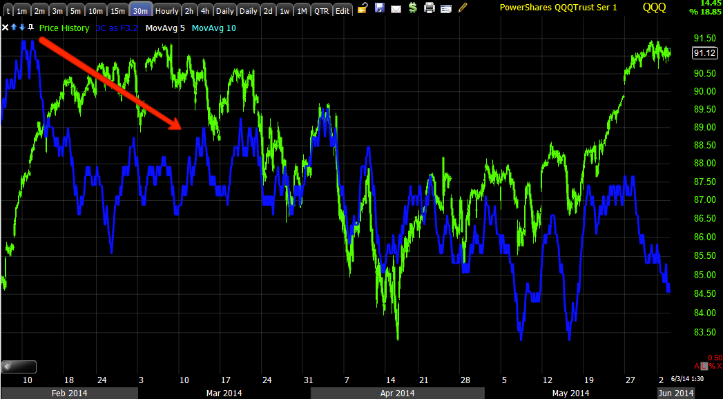
 This is the SPY in red vs TLT in green, you can see the move up together that has pundits up in arms. However recent weakness in TLT the last few days doesn't look to be an end of that strange correlation, but rather a simple pullback inside a defined channel as it has done several times before.


 This is the weekly 3C chart shows the H&S top  as well as the base area around $102, the base's smaller size has been one of the reasons I've felt TLT has a pretty high probability of pulling back to $102. If it does pullback, we'll see either accumulation of the pullback or not, if so we can step in to the long position, if not we just move on. The overall price pattern from the H&S to present looks like this is a counter trend rally in TLT and a pullback to $102 to form a larger base makes perfect sense.

 This is that channel on a 15 min 3C chart, there is some recent weakness developing in the channel, but I'd expect to see some kind of channel buster before a significant move, this would be VERY tradable and with a channel that defined, a Channel Buster looks to be the highest probability.

This is just a guess, but I'd guess we bounce off support here, make an upside run and break through the top of the channel, Channel Buster. That break out is actually a head fake move and creates a fast, strong move down that moves below the bottom of the channel, very tradable and that may start us on the move to $102.

 This 5 min chart shows a VERY clear negative divegrence at the top of the channel and a positive at the bottom, again, I don't think these divergences at the channel's resistance and support are accidental or random.

The 1 min chart shows the same thing, so I'm guessing that TLT will make for a decent long here, a stop can be set a bit under the channel, I prefer a wider stop in exchange for fewer shares initially. On a Channel Buster (short), I think the position size can be increased as this is a very high probability trade set up.

As for the correlation, we'll just have to see. The 5 year and 10-year Treasury futures (3C charts) look better than the long end (30 year), so perhaps there's going to be some divergence between duration of T's.

In any case, if the 5/10 years move up, that means yields move down, that's not a good thing for the market (one of our leading indicators and one of my favorite as Yields move opposite price of T's and tend to pull equities toward Yields like a magnet, so a bounce here in Treasuries would send Yields lower and pull on the market (lower).