Tuesday, March 12, 2013

AAPL Update

This is an update of the earlier AAPL long idea (short-term/intraday trade)...

 The 1 min intraday AAPL chart looks like many of the averages, eve the SPY where the positive divergences are only on the later intraday timeframes/

 3 min has a decent relative positive divergence, at 5 mins AAPL is back in line (3C/price confirmation).


I show this AAPL 15 min chart which is mostly in line to illustrate why there are no longer term trades in AAPL, there's no edge.

GOOG Charts

Since none of the longer term charts have changed (the reason I want to either add to or consider an additional GOOG put/short position on a little price strength), I'll just update the short term charts that are behind the call position in GOOG which is a weekly call that is meant to be very short term, I suspect it will be closed tomorrow in the morning.

 5 min chart saw some strengthening late in the day with a leading positive divergence

 This is the extent of the divergence and why the GOOG call/long is considered to be a VERY short term trade, it wouldn't be worth it to go long the equity as the trade is envisioned to be so short so the leverage of weekly options is used. While this 10 min chart may appear to be in line with price action (which is true on an intraday basis), the real situation is partially hidden from view. When zoomed out a bit...

The exact same timeframe is leading negative, the longer charts just get worse from here.

GOOG Update

I'm leaving the Call position open overnight.


Market Update-SPY / IWM

I think you could if you were really aggressive, play the SPY long for a run to the new highs which I pointed out earlier are only 9 points or half of 1% away from yesterday's close, but I personally would not, in fact I have no intention of closing the weekly IWM puts, when a market fails, it does so hard and when a market moves to the downside, it does do approximately 4 times faster than it rises and typically at least 25% further down than the market went up.

Here's a look at the SPY divergence that is a very weak one, but could get the job done and a look at some other averages and how things look there as well as the IWM Put and why I'm inclined to leave it as is.

 This is the same 2 min relative positive divergence I showed you earlier, it's still active.

 This is a 5 min relative positive divergence, but these were created out of weakness, these aren't the kind I'd be going long.

 SPY 10 min is the end of anything remotely positive and is leading negative instead.

 DIA at even 3 mins is leading negative

The 10 min chart is leading negative

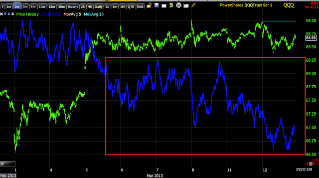
 QQQ 15 min deeply leading negative and look how quickly, at the same time breadth was even worse in to market price strength.

 QQQ 2 min leading negative-sorry this should have been before the longer chart.


 QQQ 60 min, this says something, especially as it comes right after the area I consider to be the area where the trend's back was broken.

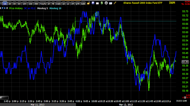
 IWM 30 min has been in line, these are the charts I love, they move with price and then diverge sharply, these are among the most reliable.

 IWM 15 min-remember the QQQ 15 min in the same area with the same sharp neg. divergence

 IWM 10 min

IWM 60 min, again remember the QQQ 60 min and where this divergence falls.

Leading Indicators 2

OK, here they are and they show how the market was a bit overdone earlier before we got some upside at 2:15...
*Leading indicators are always compared to the SPX (green) unless otherwise noted.
 Here commodities  are holding up better than the SPX, this is a short term bullish signal for the SPX, bur very short term and you need to know why, the first thing you want to check with commodities is the movement in the $USD.

 Here's commodities vs. the $USD (green), note there's a nearly perfect inverse relationship, typically stocks follow this inverse correlation as well, but today the SPX was even more negative than the $USD correlation would suggest, this is a 180 degree change from recent market behavior related to currencies and especially the $USD.

 Here's FCT going negative yesterday in advance of the SPX, today the SPX turns negative, this is why we call them "Leading indicators".

 HYG also turned negative in advance of the SPX, longer term credit is way more negatively dislocated from the equity trend, since credit markets are much smarter and larger, they tend to lead equities, equities tend to follow credit.

 I mentioned I thought HYG was seeing a short squeeze bounce recently, this 15 min chart is showing the end of that move, the yellow area is a head fake move.

 Intraday before the SPX moved at all at 2:15, HYG's 1 min chart was slightly positive, suggesting the SPX would see some upside intraday.

 Junk Credit trades a lot like High Yield, it too went negative and broke down to the left and saw what I believe to be a short squeeze bounce to the right that saw distribution and is ending as price starts to roll back over.

 Looking at currencies intraday, the Euro which has a pretty tight correlation with the SPX was showing support well before the SPX (as it was making a new low), this suggested the SPX see some intraday upside as well, this is a much stronger signal with the $USD also signaling the same.

 Longer term, to the left the SPX and Euro are moving together as this is their typical correlation, the break down in the Euro and EUR/USD is quite sharp, this leaves the SPX largely unsupported, it can move higher as it has done, this is the essence of a divergence and what makes it such a powerful signal.

 Intraday since yesterday we can see the Yen moving up  while the SPX moves down at the same time, this is one reason I have been watching the Yen so closely. I do believe some of the upside in the Yen is due to China, but I think some is due to carry trades being closed out, which is a red flag warning for the stock market as carry trades typically finance equity positions, so equity positions would be closed out first. If you don't believe 3C is showing that, then look at market breadth, it was down yesterday in to a market that was largely up-how can you argue with that?

 The Yen on a 5 min chart also showed earlier at 1:15 the SPX was lower than the Yen correlation, also suggesting some upside intraday for the SPX.

 Treasuries are the flight to safety trade, look at the 30 min leading positive divergence , with the market's price pattern looking so strange, 3C signals and breadth, I'd be taking this chart seriously as well.

Near term the 5 min TLT chart continues to see positive divergences

Bigger Picture Update

*I accidentally published the Leading Indicators post before it was done so there will be a follow up, there are some good tools and concepts so I don't want to skip it.


We have very slight positive divergences in the futures and most of the averages, but they are very limited. The TICK is also signaling higher prices.

GOOG looks like it will be ok, but I really don't anticipating holding it very long at all.

I'll use the SPY as it one of the best looking, which is not to say much.

 SPY 1 min is not positive, but rather in line, most positives that you will see are relative divergences.

 SPY 2 min went negative in to the highs of this morning, the only divergence here is a relative divergence which is the weaker between relative and leading.

 The 3 min chart is the same story as the 2 min above, negative in a bigger way in to the highs of this morning with a relative positive as prices fell.

 The first timeframe outside of intraday where we see institutional activity is the 5 min chart, here you can see it also was clearly negative in to yesterday's move and today's highs, I suspect 3C will make a lower low shortly which will not be good for the SPY, especially if it is bouncing as it is presently.

 This is a wider view of the 5 min chart or "trend", again since the 5th (which looks very strange just looking at price alone) we have a very deep leading negative divergence. Last night I showed you breadth charts that were negative or getting worse yesterday even as 3 of the 4 major averages were green, this is a major red flag, especially on top of the earlier breadth post this week.

 The 15 min SPY chart still shows that area that looks like a "W", this is where I suspect the back of the trend was broken, even though we have higher prices, it's no different that what I said the day I first posted, "The back of the trend is broken". Even on the first day I acknowledged that moves to the upside were not only possible, but almost certain and the analogy I used was "the snake's back is broken". A snake is usually  very elegant moving creature, smooth, flowing movements, however when a snake's back is broken it whips around wildly, like the market volatility I was trying to convey as well as it being the most dangerous at that point. If you were to assume a snake is no longer dangerous because its back was broken, you'd be very mistaken and in this case, I believe it's very dangerous either way-to the upside or downside so I want to be on the side of probabilities.

The daily chart is one of the longest, cleanest trends, we need other charts to tell us when timing is right, but there's a major problem in the market with a divergence like this.

In addition, as I posted yesterday...the monthly Demark inspired indicator is giving a sell signal, the last major one in the SPX was November of 2007.

Leading Indicators

Yesterday Context was positive, meaning ES was supported by risk assets, today it is back to negative as it has been nearly every day for a couple of weeks now, almost the same period where we have a very clear negative divergence since 3/5.


Although most of the Leading indicators are clearly negative (these are mostly risk assets that should move with the SPX, when they dislocate negatively, they are leading negative), there are a few on short timeframes/intraday that show the "overdone" status of the market I mentioned in the last post.

I had some questions as to why not go long the SPX if a new high is expected. A new high in the SPX is half of a percent away from yesterday's close, that can turn on you real quick, if there were support for a position long the SPX, I'd take it, but the probabilities and support are just too ow. I'll show you next post.

Quick Market Update

The market looks a little overdone on the downside intraday when comparing to currencies, some 3C signals, etc.

When the market looks overdone as I will show you in probably the next post and it just keeps going, that's the extremes in the market and a signal that things have really changed. My gut feeling is the market will get a little relief from the downside intraday

Future Update

Amazingly, the futures are still similar to the earlier readings with a few changes: ES/SPX futures are still just about perfectly in line with 3C, TF/Russell 2000 Futures actually look worse, they look the worst. NQ/NASDAQ futures still are a bit more positive than price.

 ES futures had a pre-market positive divergence, it wasn't as big as it looks now because the scale of the chart is much wider due to price having moved down, but after the open, that went negative and ES has been almost perfectly in line since.

 TF/Russell 2000 (IWM) futures look the worst, they are actually leading negative.

NQ/NASDAQ 100 futures are not screaming positive, but more positive than anything else. AAPL's 1 min chart has gone negative a bit, but there are still AAPL positives to the 5 min chart so I wouldn't say it's done with yet.

GOOG Charts-Weekly Calls/ April Puts

Here are the charts and the set up for adding to or starting a new Put position in GOOG (The April $810 Puts are still an open position).

 The idea here is that we have two head fake areas that should turn out to be failed breakout levels, the major one is at the $775 area, the minor one is at the $800 area, although $800 is definitely a psychological level.

When a breakout fails, they typically reverse fast and hard, "From failed moves come fast moves" so the first thing we want to do is try to confirm the breakout is seeing distribution and not supported...


 The long term 2 hour chart shows a clean trend and it's a clear leading negative divergence above the $800 area.

 The closer 15 min chart shows the preparation to break above $775 with a positive divergence (accumulated at the white trendline) and negative divergences after the break out, suggesting the breakout/higher prices and demand, were used to sell in to, at the $800 area the divergence is clearly leading negative.

 The 10 min chart is zoomed out as far as it will go, but it really needs to be zoomed out a bit more and then you'd see 3C moving up in sync with GOOG from November where there was a small positive divergence and then going negative in to the new year-you can still see that, but if I could zoom out a bit more 3C would be moving a lot closer to price. *For those using 3C or really any cumulative indicator, this is completely normal as these are not oscillators and are not anchored to the price scale, the way cumulative indicators are used (Worden's Money Stream or Time Segmented Volume are the same as far as the scaling factor) is by comparing the price highs/lows/trend to the indicator highs/lows/trend at the same point in time, usually by using at least two relative points, they are typically highs, lows or the general trend. Oscillators differ as they are fixed and the value is important, although many people don't use oscillators with divergence analysis, they are actually more effective when used in that manner.


Here we have the intraday GOOG chart (1 min) with a positive divergence, the 2 and 3 min charts are positive as well, so I want to use the short term divergences to sell (or buy puts) in to price strength and use short term calls to ride that price strength. The idea would be to enter calls somewhere in the following area...


GOOG Weekly Call-Expiration 3/16 / Strike $825

This is a speculative position as it may be closed intraday

Starting a Small Weekly Call In GOOG ***Read

I'm really looking at GOOG to set up an add to or a new position for those interested in April Puts, but I figure since there's already an April put position in place, why not try to rise the bounce that I'm expecting to set up the entry for April Puts with some weekly calls? The position will be smaller and it's already hedged with the April Puts. I'll let you know what expiration and put out the charts for the April Put trade.


AAPL Factor-Market Update

I'll show you the intraday futures and averages, they'll all be in line on an intraday basis except for NQ (NASDAQ 100 futures) and QQQ, the reason I believe is AAPL, I think the locals are reading the AAPL tape and that's the reason they are using NQ and QQQ as well a they may have been offering better entries, especially with options.

 ES/SPX futures on a 1 min intraday chart are nearly perfectly in line with price-that's price/trend confirmation, there are no divergences suggesting the current trend (whether it be up, down or sideways) has any strong underlying trade that should move it, although the averages will often draft each other (if 1 moves strongly the others follow), but we didn't see much of that yesterday with the SPY/QQQ


 TF/Russell 2000 Futures are also in line

 Only NQ/NASDAQ futures have a positive divergence.

Looking at the averages...
 SPY 1 min is in line currently (green arrows) just like ES.

 The SPY 2 min looks worse

 However if you zoom the 2 min chart to intraday status, it too is in line.

 IWM 1 min intraday is in line as 3C is moving with price, just like the R2K futures above.

 The QQQ 1 min however has a leading positive divergence.

 When viewed within the trend it's obvious this is intraday only and one of the reasons the AAPL trade may have to be closed quickly as there doesn't seem to be much support beyond an intraday move.

 QQQ 2 min chart is in line, so the divergence is only on the intraday 1 min chart-the weakest divergence possible, but still a higher probability of an intraday move to the upside and the reason...

 AAPL's 2 min chart, after seeing distribution on the open has a positive divergence right now.

 The 3 min chart does as well, this is still an intraday timeframe, but suggests more support for an intraday move higher.

At 5 mins, AAPL is almost perfectly in line, meaning the positive divergence hasn't migrated to that timeframe, which in my view, caps the potential return and this is why I think you need leverage to make the trade worthwhile. At 10 mins above, AAPL is negative, so again it looks like an intraday move in AAPL with the Q's following, but not much more than intraday.

I'm going to see what else we may have that may be more profitable and higher probabilities.