Monday, April 20, 2015

Daily Wrap

As posted first thing this morning in the A.m. Brief, the expectations of both "Week Ahead" posts as well as the Daily Wrap Friday, in addition to numerous other reasons, ended the post with the following which is one good reason in my view to take the time to learn about the lost art of "Volume Analysis"...

"Interestingly for next week , especially the early part, Today's Dominant P/V RElationship was SUPER Dominant across the board: 27 Dow stocks, 91 NASDAQ 100, 1141 Russell 2000 and 327 SPX 500, ALL CLOSE DOWN/VOLUME UP.

This is obviously a very bearish relationship, but it's also a strong 1-day oversold relationship and most commonly we see a short term oversold bounce the next day or so.

Of the 9 S&P sectors, ALL NINE WERE RED. Utilities were the best performer at -0.36% and Consumer Discretionary lagged at -1.48%.Of the 238 Morningstar groups, 226 were red.

Only 11 Dow stocks remain above their 50-day moving average, only 1010 (almost half) of the Russell 2000 are above their 50-day.

Overall, the market is at a deep 1-day oversold point so our forward looking analysis for early next week doesn't look so far off, a 1-day oversold bounce and INCREASED VOLATILITY sounds very reasonable here, that should be an excellent entry for positions, options/puts, etc."


As seen earlier today in Remember Volatility? the recent swings and ranges on a daily basis have seen the increase in volatility we have been looking for, even if price essentially remains flat on the year which in itself is a message of the market. As noted numerous times, I can't remember how many times I have posted that an average was green YTD or red YTD as they keep flopping back and forth, not at all the trend of the last 5+ years.

Friday after the Chinese markets closed, futures sank as low as -6%, the overnight PBoC RRR 100 basis point cut (18.5%) was the largest RRR cut by the People's Bank of China since 2008 and wreaked of panic. Furthermore, clarifications by market regulators were made to make clear they weren't trying to pop the bubble in Chinese stocks, as I said this morning in the A.m. Brief .

And why shouldn't they wreak of panic? I found this image of Chinese stock traders most amusing and most terrifying.
 No Joke!

 While the Shanghai Composite pared back some of those futures losses, not even a 100 basis point RRR cut (easing) from the central bank could close the Shanghai Comp green at a -1.64% loss. Note the Ultimate Oscillator divergence which is quite large, but even more impressive as we go down the list...

The Hang Seng which saw a parabolic move as regulations changed to allow more investment in the Index that sells the same stocks as Shanghai, but they were at significant discounts of up to -35% in some cases.

Now the candlestick price pattern looks like a classic TOWER TOP!  And with the Ultimate Oscillator divergent too on a parabolic move which I never trust anyway.

Take a look at Germany's DAX, if that doesn't look like a top with the U.O divergence, I'm not sure what does...well the Hang Seng may win the prize, all of which we saw well over a week ago in FXI posts/updates.

Remember the LEADING quality to the $USD lately in posts I have put up numerous times, which with 4-days down last week was the worst 4-day performance in just about a year, saw a bounce today, again with a leading indication for the broad market, take a look at $USDX futures on a 3C chart.
You may recall the April 2nd $USD forecast for a bounce and then a larger move down, one that may put the $USDX in a primary downtrend as it has made a lower high, next a lower low will be a significant change and put significant pressure on the $9 trillion in $USD-based carry trades, which will in return put significant pressure on risk assets like stocks as Carry trade losses snowball at 100-300x leverage.

The positive divegrence on this 10 min chart of $USDX led to today's positive performance, but note the negative divegrence in to today's gains.

This on the back of EUR weakness (also a former carry trade currency) and $AUD came under pressure after first rising on the PBoC RRR cut, then being talked down by Stephens (another former carry trade favorite currency) who said he wouldn't be surprised to see the $AUD head lower.

Considering the $USD's recent leading of the SPX (consider the forecast for the $USDX-Larger leg down since the bounce was completed), last week's late in the week negative divegrence in the EUR which led to a move lower, forecasts $USD strength as EUR weakness typically translates in to $USD strength, thus another signal from last week of today's oversold bounce (based on market breadth/internals, NOT INDICATORS which can stay at extreme levels for a long time). Thus today's $USD distribution in to the bounce is a negative sign for the stock market following the same logic and relationships that have been in place.

SPX (green) vs. USD (red) and the leading relationship of the $USD.

Today's $USD strength seemed to weigh on the precious metals with GLD-.76% (as we have been recently looking for) and SV down 1.74%. I'll be updating GLD tomorrow.

As for the averages today and their forecasted oversold bounce condition after last week's Chinese margin crackdown, expanded Chinese short salable stocks, Greek Exit headlines and the Comcast/TWC antitrust headlines internals showed the market was due for an oversold bounce which is much more reliable than indicators that seek to prove the same. Tech was the leader with AAPL up over 2% finally making its move above its triangle's apex and on the watchlist, Tech was just behind transports actually, which deserve a bounce.
 The major averages with the NDX in blue at a gain of +1.51% and Transports in salmon with a gain of +1.69% despite oil prices, but you know what I believe we will be seeing near term in USO/oil. Saudi oil production is at a NEW RECORD high.

I'll be updating transports tomorrow as well looking for another entry for those interested as Transports have been a core short position with at least 2 previous entries.

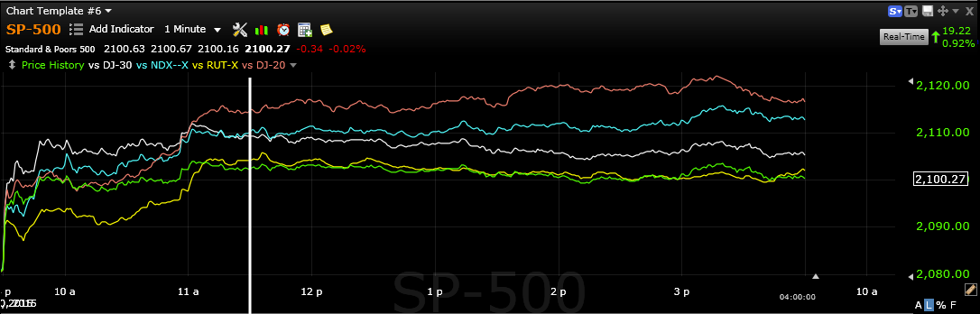
Note after the European close, the averages went flat on the day.

 As for the "Reversal Process" forecasted for last week, looking at the major averages over a week's time, you can see the flat reversal process as there's virtually no movement from the start to the end of the week period covering mostly last week.

Energy over the last week (blue) has led, but as you know, I believe we will see USO weakness and Energy in general (XLE) is another asset I should be covering tomorrow, even though it's much broader than simply the price of oil.

XLF you likely already saw in an earlier post, it's also high on my list.

Yields were modestly helpful to the market today as might be expected

Internals...
Ironically in almost perfect opposition to Friday's oversold condition in P/V relationships and sector performance, today was near the EXACT opposite.

The Dominant Price/Volume Relationship once again hit extremes in all 4 major averages, but unlike Friday's solidly near term (1-day) oversold, today was the most bearish of the 4 relationships, Price Up /Volume Down. There were 21 Dow stocks, 82 of the NDX 100! 1018 of the Russell 2000 and a walloping 316 of the SPX 500 (of 4 possible relationships), this is extremely dominant. 

While I'd normally say this is a 1-day overbought condition, it can also be interpreted as a VERY weak upside move that is failing, we still have that SPX trendline head fake area just above around $2115 which would make for an excellent set of trade set ups as mentioned in Friday's Daily Wrap, especially put positions.

Adding to the argument for a 1-day overbought condition, all 9 of 9 S&P sectors closed green with Tech leading at +1.71% and Consumer Staples lagging at +.35%. 

Also a huge 208 of 238 Morningstar groups closed green. If this is not a 1-day overbought event with a red close tomorrow, it is CERTAINLY a VERY weak trend on any further gains which would suit me just fine if we were to make a head fake move in the SPX!

The overall 3C charts look horrible on this move with no confirmation and steady migration in the intraday timeframes to leading negative, but tI suspect there's a little room for some additional upside.

Ex:
 Not even a 2 min chart could confirm today's oversold bounce! This is not good for the overall market moving forward.

The 3 min looks similar

The 5 min looks perfect for a reversal process and remember, the 15 min chart was the line in the sand...


Since the 4/2 bounce/triangle forecast, 15 min 3C/SPY was in line perfectly then went negative, now leading negative EXACTLY WHAT I WAS LOOKING FOR AND DEPICTING SEVERE WEAKNESS IN THE AVERAGES.

Our leading indicators are looking great as well. The SPX:RUT ratio is severely negative. Pro sentiment indicators are severely leading negative, yields are leading negative, HYG is falling apart as it was notably weak intraday, commodities are taking a turn to the downside and HY Credit has done so already since the reversal process of last week seen above on the week long comp. of the major averages.

I'll take another look at Index futures before turning in, but so far there's nothing special about ES or TF, more or less in line, but NQ/NASDAQ 100 futures are showing some intraday 1 min weakness...
NASDAQ/NQ futures pop on the US open and note the distribution in futures all day, but especially in to the flat area (think VWAP) after the European close (shown above).

I COULD NOT BE HAPPIER WITH THE WAY SIGNALS ARE GOING, THE WAY THE FORECAST HAS PLAYED OUT.

IF WE CAN GET THE SAME KIND OF ACCURACY AND SIGNALS IN THE TRADE ASSETS ON THE WATCHLIST, SEVERAL MENTIONED TONIGHT (GLD, USO, Transports, Tech, AAPL, Financials, Energy), I'LL BE TICKLED PINK!

Again, I'll check the futures before turning in, have a FANTASTIC NIGHT. I hope you can feel the excitement I'm feeling through the post and thank you for all the kind comments/emails re: Friday's Shout Out to Andrea, even if I didn't have time to properly respond (I hate perfunctory responses), know that I read them all and shared many with Andrea. We are so grateful for such an amazing group of people!

XLF (Financials) & FAZ Update

I've been popping through numerous watchlists as often as I can between looking at the market and other things. Today I decided I'd post a larger XLf (Financials) using FAZ (3x leveraged Short -Inverse Financials) and FAS (3x leveraged long Financials) as part of the multiple time frame/multiple asset confirmation.

While ETFas are managed to (typically) track the 1-day performance of the underlying asset (for example SPY tracks the S&P-500), while the percent change is usually very close (even for the 2 and 3x leveraged ETFs), the actual volume or "demand" in the sense of volume, is not matched and totally different. I've mentioned numerous times that I often find leveraged ETFs give signals earlier than their non-leveraged counterparts or underlying asset. I suspect this is because the leverage makes timing more pertinent as gains and losses are magnified by the leverage. In any case, since 3C uses TSV-based data for its input which is Worden's proprietary indicator, "Time Segmented Volume", you can see just by the name that 3C and TSV use volume as a significant part of the calculation, thus despite the related ETFs tracking similarly, the demand component is very different, which is one of the reasons I use different assets in the same sector to see if there is "Multiple Asset Confirmation".


I would say that XLF broadly is in a good position to see a downside move of consequence, in saying "consequence", I mean I believe this is well beyond a 10% pullback or the media's 20% number they like to use, I believe we are looking at a primary trend move to the downside which means the October lows taken out and continue to move to lower lows. There are numerous fundamental catalysts for Financial weakness specifically, not the least of which is the contagion from a Greek default/exit which we'll touch on in the Daily Wrap.

In any case, here are the charts for XLF, FAS (3x long Financials) and FAZ (3x short Financials)...Remember, XLF and FAS should have similar confirming signals, FAZ should have nearly opposite 3C signals for confirmation.

 The trend in XLF (Financial sector) on a daily chart which seems to have run in to another large triangle-based price pattern. Triangles this size are not consolidation/continuation patterns, they are far too large. Typically a large triangle like this following an extended uptrend is a top, a large triangle following an extended downtrend is typically a bottom.

Note the increase in volatility or "Peeling" away from the trendline after the trendline is broken at the October lows with upside volatility after the October lows and in to a tightening, pinching range like many other of the averages, sectors and stocks.


 Taking a closer look at the apex area (point of the triangle which usually sees a highly directional price move as the apex comes to a point just like inched Bollinger Bands), there seems to be a bear flag of sorts (not textbook as far as the preceding trend). Volume is also not correct for a bear flag, but this does seem to be some organic price pattern.

Friday's break below the flag and close right at support is the perfect signal on increased volume for a bounce such as we saw today.


From my normal perspective, given the rather narrow range of the flag, I'd be looking for a short XLF entry or add to above the top end of the flag's range, a Crazy Ivan shakeout. I'd be looking for short term charts to confirm distribution above the range for the entry above $24.60 which is where I'll be starting my price alerts.


The long term 6 hour chart of XLF is showing the last major accumulation at the October lows and significant strong distribution in to 2015 and through the triangle area.

This is FAS-3x long Financials on a 4 hour chart, also showing the same October lows accumulation and leading negative distribution signals in to the triangle area.

The FAZ 3x short Financials is showing a confirming leading positive divergence.

XLF 30 min also shows with more detail (stronger divergences) the same exact trends as the multi-hour charts in all 3 ETFs, significant October lows accumulation and leading negative divergence that have grown stronger in to the triangle.

FAS 30 min chart (same timeframe as XLF above) shows the same thing, accumulation at the October lows and leading negative distribution in to the formation of the price triangle.

FAZ which is the 3x inverse of both, confirms on the same 30 min chart with a leading positive divergence, note longer term though the October highs in FAZ on all of the charts October highs which would not surprise me as I believe this will be one of the biggest movers.

This is XLF's bear-flag-like area at the yellow arrows. Note the recent leading negative trend on the 15 min chart, the same 15 min charts I have been watching in the broad market for turns to the downside, all of which have done so with SPY catching up last week.


FAZ being the inverse shows the area like a Bull flag and has positive divergence in to the flag-pole and the flag with only a small recent negative on the move in the market expected today from Friday's Week Ahead post.

FAS 10 min with a larger leading negative divergence on a 10 min chart in the bear flag area similar to XLF.

Note April 2nd where the overall forecast for a market bounce based on the triangle's all coming to an apex and the 3C chart action since that forecast moving forward in to price gains with a strong leading negative all last week leading to Friday's lows, which is interesting, unless the market knew a week in advance about the Chinese issues Friday...

Now to the tactical time frames, XLF 5 min with the same leading negative divergence leading to Friday's lows, there's no confirmation whatsoever of today's oversold bounce expected market wide from Friday's "WEEK AHEAD" post.

And FAZ 5 min is confirming with an equal/opposite leading positive divergence leading to Friday's gap up.

XLF 2 min is just showing us a closer timing signal going negative in to last week and Friday's gap down, again no positive divergence even on a 3 min chart, suggesting any upside we can get in Financials is a gift from here, although I still like them broadly speaking in this area for the primary trend or trend trades.

XLF 2 min shows a weak (2 min) leading positive divergence in to Friday's FLAME OUT area in the afternoon as stops were run and accumulated for an oversold bounce. Note today's 3C distribution signal in to the oversold bounce today.

1 min XLF is pretty flat, this will likely be the "timing" timeframe for actual tactical execution of a trade idea.

While the 1 min FAZ is already in a leading positive divergence.

I'd set price alerts for slightly higher XLF and slightly lower FAZ prices, hopefully this gives us a good chance to enter at a tactical area of lower risk, higher gains while also getting in on what appears to be a significant strategic trend change coming.


Quick Market Update

I don't think today's move is quite ready to roll on us, there may be some additional upside which is on very short term charts, the base or lack of a sturdy base is problematic. I suspect it may take some fundamental information (not technical) to cause a head fake move based on the SPX March resistance line, I don't see the market as having the strength itself to pull that off without some kind of F_E_D speak or something along those lines.

The charts that needed to fail, largely have and instead of looking at 15 min charts for signals, we are now down to the nitty gritty of intraday charts, 1 min in many cases.

I'll post examples in the Daily Wrap.

I also have an XLF/Financials / FAZ post that will be out soon.

Remember Volatility?

If you recall the posts that talked about the stages of a market or stock's cycle, accumulation, mark-up, distribution and decline (stages 1-4), you've probably heard or seen the examples of how volatility precedes the transition from 1 stage to another, often in surprising ways that are what I call "seemingly" bullish or bearish, but all the while the main concept is "Price is deceptive".

It's true that price is king, but that doesn't make it any less deceptive at times. I don't have any argument with someone that sees an AAPL update and wants to try to catch the bounce up, as long as they understand the risk and see the underlying trade, that's a personal choice that 1 trader may be better suited for than another due to time constraints, account size, risk tolerance, etc. I'd rather be buying something that is showing accumulation personally. However for most people, they don't see what we see, underlying trade, therefore the "Price is kins" meme can often and according to studies, often sees people lose all bull market gains when the market turns to a bear market for a number of reasons that are too long to go in to for this post, but suffice it to say that when you have a good experience with something, you develop cognitive biases.

The actual point was volatility and the surprising "seemingly" this or that price moves before a trend change from 1 stage to the next. From a stage 1 base to stage 2 mark-up, it's very common to see a new low made and run all of the stops before a big move to the upside. Before stage 2 rally/Mark-up turns to the lateral stage 3, it often peels away from long term trendlines in a "Seemingly" bullish parabolic move (look at Gold/GLD 2011).

One of the things I have warned of and am watching for is the typical topping "Igloo with Chimney" head fake short squeeze we often see whether on an intraday chart or a 5-day weekly chart, right now that would be the SPX daily trendline from March...
While not the "Igloo / Chimney" price pattern, the chimney is a head fake move on a rounding top just before a downside reversal, a breakout above a well know resistance line in the most watched Index in the US, maybe the world, would perform the same conceptual function.

The end of stage 4 decline or a bear market tends to end with a BANG, a big gap down on huge volume known as capitulation, however price tends to drift lower more slowly after that for a bit before starting a stage 1 base again, but the point is the RISING VOLATILITY WHICH IS ONE OF THE MOST IMPORTANT THINGS I HAVE BEEN LOOKING FOR RECENTLY IN THE MARKET'S PRIMARY TREND FOR A TRUE BREAK OF WHAT I BELIEVE IS A LARGE BROADENING TOP FOR THE SPX.

I'm trying to get us as close to the right edge of that cliff without getting stuck in this...
 This is the DIA 10 min chart with huge volatility, but not going anywhere as the Dow was RED TYD as of Friday and is up +1.19% YTD today. It's this chop and more specifically the chop within moves and pinching volatility as of the start of April, that has made short term trading very difficult unless you have been in and out and watching exceptionally close. I don't know how many times I've posted, "The market is green for the year" and then "The market is red for the year" through 2015, THAT'S A CHANGE IN CHARACTER ALONE THAT SHOULD TELL YOU SOMETHING ABOUT THE BROAD MARKET IN TERMS OF THE PRIMARY TREND SINCE 2009.

That's fine, it's the increase in volatility I'm most interested in as a signal.

 Looking at the Dow daily chart, this looks like a swing traders dream and we have called just about every swing this year, but take a closer look at the day to day candles and imagine not knowing what happens, what's on the right side of the chart tomorrow? Look at the approximate swings/Volatility day to day for the Dow alone marked by arrows of approximate size of each days swing and whether up or down....

 Things are a lot easier to see once they've happened, but at the right edge of the chart, it's not so easy, especially with swings with that much intraday or day to day volatility.

Still, remember the 15 min charts which were 1 of 3 indications I've been watching to find the pivot in this market on a primary trend (in my view)?

That's the DIA 15 min chart, the chart that was positive when the April 2nd forecast was made, the chart I've been watching to turn negative.

As for ES, it's hard not to just jump all in right now,,,
60 min ES/SPX E-mini futures. The positive divergence in to early April is clear as is the leading negative divegrence now, an even stronger signal than the DIA 15 min above.

So as you can see, I'm doing the best I can to keep us out of that choppy mess, but not miss the pivot because there are very clear large signals that I believe likely represent the primary trend (as in since 2009) and a very likely trend change in that primary trend.

The increased volatility whether up or down is a good signal for us and remember that the "seemingly" strong price move is often the reddest of flags,


USO Update

USO calls that are counter to the large 2015 base, are hard for me to make because we were the earlier to recognize a change in USO, the earliest as far as mainstream media to say it looked like a base, but not a base that was finished while others were calling it a base about 2 months ago and it has great longer term signals, great overall base signals and off price action alone, looks like it's ready for a base/upside breakout, not a false break used to trap longs and push prices back to the lower end to make the base larger/stronger, but based on price alone it looks like it is just waiting to gather enough steam to breakout and

I'm a huge fan of that eventual move.

 This is the "W" base in USO, it even has a head fake move at the second low of the "W" or Double Bottom, which is why I say that from a price based perspective alone, it looks near ready to go.

However a closer look at the Daily candlesticks from the last resistance level and this tag of resistance shows the same long upper wicks indicating higher prices are being rejected as volume falls off as well.

It's more the 3C charts though that make me thing a swing pullback which could be near 20% is probable as you see with this 15 min USO negative divegrence between the same two areas seen on the chart above this one.

 The 10 min negative from the most recent swing up to resistance and a relative (weaker) and then leading (stronger) negative divegrence.

The shorter charts like 3 and 5 mins above show the same negative in the area of resistance.

As does the trend of this 1 min with accumulation and distribution on a very short term basis, thus  for now I'll stick with USO. A break to pull in new longs and trap them wouldn't be unusual, if I were the crook moving oil prices, that's what I'd do, after all a failed breakout is a fast reversal.


AAPL Update & Market TIMING Proxy

Our original 4/2 market forecast which has been pretty darn accurate was made using all of the information I could gather which included going through numerous watchlist stocks and noticing a common theme, that's when I posted the forecast/update and since I had seen enough as I had looked at the AAPL chart and because it was the easiest, cleanest chart to use a proxy for the broad market, that's what I used.

As you know from Friday, I suspected AAPL was going to use a Crazy Ivan shakeout for (head fake) slingshot momentum to the upside, but this wasn't the first call for a move higher in AAPL based on its triangle, the original 4/2 post also called for it and last week's AAPL Finally Looks To be Making a Move called for the same, so I'm happy to see the move whether you played it for a piggy back (short term long trade) or are just interested in it as a short or market proxy like I am. AAPL charts look to be fantastic market timing indications which is important in picking the best pivot without the kind of chop you would have seen last Friday through today.

A Crazy Ivan Shakeout like this one embodies everything, all of the reasons head fake trades exist, why they work, what the psychology is, what the probabilities are and how you use them to your advantage (all in the "Understanding the head fake move" articles (2) that are always linked at the upper right side of the site.

This was a suspected Crazy Ivan shakeout, today it looks to be a confirmed on, thus as both a trade idea and a broad market proxy for timing, it's of great interest to me.

 First, the long term highest probabilities...
 4 hour AAPL deeply leading negative right at this triangle.

The 10 min chart shows the right side or Apex of the triangle, the head fake/ Crazy Ivan shakeout and accumulation of that move Friday...

So now we look at the charts, whether there's distribution in to higher prices as always expected or not and at what pace if so. This is the concept of "Migration" or the strengthening of a divergence.

 intraday 1min AAPL shows a negative divegrence building.

 It has already hit the 2 min chart, in a rounding type price action.

We already have signs of it on the 3 min chart as well so there is a negative divegrence building/migrating across longer timeframes in AAPL. If I zoom out you can see the positive Crazy Ivan divergence, but you'll see it below, I'm trying to focus on the migration of today's negative divegrence.


This 5 min chart shows the positive divegrence as the Crazy Ivan allowed smart money/specialists/market makers/etc. to pick up AAPL on the cheap and in supply on the head fake/stop run or Crazy Ivan shakeout, thus the divergence.

From a practical point of view, I'd say when AAPL's 5 min and 10 min chart are showing decent negative divergence as this process keeps moving to longer charts, the timing for the overall broad market will be there, not only for today's gap fill move, but on a larger basis as AAPL was one of the disappointments and I thought maybe my analysis was wrong being it HAD NOT broken out, but now it has done what I was looking for, it looks to be an excellent timing indication for the broad market which will include MOST stocks as well.