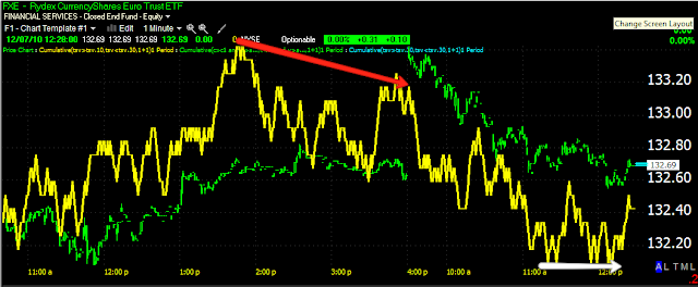
This is today's 1 min chart. The first area of interest was the opening gap, which showed immediate distribution (first red arrow). Then a zone of accumulation at the white arrow, did little more then slow the downtrend. The 2nd red arrow from the left showed a large leading negative divergence, the 3rd red arrow shows a relative divergence, but the longer 2nd red arrow shows where the real damage was being done. It seems there was an effort to unload at obviously higher prices during that 1 hour+ period. The rest is self evident.
End result, about 1% GAP HEAD START nearly totally erased.
Is interest rates about to start going up?
-
Yes, I know - it does not make any sense - FED is about to cut
rates...but....real world interest rates are not always what FED wants it
to be.
6 years ago


