Okay, like said, I've been looking at a lot of charts today because we are at a pivotal place. Lets go back briefly and look at what my expectations were as published Wednesday, "The market Will see a sharp sell-off between now and Friday" this will cause most of the calls to expire worthless and may inspire a lot of PUT buyers to exercise their PUTS and effectively be short. The sell-off came the very next day, the move was a good start to lock in shorts, the idea was shorts would re-enter positions seeing the sharp sell-off and over the next week we'd see a short covering rally that would take out the shorts including the exercised Put players.
So Market Breadth is important to look at, the first set of charts are largely market breadth.
NYSE Advance Decline Line (green v the NYSE red). Note how the NYSE A/D line has held steady much higher then price, this is a positive divergence in breadth, similar to the positive divergence in breadth in mid to late 2010.
Stocks trading 2 standard deviations below their 200 day m.a., (This is the 2007-2008 top) very often a spike in this indicator is a good oversold signal and leads to a rally a you can see. In this set of breadth indicators, the indicator will be green, the index it is compared to is red and usually the NYSE composite unless otherwise specified.
Same as above, except current.
Stocks trading 2 standard deviations above their 200- day m.a. with Rate of Change applied to the indicator (yellow), you can see numerous divergences in the ROC line that led to negative divergences and positive divergences, right now we are very close, if not at positive divergence.
McClellan Summation Index with ROC applied to the indicator, also shows numerous positive and negative divergences that moved price, currently a positive divergence vs price.
2 Standard deviations above the 200-day price moving average, when there are spikes below 20, it often leads to a rally as you can see.
Stocks trading 2 standard deviations above their 200 day price moving average with Rate of Change applied to the indicator. This shows multiple positive and negative divergences over the lat 2+ years., currently a positive divergence.
This is an example of how the Bolton Tremblay Indicator can lead price, the S&P pictured here fell on this leading divergence.
Here's the same indicator today, look how t has refused to move lower when compared to price at the same relative levels.
The NASDAQ 100 A/D line which signaled an earlier negative divergence sending price lower is currently leading price in a slightly positive divergence.
When applying ROC to the same indicator, the divergences become more obvious.
Zweig Breadth Thrust can be used two ways, levels of overbought above 60 and oversold below 40 often lead to reversals.
Also divergences in the indicator are powerful, it looks like we have a current positive divergence.
McClellan Oscillator vs. NYSE shows multiple positive and negative divergence over the last year +, currently looks like a nice positive divergence.
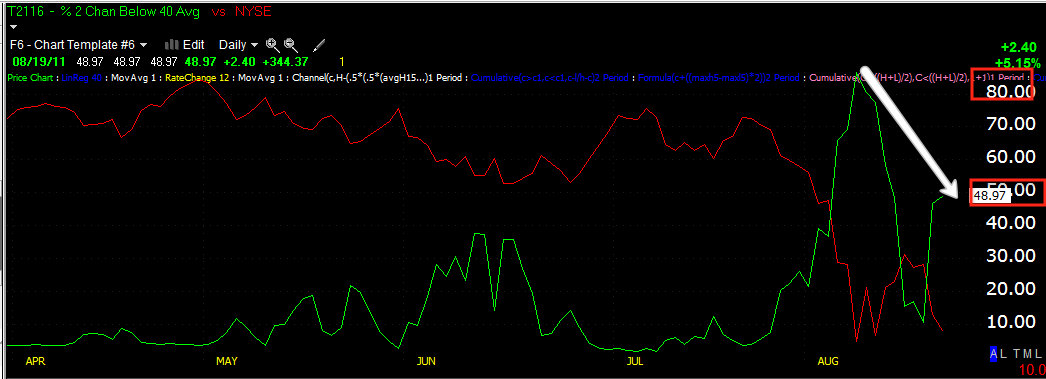
& of Stocks trading 2 standard deviations below their 40 day moving average. There's a clear positive divergence here at two relative points that are the lows.
Russell 2000 A/D line vs the Russell 2k with ROC applied, ROC clearly shows divergences in the indicator, currently it looks positive.
The same for the NASDAQ Composite. Wherever the indicator is not giving a strong signal, Rate of Change can often magnify the signal.
QQQ Breadth Charts (Intraday)
Intraday Momentum 2 min scale shows a positive divergence in to the close.
The same indicator on an hourly timeframe.
This is a NADAQ 100 Breadth indicator-% Count new highs/New lows for 205 bars over a 15 min. timeframe, note the first bottom and nearly 80% on the NASDAQ 100 were hitting new lows. On Friday's test of the area, it was about 25% new lows , a significant improvement.
Here's the same indicator over a 30 min timeframe, so new his/lows over the last 250 30 min bars, a similar reading.
Here is the NASDAQ 100 15 min. McClellan Oscillator, showing a positive divergence over the last two days down.
The 30 min shows the same over the last two days.
This is the 30 min zoomed out to see the first bottom and Thurs./Friday's test, note the positive divergence at each as well as the negative divergence building right around the time I started to warn of a downturn.
This is the same indicator with more detail on the 5 min chart, also showing a positive divergence on Thurs. Friday's test of the recent lows.
This is the same on a 2 min chart, showing a positive divergence piking up especially in to the Friday afternoon trade.
This is the 60 min Advance/Decline Ratio for the NASDAQ 100 component stocks , note the first bottom, the bounce and the shallower test of the recent lows.
The 30 min NASDAQ A/D line shows even more detail and a strong relative positive divergence
The 15 min chart shows the transition from Wed-Thursday and shows a positive divergence forming Thursday-Friday.
The 5 min chart is a bit more detailed for Friday's action.
This is a % Stocks hitting new lows/highs over 250 bars on a hourly timeframe for the NASDAQ 100, note the difference between the first bottom and the Friday test of the same area.
This is the same chart for a 30 min time frame
And for a 15 min timeframe
and 5 mins.-All show positive relative divergences
As you can see, the dominant P/V relationship was Price Down/Volume Down
All NYSE Stocks
Dow -30 Stocks
 NASDAQ 100 Stocks
Russell 2000 Stocks
S&P-500 Stocks
3C Charts
DIA 1 min
DIA 5 min
DIA 10 min
DIA 30 min
It looks like for the first time we may even see a positive divergence on the 1 day chart should 3C turn up shortly.
IWM 1 min
IWM 5 min
IWM 15 min.
IWM 30 min (I included boxes so you can see these are not only leading positive divergences, but relative positive divergences and the points of relativity are at the boxes.
QQQ 1 min
QQQ 5 min
QQQ 15 min
QQQ 30 min.
SPY 1 min
SPY 10 min
SPY 15 min-very strong divergence
SPY 30 min, again the red box is used to show 3C's position relative to past positions and price.
SPY 60 min leading divergence
Treasuries-The Safe Haven Trade
TLT (20 year T-bond fund) 1 min

TLT 10 min
TLT 15 min
TLT 60 min
TBF (Short 20+ year Treasuries) 1 min.
TBF 10 mn.
TBF 15 min
TBF 30 min
TBF 60 min
VXX-Volatility The VXX trades inversely to the market so weakness in VXX would indicate probable underlying strength in the market.
VXX 1 min
VXX 5 min
VXX 10 min
VXX 30 min
VXX 60 min
Pivot Points-Support
DJ-30 daily S2 pivot
Russ 2k daily S2 Pivot
SPY Daily S3 Pivot
NDX Daily S1 Pivot
From the breadth charts and the 3C charts, my original theory still sounds promising, it was first the markets break down sharply Thursday-Friday, which eliminates all of the call positions, with Put holders seeing the weakness n the market, they decide to exercise their put and enter a short position rather then take the gains up until Friday. The idea continued that next week (starting this week) we would see strength in the market that will force a short squeeze on shorts-pretty much everyone gets their clocks cleaned.
If we see some strength develop in the earlier part of this week (and for those of you who went short some of my ideas or your own when talked about the market dropping sharply last week on Tuesday/Wednesday would keep your shorts open with a fairly tight trailing stop for the moment) I would expect a short squeeze. There were plenty of large open interest Puts below $112 (SPY) that could have easily been taken out. Being the formation we are most likely to see would be a double bottom, know that double bottoms, just like double tops are head faked nearly every time. For a double top that means a new breakout high before a reversal, for a double bottom that means a new break down low before a reversal, the patterns are just too obvious and they have been some of the first patterns to be hit by head fakes going back many years before it became so prevalent. So any new lows below the pivots and support should be watched closely for positive divergences as a timing signal.
The Price Volume Relationship is the most common relationship during a bear market, however it is also one of the most ambiguous, it doesn't tell us much. Had the P/V been pries down/volume up and the 3C and breadth charts had been negative, I would think that there was real panic in sellers and to expect a whole lot more, so in a way, the lack of a strong P/V relationship does tell us a little something. Remember, tops and bottoms are a process, not an event.
As for the news, Tripoli is a big one to watch, but the Egyptian/Israeli friction is the main one to watch. When Mubarak was being deposed by the military, NOT by the PEOPLE, as he was already set to be because he insisted on his son taking over Egypt, when in fact the military has picked the presidents since Nasser, I warned, the facade of democracy will quickly crumble and the people will turn on the military. Also I said the military rulers will quickly seek to vent the people's rage outwardly instead of at the military and create a sense of nationalism, well here it is. Also I told you that the Muslim Brotherhood had been linking up with Hamas during this time of protest as Hamas slipped across the border, don't think for a moment that the two together didn't have something to do with the cross border skirmish that left Egyptian soldiers dead. Nothing seems to move the price of oil faster then instability between Israel and it's Arab neighbors. It's ironic too that we are approaching the season of war n the middle east and there has been a lot of talk of Israel hitting Iran, with instability to the south, this will test Israel like they haven't been tested in nearly 5 decades.
Remember, this analysis is forward looking, but only in a short to intermediate sense, the big picture remain the market is very ugly and when the second shoe drop, it will be a drop like few of us have seen before.


 TLT 10 min


