There are several charts showing distribution, specifically today, so far AAPL's daily candle is not very pretty.
This is a 5 min chart and shows the same thing as the 10 and 15 min charts to follow, right off the open, there was distribution as 3C failed to make a higher high with price.
The 10 min chart shows the same thin, there's also a touch of a leading negative divergence.
The 15 minute chart is more serious and this is a pretty serious downtrend.
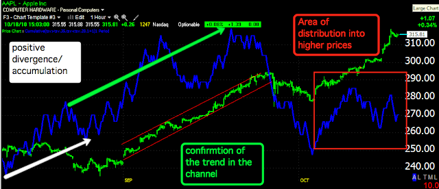
The hourly shows in white, as price was declining that 3C was showing accumulation. Shortly after we saw the uptrend chart in a very neat (too neat) channel. The green arrows show confirmation of the 60 min or big picture trend, basically it's still healthy, that is until the channel broke down. Since then there has been distribution or selling pressure into higher prices. Whether or not it's profit taking or a change of trend remains to be seen. 3C shows the underlying action so you know what you are getting involved in, but I ALWAYS prefer price confirmation as distribution can be large an carry on for awhile.
As for the shorter time frames, I believe this could be relevant to their earnings or attitudes towards guidance. However, there are a lot of traders who WILL book those kinds of profits going into the uncertainty of earnings. I'll watch to see if anything changes drastically in the last 30 minutes.
Is interest rates about to start going up?
-
Yes, I know - it does not make any sense - FED is about to cut
rates...but....real world interest rates are not always what FED wants it
to be.
6 years ago


No comments:
Post a Comment