There are certain watch list assets that look horrible on numerous timeframes, but for the sake of a better entry, less risk and not sitting in the asset as it moves sideways for 6 months as many have, a solid head fake move putting an acclamation mark at the end of a top is the best entry area.
One of these assets that has been on our radar with 2 previous trend entries at better levels as a core/trend short would be transports, they look horrible vs. the market which in and of itself is a message of the market. I recently posted the difference between Industrials and Transports (Dow theory confirmation/non-confirmation), it looked like this...
The Dow Industrials are on top, the Transports in blue and the difference between them in red. You can see clearly with the custom indicator I created (red) that Transports have diverged significantly away from Industrials. Dow theory would say this is a screaming red flag for the market and I'm not so sure I'd disagree.
However even a dog asset must bounce. Look at the recent string of lower highs and lows in the $USD to be followed by the strongest 7-day move in near 8 years, but with yesterday's 2nd weakest 1-day move since March 2009, it isn't meant to last. These are the kinds of set-ups we can use and why it has been so important to me that we get one before the market comes apart, whether that be on Greece, the F_E_D or just of its own weight.
The daily chart of Transports looks like this...
The best short areas are in the red box where we have had 2 previous entries. Two support lines have been broken and while looking weak just as the $USD did before it's counter trend rally, Transports have put in a divergence that is strong enough to give us a reasonable entry as a trend short, of course shorting it in to price strength as everything else is flashing major weakness.
This is that positive divergence in Transports that has had me hopeful we'll get a better price a bit higher and we can use that to open a new or additional longer term trend short. At any other time over the last few years a divergence this size on a 30 min chart would be good for 2 weeks of bounce before it even started to lose momentum, much less show signs of falling apart.
Something pesky keeps happening...
This is Transports on today's early strength on an intraday chart. All week any price strength in the market or numerous watch list assets has been met with immediate distribution just as you see above in Transports.
It has now gotten to the point in which the 15 min chart (the timeframe just below the 30 min positive divergence that is sponsoring this bounce) has started to go negative which means it won't be long until the 30 min chart, or what we'd call, "The gas in the tank" runs dry and Transports slip lower.
Hopefully we can get a decent, low risk entry in Transports and numerous other assets before that happens.
The way this is playing out in the market is as follows...
As made clear last night, I view this flag and the SPY $212.50 level a catalyst for pushing these broken assets higher , at least high enough to make entries in them low risk/high probability, but once again like the last 3 days (this week)...
Like yesterday and the day before, the intraday SPY chart has shown a negative divergence and price has followed it lower intraday.
The same with the QQQ
The same with IWM.
I have to admit, expecting a head fake move to the upside to fill out the chimney space, I suspected the invisible hand that moves the market (short term manipulation) would go to the first, #1 go-to asset when you need to push the market higher, but just don''t have the strength or a decent short squeeze and that is HYG- High Yield Corp. Credit.
I wrote just days ago that I suspected HYG would come down a bit making it less risky for them to accumulate enough to help the market along...I WAS WRONG.
HYG IS FOLLOWING ITS LONGER TERM/STRONGER DIVERGENCE LOWER.
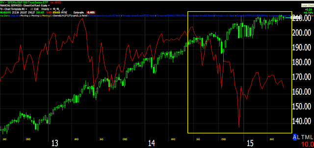
Below is the SPY in green vs. HYG in red. Remember HYG is almost always the first asset of choice for ramping the market higher and the market follows it in near lock step...
HYG this week making lower lows, not helping on the upside.
On a larger scale HYG making significantly lower lows.
And on a weekly chart, although I find the one above this most interesting for our immediate purposes. HYG is already in a downtrend vs the SPY/SPX.
The thing is HYG is not just a tool of short term manipulation, in fact the only reason it works for short term manipulation is because High Yield Credit is one of the largest institutional "Risk On" assets, you don't find many retail traders trading credit. When the market sees HY Credit moving up, it assumes institutional money is in a risk on posture and the computers buy, however if there's one thing HY Credit is telling us, one message of the market, it is that institutional money is getting the hell out of Dodge.
Is interest rates about to start going up?
-
Yes, I know - it does not make any sense - FED is about to cut
rates...but....real world interest rates are not always what FED wants it
to be.
6 years ago


No comments:
Post a Comment