Thursday, January 27, 2011

Time for Another Check of Market Breadth...

Market Breath is defined as: "The fraction of the overall market that is participating in the market's up or down move. Looking at this parameter allows investors to reduce the impact of the large cap stocks which influence market indices the most, and instead examine price trends of a diverse range of stocks. This parameter is important in the context of technical analysis, as a measure of market sentiment."


Because market averages are weighted differently, looking at the average alone only gives a very narrow view of the market of stocks, which is more relevant to the economy when using the market as a leading indicator for economic health. Because the averages are so easily manipulated by weighting factors, a study of market breadth can reveal the true underlying trend, sentiment and even reversals. There's no way to properly judge the market's true vitality without studying market breadth indicators. Telechart and other Worden products have a wide range of market indicators that are second to none. If you are looking for a platform for charting, I highly suggest a Worden product. Click the links for more information.

All indicators will be in green, the comparison to the market average will be in red. For most comparisons, the NYSE universe of stocks is used, unless specifically noted otherwise.

 % of Stocks Above Their 40 Day Moving Average . As you can see, while the red NYSE gained since October 13, the % of stocks which trade above their 40 day moving average has fallen significantly. While the S&P gained 10.29% since October 13th at the indicator's high, the indicator itself has fallen by nearly 21%. In a healthy market this indicator should keep pace or out pace price gain, not slide with far fewer stocks able to trade above their own 40 day moving averages.


 % of Stocks Trading 1 Channel (Standard Deviation) Above Their 40 Day Average. As mentioned above, the indicators should keep pace with price. At the green arrow we see the indicator making higher highs with price, at the red arrow we see a negative divergence in this breadth indicator. Trading 1 channel above their 40 day average indicates a very strong stock. From the October 13th peak, the indicator has fallen 34.7% while the S&P has gained 10.29%. Again, this is another indication that market participation into higher index prices is falling way off and more stocks are falling then previously. The trend remains ugly.


 % of Stocks Trading 1 Channel (Standard Deviation) Above their 200 Day Moving Average.  Obviously the 200 day moving average is a longer term average and shows the longer term trend. Stocks are not as fast to fall below this average as the shorter duration averages. Still we see another negative divergence with the market rising and the indicator falling. The indicator fell from 11/05/2010 -11.85% as the market gained 6%.

 % of Stocks Trading 2 Channels (2 Standard Deviations) Above Their 40 Day Moving Average. Note the higher highs at the green arrow and the current negative divergence at the red arrow. These are likely to be stocks that have trended up very well. From November 5th at the indicators high it has fallen an amazing 55% while the market has gained only 6%. 


 % of Stocks Trading 2 Channels (2 Standard Deviations) Above Their 200 Day Moving Average. As you can see, confirmation until November ended and turned into a negative divergence.  From November 5th, the indicator has fallen 33.57% while the S&P has gained 6%.

 Absolute Breadth Index. As defined by Investopedia, "A market indicator used to determine volatility levels in the market without factoring in price direction. It is calculated by taking the absolute value of the difference between the number of advancing issues and the number of declining issues. Typically, large numbers suggest volatility is increasing, which is likely to cause significant changes in stock prices in the coming weeks." 


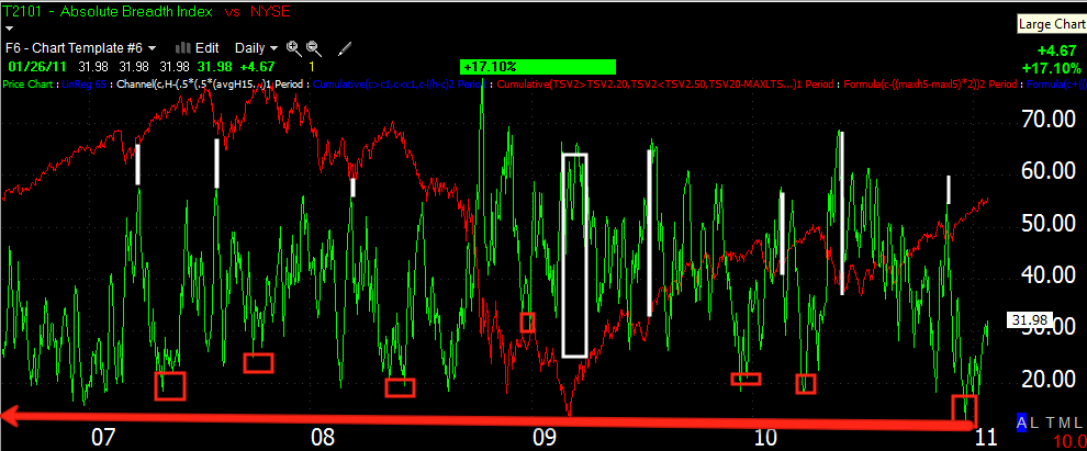
As you can see, spikes (in white) in the indicator have led to advances in the NYSE, while low readings have often signaled tops. Recently we made  new multi-year low.


 McClellan Oscillator This indicator is most useful when looking for divergences, similar to MACD. I've pointed out several negative divergences in orange and a positive divergence in white. This is an example showing the 2007-2008 top in the market. Note the negative divergences into all the major tops of the top pattern.


 Here is the current McClellan Oscillator. There was a powerful 2009 divergence at the market lows and several positive divergences in white after market pullbacks. The orange arrows indicate negative divergences that all pulled back. Note how big the current divergence is and how the Oscillator is nearly below zero.

 NASDAQ Composite Advance / Decline Line. Since April 22nd 2010, the A/D line has fallen 10.34%, the Composite has gained 9.38%

Finally the Russell 2000 Advance Decline Line. From April 26, 2010 until now, there has been 0% movement, at the same time the Russell 2k has gained 7.62%.

It should be obvious now from looking at these breadth charts that the market lack internal vitality, that more stocks are trending down as the easily manipulated averages continue to grind higher. Intellectually, there's a falsehood to the averages' standing as it is not supported by the same majority of stocks that it was at much lower levels. This is a very dangerous market and you should now be aware that there are many investment opportunities on the short side and while it may seem you are trading against the trend, you can see above the overall market is not trending in a healthy direction.

No comments: