Here are some of the positions from yesterday I used.
BAC 5 mn, we saw a move up, but the 5 min chart is not confirming, these are some of the clues I'm looking for.
However, BC 10 min is still showing a strong round of accumulation, this action thus far confirms my gut feeling I mentioned about a larger base being accumulated.
FAS-Financials Bull 3x the 1 min chart s showing a negative divergence on higher prices-remember, this is a 1 min chart, it's not a reason to panic.
TQQQ UltraPro long the QQQ shows a slight relative negative divergence, very slight. However look at our 3C depth accumulation zone, we are still very much in the area of strong accumulation, yet the bars in the trough are getting a bit deeper, I'll come back to this. This is no where near a distribution zone, just look at the bars to the left.
TYH Technology Bull 3X- a 1 min negative divergence
The 15 min chart which represents the longer trend and where accumulation accrues is still VERY positive.
UDOW UltraPro Long Dow-30 5 min negative divergence and the bars in the accumulation zone are deeper.
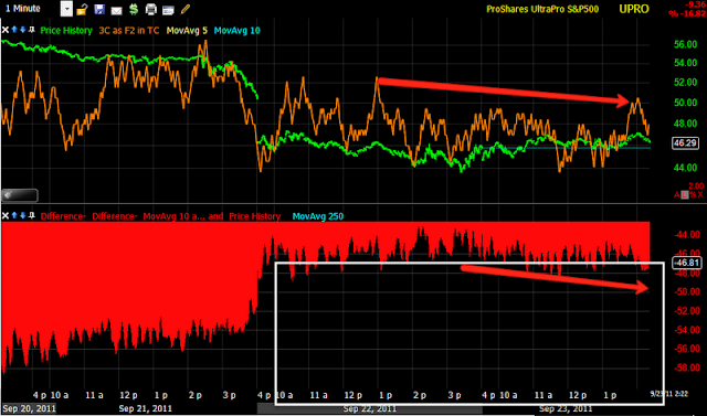
UPRO Ultrapro long S&P-500- a 1 min negative divergence
However the longer term 15 min chart shows how strong this area of accumulation is in how shallow the trough is.
URTY Ultrapro long the R2k 2 min negative divergence
URTY 5 min negative divergence, very slight, but these are the hints.
The 15 min bigger picture in URTY. This appears to be a very strong accumulation zone.
When I explained my gut feeling in the last post, I probably didn't use the best example, which had a big 1 day move up, followed by a new low that was also accumulated and then the move up. This I think is a better representation of my gut feeling. Think back to the days when market makers and specialists were an important part of the market before HFT came along. Part of what a market maker did was fill large institutional orders in the stocks they made a market in. The institution might say, we want 30 million shares of XYZ at an average cost of $112. The market maker would start accumulating the position, it would show up on the short term 1/5 min charts first, then that accumulation would accrue on the longer 10-15 min harts if it was strong enough. However, when the price of XYZ went to $112.75, the market maker who wants to retain the institutional business was now out of the target accumulation zone, so they would maybe have accumulated 15 million shares of the 30 million share order, what they would do is start to overwhelm the book on the supply side by selling some of those 10 million shares, maybe 1 million would do it, depending on the depth of the order book. 1 million share may be enough to knock XYZ down to $111 where the market maker could start accumulating again and by the time prices reached the average of $112 the market maker would have accumulated the full 30 million share position and if they were good, below the institutions average cost, then they got more business. If not, then another market maker got future business. So think it will look more like the above chart.
Is interest rates about to start going up?
-
Yes, I know - it does not make any sense - FED is about to cut
rates...but....real world interest rates are not always what FED wants it
to be.
6 years ago


No comments:
Post a Comment